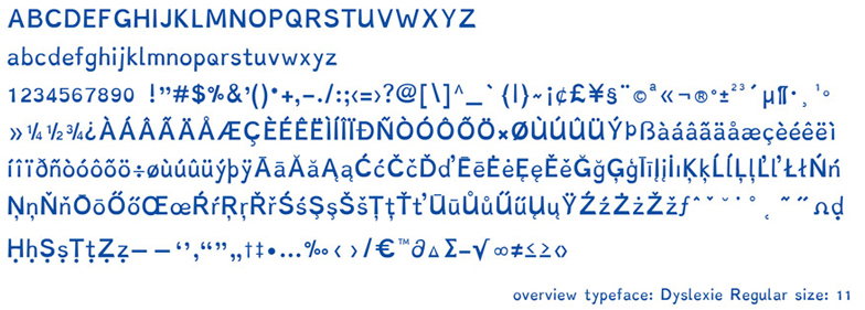
Designed to address the visual processing problems associated with dyslexia, this font uses a set of tailored strategies to make reading easier for those with the disability.
Christian Boer developed Dyslexie from first-hand knowledge of its effects. “When they’re reading, people with dyslexia often unconsciously switch, rotate and mirror letters in their minds,” he explains.
“Traditional typefaces make this worse, because they base some letter designs on others, inadvertently creating ‘twin letters’ for people with dyslexia.”
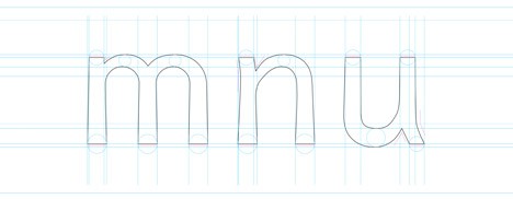
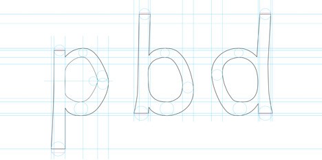
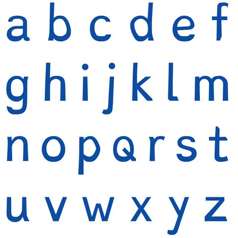
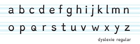
For simplicity, clarity and consistency, most typefaces involve numerous mirrored letters, such as an ‘m’ that is a doubled ‘n’ which in turn is an upside-down ‘u’, or ‘b’ flipped to become ‘p’s and ‘q’s.
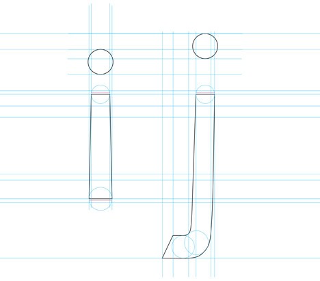
To address this, Boer thickened the bottom portions of letters, making it more clear which end is up and creating clearer distinctions between different characters in the process. Larger spaces and punctuation are also made to make everything more legible.
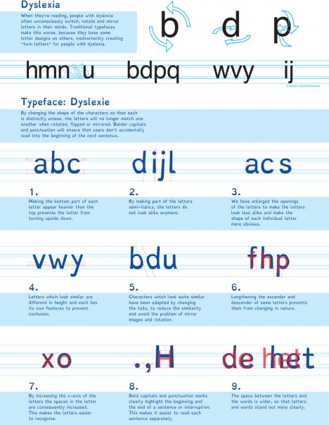
“By changing the shape of the characters so that each is distinctly unique, the letters will no longer match one another when rotated, flipped or mirrored,” Boer said. “Bolder capitals and punctuation will ensure that users don’t accidentally read into the beginning of the next sentence.”