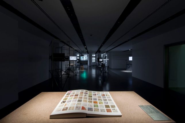
The map is not the territory, but the exception also proves the rule, as in the case of this book, which samples over 1,000 different maps to deconstruct their design approaches and inspire designers through their visuals. It’s not about the territories the original maps were made to represent, but all of the different design strategies embedded in the pages of past atlases.
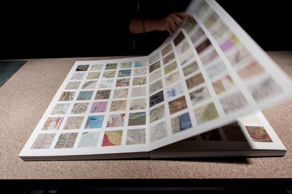
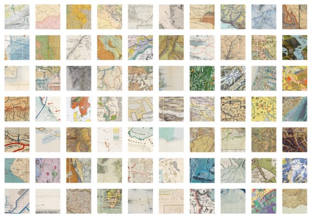
Kerim Bayer combined over 5,000 small map images in Map Section. “Deconstructing them really did help me personally to double down on my interest in the graphics, in reducing them to their empirical elements and appreciating them mainly for their beauty,” he explains. “Although presented in a book the size of an atlas, it contains not maps of countries but maps of the graphic devices we use to translate and produce spatial information: lines, dots, colours, symbols, illustrations, shading, text, insets, hachures, legends, grids and contours.”
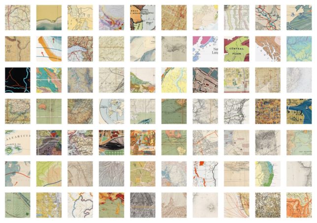
At first, Bayer considered selecting the thumbnails manually, but worried that would lead to biases in the results — instead, he tapped into his collection of scientific, transit and city planning maps programatically, letting randomness work for him. “For the purpose of highlighting the graphics of the maps and providing a resource, which is the mission of the project was anyway, randomisation worked just as well, if not better.”
“I’ve been looking for a way to better relate to my own maps for a long time,” says the book’s creator. “Maps always have been a learning tool, even if I don’t necessarily fully yet understand how. They’ve also been a resource and an aide for learning a great many other things.”