How do you make a website visually dynamic, without using any special effects? There’s nothing quite like the artsy and adventurous look of hand-drawn graphics. The juxtaposition of these spontaneous, free-flowing, real-world elements against the sometimes cold and impersonal nature of the internet infuses some much-needed character and warmth into a wide range of websites, from health insurance blogs to record companies.
PSYOP
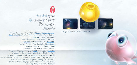
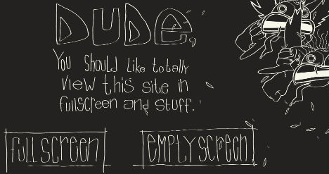
No doubt, handwriting fonts can be tedious and hard to read. But this is the real deal – hand-written text scanned and integrated into what ends up being a fresh and surprisingly crisp overall design. The design stands in sharp contrast to design collective PSYOP’s very technologically advanced CGI television commercials.
BootB
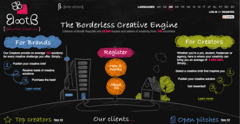 BootB has positioned itself as something different from the usual crowdsourcing site: a “marketplace for building unlimited creativity”. Its website, which combines simple sans-serif text with sketchy graphics and a hand-drawn logo, certainly sets it apart from similar sites.
Bio-Bak
A hand-drawn font and plenty of interactive illustrated graphics are just the beginning of the creativity… and the weirdness… that can be found at the bio-bak.nl website. There’s a T-rex with a human face drinking Heineken, for starters. What the hell is this site all about? It’s hard to tell, but you could definitely spend hours playing around on it, exploring all of the hidden nooks and crannies.
Elan Snowboards
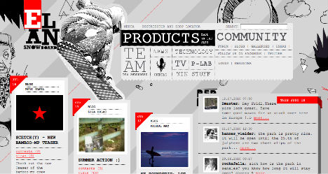
Here’s something you don’t see everyday: a website that’s appropriately edgy for its purpose, but not entirely Flash-based. Elan Snowboards has a fun hand-illustrated background but it’s still easy to read and navigate, without any unnecessary bells and whistles.
Kitty Attack Blog
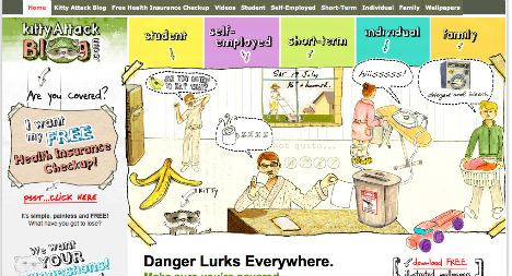
How do you make a blog about health insurance (visually) interesting? Make it look absolutely nothing like a blog about health insurance. We can’t vouch for the content, but the design – with its colorful cartoons and hand-drawn logo – is fun and eye-catching.
Biola Undergrad
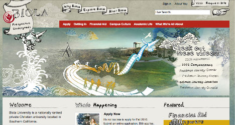
How many Christian university websites to do you see that employ vaguely tattoo-inspired imagery? Biola University, a private religious college in Southern California, captures a young and carefree vibe with classic sailor tattoo-type hand-drawn graphics that are fitting for the atmosphere of the school’s location.
El Rellano
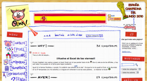
Sure, there’s the funny little illustrated pig in the logo, the embossed tape headings and the navigational buttons seemingly scrawled with a blue ballpoint pen on notebook paper. But perhaps the greatest thing about this somewhat kooky website is the borders drawn in crayon.
Hello Sour Sally
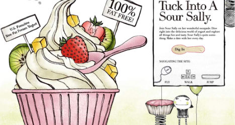
Frozen yogurt – it’s just not as fun as ice cream. Except at the ‘Hello Sour Sally‘ website, where adorable little hand-drawn cartoons romp and play through an interactive adventure.
Jason Gray
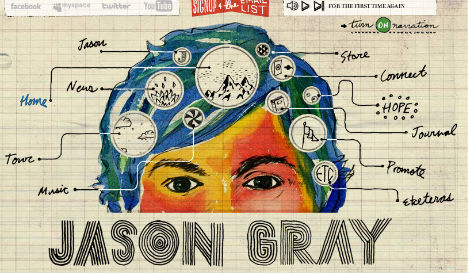
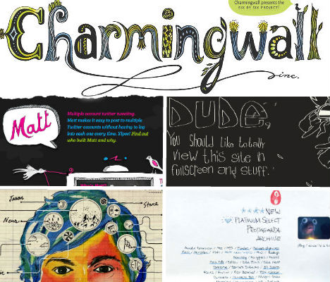
Visual artists use hand-drawn websites all the time to show off their work, but this look is also effective when used for other types of art. Musician Jason Gray’s website, with its giant illustrated head (and moving eyes), has a fun and independent feel.
Camellie
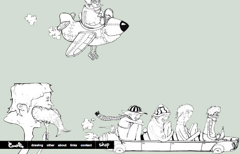
Artists tread on dangerous ground when their website designs distract from their work – unless they’re using their own illustrations to provide visual interest. Camellie.com is a great example of making this work.
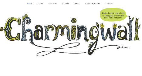
Charmingwall
Infusing creativity into a website that’s presenting the diverse work of multiple artists is no easy task. Charmingwall, a New York gallery, pulled it off brilliantly with an interactive hand-drawn design that captures the playful spirit of its collection.
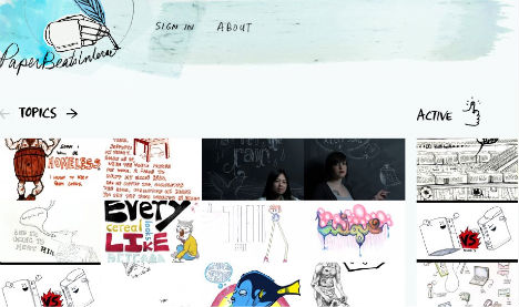
Paper Beats Internet
‘Paper Beats Internet’ – do you agree? Perhaps not, but this ‘analog’ social networking site using real handwriting and doodles certainly makes a case for that standpoint.
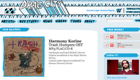
Drag City
For an indie record label with artists as quirky as Joanna Newsom on its roster, only a refreshingly different sort of website will do. Drag City’s pale blue illustrated graphics and hand-drawn logo feel young and unrestrained.
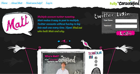
The Mattinator
Following the modern, Japanese illustration-inspired style of Twitter’s own design, ‘The Mattinator‘ – a website that allows you to post to multiple Twitter accounts from one login – employs plenty of cartoon imagery.
Flossy Yannik
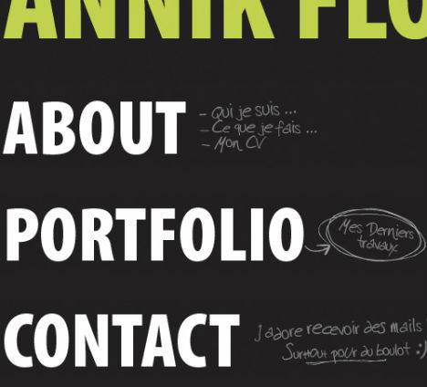
Sometimes, just a little bit of real handwriting can make a website feel more dynamic. The scribbled text to the side of the big, blocky typeface on the Flossy Yannik website provides some nice contrast and personality.
