When the world wide web first came into popular use in the ’90s, it wasn’t pretty. Cold, visually uninteresting and – well – ugly, websites put functionality far before form and were anything but inviting. So for everyone who loves to run their hands along a pleasing texture, from fine linen canvas to a big soft sweater, textured images in modern web design are a warm and comforting reminder of the three-dimensional, sensual real world.
Big Sweater Design
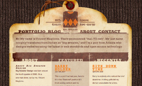
Vincent Maglione’s last name translates roughly from Italian as “big sweater”. So not only did Maglione name his web design company “Big Sweater Design”, he tied the reference in to his portfolio website in the most memorable way possible, using a knit sweater texture for the background.
Real Visuals
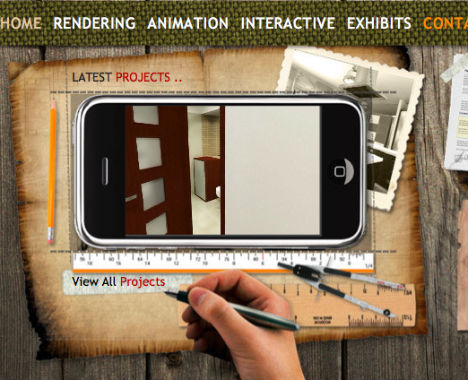
For a company that calls itself “Real Visuals”, this architectural rendering, 3D interior design and 3D architecture firm certainly illustrates the concept well on its own website with a realistic wood plank background as well as fabric, paper and other textured images.
Rock Point
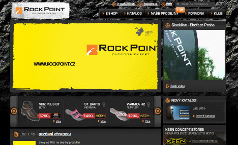
Outdoor equipment company Rock Point outfitted its website with a highly appropriate – both for its name and its business – rough rock textured background. The background serves as a nicely contrasting backdrop for all the slick modern merchandise, pulling in a reference to the great outdoors.
Przeznaczenie.eu
With blood spatters on cracked dirty pavement, this website is nothing if not gritty, perfectly suited for an interactive “serial mystery-crime” game.
Made to Kill
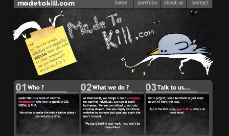
Not all web background textures have to be literal and attention-grabbing. The subtlety of the chalky black paper on the website for Made to Kill, a web design firm, keeps the focus on the company’s portfolio.
The Brown Corporation
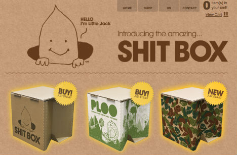
What else would you expect from ‘The Brown Corporation‘, a company that makes lightweight portable cardboard toilets with a fecal mascot named ‘Jack’, but a brown cardboard background on their website? Hey, it works.
Texture Lovers
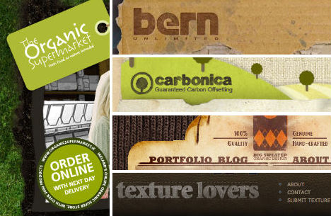
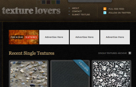
Something tells us the folks at ‘Texture Lovers‘ love texture. Just a hunch. But for all their affection for tactile surfaces, they kept the leathery background of their own website low-key, making sure that the texture samples they produce are the center of attention.
Alpine Meadows
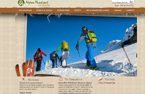
Simple and yet much more visually interesting than a flat color, the plaid fabric background and fraying ribbon nav bar on the Alpine Meadows website are nicely done.
Bern Unlimited
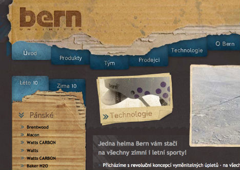
Would the Bern Unlimited website be anywhere near as eye-catching without the torn cardboard header and side bar backgrounds? Clearly scanned from real boxes, this texture is one-of-a-kind.
Carbonica
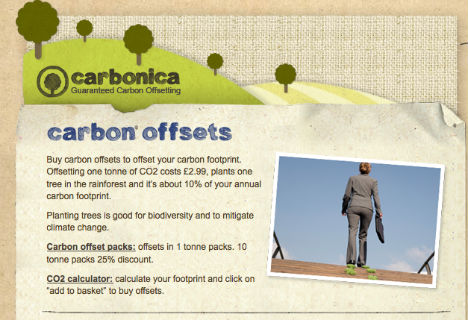
What does brown kraft paper and linen fabric say to you? Organic, natural, earth-friendly? Perfect, because that’s exactly what Carbonica, a carbon offsetting service, is all about.
The Darling Tree
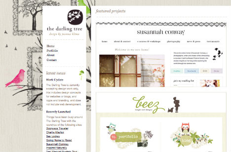
Another case of supreme subtlety, Susannah Conway’s website has a barely discernible fabric-textured background that plays up the illustrative quality of the graphics.
Bridge 55
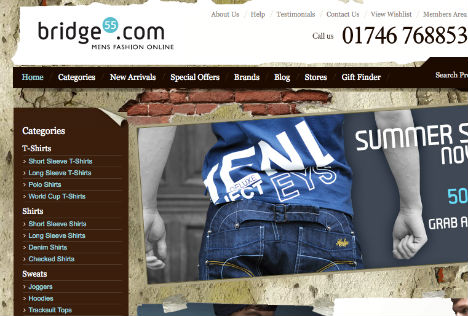
A store for urban men should have an urban-looking website. Bridge 55 clothing pulls it off well with a cracking plaster wall, revealing bricks beneath.
Narfstuff
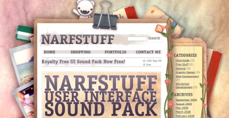
With a combination of watercolor web design, paper textures and even polaroid borders on images, the Narfstuff website is a visual buffet of beautiful textures.
The Organic Supermarket
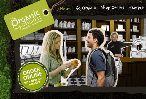
There’s something about moss that just makes you want to reach out and touch it. Perhaps Ireland’s Organic Supermarket is hoping that this earthy, green background will make you reach right through your screen and pick up a few bags of groceries while you’re at it.
Wall Swaps
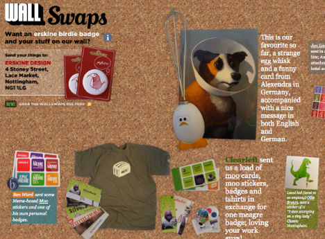
Any analog types that bemoan the loss of physicality in the computer age, especially those who love to pin inspiration and ideas on the wall, will love the cork board design of ‘Wall Swaps‘, which basically creates a digital version of a bulletin board.
