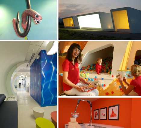
Can’t handle the tooth? Get your abscess to one of these 10 jaw-droppingly innovative dental offices! Today’s top professional designers have consulted with dentists to create a variety of soothing, relaxing, therapeutic spaces that help put patients at ease when it’s time for the big freeze.
Bloo Dental: Deep Sea Drilling
 (images via: Green Home Design and ChicTip)
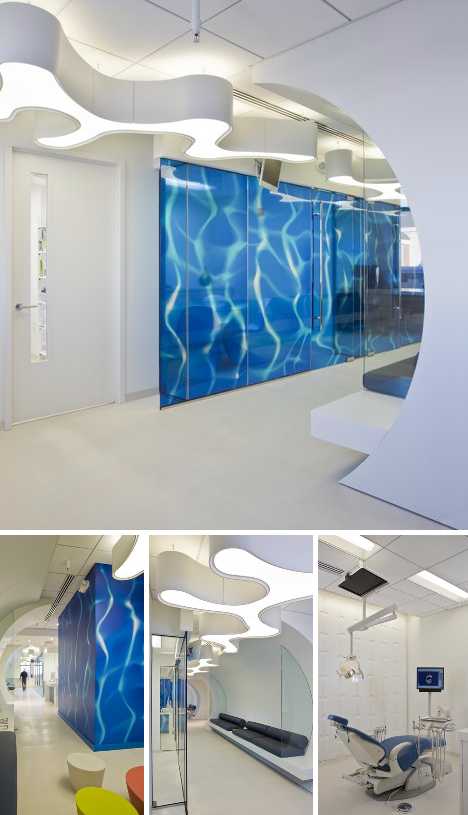
Who said one shouldn’t mix work with play? Dentist Haress Rahim was at a loss when discussing possible themes for his new office with Andreas Charalambous of FORMA Design, when he mentioned his great love of scuba diving. It was a Eureka moment, and before long an anomalous 2,500-square-foot space in Brambleton, Virginia had become Bloo Dental.
 (image via: Green Home Design)
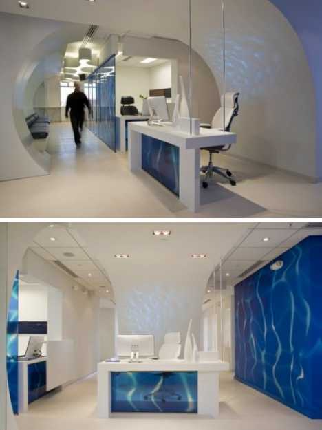
Low ceilings and circular cutout doorways add a submarine-like aesthetic without inducing claustrophobia while a video of moving water projected on to the wall of the reception area induces a relaxing vibe throughout the office… and presumably, the patients.
KU64 Dental Clinic: Where The Yellow Went
 (images via: Momoy and ArchiThings)
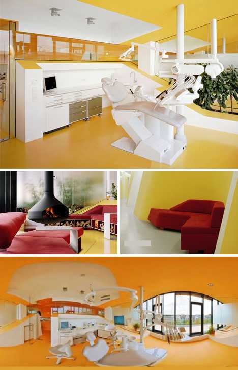
The architectural design firm GRAFT took a bold step when deciding the central color theme of the 10,180-square-foot KU64 Dental Clinic should be yellow. For years the Pepsodent people musically asked us where the yellow went and now we know: to Berlin, Germany! Surprisingly perhaps, the sunshiny hue highlighted by orange and red accents works to impart a sense of calm, allowing owner Dr. Stephan Ziegler to lighten up on the Novocain before getting down to business.
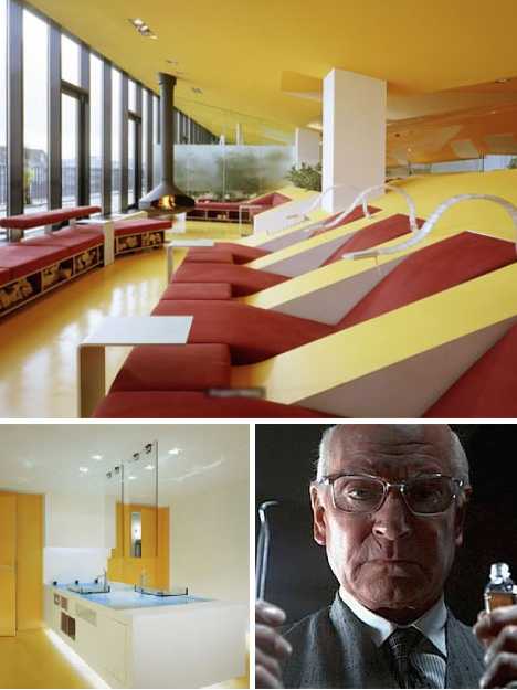 (images via: Distro Architecture and Rotten Tomatoes)
It’s a pity, perhaps, that Laurence Olivier’s chilling performance in the 1976 thriller Marathon Man left many moviegoers with an enduring negative association regarding German dentistry. The facts paint quite a different story and it’s likely an appointment with at KU64 Dental Clinic will be a worry-free experience. I only have one question… is it safe?
Undersea Dental: Double-O Seafoam
 (images via: Hot Wire Foam Factory and Imagine Factory)
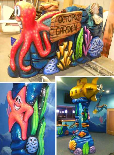
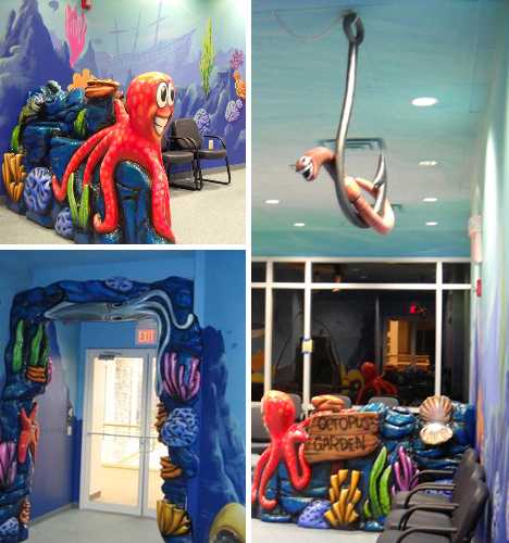
Marine themes are popular with dental office designers, and why not? You’ve got the water-spraying tool, the rhythmic wavelike rush of your deep breathing and of course, the little porcelain whirlpool just off your left shoulder. It makes sense to go all the way with an oceanic decor scheme that keeps nervous patients as cool and serene as, say, a visit to an octopus’s garden (design by Steve Morrone, founder and owner of Imagine Factory LLC).
 (images via: Hot Wire Foam Factory and Imagine Factory)
Steve Morrone of Hot Wire Foam Factory may have only two arms but his version of the octopus’s garden will impress even the most jaded cephalopod (or Beatle). Morrone uses expanding foam to create “4D Murals” that can be customized to suit clientele from 8 to 80. The pediatric Under Sea Dental Office shown here should cheer up any child checking in for a check-up.
Minami-Nagano Dentai Clinic & Residence: Nice Cavity!
 (images via: NeuBlack and Hiroki Tanabe)
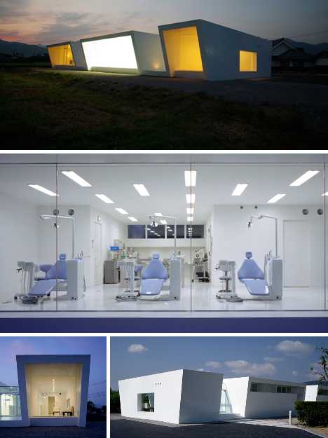
The Minami-Nagano Dentai Clinic & Residence offers minimalist architecture and decor for those who prefer their visits to the dentist be as minimal and devoid of content as possible. Tokyo-based architect Hiroki Tanabe drew upon traditional Japanese design themes for the stand-alone dentist office and residence, allowing the soft lighting and spare scenery of the surrounding environment to infuse the building’s spare yet stylish structure.
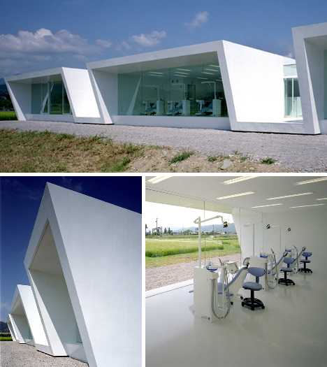 (images via: NeuBlack and Hiroki Tanabe)
Tanabe’s design combines the convenience of a combination home and office with the need to keep the sights & sounds of dentistry at arm’s length from the peace & quiet of one’s inner sanctum. Don’t know about you, but awakening to the sound of a dentist’s drill is a nightmare in itself.
KinderSmiles: Pearly Whites Go Green
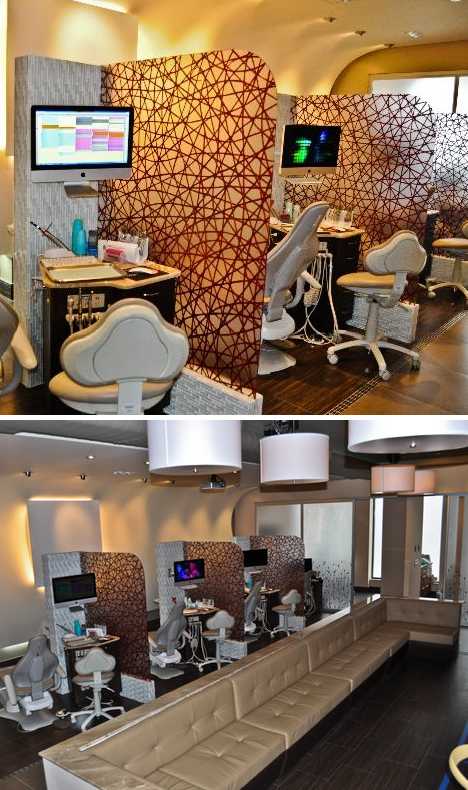 (images via: Paramus Post and OpenPR)
KinderSmiles, located in Oradell, New Jersey, raises the bar when it comes to green dentistry… yes, green dentistry. The firm’s newly renovated facilities were designed with the environment in mind using non-toxic paint and other environmentally friendly building materials. The office also features a totally paperless office system that computerizes medical records and negates the need for bulky file cabinets. While green is good, KinderSmiles knows their patients shouldn’t feel blue. A video zone, 400-gallon fish tank, play area, 10-ft projection TV, flat screens and iPads keep the kinders smiling while a coffee bar helps adult patients and parents enjoy a Starbucks moment – decaf optional.
Royal Dental: We Do Crowns
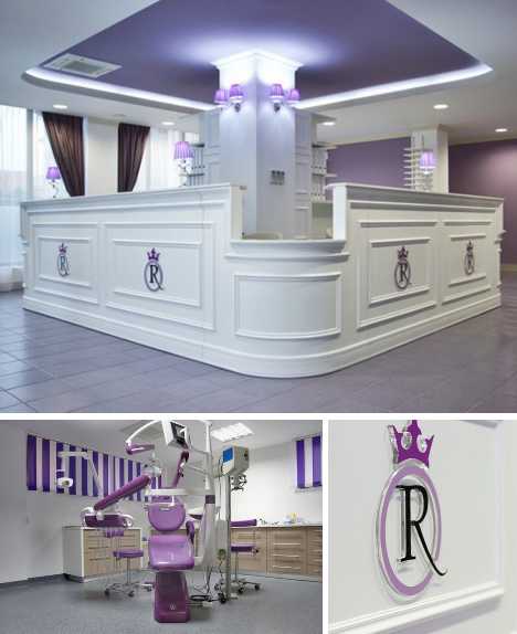 (images via: NaBUZZ)
It’s good to be the king, and at Royal Dental in Timisoara, Romania, everyone’s treated like royalty! Well, maybe not, but at least their dental needs are treated amidst office decor that would make Marie Antoinette feel right at home. Designed by EZZO for Dr. Razvan Savu, Royal Dental dazzles its staff and patients with a princely color scheme featuring bright white walls & fixtures highlighted by majestic purple trim.
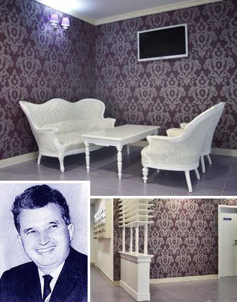 (images via: NaBUZZ and Find A Grave)
Royal Dental’s motto is “Daca un profesionist vi se pare scump, incercati sa apelati prima data la un neprofesionist”, which means “If it’s good enough for Ceaucescu, it’s good enough for you!” Or something like that… OK, so the guy was a dic(tator), but check out that megawatt smile!
MDIM: Orange Ya Glad?
 (images via: EZZO)
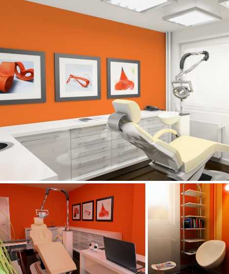
If you thought every dentist’s office in Romania looked so aristocratic, think again. EZZO has a number of design tricks up their sleeves and they went all out for Dr. Ioana Moldovan, owner and operator of MDIM. The bold orange color scheme and contrasting white & ivory fixtures give off a most un-medicinal vibe.
 (images via: EZZO)
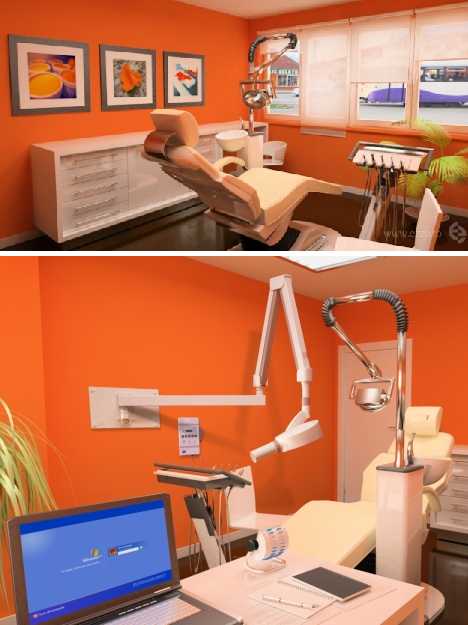
EZZO was tasked with the problem of designing an aesthetically pleasing solution to the needs of a modern dental office while refreshing the image of a dentist already in business at an existing location, all on a limited budget. At MDIM, it looks as though they’ve solved things in a most pleasing manner.
Valleau & VanDeven Dentistry: Kid Stuff
 (images via: Valleau & VanDeven)
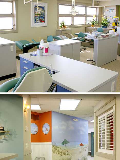
Valleau & VanDeven Dentistry specializes in making children – and their often hard to please parents – happy as a kid in a candy store. OK, poor choice of metaphor but you get the drill… actually, THEY do, and in some snazzy designer surroundings at that!
 (images via: Valleau & VanDeven)
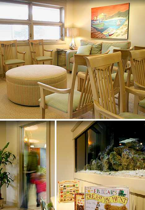
From the “bright, breezy” entryway to the “warm, inviting” waiting room, V&V aims to make your appointment with destiny, er, dentistry, as enjoyable as a day at the beach – and the hygienist promises not to kick sand in your face. V&V state their “open bay” main dental work area “makes for a less intimidating, more inviting atmosphere,” but I dunno… having little Johnny or Janey squirming and screaming in full view less than 2 feet away isn’t really conducive to a peaceful root canal.
Smiles: Thrilla In Manilla
 (images via: ArtHitectural and Buensalido Architects)
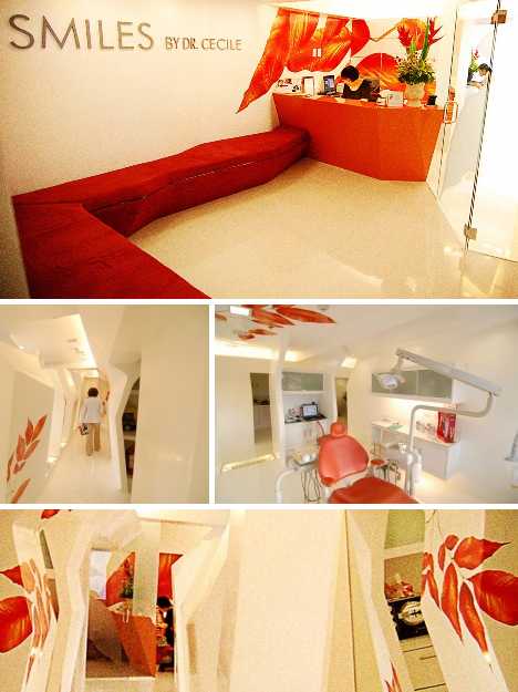
Smiles By Dr. Cecile Dental Clinic, located in central Manilla, the Philippines, is an established dental office looking to shake things up. The owners asked Buensalido Architects to update their office to match their vision of what a modern dental office should be by “morphing people’s perception of clinics that have a boring hospital-like ambiance into one that is fashion forward and cool.”
 (images via: ArtHitectural and Buensalido Architects)
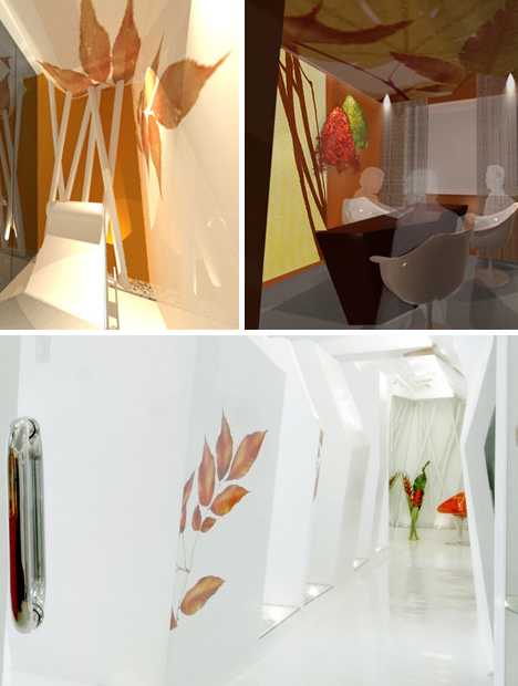
A team under architect and designer Jason Buensalido virtually eliminated straight edges and flat planes from the office’s hallways, instead creating “a continuous surface that welds walls, ceiling, and flooring into one amorphous shape, mimicking the developmental behavior of a typical tooth.” Warm white color trimmed with autumnal shades and earth tones add a dash of warmth to what is already a cozy, organic aesthetic.
No Tooth Fairies Here!
 (images via: Unique Interior Designs)
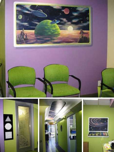
From the Flight Zone waiting room to the “sick bays” where patients experience the joys of mercury rising and the oral borealis, this is one dental office that’s (dare I say it) out of this world! Unique Interior Designs was tasked with the problem of appealing to kids ranging in age from 3 to their early teens without frightening/boring those at either end of the age spectrum.
 (images via: Unique Interior Designs)
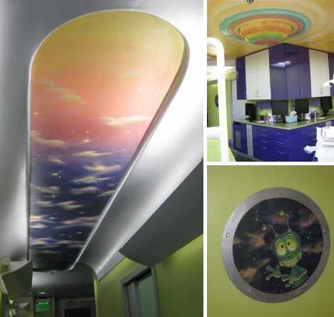
By going with a generic space theme and eschewing the lure of the box office (Star Trek/Wars) or the silver screen (The Jetsons), UID gained the freedom to add light and cheer to the dental office’s decor. True, the lime green and plum color scheme tends to evoke the 70’s a bit but the plethora of whimsical detailing and big-budget touches like the hallway-length “moonroof” add fun without feeling foolish… leave the latter for when the laughing gas kicks in.
![]()
 (image via: Odonto Magazine)
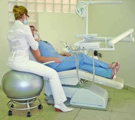
Of course, one can’t judge a book by its cover and the same goes for dentists, no matter how stylish their offices might be. You’ll forget about the aesthetic once the anesthetic sets in, anyway, and only time will tell if the dentist you “chews” is really on the ball.