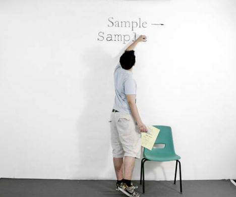
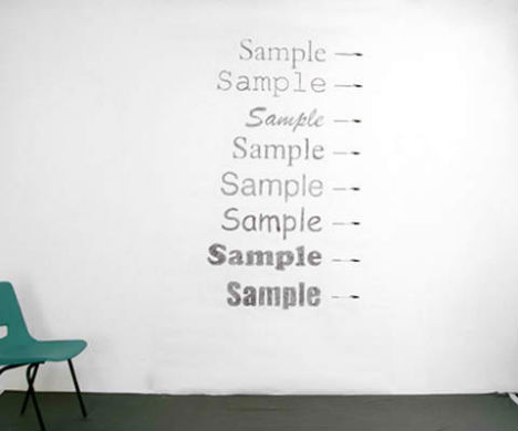
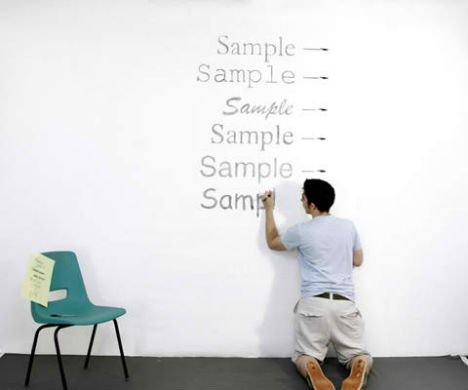
Can we save a significant amount of ink simply by choosing one particular font over another? In an interesting experiment, artist Matt Robinson tested various typefaces to see how economical they are with ink, drawing them out with ballpoint pens.

Using one pen for each typeface, Robinson wrote out the word ‘sample’, and then measured the remaining ink to come to a conclusion.

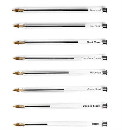
What he found when laying each pen out beside each other like a bar chart was that Garamond used the least amount of ink, with Courier in hot pursuit. You might imagine that a simple sans-serif typeface like Helvetica would beat them all, but it actually came in behind both Times New Roman and Brush Script.

Of course, this experiment was hardly scientific, and a more accurate way of measuring the ink would likely have been to use a printer. But it’s cool nonetheless, and gives you another reason not to use the dreaded Comic Sans or Impact (as if you needed one.)
