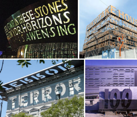
Signs aren’t always an afterthought – sometimes they’re integral to the design of the building itself, carved in towering letters right into the facade or even serving as structural support. The marriage between typography and architecture is particularly eye-catching in these 13 examples, where the graphic beauty of type and, at times, moving lines of poetry add another layer of identity and emotional connection to built environments.
Wales Millennium Center, Cardiff, Wales
(images via: wikimedia commons)
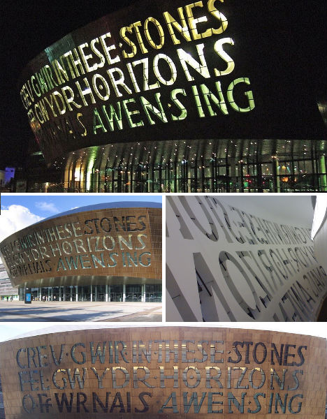
‘In These Stones, Horizons Sing’. Written in both Welsh and English, this sentence makes a bold statement on the facade of the Wales Millennium Center in Cardiff, an arts center that holds performances of opera, ballet, dance, comedy and musicals. The inscription was written by Welsh poet Gwyneth Lewis, who wanted the words to reflect the architecture of the building. “The strata of the slate frontage of the Wales Millennium Centre reminded me of the horizons just beyond Penarth Head … The stones inside the theatre literally sing with opera, musicals and orchestral music, and I wanted to convey the sense of an international space created by the art of music.”
Minnaert Building, Utrecht University, Utrecht, Netherlands
(images via: architravel)
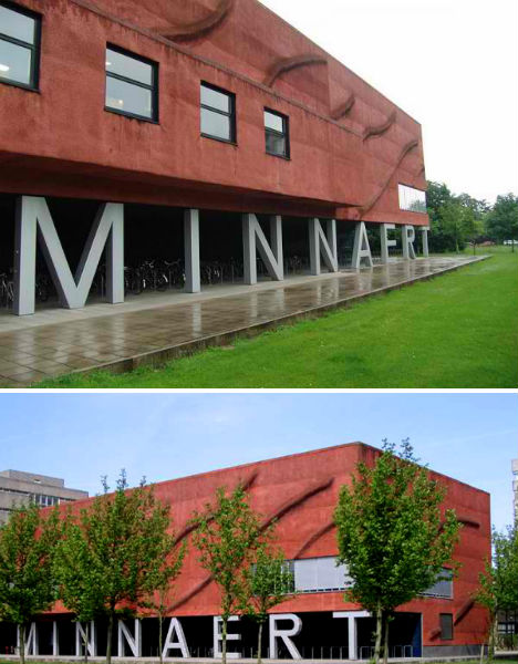
The Minnaert Building, designed by Neutelings Riedijk and added to Utrecht University in 1997, uses the letters in ‘Minnaert’ to form columns, making them essential structural supports for the section of the building that juts out over a bicycle parking area.
Fukutake House, Megijima Island, Japan
(images via: heartfish)
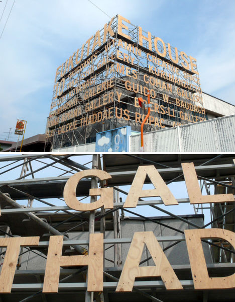
Fukutake House, a project started by seven of Japan’s leading art galleries, brings art to rural communities that tend to be isolated from it. Occupying a new location each year, Fukutake House reinvents itself annually, but its 2010 incarnation was more stunning than ever with a typographic installation covering the facade of the elementary school that the festival temporarily occupied.
University of Toronto Graduate Housing, Toronto, Canada
(images via: wikimedia commons, morphopedia)
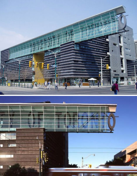
Text is embedded into the design of the Graduate Housing building at the University of Toronto, with massive
letters shielded by a glass and steel screen, the ‘O’ seeming to hang precariously from a ledge. The structure is one of the more important works designed by Pritzker-Prize-winning architect Thom Mayne.
Lentos Museum of Modern Art, Linz, Austria
(images via: houseofcassette.com, sendung)
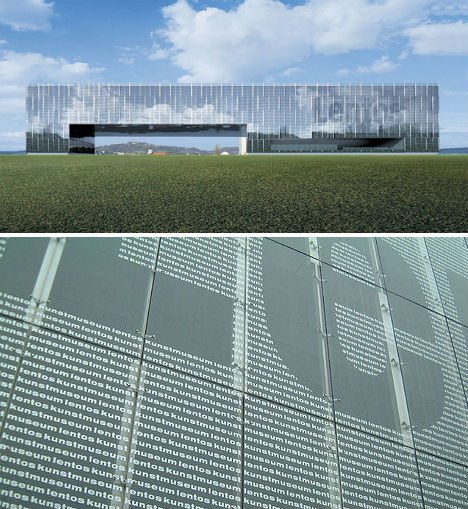
With a transparent glass casing covered in words, not to mention the huge ‘LENTOS’ built right into the facade, the typographic elements of the Lentos Museum of Modern Art are integral, yet subtle: you don’t even notice the letters all over the exterior until you get close. It’s a fitting aesthetic element for an museum that displays, among many other works of art, typographic design.
House of Terror, Budapest, Hungary
(images via: milgrammer, david hand)
Though it may seem a bit sensationalistic, the word ‘TERROR’, which features prominently on the building’s overhanging roof, is a fitting name for a building with a horrifying history that is unfortunately all too real. Budapest’s House of Terror occupies 60 Andrassy Street, a building that was once leased by Hungarian Nazis and also housed two Communist organizations. All three used the basement as a torture chamber, and many people died there. When the sun hits it just right, the cutout in the metal overhang casts a sobering reminder of the building’s history upon its facade.
New Jersey Performing Arts Center, Newark, New Jersey
(images via: wallpaper magazine, walker art)
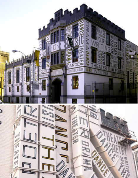
Designer Paula Scher of New York’s Pentagram started out creating bold typographic album covers in the 1970s, so it’s no wonder that, tasked with redesigning an architectural facade, she focused on “architecture as graphic design”. Scher dreamed up the transformation of this 1940s building for the New Jersey Performing Arts Center, painting words like ‘music’, ‘theater’, ‘dance’ and ‘poetry’ on everything from the brick itself to the air conditioning ducts.
Caltrans District 7 Headquarters, Los Angeles, California
(images via: the city review)
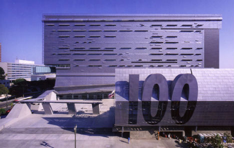
Architect Thom Mayne’s firm Morphosis, which designed the University of Toronto Graduate Student Housing building above, also tackled the Caltrans District 7 Headquarters building in Los Angeles. Says the firm, “The large cantilevered light-bar connects the structure to First Street, and the forty-foot, forward-canted super-graphic “100” marks the South Main Street entrance. This layered sign, with its nod to Chandleresque L.A.’s Hollywood sign, denotes the building as an urban landmark.”
Museum of Modern Art, Queens, New York
(images via: chi-athenaeum, cooperrobertson.com)
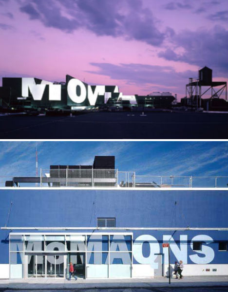
One could almost say they can tell this building is the Museum of Modern Art from a mile away. Architects Cooper, Robertson & Partners won a 2003 American Architecture Award after they expanded a former factory in Long Island City into a satellite facility for MoMA. The firm not only emblazoned the museum’s logo upon the facade, but put it in lights on the roof.
The Cooper Union, New York
(images via: pentagram)
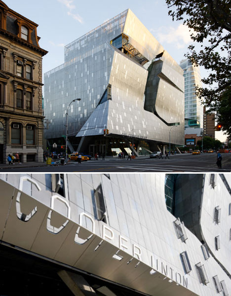
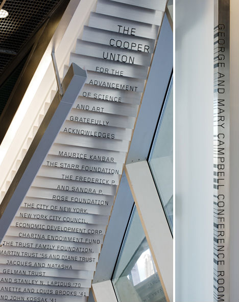
The Morphosis-designed Cooper Union academic building in New York’s East Village is so visually engaging, it’s easy to overlook the details – but the details, in this case, are just as interesting as the building itself (especially for typography geeks). Designer Abbott Miller took inspiration from the font used for the sign on the original 1859 Cooper Union building to create a modern cutout sign on the new building. The font was also carried into the interior, descending down the underside of a stairway and even spotted on the vertical corner guards of the classroom doors.
Fairmont Pacific Rim Hotel, Vancouver, Canada
(images via: beyond robson, kennymatic)
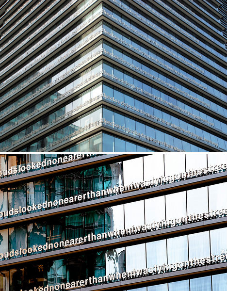
Don’t be surprised if you see tourists gawking at the Fairmont Pacific Rim Hotel in Vancouver. There’s just trying to read the lowercase text that wraps around each level of the building. Designed by British artist Liam Gillick, the installation reads, “lying on top of a building, the clouds looked no nearer than when I was lying in the street.”
Seattle Art Museum, Seattle, Washington
(images via: nimbu, antonio ce)
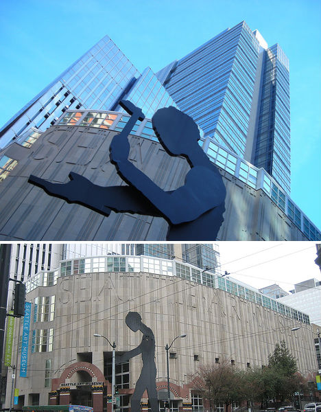
Let’s hope that the Seattle Art Museum never leaves its current Robert Venturi-designed facility on First Avenue; its name is carved right into the facade.
Unidentified Building, San Francisco, California
(images via: typophile)
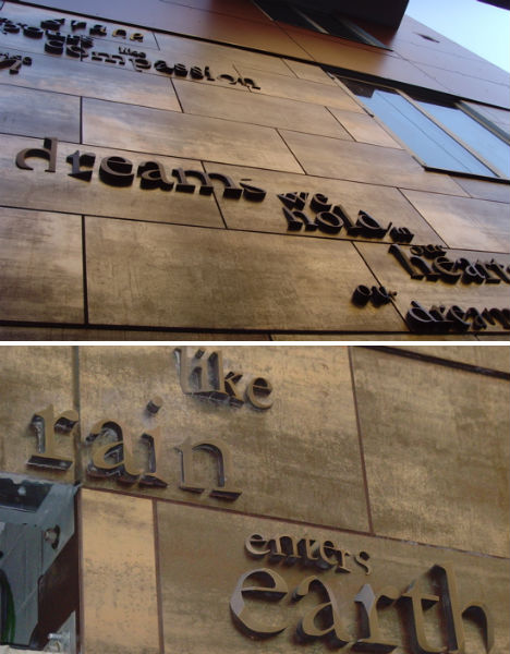
A typography-loving passerby captured these shots of an unnamed apartment building in San Francisco, where eye-catching text clings to the surface, seemingly sinking in at some points. The bits that can be read include “dreams we hold in our hearts” and “like rain enters earth.”
