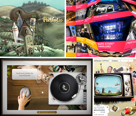
Gone are the days when a slow-loading Flash intro gave websites cool points, but failed to serve a real purpose. Flash is now an integral element of some of the most visually stimulating, engaging websites on the ‘net, allowing users to be active participants in the content of the site. Animations, games, virtual exploration and dazzling transition effects make these 15 Flash websites stand out as creative, interesting and fun.
Mauricio Guimaraes
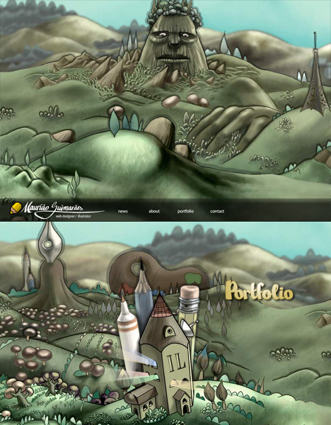
When you arrive at illustrator and web designer Mauricio Guimaraes’ website, you’re in for an interactive journey across a strange and fantastical landscape featuring pencils, pen nibs, artist palettes and more. Fly across the land with your mouse and click on the mountain/head (whose eyes move along with your cursor) to read about Guimaraes, the bundle of writing instruments for his portfolio or the big pile of telecommunications equipment to contact the artist.
Wonderwall
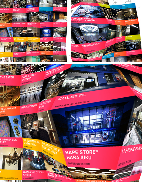
The portfolio of interior design firm Wonderwall almost seems like a living being when you’re moving your mouse across it; it responds astonishingly fluid movement and little sound effects that sound like drips of water. And while it may seem as if such a design would eclipse the portfolio itself, in this case it incites the viewer to stay and peruse and play much longer than they would on a traditional portfolio website.
National Grid Floe
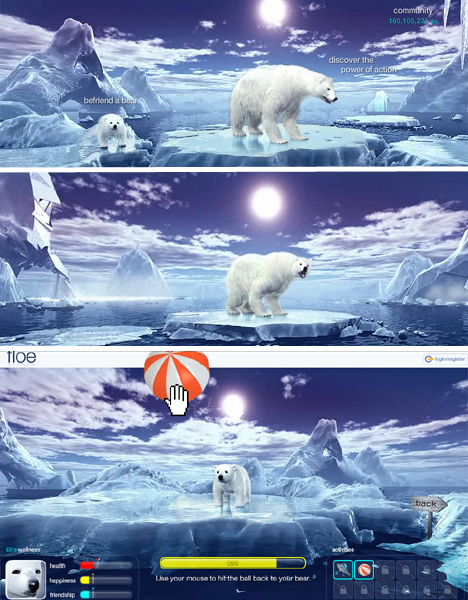
Improve your carbon footprint, or the baby polar bear gets it. That’s basically the gist of London-based utility company National Grid’s website, though it’s actually fun to navigate the site and get a reaction out of the bears. Make friends with a bear cub, name it, and as you answer environmental impact quiz questions correctly, you get to play with it and increase its health.
Get the Glass
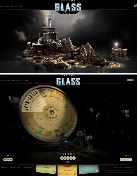
For most kids, when cookies are out of the equation, drinking a glass of milk is more of a chore than a treat. But the Got Milk? campaign is drawing kids in with a Flash-based interactive flash board game on its website that’s surprisingly sophisticated. The aim is to “briefly put your daily morals aside” and help a family of milk-craving fugitives break into an island fort to get the last glass of milk.
Waterlife
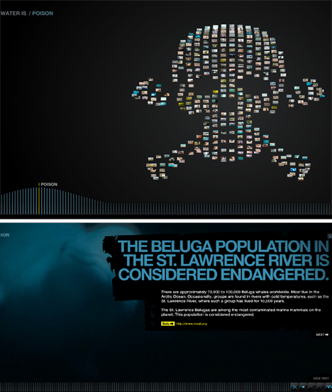
A documentary called WaterLife tells “the story of the last great supply of fresh drinking water on earth”: the Great Lakes. With a soothing color scheme, plenty of animation, 3D effects and the opportunity to interact, this website serves as a strong companion to the film.
Dojo SF
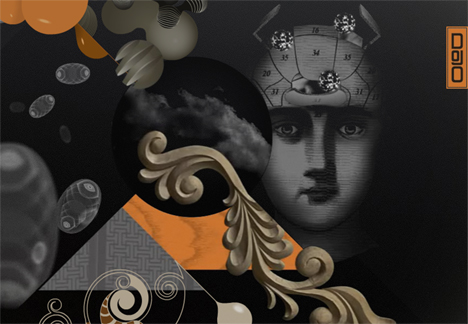
The Dojo SF intro page slowly unfolds to reveal a strange but spellbinding jumble of arcane imagery, while the individual pages use seamless transitions and scrolling to offer quick and easy access to all of the site’s important info.
The Eco Zoo
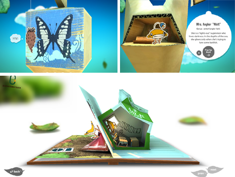
With stunning Papervision effects and a really fun, interactive flash interface, it’s no wonder the Eco Zoo website won “FWA Site of the Year” in 2009. The designer, Junichi Nakazawa of ENJIN Inc, says “The Eco Zoo is our attempt at creating communication that is easily and enjoyable understood by people of all generations and nationalities, while pushing the envelope of online creative expression.”
Falcon’s Treehouse
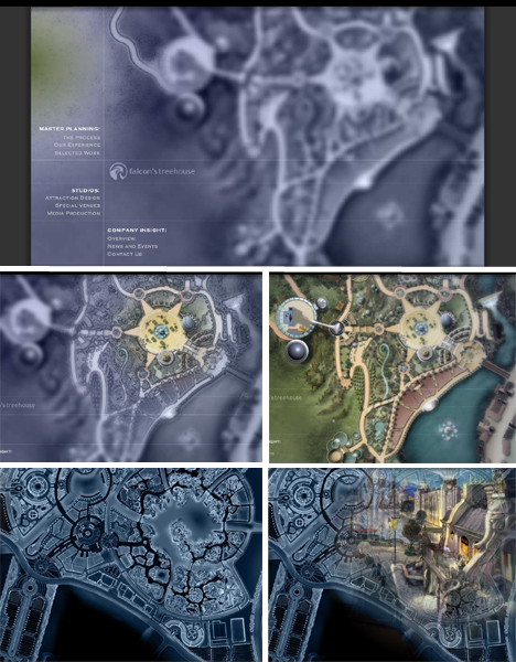
Falcon’s Treehouse is a creative services firm that designs and produces what they call “themed experiences”, so it’s only fitting that their own website is an experience unto itself that unfolds as you interact with it. The more you play with the site, the more strange new landscapes begin to reveal themselves – night turns into day, patterns appear, blurry images are sharpened.
Record Tripping
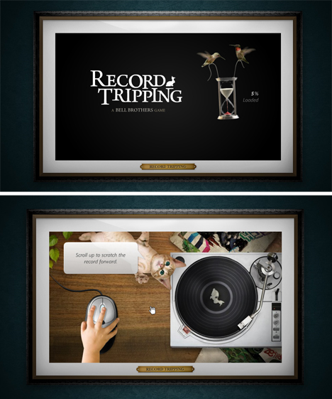
It starts with a scratch of a record, and gets more complex – and fun – from there. The Bell Brothers’ interactive browser game ‘Record Tripping’ turns your computer mouse into a turntable, inciting you to use your mouse’s scroll function to for a series of challenges that also involve Alice in Wonderland, The Gorillaz, Death Cab for Cutie and Weezer. It’s not quite as strange as it sounds, but fun to play.
Breathe Architecture
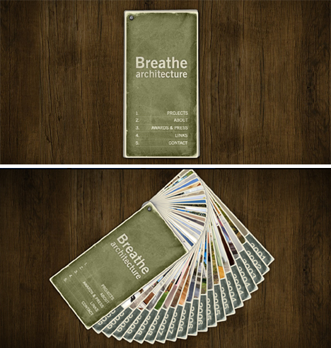
The Breathe Architecture website doesn’t do anything wild, but sometimes, simplicity can be so refreshing – especially when there are so many Flash websites out there that are cluttered with unnecessary fluff. In fact, for a Flash site, this is downright minimalist, with a design that’s easy to navigate, intuitive and ultra-responsive.
Hobnox Audiotool
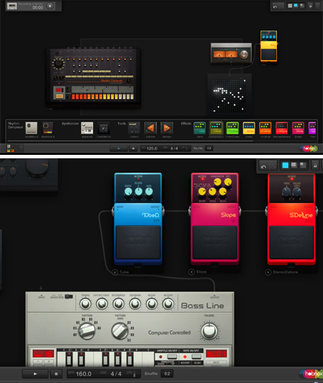
On the other end of the spectrum – in a good way – is the Hobnox Audiotool website, a browser-based Flash audio production tool that allows you to wire together various types of effects to create music in real time, in your own little virtual studio. Laymans Reviews calls it “one of the most productive ways of wasting time on the web”.
DVEIN 2009
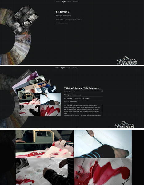
Barcelona-based motion and interactive studio DVEIN, responsible for the title sequences in a number of movies and television projects like Spiderman 3, displays their work in an eye-catching wheel of images. Once clicked, many of those images are animated – and from there, a video opens to display the work in full.
Help the Honeybees
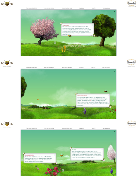
Honeybee populations around the world are disappearing at an alarming rate, and Haagen-Dazs is letting everyone know with their program Help the Honeybees. Their interactive Flash website allows you to take your very own honeybee on a journey through a buzzing field full of pollen-packed plants to learn more about the plight of bees.
Edwin Murat Ganter
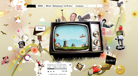
Illustrator and web designer Edwin Murat Ganter shows off his skills using flash images of his work scrolling across a television screen. Nothing stands as a truer sense of a web designer’s work than his own website, and this one is creative and functional.
Monoface
“Simpler is better.” That’s what advertising agency Mono is trying to get across with their awesome flash website that doesn’t do much more than allow users to create bizarre faces from disparate parts. But get sucked in trying to come up with the funniest combinations (there are 759,375 possibilities), and you’ll get the message.
