Clean, graphic, simple and powerful. In a sea of logos, the ones that stand out say the most with the least amount of fuss. Clever designers pack memorable corporate branding into professional custom designs by finding symbols in letters and identifying graphics with multiple relevant meanings – all in a clear and concise package. These 15 stellar examples show just how creative logo makers can be with barely more than a sans-serif font and some basic shapes.
Killed
(image via: creattica)
Sometimes, super-effective logos can be so simple. This one, designed by Sean Heisler for an entertainment company, simply shoots down the suggestively head-and-body-shaped letter “i” in “Killed” for a refreshingly unfussy visual representation of the company name.
Mister Cutts
(image via: creattica)
What do you think of when you hear the words “Mister Cutts”? A pair of scissors made to look like eyeglasses and a mustache may not be the first thing, but maybe that’s because you’re not as clever as Tabitha Ayers, the designer who came up with this logo.
Horror Films
(image via: logofaves)
How can a single white circle with a few holes in it say so much? It’s a film reel. It’s a face with its mouth rounded into an ‘o’ in terror. It’s ‘Horror Films’ all the way, without any unnecessary bulk or fluff.
CFO Cycling Team
(image via: logo faves)
When the letters of a company or organization’s name just happen to form an associated image, it’s like magic in the hands of the right logo designer. For the CFO cycling team, a person riding a bicycle serendipitously emerged to form this super-simple and memorable graphic.
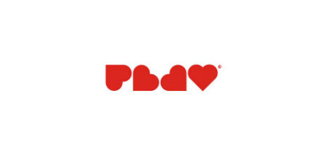
Play
(image via: logo faves)
If you didn’t know that these hearts were supposed to say ‘PLAY’, would you see it anyway? Perhaps it depends on whether you’re visually inclined. To some, the word jumps out, yet others don’t see it right away, but it’s certainly a clever use of heart shapes.
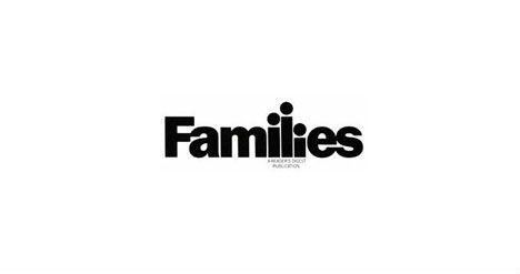
Families
(image via: logo faves)
Once again, the letter ‘i’ stands in as a graphical representation of the human body, and it works effortlessly here in the word families (albeit with a dot added over the ‘L’).
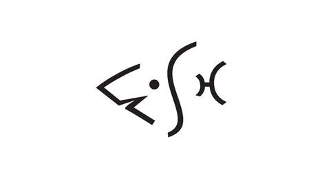
Fish
(image via: brand stack)
Leave it to a graphic designer to see images in words. There’s no denying that the letters F-I-S-H flawlessly form the head, eye, gills and tail of a fish without a need for reaching on the part of the viewer.
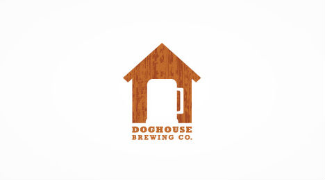
Doghouse Brewing Company
(image via: creattica)
A little house and a beer mug: what else does that say but ‘Doghouse Brewing’? And all it took was the addition of a handle in the cutout of the door.
The Thirsty Peacock
(image via: logo pond)
Arrange an enticing array of rainbow-colored wine bottles into a fan shape with a wine glass front and center, and what do you have? A peacock made out of wine bottles? Well, yes, but also a ‘thirsty peacock’, the name of a wine store business.
Infinity Crime
(image via: logo faves)
It didn’t take much tweaking to turn the infinity symbol into the mask of an evil villain, but it did take some creative vision. Alex Chmura came up with this idea for ‘Infinity Crime Studio’, a fictitious company that some unnamed businessperson out there should snap up right away.
Burnett Electrical
(image via: logo pond)
You don’t need an artistic masterpiece on your letterhead when the solution is as brilliantly clear and memorable as this. The ‘B’ and ‘E’ of ‘Burnett Electrical’, combined just the right way, reveal an image of an electrical plug.
Wine Searcher
(image via: logo gala)
Asked how he got the inspiration for this ingenious logo, designer Gareth hardy told Logo Gala, “Whilst in a bar, bored, staring at two empty bottles. I am always looking at contours of objects. Lines are all around us and make the world we live in. I noticed that the contour of the bottles could be adjusted to reveal a pair of glasses.”
Playground
(image via: logo moose)
Ahh, another refreshing case of imagery and typography combined into one cohesive, readable, memorable logo. Don’t you love it when that happens?
Elephant Talk
(image via: logopond)
Bold and graphic, this combination of an elephant’s body and the quotation marks that form the head are a great illustration of ‘Elephant Talk’. Taking the idea a bit further, commenters at LogoPond have suggested a few changes that would be equally strong: flipping the quotation mark horizontally or taking away the body and facing the quotation marks toward each other like two elephant heads facing off.
Egg
(image via: creattica)
Egg + egg + egg + egg + ‘E’ = Egg. You can’t argue with that math when it comes out looking like this.
