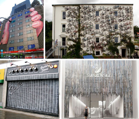
Sure, a brand name and an alluring product display in the window are enough to incite most people to step inside a store – but some retailers downright demand our attention with incredible storefronts that can’t be ignored. A chocolatier with a delightful Willy Wonka-worthy facade, a bike shop covered in (what else) bikes and a guitar shop that looks just like a Gibson amp are just a few of the clever and creative shops spotted around the world.
Gibson Amp Guitar Store
(image via: glen scott)
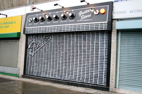
Not only does ‘The Guitar Store’ in Southampton, England look exactly like a guitar amp (especially when the security grate is down) – but the knobs go up to 11.
Diesel London Radio
(image via: electronic beats)
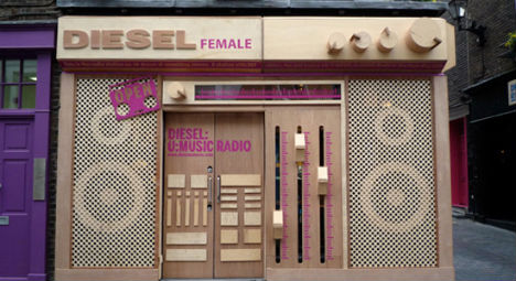
On a similar note (pun intended), there’s this solid gold old-school radio makeover at Italian clothing shop Diesel on London’s Carnaby Street. Electronic Beats Online says the plywood construction – made to promote their Diesel:U:Music 24-hour radio station – is a real radio, and all those dials on the front actually work.
Bike Shop Berlin
(image via: the mirror)
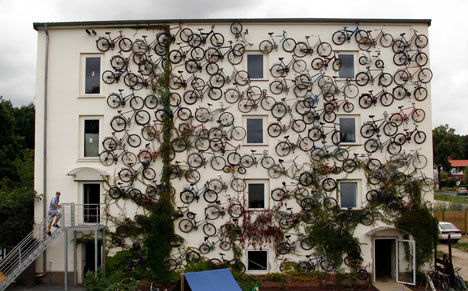
What to do to call attention to yourself when you’re trying to sell bikes out of a totally nondescript building? Business owner Christian Petersen got creative and mounted 120 bikes to the store’s facade, and there’s no longer any doubt what’s sold inside.
Louis Vuitton Topiary Facade
(image via: cube me)
Another bland building gets a very brand-centric makeover, but in a totally unexpected form. Gregory Polleta and Sung Jang created ‘Topiade’, a facade resembling French topiary in the form of the highly recognizable Louis Vuitton print.
Japanese Electronics Store
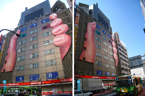
(image via: crunchgear)
Perhaps you can tell its age by just how huge the phone is compared to the hand, but nevertheless, this bold mural on the face of Japanese electronics chain Biccamera is definitely an attention-grabber.
Wavy Hair Salon Interface
(image via: dezeen)
Spare and modern, this simple wave design on the facade of Salon Mittermeier in Austria suggests an abstracted wave of human hair in its water jet-cut laminated sheets.
Fake Storefronts for Urban Revitalization
(images via: the daily mail)
Yes, that says ‘delicatessen’, but you won’t find any meat there. In fact, you won’t find anything at all – because it’s just a facade, put up to temporarily beautify a crumbling vacant storefront. The fake storefront experiment took place in Tyneside, England as a cheap way to make the depressed area more attractive to pedestrians and lure new businesses into town.
Kwik-E-Mart Makeover
(images via: james grimmelmann, xurble)
Simpsons fans got to step into real-life versions of Kwik-E-Mart when dozens of 7-11 stores across the U.S. got temporary makeovers to promote “The Simpsons Movie”, complete with character cut-outs, new signage and even real graffiti. Inside, the promotion got even more convincing with box upon box of KrustyO’s cereal, Buzz Cola and Homer’s favorite pink sprinkled donuts.
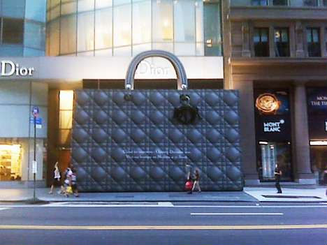
World’s Biggest Dior Bag
(image via: trendhunter)
A boring old plywood facade for a Dior store? Never! The luxury retailer settled for nothing less than an enormous cut-out of one of their iconic bags when their 57th street store in Manhattan was undergoing renovations.
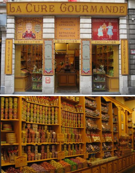
La Cure Gourmande
(images via: brussels pictures)
What could this storefront signify other than a treasure trove of sugary delights that line the shelves inside? La Cure Gourmande kept the look of an antique chocolatier for its stores around France and Belgium, beckoning passersby to skip inside and gorge on every sweet imaginable.
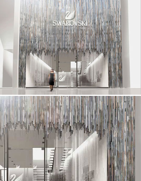
Swarovski ‘Crystal Forest’ Storefront
(image via: selectism)
The light reflecting off the ‘crystal forest’ outside the Swarovski Flagship store in Ginza, Tokyo is almost blinding, and entirely fitting for a brand that produces some of the most sparkly products in the world. The facade is made from stainless steel mirrors, and the inside of the store is painted white to best highlight all the colorful little prisms of light they create.
Broken Apple Window
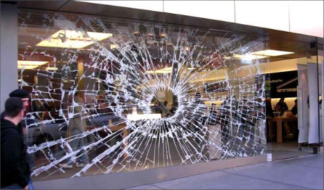
It may not scream ‘Apple’, but this window sticker is definitely an eye-catcher. And yes, there is a point to the whole ‘broken glass’ gag – it’s mean to show just how loud iPod HiFi can get.
