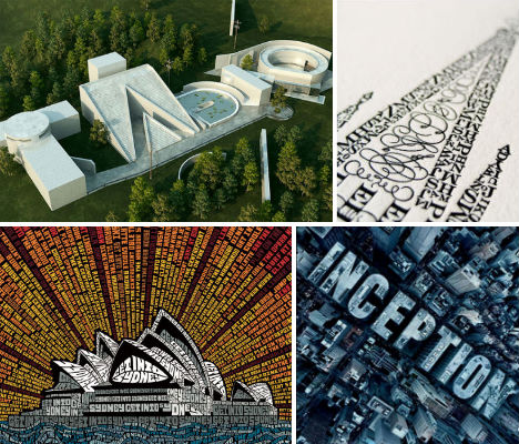
The right minimalist sans-serif or swooping, elegant script typeface can be just as expressive as the words it spells out, and can sometimes even stand in for brushstrokes of paint and other illustrative media. Just as typography is sometimes used as a bold graphic element in architecture, it can also be used as the building blocks to create imaginative structures and cityscapes.
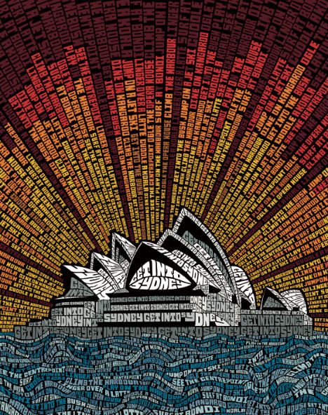
Typography Sydney Opera House
(image via: we love typography)
This tourism ad for the city of Sydney, Australia extolls the virtues of the area in the form of a typographic illustration of the Sydney Opera House. The text reads, among many other things, “Dine on kangaroo”, “Cuddle a koala” and “Surf at Bondi.”
Tadao by Chris Labrooy
(image via: chris labrooy)
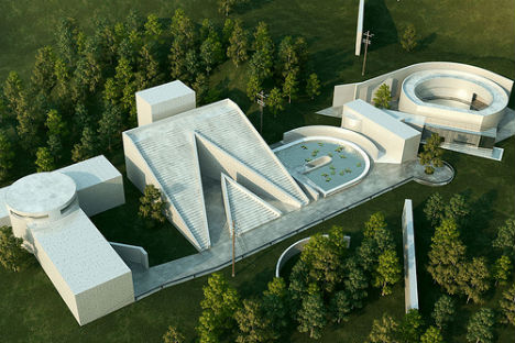
3D designer Chris Labrooy based an unusual (and awesome) set of typographic illustrations on the styles of his favorite architects, including Tadao Ando. Ando’s solid yet place-sensitive structures, often made of concrete, inspired the perfect basis for an imagined complex that looks as if it could really have been designed by the architect. It bears a notable resemblance to Ando’s Westin Awaji Island Hotel.
Letterpress Tower by Cameron Moll
(image via: cameron moll)
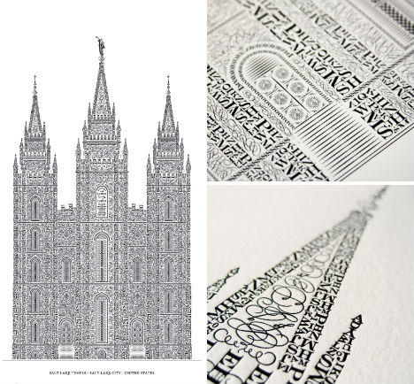
Crafted character by character in the shape of the Salt Lake Temple, designer Cameron Moll’s letterpress tower took hundreds of hours to create. The beautiful architectural qualities of the letterpress medium itself pay fitting tribute to a painstaking process, with letters and typefaces chosen by shape for each portion of the design.
Urban Typography
(image via: thoughtbucket)
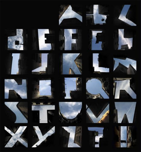
A German photographer saw more than just roof lines and blue sky when gazing up at buildings; these imaginative letters were made with creative cropping.
Bauhaus by Chris Labrooy
(image via: chris labrooy)
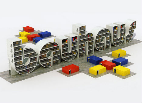
In this design Chris Labrooy has captured the essence of German Modernism – both the architectural style and the typeface it inspired. One can almost imagine this concept coming to life as a real building complex, standing in tribute of minimalism and clean lines.
Inception
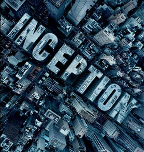
(image via: filmofilia)
One place where architecture and typography notably came together was in this poster for the movie Inception, in which dream architecture unlimited by the laws of physics played a starring role.
Toyo by Chris Labrooy
(image via: chris labrooy)
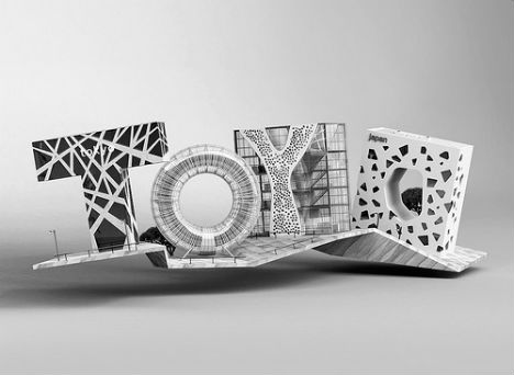
If there’s one thing you can say about architect Toyo Ito’s innovative designs, it’s ‘expect the unexpected’: Ito is known for sheathing his buildings in unusual, textural facades, often in white. This interpretation of Ito’s work by Chris Labrooy captures some of Ito’s best-known works including the Tod’s Omotesando building in Tokyo and the Mikimoto building.
Type City
(image via: jemmjemm)
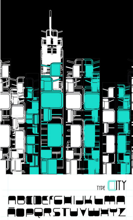
Artist Helen Parada of El Salvador crafted an urban scene using nothing but letters in a heavy, rounded typeface for this digital illustration.
Colosseum Made of Words
(image via: cameron moll)
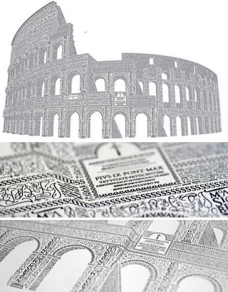
Inspired by the work of master calligrapher M. Giovambattista Palatino and an anniversary trip to Rome, typography artist Cameron Moll spent a full year hand-crafting this incredibly detailed illustration of the Colosseum using characters from the Goudy Trajan and Bembo Pro typefaces.
Frank by Chris Labrooy
(image via: chris labrooy)
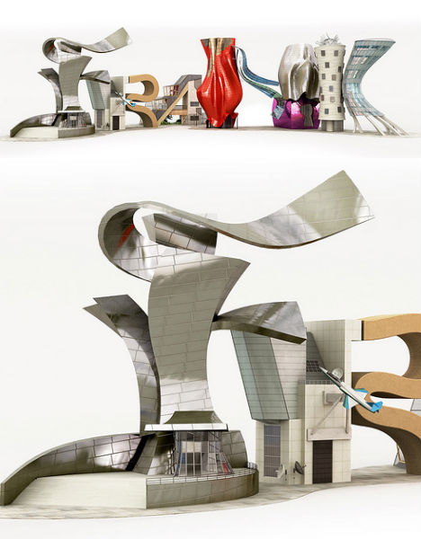
Is there any question as to the identify of the architect to whom this piece pays homage? Even if you’re not personally familiar with Frank Gehry’s oeuvre, the shiny, curving metallic facades should give it away.
City of Text
(image via: pxleyes)
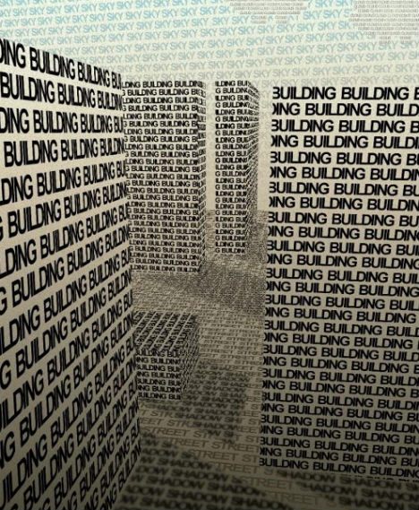
Artist David M.L. of Spain crafted a city block out of the words ‘building’, ‘street’, ‘shadow’, ‘sky’ and ‘cloud’ in this clever typographic illustration.
BMW Zebra Crossing Ad
(image via: ads of the world)
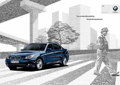
BMW went with the same idea for this ‘Zebra Crossing’ ad, which forms the cityscape with words. The tagline of the ad is, “You can describe anything. Except driving pleasure.”
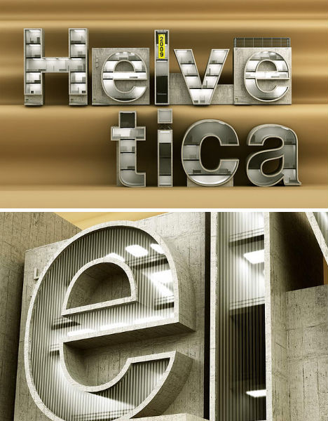
Helvetica by Chris Labrooy
(images via: chris labrooy)
Chris Labrooy shifted his focus from interpreting architectural styles with typography, to turning a typeface into architecture. Helvetica, perhaps the most beloved typeface of typography enthusiasts thanks to its elegant simplicity, is fittingly cool and modern when translated to a series of imaginary buildings.
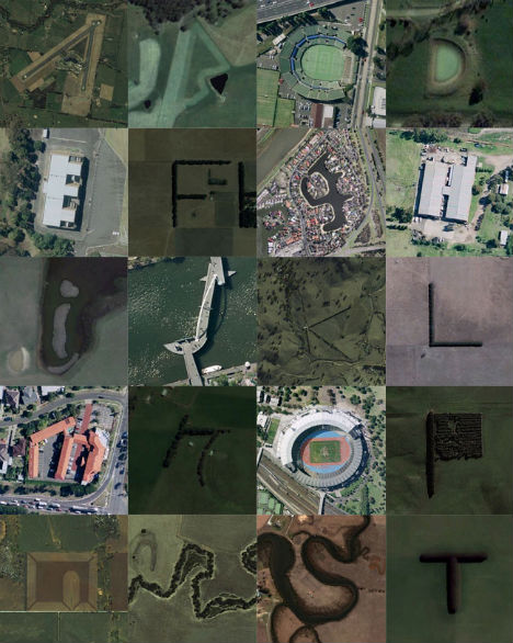
Google Maps Typography
(images via: rhett dashwood)
Creative director Rhett Dashwood spent several months searching Google Maps to find architecture, farms and natural land features that form the letters of the alphabet. See all 26 letters and get the links to the locations at Rhett Dashwood’s website.
