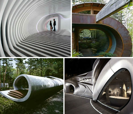
Folding onto themselves like ribbon and snaking along the grass, these 15 structures have barely a straight line in sight. From interiors that resemble honeycombs and cocoons to shell-shaped residences and water-inspired gallery spaces, organic shapes trump the geometric, with overall effects that range from earthy and hobbit-like to sleek and futuristic.
Red Town Office by Taranta Creations
(images via: dezeen)
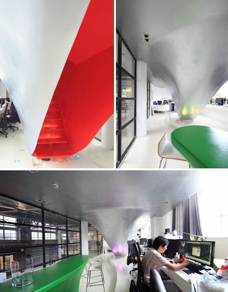
The Shanghai office of Chinese architecture firm Taranta Creations is anything but ordinary, with an organic staircase swooping down from the ceiling. Painted a bold red inside with a curved exterior, the staircase almost makes it seem as if the second floor is drooping down into the first. Other unusual features in the office include desk recesses in the floor painted in the same bloody shade.
Roca London Gallery by Zaha Hadid
(images via: dezeen)
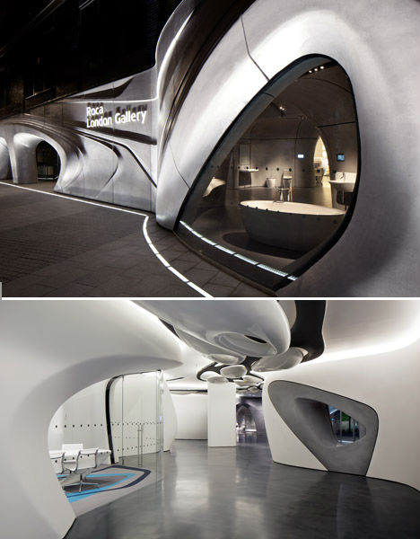
Aside from a few pillars and the floor, there may not be a single flat surface anywhere in this gallery space, designed by Zaha Hadid. Roca London has the feel of a synthetic cave, curving and wrapping around itself with bulbous shapes poking down from the ceiling and out of the walls. The space is a show room for the bathroom brand Roca’s fixtures, and its design draws inspiration from the round forms of basins and the fluids they contain.
Centre Pomidou-Metz by Shigeru Ban
(images via: evolo)
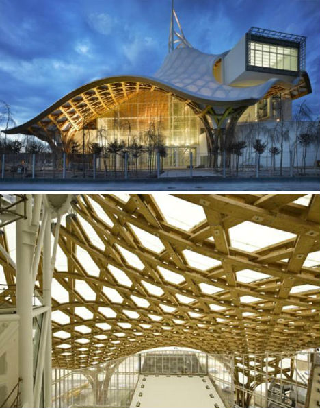
Among the most notable amorphous structures built in recent years is the French Centre Pompidou-Metz, the sister museum to the Pompidou in Paris. Renowned Japanese architect Shigeru Ban gave it a flowing, latticed roof inspired by the shape of a Chinese hat. The latticework is covered in fiberglass and teflon to create a tent-like effect that glows like a lantern at night.
Glocal Design Station by Row Studio Mix
(images via: daily tonic)
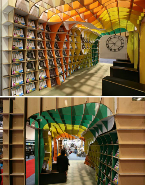
Creating a soft, rounded interior from a conventional straight-walled structure, the Mexican architectural and design practice Row Studio gave the temporary display for Glocal Design magazine’s Habitat Expo 2011 a vibrant feel that’s brimming with vitality. The interior is made up of a grid of interconnected MDF panels that warp and flow along the ceiling and walls.
Lucien Pellat Finet Interior by Kengo Kuma
(images via: sofia rodrigues)
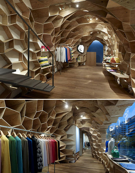
A very similar concept is explored by architect Kengo Kuma in this Tokyo store for fashion deigned Lucien Pellat-Finet. Plywood was crafted into a honeycomb-like structure that not only transforms the feel of the space, but also creates built-in shelving.
Zebar by 3gatti
(images via: daily tonic)
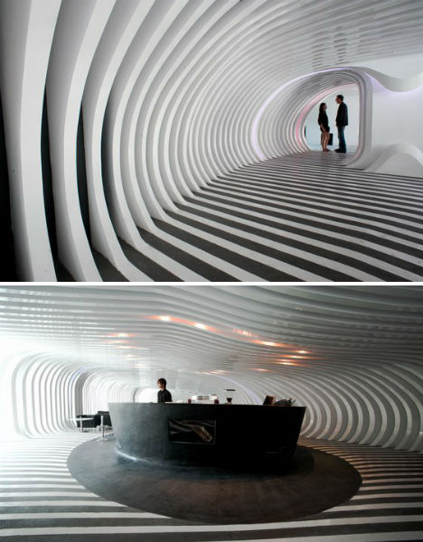
Inspired by 3D modeling, the design of this Shanghai music bar by 3gatti is smooth, clean and lacquered yet still organic, calling to mind a great cavern lined with ribs. Each of the plasterboard slices that make up the columns that flow along the curving ceilings and walls was painstakingly hand-cut, in stark contrast to the usual digital computer-based manufacturing that would normally be used for such a project. The architect calls it “a caved space formed from of a digital Boolean subtraction of hundreds of slices from an amorphic blob.”
Shell House by Senosiain Arquitectos
(images via: senosiain arquitectos)
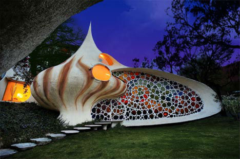
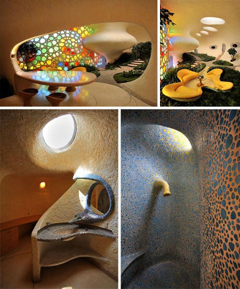
Few natural objects evoke images in our minds of such perfect, beautiful curves and swirls as do sea shells. This highly unusual, sculptural home by Senosiain Arquitectos looks like it might have come from some monstrous deep-sea creature, its front wall made up of colorful stained glass. Inside, the home features a living room, kitchen, bathroom and upper bedroom, punctuated by round windows and skylights that highlight the curving surfaces and organic textures of the walls.
Shell Villa by ARTechnic
(images via: artechnic.jp)
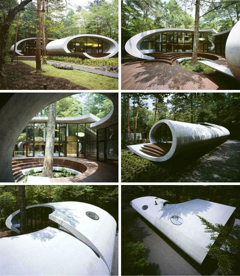
Another residence takes its shell inspiration in a slightly more abstracted, modernized way. The Shell Villa by ARTechnic is at once organic and futuristic, a raised home with a swirling encapsulated design that seems to be made of one giant piece of concrete. The line of the roof continues in a ribbon-like slice to encircle a tree at the center of the residence.
Wilkinson Residence by Robert Harvey Oshatz
(images via: oshatz.com)
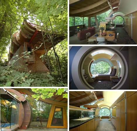
This dreamy forest home blends seamlessly into its environment with the main level of the house raised above the sloping lot to the level of the tree canopy. The curved lines of this residence reflect the owner’s love of music. Says the architect, “This house evades the mechanics of the camera; it is difficult to capture the way the interior space flows seamlessly through to the exterior. One must actually stroll through the house to grasp its complexities and its connection to the exterior. One example is a natural wood ceiling, floating on curved laminated wood beams, passing through a generous glass wall which wraps around the main living room.”
Round Hotel Rooms Made of Concrete Pipes
(images via: dci)
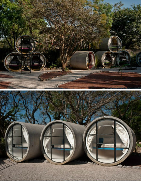
Few living spaces go so far as to even eliminate the flat surface of the floor, but when you’re building little hotel pods into concrete pipes, there’s just no way around it. The Tubo Hotel in Mexico consists of stacked, reclaimed pipes that have been fitted with beds for low-cost, high-kitsch-factor lodging. Designed by T3arc Architecture, the hotel has 20 rooms with panoramic views of the Sierra del Tepozteco.
Fennell Residence by Robert Harvey Oshatz
(images via: oshatz.com)
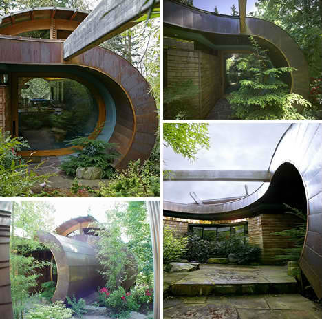
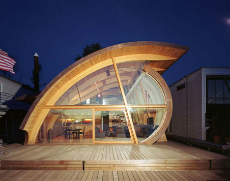
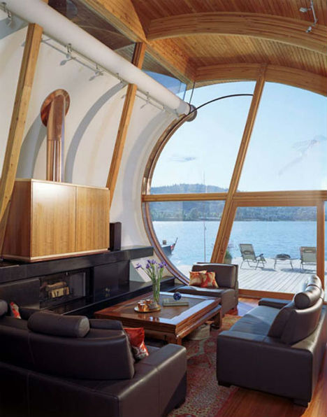
Another home by the organic curve-loving architect Robert Harvey Oshatz is the Fenell Residence in Portland, Oregon which is actually a floating house that takes its visual cues from the river on which it sits. The home evokes the tides, with the main section of the roof arching over the home like a wave. Inside, the theme of water continues with white walls that call sails to mind, and wood-lined alcoves that feel a bit like the interior of a ship.
Curving Villa on Sarasota Bay
(images via: totems architecture)
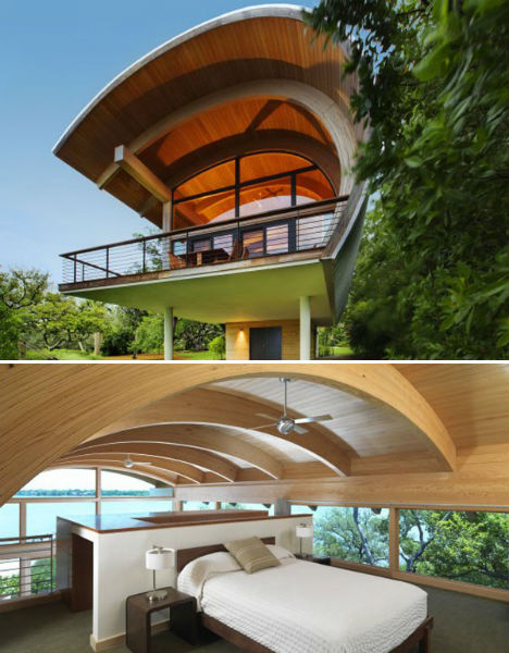
This villa on the Sarasota Bay in Florida pays tribute to the adjacent sea in a very similar way to Oshatz’ Fennell Residence. Set on the Gulf of Mexico, the one-bedroom home by TOTeMS Architecture is characterized by a wave-like curving roof design that looms over the main rectilinear portion of the structure.
Curving Office Building by Gerd Priebe
(images via: archdoc)
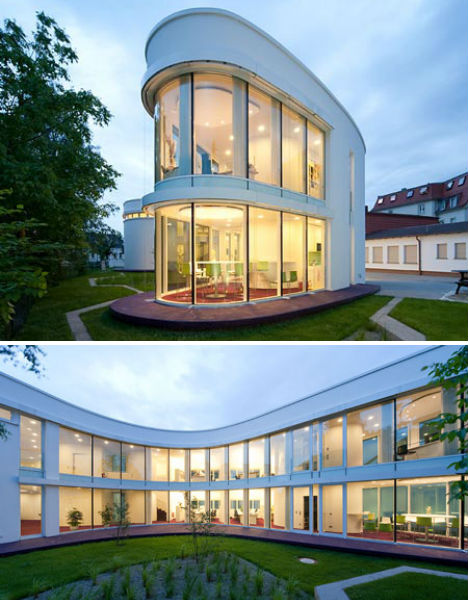
Joining the blocky shapes of the rest of this medical complex in Heidenau, Germany with the natural world outside, this curving addition by architecture firm Gerd Priebeis a narrow volume that flows along the grass like a snake. The bulk of its walls are made of glass, giving the offices inside an enlivening view of the grounds.
Museo Soumaya
(images via: dezeen)
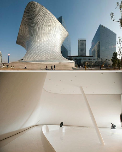
Looking like an anvil covered with reptile skin, the Museo Soumaya of Mexico City certainly makes a strong statement. FREE Fernando Romero Enterprise designed the towering museum, which features a windowless facade made of hexagonal aluminum tiles. It’s made of 28 steel columns of varying shapes and sizes.
The Nautilus Project Restaurant
(images via: freshome)
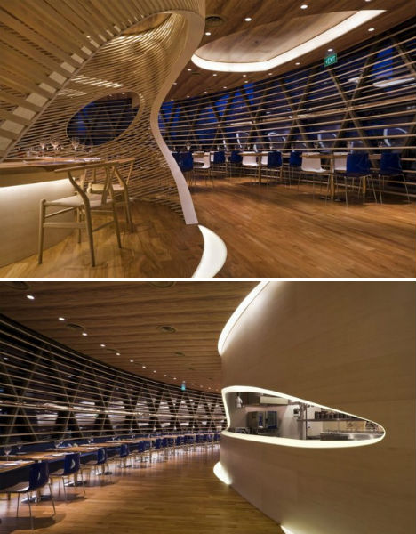
Fittingly called the Nautilus Project, this Singapore restaurant by Design Spirits looks ordinary on the outside but becomes an almost cocoon-like space once you step through the door. A round central chamber contains the kitchen, and throughout the dining room are small semi-private spaces made of curved wooden latticework.
