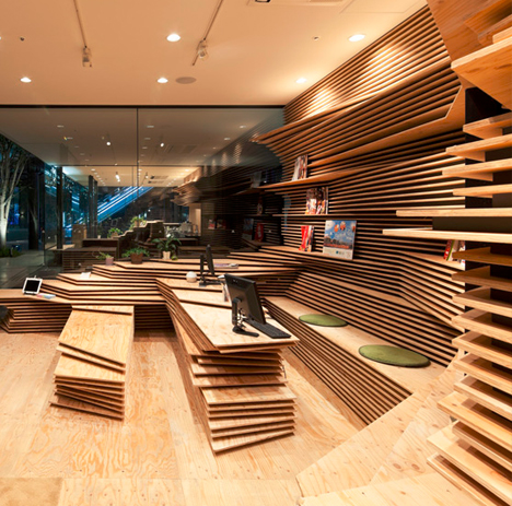
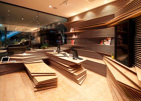
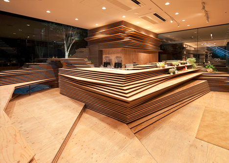
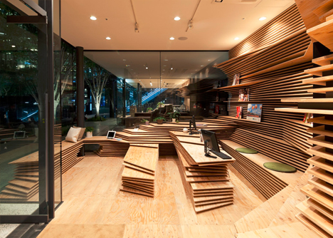
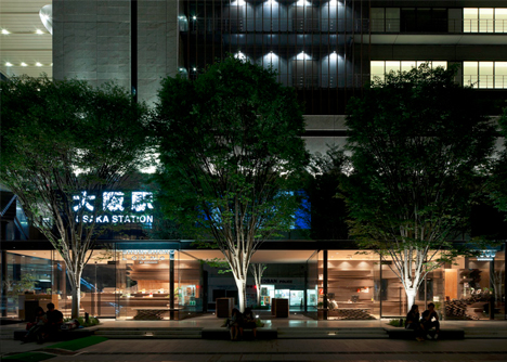
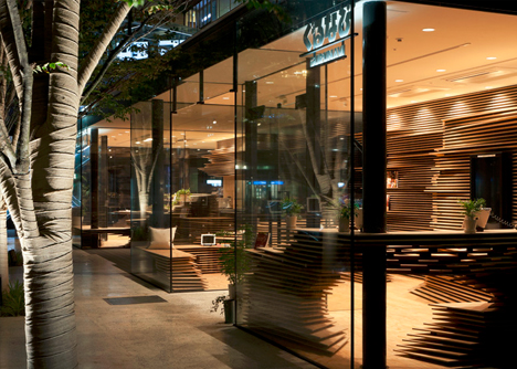
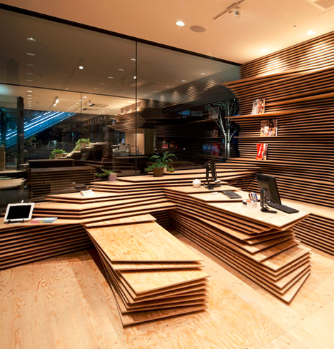
This set of two spaces in Osaka, an information hub and public cafe, each employs layers of horizontal wooden sheets that stack up vertically to form seating, shelves, standing desks and work surfaces.
Japanese architect Kengo Kuma worked with their client, a regional restaurant guide requiring a physical presence in a space open to the public, to shape both essential elements and opportunities for unexpected interactions.
Alternating layers of recessed and black-edged boards create a heightened contrast with their bright, naturally wood-colored counterparts sticking further out from the walls.
Both rooms are set in the bottom of the same structure but are separated by outdoor space, so their common (and unusual) material language helps them connect across the void.
By using light colors and through bright illumination, people passing between the rooms are meant to find them surprising, distracting and engaging. The composition was made, in part, to draw in pedestrians on their way through the central passage that bisects the spaces, a visual ‘hook’ for busy commuters in the bustling city.
