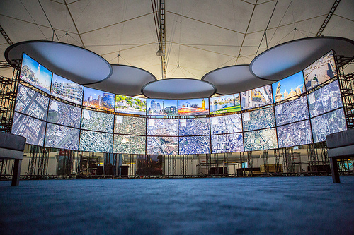
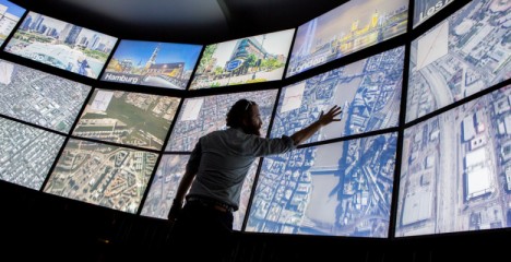
This new project brings a whole world’s worth of metropolitan data to your fingertips via both an online application and an upcoming installation at the Smithsonian Museum, courtesy of TED founder Richard Saul Wurman. A rich virtual resource, it represents the work of over 15,000 contributing cartographers and designers from 200 countries.
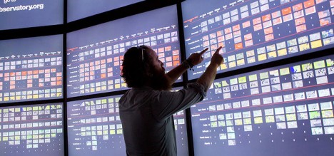
Collecting and data big and small, static and live, the multi-media Urban Observatory allows (and encourages) comprehensible and comprehensive visual comparisons between cities on various fascinating fronts.
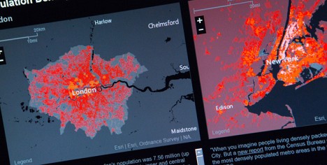
While it continues to solicit data sets to expand its offerings, already people can look into housing and population density of young and old urban residents, transit patterns for cars, trains and planes, open spaces and much more.
Want to learn about how traffic patterns differ between a spread-out city like Los Angeles versus central London, or see how home prices differ between New York and Tokyo in an intuitively interactive way? Now you can do all of these in one place and using a straightforward and user-friendly interface. From its creators: “The Urban Observatory is an interactive exhibit that gives you the chance to compare and contrast data from cities around the world–all from one location. It aims to make the world’s data both understandable and useful. Brought to life by Richard Saul Wurman, Radical Media, and Esri, it is the first exhibit of its kind.”
The spatial installation component is coming to the Smithsonian Institute in Washington, DC, in 2015. More from VentureBeat: “It was a massive undertaking. Cartographers and computer scientists used big data sets, helped by 3D graphics and Landsat, NASA’s satellite program that captures incredibly detailed images of the earth’s surface, to look back at the last 40 years of city development. It provided scientists insight into how the planet is developing – and how to help save it.”


