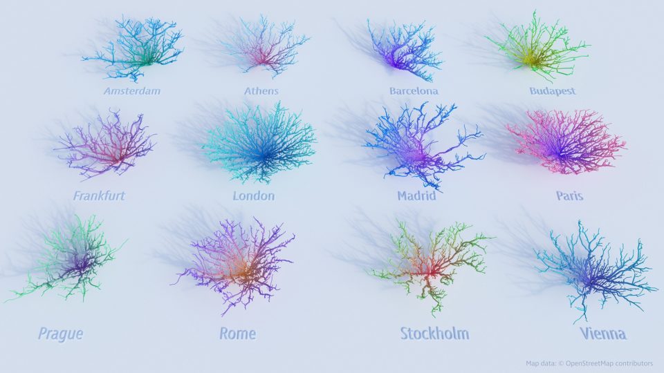
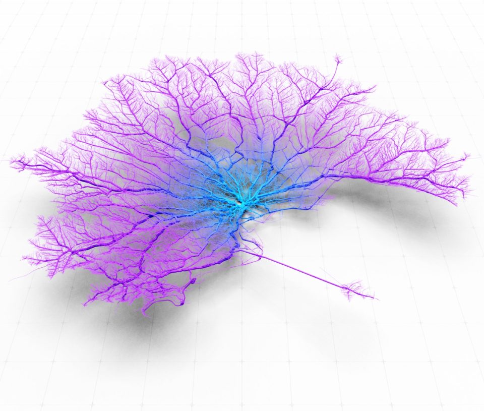
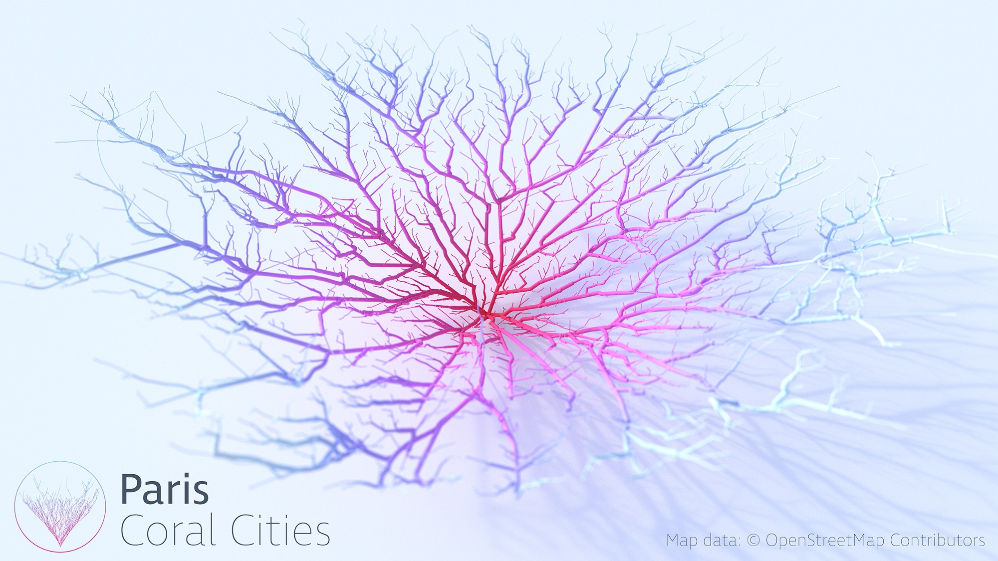
Cities like London, Amsterdam and Rome bloom like vivid living organisms in a series of creative road network visualizations, each one as unique as a snowflake. The individual shapes of cities have just as much to do with these arteries multiplying into wispy branches as they do geography, topography and architecture, notes data scientist Craig Taylor, and when they’re rendered in color and animated, they take on an unexpected abstract beauty.
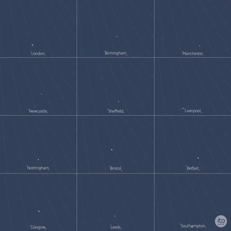
The animations represent how far you can drive out of various city centers within thirty minutes. Taylor chose the “top 40 places to live” as indicated by the Mercer Livability Index as his subjects. The time-drive analysis is based on “an optimistic view” of zero traffic. Taylor began with the U.K. before creating a visualization for the European Union and another for the top 10 world’s most livable cities of 2018.

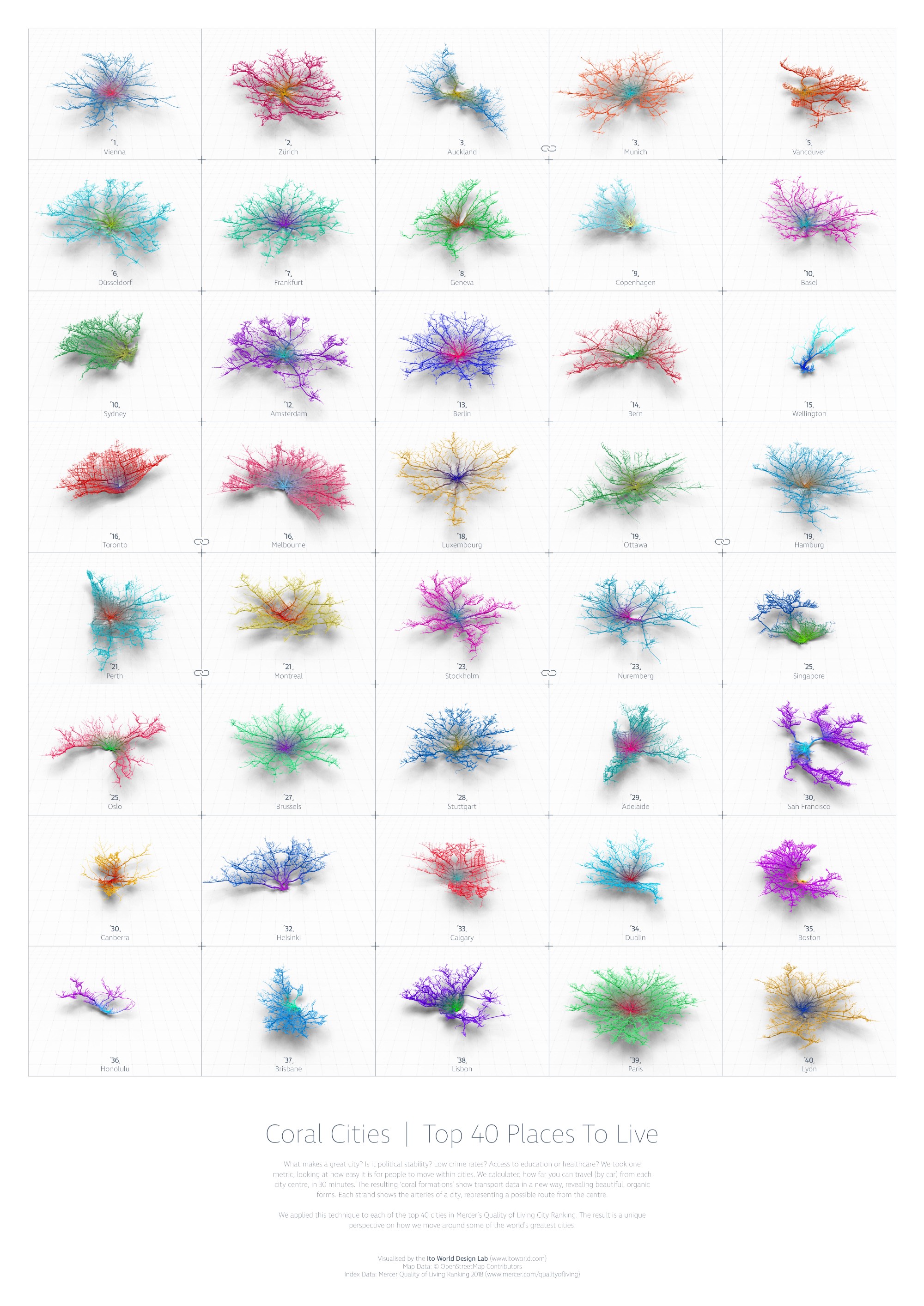
“For the past six months I have been fascinated by the concept of making city networks look like living corals,” says Taylor. “The varying patterns of urban forms are inherently dictated by their road network; a complex, seemingly organic connection of links moving people across their city. Like branches of coral they have a pattern and a function, I chose to expose this pattern and manipulate it to become something far more conceptual. However, whilst being incredibly beautiful they are derived from various geo-spatial analysis of drive-times catchments making them somewhat informative as well.”
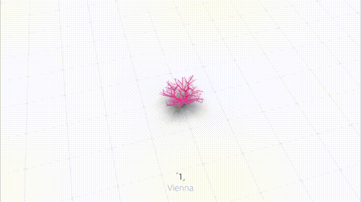
The project comes to life in two animated videos, and it’s also available as a high-resolution poster. Taylor goes into detail about how the visualizations were created at Towards Data Science.