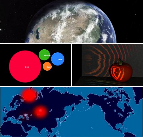
Raw data, as interesting as it may be to the scientists and analysts who use it, simply isn’t very interesting (or understandable) to the rest of us. In order to get the general public truly excited about some bit of trivia, a set of facts and figures, or an unusual trend, you’ve got to dress it up a bit and give it a little flash. That’s just what the makers of these films did. Their short movies all illustrate data sets, but not in a boring, overtly scientific way. These data are presented with the help of some cool graphics and/or video that make them not only informative, but downright fascinating.
The Size of the Known Universe
According to the incomparable Douglas Adams, “Space is big. You just won’t believe how massively, mind-bogglingly big it is.” Its massive size is almost impossible for the human brain to comprehend, but that doesn’t mean that humans will ever stop trying to explain and illustrate it. This film from the American Museum of Natural History shows every known part of our universe, starting on Earth in the Himalayas and expanding to view stars, planets, asteroids, quasars, and a whole lot of dark, empty space.
The Biggest Stars in the Universe
As difficult as it is to imagine the vast size of the universe itself, it is nearly as hard to visualize the size of individual stars. The relative sizes of the planets in the solar system are explored first for reference before the video zooms out to show the inconceivably massive known stars. Starting with our own Sun – which, by the way, looks impressively large compared to the planets – the stars just get larger and larger until even the largest planet in the solar system is completely dwarfed. It’s a humbling reminder of just how tiny our planet is and how vastly minuscule every one of us is in comparison to the rest of the universe.
Asteroid Discoveries – 1980 to 2010
As our space observation and exploration tools have grown more and more sophisticated, we have been able to gain unprecedented glimpses into the universe around us. This video examines the pattern of asteroid discoveries beginning in 1980, showing exactly how our technology has continually advanced to allow more frequent discoveries, further and further from Earth.
1000 Years of Worldwide War in 5 Minutes
Although the data used for this video is somewhat biased, the visual representation of 10 centuries of war is still remarkable. Each explosion represents a military conflict, with the size of the animated explosion and associated label representing how many died in each war.
The Decline of Empires
Along with war and conflict has come the natural ebb and flow of the world’s empires. This video gives an interesting look at how the great world powers of the 19th and 20th centuries changed – with an emphasis on their downfalls. Year by year, the empires grow, shrink, break off into factions and sometimes disappear altogether. Just like in today’s world, these empires were in a near-constant state of flux – although the data represented in the video make that time period look much more volatile than our own.
Every Nuclear Explosion since 1945
A haunting depiction of a terrifying subject, this short film from artist Isao Hashimoto shows every nuclear explosion in the world since the first one occurred in 1945. The film also shows which countries were behind the blasts, illustrating just who in the world has the most nuclear firepower. The video is strangely beautiful, but of course very scary. The final blasts of the video are in Pakistan in 1998 – given the doubts about the legitimacy of the alleged nuclear tests performed by North Korea in 2009, they were not included.
Scientific Visualization of the 9/11 Attack on the World Trade Center
This scientific animation is difficult to watch, but it is an interesting look into how the planes struck the WTC buildings on 9/11 and what happened immediately after the impacts. The video was created by scientists and engineers at Purdue University as a scientifically accurate depiction of those tragic events.
Light Traveling at One Trillion Frames per Second
The Media Lab at MIT developed a new imaging system that is capable of recording images at one trillion frames per second – which is fast enough to record a burst of light traveling through a one-liter plastic bottle and reflecting back toward the source.
Worldwide Android Activations
When the open-source Android operating system was released, the world immediately took notice. The first Android-powered mobile phone was released in October 2008, and between that time and January 2011 millions of Android devices were activated all over the world. This video maps out all of those activations from that time period, calling attention to which parts of the world are most into Android.
Radiohead’s Data-Only Video
Radiohead is an innovative band that has tried some rather unconventional things during its long run of popularity, so this unique video should come as no surprise to fans. No lights or cameras were used in the music video for the song “House of Cards;” rather, the images were created by 3D plotting technologies measuring info about the shapes and distances of objects – namely, Thom Yorke’s beautiful singing head.
