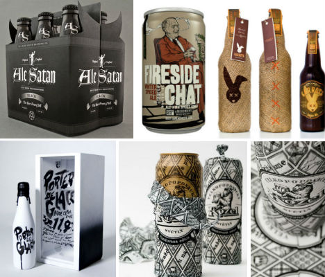
The hand-crafted revolution in beer has led to a backlash against the bland and mass-produced – both in the brews, and in the packaging. These 20 examples of creative beer cans, labels and cartons are cleverly tailored to the brand and the individual brew, and together, they’d make store shelves look like art galleries.
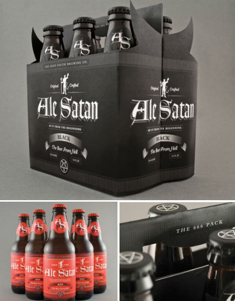
Ale Satan by Ethan Bennett
(images via: behance)
The devil is definitely in the details of this amazing design by Ethan Bennet, cleverly named ‘Ale Satan.’ The cardboard packaging features devil horns on the sides, and reads ‘666 Pack’ across the handle. The bottle caps are printed with pentagrams.
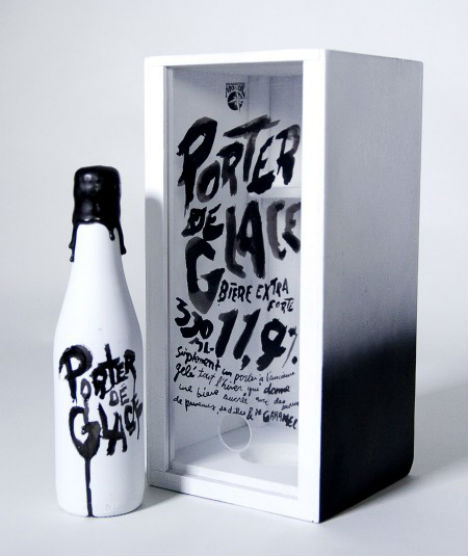
Porter de Glace by Mathieu Lacombe
(images via: oh beautiful beer)
Rough hand-drawn typography characterizes this prototype packaging for the Ice Porter by Quebec’s Brasseurs du Monde, by Mathieu Lacombe.
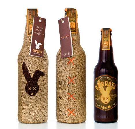
Carrots Beer by Pereira & O’Dell
(images via: pereiraodell.com)
“The objective was to create a buzz around this high-end fashion boutique (CARROTS) and specifically around their men’s line, driving new male customers into the store. We created a limited edition, designer beer made from carrots. We brewed the beer, handcrafted the bottle wraps, and applied the labels. The 22oz. burlap-wrapped bottles were hand-delivered as gifts to specifically targeted men and the 12oz. beers were served at CARROTS-sponsored events and in-store to enhance men’s shopping experiences. Among the hundreds that received the bottle as a gift and the ones that tried it in the store, many people actually placed orders for beer to take home, turning a unique promotional item into a sexy and successful new product. Not to mention creating a buzz around the store.”
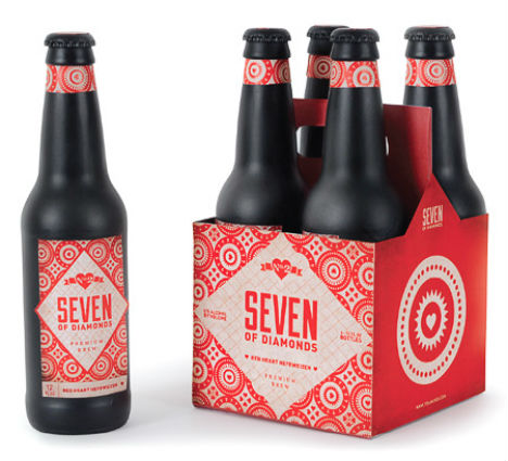
Seven of Diamonds by Christina Berglund
(images via: christina berglund)
“Seven of Diamonds Brewery is based on the beer card tradition. As the tradition goes, when a player wins the last trick of the hand with this card, his opponent must buy him a beer. Four varieties correspond with the four card suits—hearts, clubs, diamonds and spades.”
Arrogant Bastard by Thahn Nguyen
(images via: cargo collective)
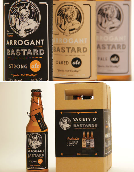
California State University student Thanh Nguyen redesigned the packaging for Arrogant Bastard Beer. “This was one of the first projects for my packaging class this semester: we had to repackage a food or drink product. We could either completely rebrand the product or stick with their existing logo. I chose to give the Arrogant Bastard beers a facelift using their existing logo. “
Firewater Brew by Brian Biles
(images via: oh beautiful beer)
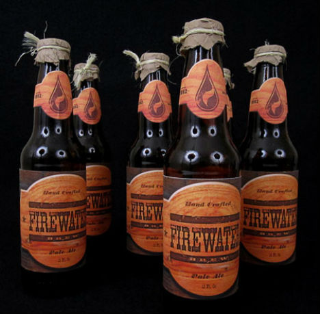
In this student project by Brian Biles, Firewater Beer gets a redesign that’s equal parts modern and nostalgic, with wood textures and rope detail that pay tribute to the brand’s hand-crafted reputation.
Ippon Matsu by Kota Kobayashi
(images via: oh beautiful beer)
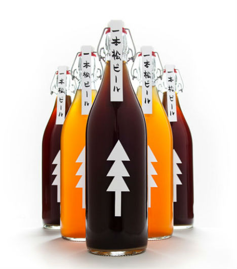
The designer says, “In the city of Rikuzentakata, a single pine tree stands as a testament to survival after the tsunami of 2011. This beer’s name means “One Pine Tree” and its design is a symbol of charity and hope for Japan’s brighter future. A scroll-like, handwritten label seals the top with its story written on the inside. The label is a solitary pine made of three triangles facing up, symbolizing the wish for progress in the reconstruction efforts.”
Velkopopovicky Kozel by Yurko Gutsulyak
(images via: gstudio)
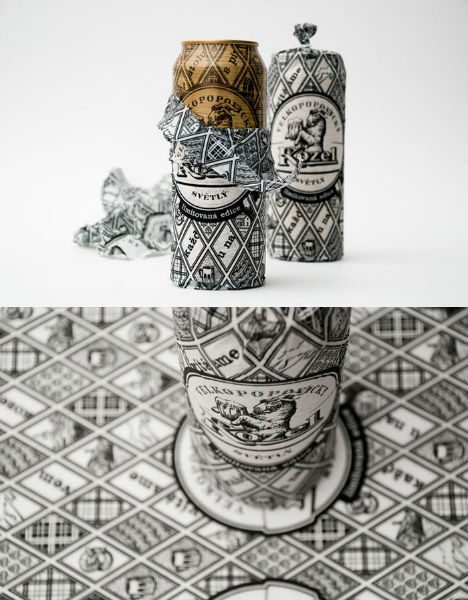
“”The project is aimed at emphasizing the values of the famous Czech brand and enlarging the number of its fans.
The design of the limited edition reflects the ancient traditions as well as the mastership of the Czech brewers. Every can is a part of the Old Czechia. Beside the collectors’ design, the Velkopopovicky Kozel beer offers gifts to everyone who will unravel the special message that is encoded on the can.”
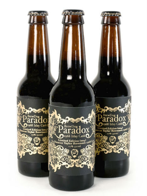
Brew Dog Paradox
(images via: johanna basford)
Paradox, a limited edition beer by Brew Dog, gets silk-screen printed labels in luxe gold lacquer on black.
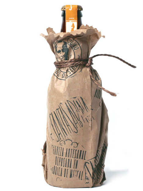
Santa Sabina by Alacran Creative
(images via: behance)
Alacran Creative’s label for Imperial Mezcal Ale by Mexican brewery Santa Sabina, a bitter ale with a pinch of Mezcal added in the last week of fermentation, features an illustration of the Guadalajara countryside. The bottle is also wrapped in brown printed paper.
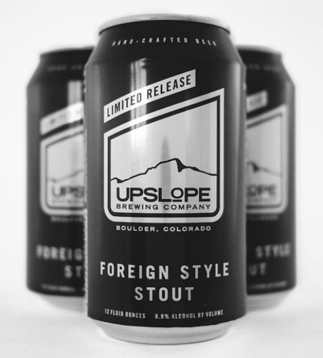
Upslope Brewing Foreign Style Stout Cans
(images via: anthem branding)
Anthem Branding says of the Upslope Foreign-Style Stout cans, “Ever since its premiere as Upslope Brewing’s First Anniversary beer, the Foreign Style Stout has been a fan favorite. The Foreign Style Stout is brewed with Pilsner malt, along with roasted barley, several specialty malts. We developed a unique can design to draw attention to the company’s first Limited Release variety. The all-black can is accentuated with a silver print.”
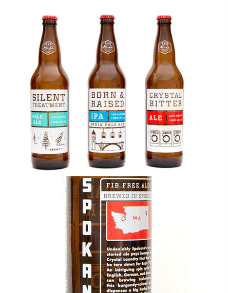
No-Li Bottles by Riley Cran
(images via: riley cran)
Designer Riley Cran created this crisp, illustrated branding for No-Li, a brewing company in the Pacific Northwest.
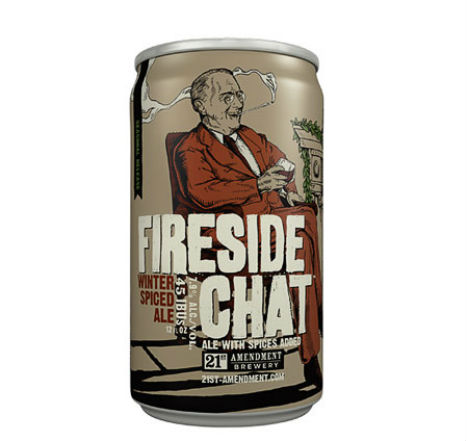
21st Amendment Fireside Chat by TBD
(images via: tbd advertising)
“Like FDR’s Depression-era radio addresses, which were like a kick in the butt and a hug at the same time, our Fireside Chat is a subtle twist on the traditional seasonal brew. We begin with a rich, dark, English-style ale and then we improvise with spices until we know we have a beer worth sharing with the nation. Fireside Chat is our early winter seasonal brew available from October through December in six pack cans and on draft. Brewed like a classic, warming Strong Ale but with a subtle blend of hand-selected spices for just the right festive flair.”
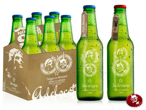
Les Angles et Demons by Plastikkcomau
(images via: plastikkcomau)
This concept packaging for a made-up beer brand has an ‘Angels and Demons’ theme.
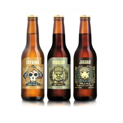
Cerveceria Hacienda by Andrew Rose
(images via: behance)
Andrew Rose created labels for Mexico’s Cerveceria Hacienda brewing company that honor the country’s history and culture, including Catrina Red Ale, Hidalgo Stout and Jaguar Pale Ale.
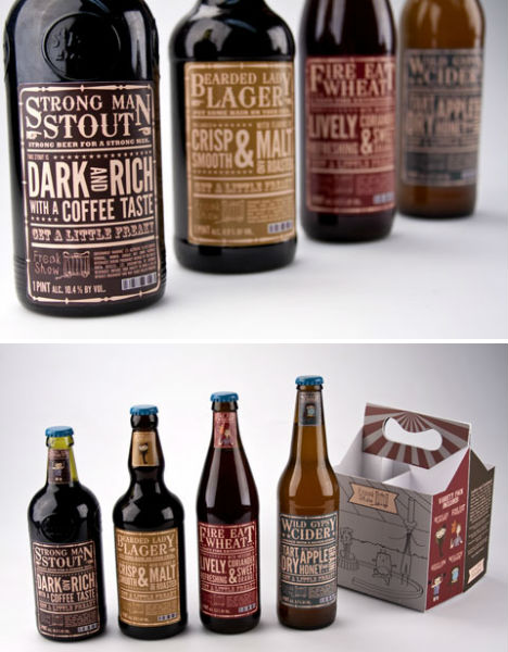
Freak Show Brews by Sarah Bina
(images via: behance)
“Freak Show is a brand of beer that uses circus characters to help describe different types of beer. The labels are designed in a wood-type poster style, characteristic of old circus posters.”
White Rabbit Dark Ale by brainCELLS
(images via: braincells)
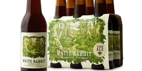
“White Rabbit Brewing in the Yarra Valley, VIC, Australia opened its doors in mid-2009 with its flagship beer being the WR Dark Ale. The illustration features a playful white bunny rabbit jumping amongst the leafy landscape. The rabbit appears in a different position on each stubby label so that no two beer labels are the same.”
La Perle by Chrystel Jung
(images via: behance)
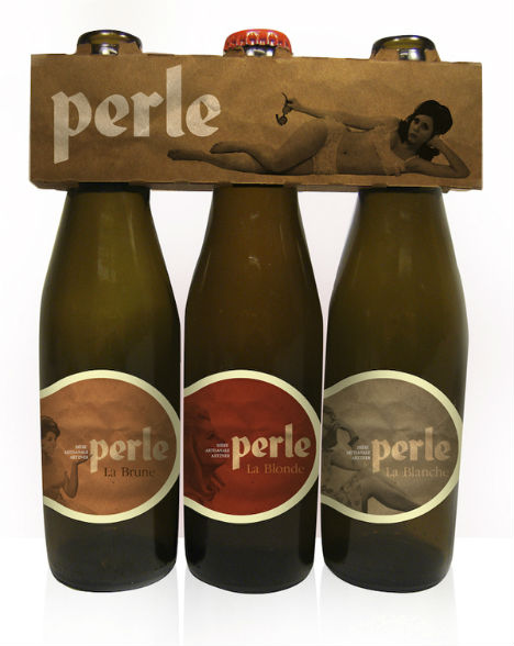
Parisian designer Chrystel Jung created these labels for a home-made beer.
Thorsteinn by Thorleifur Gunnar Gíslason, Hlynur Ingólfsson, Geir Ólafsson
(images via: the dieline)
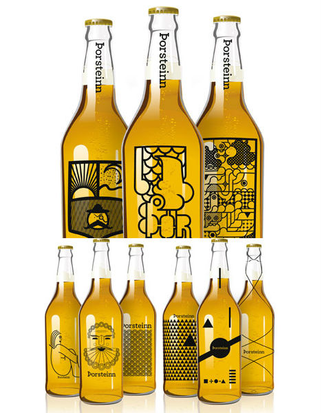
This concept is a collaboration between three graphic design students at Iceland Academy of the Arts. “This beer brand concept was born on a sunday night at school were we were supposed to make a brand for a micro-brewery. The name is traditional Icelandic name that could be loosely translated into “thirsty one”.
Miller Boom Box
(images via: the dieline)
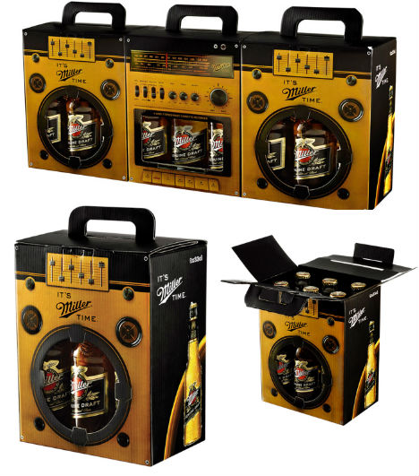
Would you expect packaging blog The Dieline’s top beer packaging design of the year to be created by one of the big brewers? Companies like Miller don’t generally compete well with smaller craft brewers when it comes to originality and aesthetics, but Miller definitely hit a high note with its boom box six-pack case.
