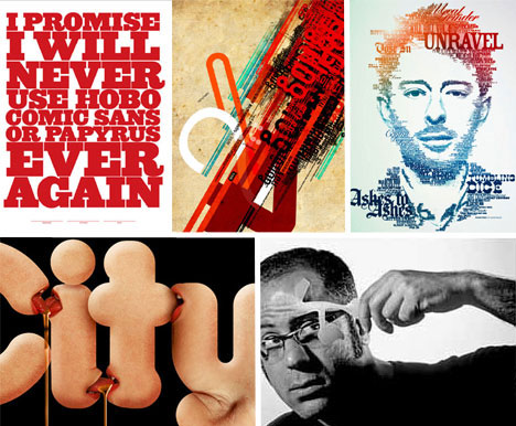
Typography is much more than just graphic design or illustration with some text thrown in. It’s an art form in itself that combines carefully chosen and arranged fonts with visual elements, sometimes as a relatively straightforward communication device and sometimes as artistic expression. These 15 examples of typography artwork embody a broad variety of techniques and styles, but they’re all brilliant.
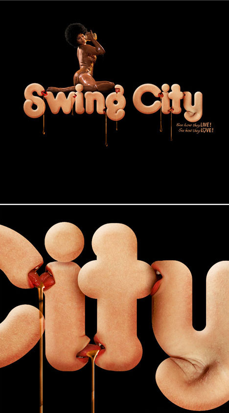
Swing City by Luke Lucas
(image via: Luke Lucas)
Art director, co-founder of creative studio Lifelounge and typographic illustrator Luke Lucas creates artwork that combines text with often-provocative images, as in this typographic title treatment for an article in Lifelounge Magazine about swingers in America’s bible belt.
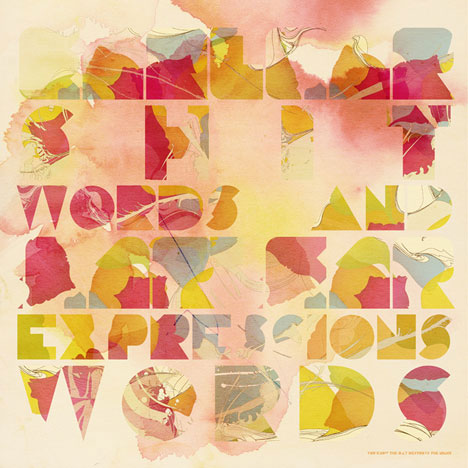
Destructive Vintage Typo Experiment by Alberto Seveso
(image via: behance.net)
Roman artist Alberto Seveso has a singular typographic design style, taking a traditional approach to graphic design rather than using computers. In a series of images called ‘Destructive Vintage Typo Experiment’, Seveso combines a 1970s-inspired type style with bits and pieces of line work, splatters of watercolor paint and sunny, vivid hues.
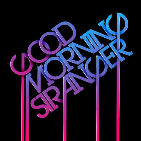
Good Morning Stranger by Nicholas Girard
(image via: behance.net)
Toronto designer Nicholas Girard shares his typographic illustrations on his portfolio blog Good Morning Stranger, for which he created this three-dimensional blog header.
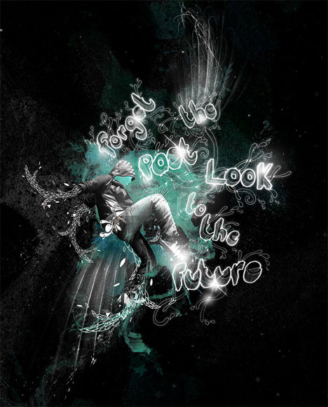
Forget the Past by Craig Shields
(image via: abduzeedo.com)
Most of Craig Shields’ digital illustration is figurative rather than typographic, but this piece stands out among his portfolio. It reads ‘Forget the past, look to the future’.
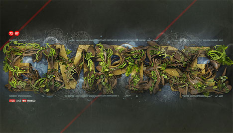
‘Empire’ by Theo Aartsma
(image via: Sumeco)
Dutch designer Theo Aartsma combines digital and traditional techniques to explore themes of nature, technology and urban culture. Aartsma’s typography art often has an organic feel, seen here in ‘Empire’, which was created for depthCORE’s Empire release.
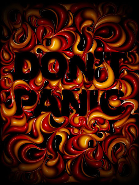
Don’t Panic by Stefan Chinof
(image via: boogiesbc.ro)
Bold and colorful, Bulgarian typographic illustrator Stefan Chinof often uses negative space among complex designs to spell out text, as in this piece, ‘Don’t Panic’. A recurring theme in Chinof’s work is liquidity, from dripping abstract shapes to illustrations disappearing into splatters of paint.
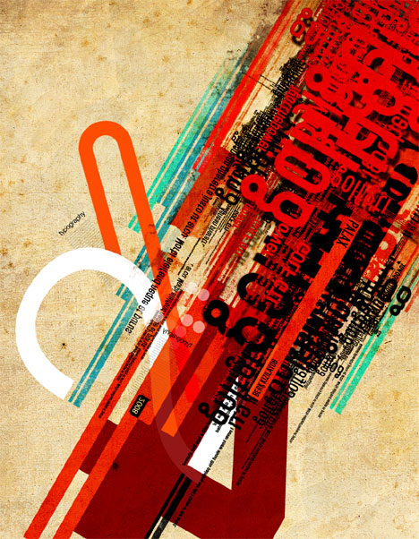
Chaos is My Name by Berk Kizilay
(image via: deviant art)
Berk Kizilay’s typographic work is chaotic and masculine, standing in contrast to the figurative illustrations in his portfolio which have a sensual an almost airbrushed look. Kizilay layers text and design elements into compositions that are almost architectural in nature.
Typoplastic Surgeries by Oded Ezer
(image via: WebUrbanist)
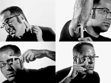
Oded Ezer stretches and blurs the boundaries of typographic illustration, integrating science to create bizarre works like his ‘Typographic Surgeries’. Oded literally attached letters to his own body and face, saying “The connection is between the letters to the face, kind of an evolution of both. I began the process in a graphical manner, but then I tried to implement it physically. So this augmentation, deformation of the body, the revelation of its typographical perspective is what turns me on.”
All Work and No Play by Craig Ward
(image via: Debutart)
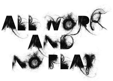
Craig Ward is a London-based graphic designer who seeks to explore the notion of word as image, often employing unusual media like feathers, paper cut-outs and in this case, human hair to create his designs.
‘Words of Change’ by Gui Borchert
(image via: Gui Borchert)
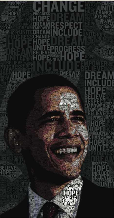
This entirely typographical portrait of President Barack Obama was created by artist Gui Borchert from 20,000 of Obama’s own words, meticulously arranged in various sizes and colors. Borchert, an art director with a large body of typographic work, was featured in Print magazine in 2007 as one of the 20 most talented designers under 30.
Letters are More than Words by d0rn
(image via: Deviant Art)
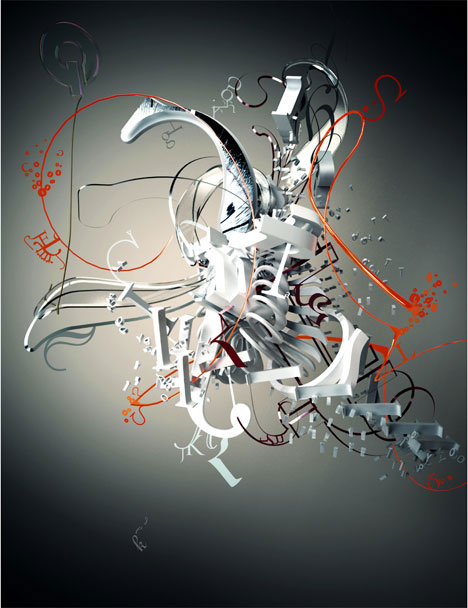
This piece by artist d0rn proves that, as the title says, letters are more than words. They’re arranged here into a flowing, three-dimensional looking mass that almost seems alive.
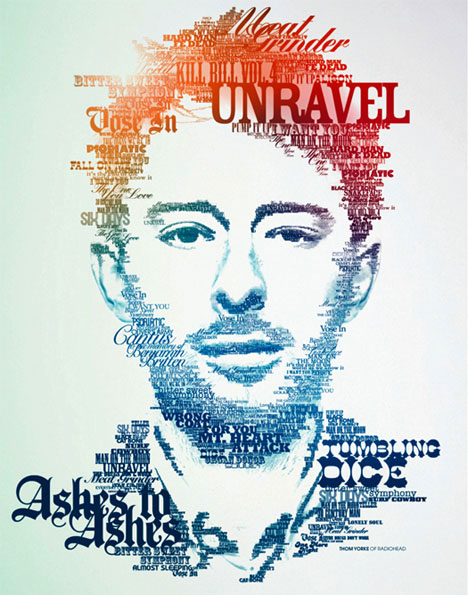
Radiohead’s Thom Yorke by Steve Yee
(image via: Style Files)
Steve Yee, art director for Chiat/Day in Los Angeles, designed a series of typographic posters for the 2009 Grammy Awards including this colorful portrait of Radiohead’s Thom Yorke. The words used throughout the portrait are the titles of some of Yorke’s favorite songs.
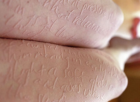
Typographic Skin Condition by David Tucker
(image via: Inxel)
Not many illustrators – except maybe Oded Ezer – would go so far as to scratch words onto their skin, turning their bodies into a painful canvas. ‘Typographic Skin Condition’ by David Tucker is more than just a masochistic sort of temporary inkless tattoo – it’s a combination of performance art, photography and a love for type.
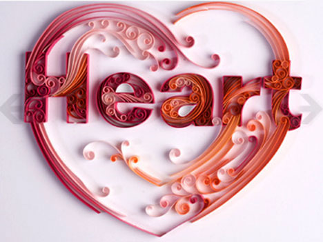
Heart by Yulia Brodskaya
(image via: artyulia.com)
Yulia Brodskaya combines typography with papercraft art to create three-dimensional designs that really pop. Brodskaya, a Russian artist living in the UK, sought to bring together her love for the two separate art forms and has done so beautifully, with a style unlike any other.
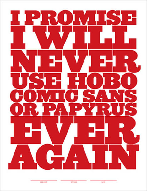
A Simple Typographic Pledge by Jeff Matz
(image via: Swiss Miss)
Anyone with an appreciation for good typographic design will get a kick out of this poster by Jeff Matz, Principal of Lure Design. If only the cringe-worthy Hobo, Comic Sans and Papyrus fonts would disappear for good, designers everywhere would celebrate.
