While spending 30 seconds on an escalator, where do you look? Most people just stare straight ahead – making escalators an ideal location for advertising. But some ads are more colorful, clever and controversial than others, using both the ideal eye-level platform and shape of the stairs to their full potential. These are the kinds of ads that make people pause and marvel for a moment before continuing on their way.
Canadian Red Cross Escalator Ad
(image via: allbusiness)
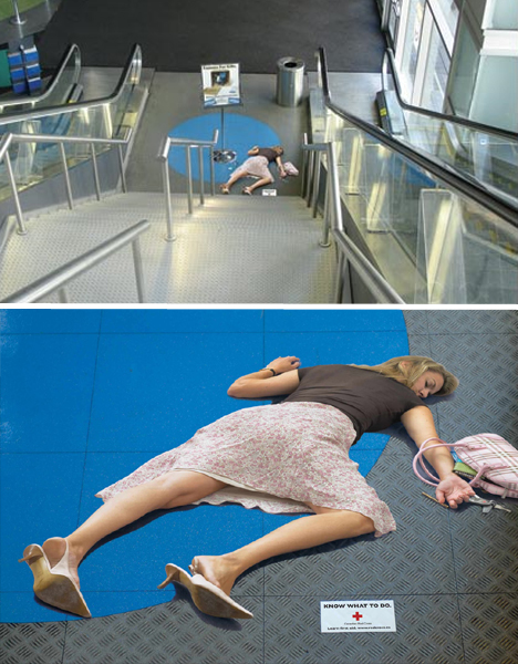
From the top of the stairs, this ad looks so realistic that it could prompt people to rush down so quickly they injure themselves – completely undermining the purpose of the campaign. Created for the Canadian Red Cross, the decal intends to promote the knowledge of first aid with a message reading “Know What to Do.”
DHL Gridlock Escalator Ad
(image via: adoholik)
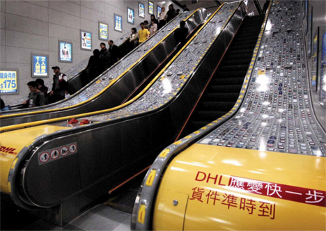
Hong Kong traffic is notoriously nightmarish. But even the gridlocks of this city can’t stop DHL, or so they insinuate with this escalator ad which depicts their trucks speeding down a convenient (though imaginary) fast lane, located on the moving handrail, as the rest of the cars remain at a maddening halt.
IKEA Staircase Ad
(image via: directdaily)
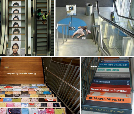
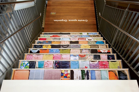
IKEA is practically synonymous with “organization”, something nearly everyone could use a little help with. That makes these stair stickers that much more effective, depicting neatly stacked clothing and linens in drawers.
Hopi Hari Escalator Ad
(image via: adland)
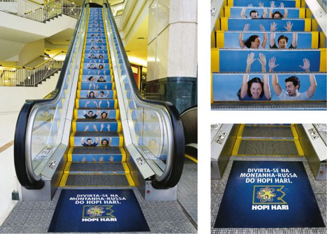
When people momentarily forget they’re on an escalator, imagining themselves having a great time at an amusement park instead, you know that an ad is special. This one for a Brazil amusement park called Hopi Hari turns each step into a snapshot of a couple enjoying a roller coaster.
Nationwide Staircase Ad
(image via: ads of the world)
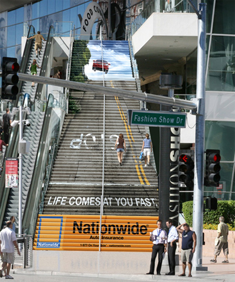
Bad things happen every day… like bizarre automobile accidents that send your car flying in the air like the General Lee, if this Nationwide Insurance staircase ad is to be believed. It certainly takes full advantage of the huge set of stairs at the end of Fashion Show Drive in Las Vegas.
Revita Beauty Center Shiatzu Escalator Ad
(image via: adland)
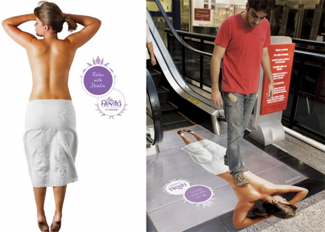
When possible, it’s best to avoid stepping on people – unless you’re a professional masseuse. While this ad may make some people uncomfortable, others may be reminded of just how good it would feel to let someone work out the knots in their backs.
Table Soccer Staircase Ad
(image via: ads of the world)
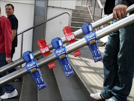
An outdoor guerilla ad campaign to promote the first international table soccer world cup featured realistic-looking flyers shaped like table soccer figures on stair handrails around the city of Hamburg, Germany.
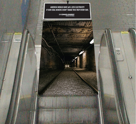
Consol Energy Coal Mine Escalator Ad
(image via: ads of the world)
Consol Energy reminds people of what it takes to power our world with coal – descending into deep, dark, dirty mines – with an ad bound to make environmentalists cringe.
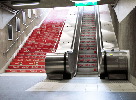
Coca-Cola Escalator & Staircase Ad
(image via: ads of the world)
Coca-Cola engaged in some targeted marketing in a joint campaign with McDonalds. Regular, full-calorie Coke was advertised to people who take the stairs, while the people getting less activity by taking the escalator see ads for Diet Coke instead.
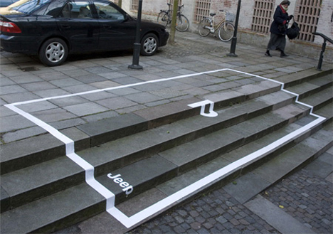
Jeep Parking Space Ad
(image via: toxel)
Capitalizing on the Jeep’s reputation as a vehicle that can go places other cars can’t, these guerrilla-style ads create parking spots in the most unlikely places – like stairs. No word on whether Jeep owners that took the ads up on their offer got reimbursed for pricey parking tickets.
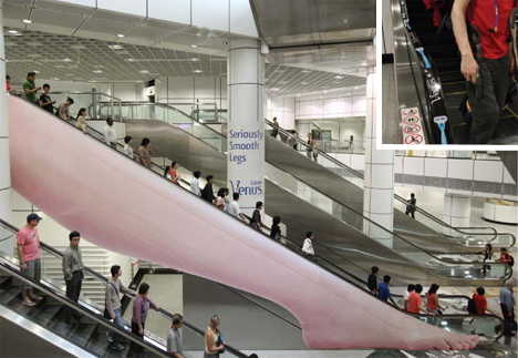
Gillette Venus Escalator Ad
(image via: ads of the world)
Who was the advertiser that looked at the side of an escalator and thought, ‘hmmm, that looks like a leg’? Someone had to have made that questionable connection to come up with this eye-catching ad by Gillette, which featured small decals of razors on the handrail.
Greenville Literary Association Staircase Ad
(image via: toxel)
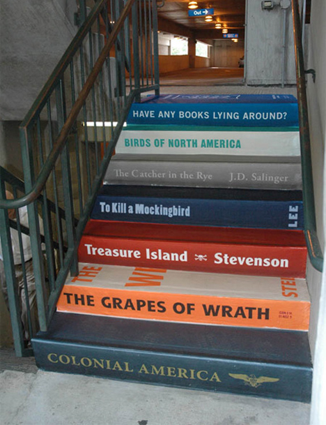
It’s not hard to grasp how book lovers at the Greenville Literary Association came to see a stack of books in a flight of stairs. This ad, created to generate book donations, takes full advantage of the shape of the advertiser’s chosen medium.
Juice Salon Escalator Ad
(image via: adland)
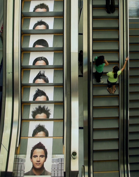
How many different haircuts can one man possibly get? This creative example of escalator advertising attempts to answer that question, putting a different style on every step, each of which briefly join with the man’s face at the bottom of the escalator to demonstrate the effect.
South Carolina Time to Thaw Stairs Ad
(image via: bounce agency)
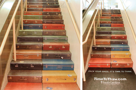
The same agency that came up with the creative Greenville Literary Association book stairs also turned a set of stairs into stacks of suitcases, inspiring passersby to “pack your bags: it’s time to thaw.” The ad encourages travel to South Carolina.
Pizza Kingdom Escalator Ad
(image via: ads of the world)
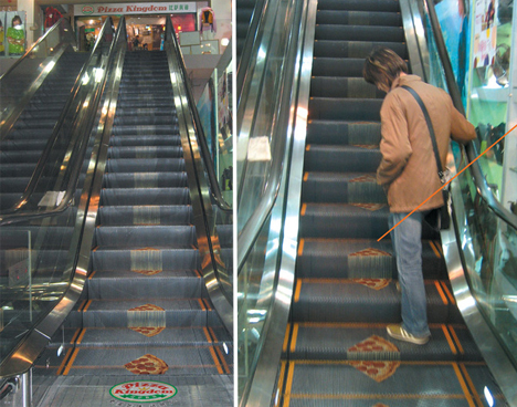
Is the sight of a pizza lying on a dirty escalator, stepped on by thousands of pairs of feet, really all that appetizing? A chain called Pizza Kingdom hoped that it would be with this strange ad, designed to demonstrate “extra cheese” stretching from step to step. Amazingly, it worked: revenue increased by 53% within a month.
