(Images via: Shanghai Cultural China, Boston.com, Arch Daily)
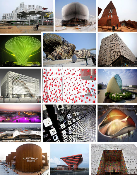
When you’re awarded the highly coveted position of official host city to the world’s latest, greatest and inarguably grandest exhibition fair, you better be prepared to spend some major dinero (or in this case, Yuan) to put on the glitz. At a personal expense of $4.2 billion dollars, China is definitely pulling out the stops for the anticipated 70 million visitors of their upcoming Shanghai World Expo, taking place in the Pudong District along the bank of the Huangpu River from May 1 to October 31, 2010. Their developing nation status should be easily forgotten now that they’re embracing a 21st century cultural and economic sensibility as reflected in their Expo theme “Better City – Better Life”. It will be hard to outshine China’s ambitious pavilion plans, but with 42 additional countries setting up shop for the duration of the event and enormous budgets being earmarked for their own respective architectural spectacles, the proof’s in the pudding. Behold the most eye-catching, heart-stopping, structurally visionary creations that visitors will be treated to when they plunk down their $24 admission fee.
Australia’s Pavilion
(Images via: Shanghai Cultural China, Chenzen)
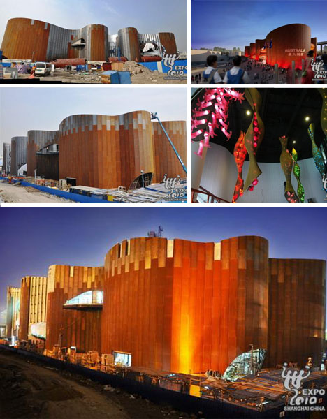
Inspired by the colossal and entirely sacred Ayers Rock landmark that juts out of the Northern Territory of Australia, their color-changing “Uluru” pavilion emulates the earthy ochre-red appearance of its namesake due to the gradually-oxidizing steel façade. At an expense of $76 million, the land down under asks its pavilion guests to discover the real Australia through a combination of “ImagiNation” cultural exhibits, interactive displays, artistic representations of their history and…naturally, the indigenous tastes of their distinctive cuisine.
Brazil’s Pavilion
(Images via: Shanghai Cultural China, Expo 2010, Arch Daily)
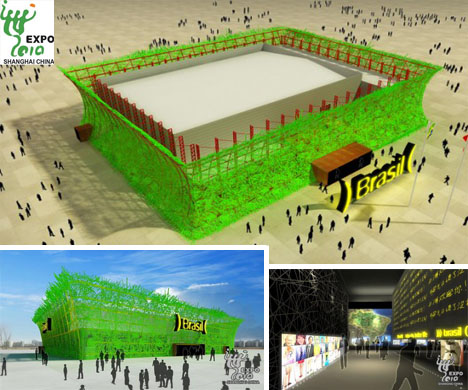
Said to be among the largest of all the pavilion structures this year, Brazil’s rectangular design – created by Architect Fernando Brandão — pays homage to Beijing’s 2008 Olympic Game National Stadium (a.k.a the “Bird’s Nest”). Its “Pulsing Cities” theme acknowledges how Brazil continues to pursue sustainable development while still balancing the livelihood of its residents. The unusual looking design — composed of a metallic framework with thousands upon thousands of recycled wooden pieces interlocking within a mesh exterior — is taken one step further with the addition of a liberal coat of retina-searing green paint. It offers a complementary backdrop to their goal of educating the public about the country’s strategic management of their precious natural resources and dedication to using green energy alternatives.
Denmark’s Pavilion
(Images via: World Expo Blog, Nuts Bike, Dezeen)
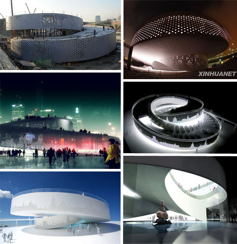
One of the most notable features of Denmark, which was brought to light during the 2009 Copenhagen Climate Change Conference, is its bicycle friendly infrastructure – an integral design component in their roof top pavilion. Incorporating 1500 eco-friendly two wheelers for visitors to take advantage of, the Danish Pavilion revolves around the notion that its traditional fairy tales can be appreciated while attendees put their pedals to the metal so to speak. The spiral knot-tied architecture – really just a looping bicycle and pedestrian-friendly ramp — contains a pond at its core as well as the original “Little Mermaid” statue from Copenhagen Harbor.
France’s Pavilion
(Images via: World Expo Blog, China Briefing, Expo 2010)
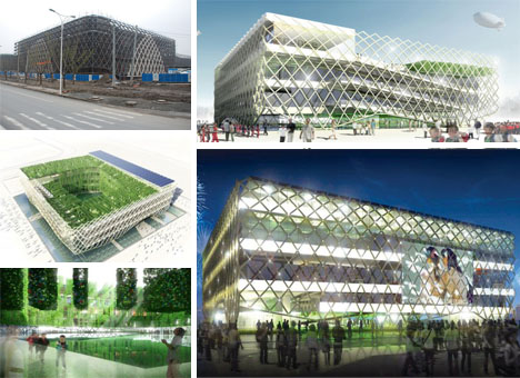
With a “Sensual City” design scheme, the tres cultural birthplace of impossibly thin supermodel women who perpetually indulge in croissants, gallons of wine and decadent truffles is shelling out $74.4 million to bankroll their water-surrounded, seemingly floating 6,000 square foot structure. Purportedly a “shining example of energy efficiency and recycling techniques,” the airy box-woven design – which contains lush French-style gardens within – is (unlike its brethren) constructed for long term permanence and will be given to China as a gift after the Expo has concluded. Those who appreciate artistic masterpieces will be able to get their fix when France displays works from such masters as Rodin, Millet and Van Gogh, all under its lush, botanical ensconced pavilion roof.
Germany’s Pavilion
(Images via: China, World Expo Blog, Shanghai Government, Xinhuanet
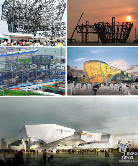
Architect Lennart Wiechell is the brainchild behind Germany’s $67 million 6,000 square foot pavilion, which reflects the theme of balance amid cultural identity, globalization, modernization and preservation. With four separate architectural components, the unit as whole appears to be precariously positioned, and yet that’s the whole point of the design – to convey a sense of intrinsic support when all the features work together as a unit. The piece de resistance, located in the “source of power” exhibition hall, is a 3 meter wide, 1.2 ton, noise and movement activated revolving metal sphere studded with 400,000 LED lights.
Great Britain’s Pavilion
(Images via: Boston.com, Yatzer)
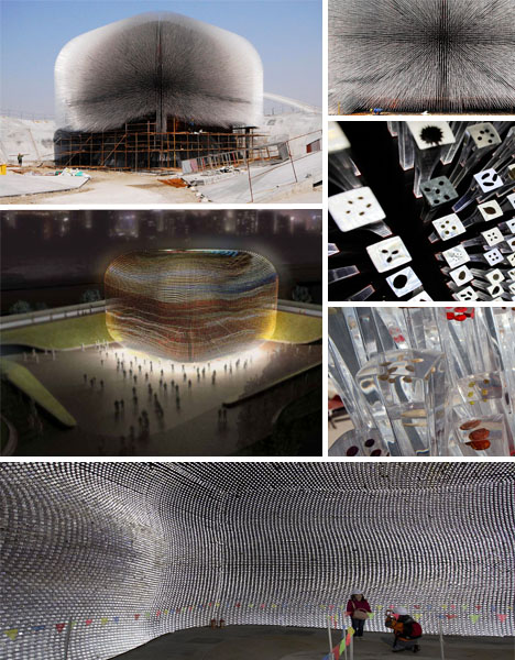
Reflecting the relationship between the built environment and what exists untouched in Mother Nature, the outrageously audacious 20-meter-high porcupine-like Seed Cathedral consists of 60,000 narrow 7 meter long translucent fiber optic acrylic rods, each tip embedded with varying seeds that are representative of the ensured future and longevity of mankind. Designed by the innovative, forward-thinking and internationally acclaimed team of Heatherwick Studio, the product of their efforts has to be the most extraordinarily risky yet phenomenally successful example of modern art on an architectural level. Radiating ambient light during the day and a self-illuminating structural glow once the sun goes down, the design even responds to breeze patterns by undulating accordingly, providing a multi-sensory event for all to witness.
Italy’s Pavilion
(Images via: Shanghai Cultural China, World Expo Blog)
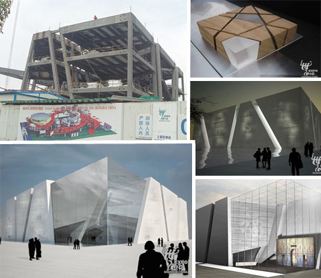
Have you ever seen a shimmering vision in concrete? Italy’s modular pavilion slabs, embedded with optical glass fibers, yield a 3,600-square-meter structure that appears to be translucent in nature and ever-changing as the sun progresses through the sky. Consisting of 20 unique shapes representative of the county’s distinctive geographical regions and bound together by intersecting lines (or “pick up sticks”), the most interesting thing about this design is that it will be recycled and reconfigured simply by removing the anchoring pieces.
The Netherlands’ Pavilion
(Images via: PR Log, Boston.com, Shanghai Scrap)
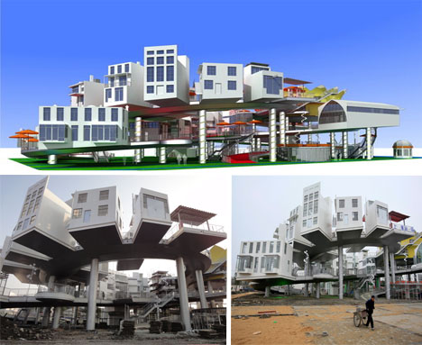
Designer John Kormeling’s Dutch Pavilion, entitled “Joy Street”, is a literal figure-eight-shaped assemblage of 26 mismatched yet oddly harmonious structures that come together in cartoonishly cheerful nature. Seemingly plucked straight from the pages of a classic Seussian tale, the artist did his best to embody the classic traditional architectural styles emblematic of his country while also paying close attention to sustainable and eco-responsible factors. Honoring Chinese traditions of luck and good fortune, the eight shaped appearance is just as strategic a design decision as the exterior paint color of decisive, statement-making red (which is in the process of being slathered on).
Poland’s Pavilion
(Images via: PR Log, Expo 2010 China)
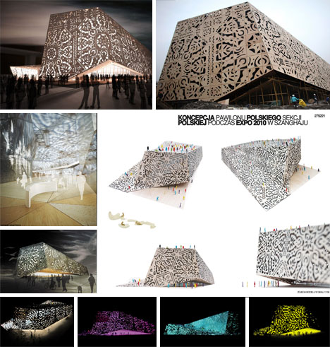
The site of three ecologically treasured circumboreal regions, Poland is known for many unique national treasures — including Maria Curie, distinctive baroque architecture, delectable pierogi — and now they can add their absolutely stunning folk-art inspired 3,000 square meter pavilion to the list. Reflecting the look of traditional hand cut, intricately patterned paper, the exterior of the entirely original architectural masterpiece is composed mainly of laser-cut plywood with polycarbonate, glass, hydro and/or UV resistant panel wall accents which also serve as movie screens upon which Polish cultural films will be shown. It is worth noting that the design team of Wojciech Kakowski, Natalia Paszkowska and Marcin Mostafa earned top honors in the design category of the 2010 EXPO’s architectural pavilion offerings for their eye-catching concept.
Russia’s Pavilion
(Images via: Expo 2010, Shanghai Scrap)
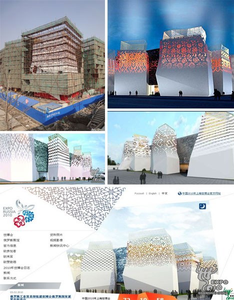
Yet another imaginative design seemingly torn from the pages of a treasured story book, the inspiration for the Russian pavilion actually stems from the historical patterns found on women’s clothing and the desire to present a magical world as seen through the eyes of a child. When you look past the pleasing textural contradictions, the 6,000 square meter design encompasses one 15 meter tall main structure linked to 12 irregularly shaped red, white and gold 20 meter tall towers (which represent the full calendar year).
Saudi Arabia’s Pavilion
(Images via: E China Cities, Expo 2010, Shanghai Daily)
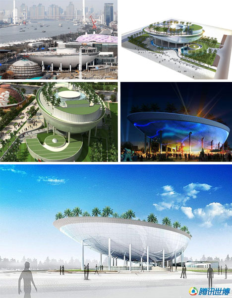
Saudi Arabia’s surreal $146 million pavilion desert scape – believed to be the most expensive among the 2010 World Expo offerings — is distinctive not only for its natural contrasts but particularly for the top deck of its suspended “moon boat” shaped structure. Boasting water features as well as 150 rooftop date palms, it has the extra-added bonus of a 1,600 square-meter cinema screen (about a quarter the size of a soccer pitch), reportedly the largest one on earth.
Spain’s Pavilion
(Images via: Boston.com, Design World, World Expo Blog)
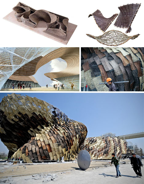
With its steel inner workings and 8,524 multi-colored, waterproofed, woven wicker exterior tiles, Spain’s $2.6 million 8,500 square meter structure is unlike anything else that will be on display at the 2010 World Expo. One of the visual benefits of using rattan covered exterior panels is that an ethereal light streaming effect is generated which also helps to ensure that the inner structure maintains a comfortably consistent temperature. Furthermore, if you look closely at the beige brown and black exterior, you can identify Chinese characters that are representative of natural elements such as the moon and the sun.
Switzerland’s Pavilion
(Images via: Arch Daily, Expo 2010, EcoFriend, World Expo Blog)
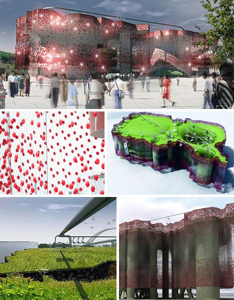
Switzerland’s inspiringly sustainable yin and yang concept, created by Buchner Brundler Architects, is immediately striking due to its exterior biodegradable soybean fiber curtain which breaks down within two weeks after being covered with soil. Incorporating dye-sensitized electricity-generating solar cells, the curtain conveys a forest like appearance that appears to illuminate from within long after the sun has set. The 4,000 square meter pavilion, which cost $18.52 million to execute, even has a rooftop cable car system which leads visitors to a flowering meadow.
Turkey’s Pavilion
(Images via: Shanghai Scrap, Expo 2010 China, Arch Daily)
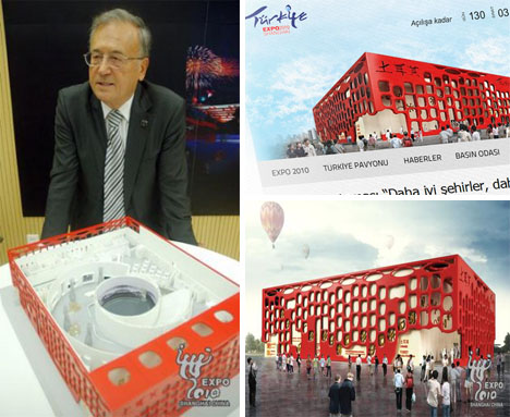
Daring to make its competition quiver with intimidation and a severe inferiority complex, the fantastically dramatic 2,000 square foot Turkey pavilion embraces its cultural roots by recreating design elements found in Neolithic “Catalhoyuk” settlements and adhering to a “Cradle of Civilization” theme. Never has a red and beige tinted box looked so good with its built-in animal sculpture, artistic open air cutouts and maze like interior swirl.
The United Arab Emirates’ Pavilion
(Images via: Cultural China, Vyonyx,Expo 2010 China, Arch Daily)
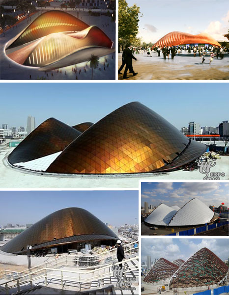
Always inclined to embrace a ‘bigger is better’ philosophy, the UAE’s 6,000 square foot “Sand Dune” pavilion seems to defy the laws of architectural physics with its somewhat undulating appearance which mimics what might happen if a gust of wind were to lift up a patch of desert sand and help it to take flight. In actuality, the Empty Quarter sand dunes are its fitting artistic inspiration. Interestingly, the north side of the structure allows sunlight to stream in while the south side is impervious so that solar heating is minimized. Even more remarkable is the fact that the country, long criticized for its irresponsible excess and lack of eco-responsibility, is surprisingly breaking down the entire pavilion at the event’s conclusion and reassembling somewhere in the UAE.
