A logo is a company’s most visible piece of visual branding, stamped on everything from billboards to promotional pens. But sometimes, you can stare at a familiar design again and again before noticing small but delightful hidden symbols, meaning and even messages. From binary code to the clever combination of interlocking shapes, these 12 logos pack in a little something extra.
London Symphony Orchestra
(image via: crossed cow)
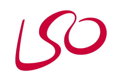
The London Symphony Orchestra escaped its staid reputation a bit with this redesigned logo, featuring the letters ‘LSO’ in a modern script that forms a single wavy line. But what you may not see immediately is the abstract image of a conductor waving with one arm and conducting with the other.
Toblerone
(image via: noquedanblogs)
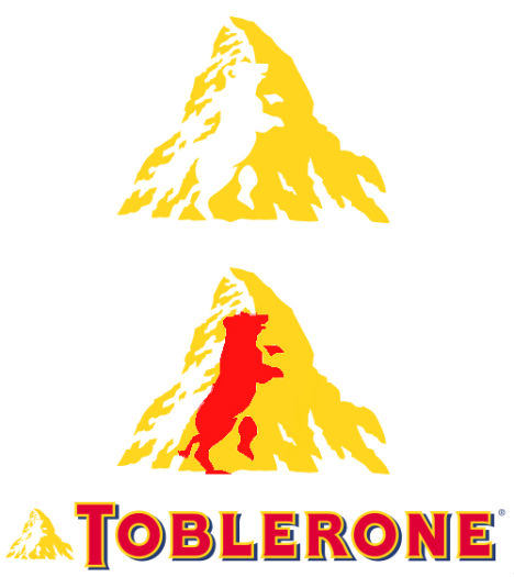
You’ve probably seen the Toblerone logo dozens of times – it’s just a mountain, right? Look closer. There’s a bear shape hidden in the negative space within that mountain, symbolizing the city of Bern, Switzerland where the Matterhorn mountain that inspired the logo is located.
Eighty20
(image via: 38one)
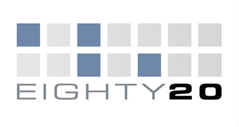
Do you ever see a logo and think to yourself, what was the designer thinking? How does this random image contribute to or identify this brand’s identity? In this case, at least, you’re simply not in on the joke – unless you’re a math nerd. If you view the dark squares as ‘1’ and the light squares as ‘0’, the two rows read 1010000 and 0010100, which read 80 and 20 in binary.
Cluenatic
(image via: 38one)
Perhaps it’s not the most readable logo ever, but it works flawlessly as a visual representation of the puzzle game ‘Cluenatic’, which involves unraveling four clues. Each of the four letters in the world ‘Clue’ are nested inside each other like a puzzle or a maze.
Sony Vaio
(image via: vector logo)
VAIO was originally just an acronym for Video Audio Integrated Operation – since changed to Visual Audio Intelligence Organizer. But the strange, seemingly abstract logo derives from another lucky coincidence: ‘VA’ represents an analog wave and ‘IO’ represents digital binary code, perfectly illustrating the integration of analog and digital technology.
Northwest Airlines
(image via: seek logo)
Before they changed it to something far less interesting – and then faded into oblivion by merging with Delta – Northwest Airlines had one of those logos that contain a bit of symbolism entirely unnoticed by the vast majority of the public. Sure, it’s got the ‘N’ and ‘W’, seemingly placed inside a circle for no good reason – but check out the location of that little triangle making up the upper corner of the ‘W’. It’s the arrow of a compass, pointing northwest.
Milwaukee Brewers
(image via: sportslogos.net)
Sure, it was just a bit of luck that gave the Milwaukee Brewers baseball team a name with the initials ‘M’ and ‘B’, but it took a great logo designer to see how those letters – combined with the negative space in a lowercase ‘b’ – could form a mitt with a baseball in it.
Bison
(image via: logo pond)
Designed for a rock band from Vancouver, this logo is like one of those left brain/right brain quiz images: what do you see first, the picture or the word?
Museum of London
(image via: lyndsey cole)
Well now, isn’t that a pretty… blob. But there’s more to the Museum of London logo than an artsy splash of watercolor; the various colored circles actually represent the changing shape of London throughout history.
Hope for African Children Initiative
(image via: hopeforafricanchildren.org)
In this trick of the eye, you’re actually drawn to look at the negative space first – the continent of Africa in white, albeit a rather unfaithful rendering. A closer look reveals the shapes of a child and a woman on either side in shades of orange.
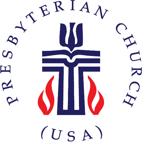
Presbyterian Church
(image via: trinity presbyterian church)
How many symbols can you fit into one relatively uncluttered, uncomplicated logo? The Presbyterian Church logo is a pretty good example of making this work: you’ve got a cross, a bible on a pulpit, a pastor’s robes, a dove, a fish and fire all within the same basic shape.
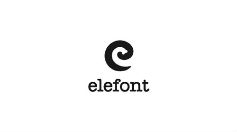
Elefont
(image via: logo pond)
Designed by Mike Erickson (otherwise known as Logomotive) for a fictitious company, this logo has three different elements combined into one simple and visually striking symbol. That curving lowercase ‘e’, which stands for ‘elefont’ and highlights an elegant font, also has an elephant trunk shape hidden inside it.
