The art of typography goes far beyond Arial and Helvetica. There is a certain elegance in the way that typographers can take a standard set of letters and turn them into unique and lovely works of art with little more than a few flourishes. These fonts are shining examples of what can be done with the alphabet we all know and love when some creativity and ingenuity are applied.
Vladimir Koncar’s Wonderful World of Letters
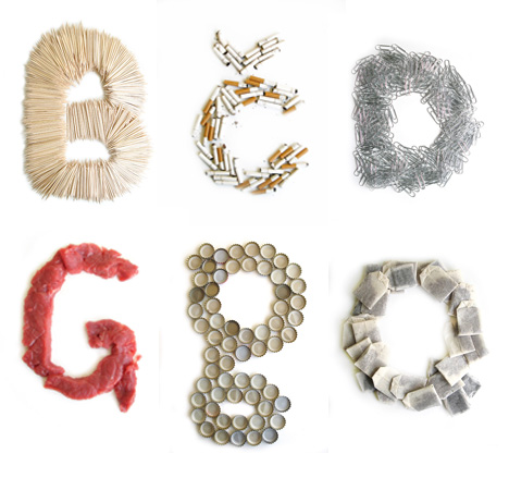
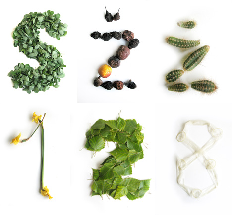
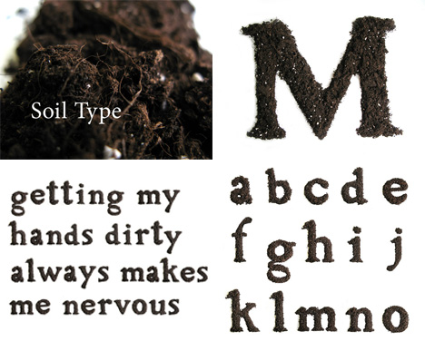
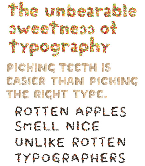
Vladimir Koncar, a Croatian artist, seems fascinated with turning everyday objects into letters. He’s taken everything from pills to cigarette butts to even dirt and hair and turned them into some of the most unique fonts ever. Paper clips, cacti, beer bottle caps – he collects items and uses them to create detailed alphabets, which he then uses to spell out his thoughts at the time.
For Koncar, this unusual exercise in typography is an escape from tedious commercial assignments. As any artist or designer knows, creating solely for others is the quickest way to kill the joy in one’s art – so a release like this one is entirely necessary. Luckily for us, Koncar’s personal project is fantastically entertaining.
The little phrases written out as examples for each font provide Koncar a link between the letters and the materials used to create them. It’s the same for many of us: we choose a specific font to get across a certain message when it’s called for. These wonderful and strange typography sets allow an unprecedented degree of visual connection between the message and the medium.
Google Maps Typography
(images via: Dornob)
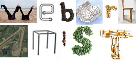
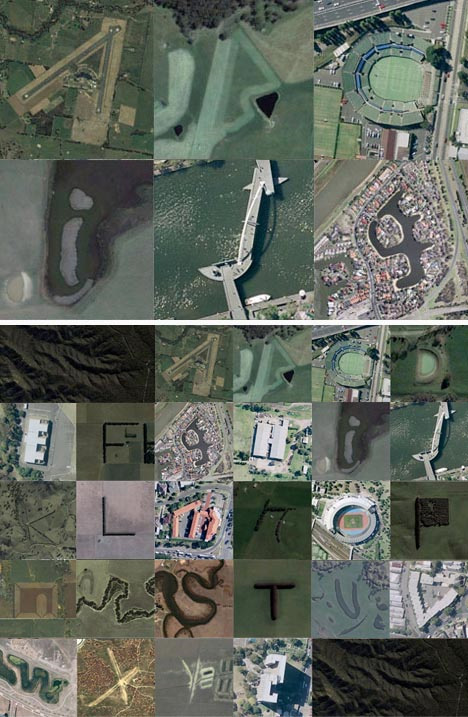
The world is full of fascinating things, and Rhett Dashwood proved that when he found the entire alphabet in various locations with Google Maps. To make the challenge more interesting, the search was limited to just Victoria, Australia – which Rhett searched mile by mile for months on Google Maps. If you’d like to see each location for yourself, Rhett’s website includes all of the locations so that you can see the letters in context on their respective maps.
Alphabet City
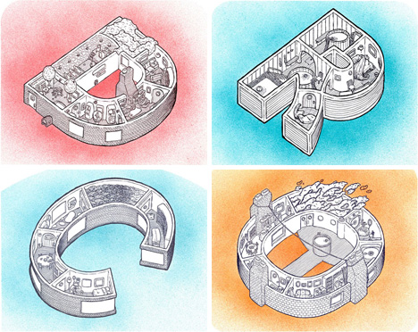
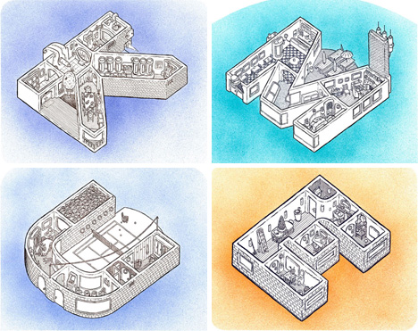
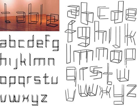
Those of us who are in love with letters, words and typography can relate to projecting a kind of personality on each letter of the alphabet. Scott Teplin puts an interesting spin on that practice with his Alphabet City prints: each letter of the alphabet is turned into a 3D home, complete with furnishings and appliances.
(images via: x-ing books)
The idea is definitely unique and borders on bizarre, but somehow it works wonderfully. Each letter is like its own little dollhouse, and peering into every picture is like sharing a moment of life with the occupants. The retro-but-modern prints are all available individually from the artist or all together as a book.
Andrew Byrom’s Adventures in Typography
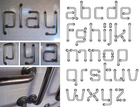
Andrew Byrom creates a fascinating variety of fonts – from those that could conceivably be used on a computer to those that have to be experienced in real life, physical form. “Grab Me,” above, is a character set made of metal grab bars installed on a wall. Some of Byrom’s other creations include letters made from box kites and Venetian blinds.
(images via: Andrew Byrom)
Byrom is a master of bridging the design gap between 3D rendered images and 3D physical objects in his typography designs. This set, called “Interiors,” is actually constructed of welded tubular steel, just like furniture.
Ideographic Alphabet
(images via: Amandine Alessandra)
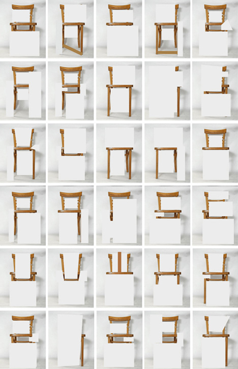
Graphic designer Amandine Alessandra makes a powerful statement about how we perceive objects with her ideographic (symbol-based) alphabet. The characters are all formed from a chair which is selectively covered and uncovered in certain spots to create each one. According to the designer, the font is only to be used to discuss the specific chair from which the letters are formed.
The Amazing Alphabet Object
(images via: Dornob)
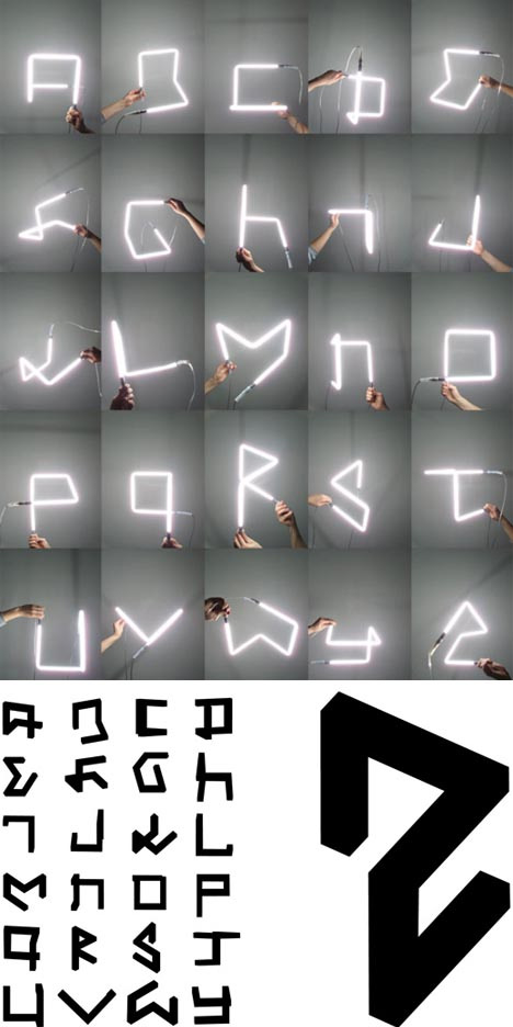
An alphabet that’s rendered in both glowing physical form and in abstracted print form is already pretty amazing. But this set of characters is even more so due to the fact that every character is created by one simple shape: the squiggly black one above. By turning the shape this way and that, every letter in the alphabet can be produced from the viewer’s point of view.
(images via: Hijack Your Life)
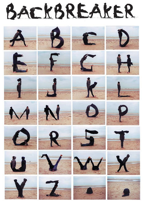
Human bodies used to form letters are really nothing new, but the Backbreaker font from Hijack Your Life is exceptional. The entire alphabet was photographed during a single photoshoot, and each letter uses no more than two people (and maybe some windblown bits of cloth). It’s a truly beautiful set of letters made even more compelling by the lovely Netherlands beach on which it was photographed.
