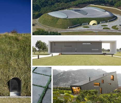
Sometimes standing out can be less than outstanding, while blending in can compliment and enhance any distinctive community. These 12 supremely stealthy structures speak softly of the need to belong, yet carry a big stick when it comes to representing their ‘hood.
Maison Barak: Avoiding Attention
 (images via: Architecture Week and Been Seen)
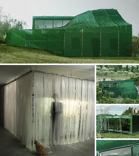
Often when buildings are being constructed and the architects would like to hide the facade while work is in progress, they’ll drape a huge tarpaulin over the site to discourage prying eyes. French architect François Roche went one step further: the tarp IS the facade.
 (images via: Architettura)
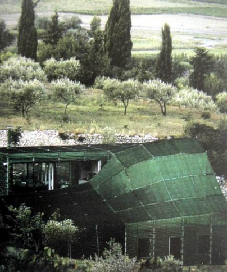
Maison Barak (no relation to you-know-who) features a green, tent-like polyurethane paneled exterior that covers and protects both the interior of the house and its solid concrete inner structure. The tent is made of green fabric in order to blend in with the surrounding vegetation and olive groves… more on that to come.
 (images via: Architecture Week)
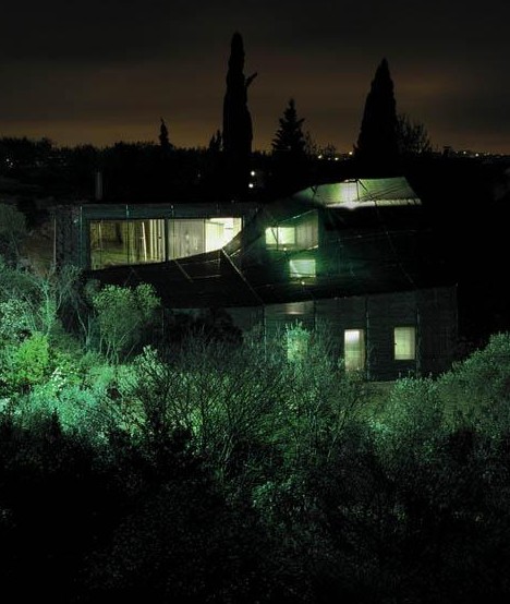
Stealth was the watchword when Roche designed Maison Barak – by blending into its surroundings, the 7-room house avoided any visual distraction with the nearby historic Château Sommières. Roche was able to use the house’s stealthy styling to meet the severe guidelines issued by Les Architectes des Bâtiments de France, who represent the state in matters of architectural heritage and planning. Even better, the covering allows the homeowners to add on rooms without changing the outer appearance of the house – very stealthy of them!
House Sulla Morella: Plane & Simple
 (images via: Homedug and Home In Furniture)
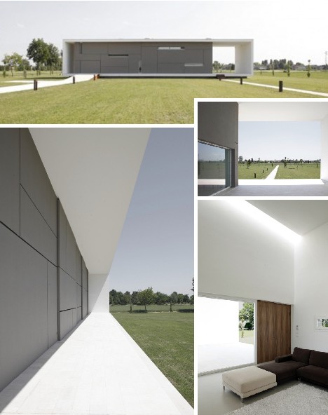
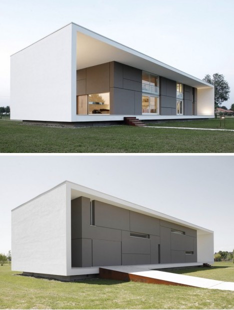
Sometimes simplicity equals stealthiness, as in the case of this exceedingly minimalist home designed by Andrea Oliva of Cittaarchitettura. So confident was Oliva in the small visual imprint of the house, he dispensed with any sort of gardening, shrubbery or other landscaping that might easily be used to conceal some of the house’s more obtrusive aspects.
 (images via: Digs Digs)
House Sulla Morella measures approximately 34m (111.5 ft) long, 11m (36 ft) wide and is 6m (19.7 ft) tall. White plaster on the exterior walls helps reflect heat while solar panels on the roof provide environmentally friendly electrical power. It appears to be the only house on the block – and the only house that IS a block.
Zufferey House: Design At Its Peak
 (images via: Freshome and Trendir)
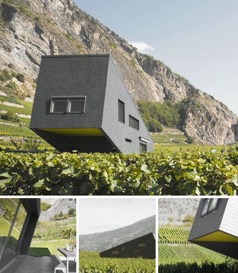
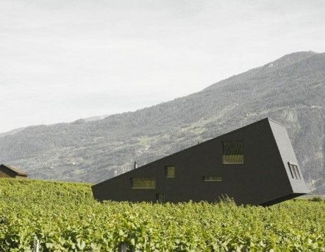
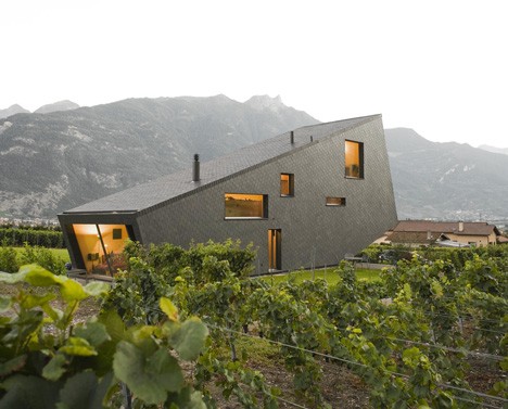
Log cabins and alpine gabled houses might be our perception of mountain homes, derived from books, TV and movies. Do they really fit in with highland landscapes, though? The Zufferey House does, because it was built to blend in with its mountainous surroundings in the Swiss Alps.
 (image via: Freshome)
Designed by Nunatak Architectes, the house displays a variety of tilted angles and a natural gray slate outer skin that looks to Switzerland’s rugged peaks for inspiration.
 (image via: Archicentral)
“Less is more”, is the mantra used in planning the Zufferey House. The structure is built on an active slab of concrete with an embedded heating system while massive Fir interior beams and painted wood particle panels add visual and practical warmth. It can and has been said that “The house looks like a stone block lying on the ground in a fragile balance.”
Division Knoll Residence: We’re Gonna Need More Windex
 (images via: Contemporist)
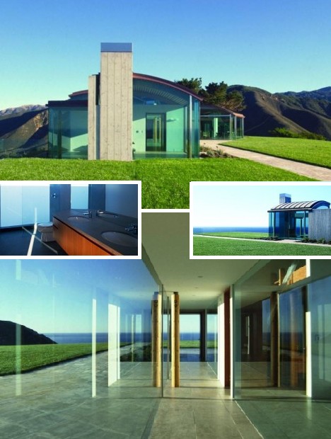
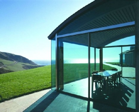
The Division Knoll Residence in Big Sur, California, is located in one of the world’s most visually stunning scenic areas so the last thing architect Daniel Piechota wanted was to detract from nature’s paramount beauty. We think he’s succeeded: thanks to Piechota’s extensive use of clear glass, it’s possible to see right through the house from certain angles.
 (image via: Modresdes)
“It’s not really about the architecture itself, but more about the architecture as a vessel for looking at the view,” explains Daniel Piechota. Indeed, every room – even the bathroom – showcases spectacular views of Big Sur’s esoteric blending of land, sea and sky through enormous expanses of glass.
C-2 House: C You There!
 (images via: A212 and Coolboom)
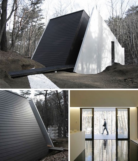
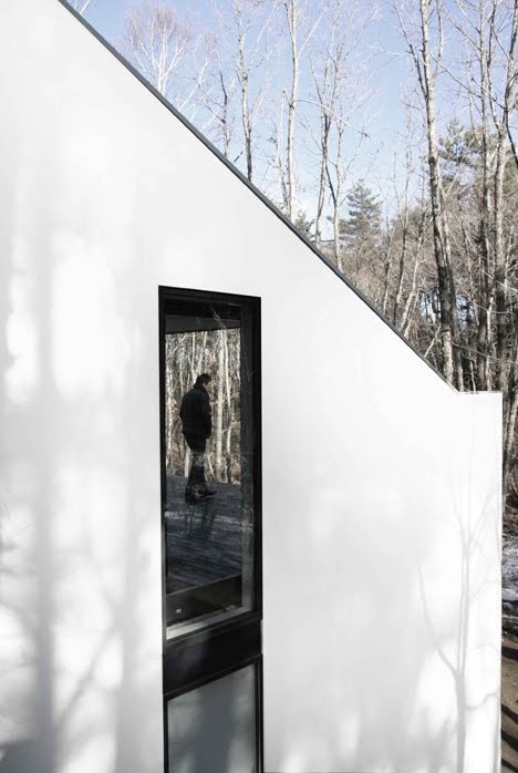
The C-2 House in Yamanashi, Japan was designed in 2006 by Curiosity Inc., whose intent was to blend architecture, furnishings and equipment into a single, co-dependent undertaking. In this respect, the C-2 House takes the concept of blending in a new direction: inwardly. This isn’t to say the house is in conflict with its surroundings – just the opposite in fact.
 (image via: A212)
Yamanishi prefecture is mainly mountainous and forested. The C-2 House looks to the environment for its design cues, such as thin vertical window frames in a contrasting hue and a somewhat jagged, tilted exterior layout that echoes the shapes of the nearby mountains.
 (images via: Coolboom)
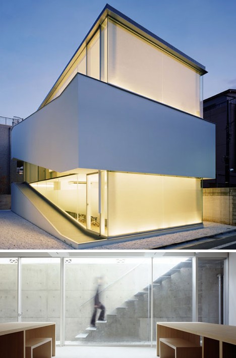
Curiosity Inc. is no one trick pony – just check out the C-1 House (above), the urban counterpart to the rurally sighted and styled C-2 House. Set into metro Tokyo’s concentrated mass of humanity and habitation, the C-1 house relies on simplicity to achieve a balanced existence that is at once firmly grounded yet also connects with the urban environment. The designers chose an overall white color scheme set off by glass walls and light wood flooring to achieve a relaxed mood; a sort of sanctum in the city.
Cube Birmingham: Fractal-abulous!
 (images via: BBC)
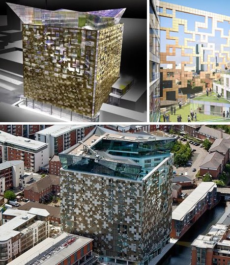
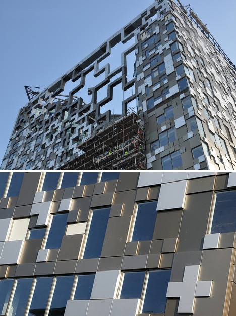
The Cube, though designed to complement the English city of Birmingham’s resurgent downtown jewelry district, has garnered few compliments from design and architecture critics. Are these jibes missing the point? While obviously intended to invoke the concept of the traditional jewel box, The Cube also looks ahead to advanced CAD programming with its stunning “8-bit” facade.
 (images via: Skyscraper City)
Based on the extreme variance of reactions to The Cube, its safe to say the design evokes a wide range of emotional responses based on the personality and preferences of the beholder. A design that looks different depending on who’s viewing it… this may be the ultimate form of blending into an otherwise static urban cityscape.
Disaster Management Park Beans Dome: Serving Disaster Since 2007
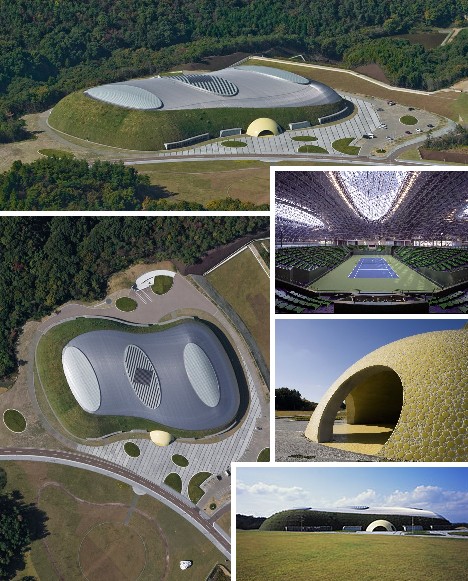 (images via: Treehugger, Forgemind and JA)
Situated in Miki City about 30km (18.5 miles) west of the bustling Japanese port city of Kobe, the Disaster Management Park Beans Dome Tennis Court is, as you already might have guessed, a combination tennis court and “Disaster Management Park”… we’re not sure where the beans come into the equation but hey, who doesn’t love a little mystery? The building was previously highlighted here as an example of Blobitecture, or “blobby architecture”.
 (image via: Archdaily)
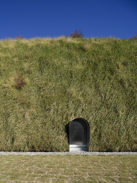
Japanese architect Shuhei Endo designed the 174,000-square-foot building with expandable doors so that in the event of an earthquake, supply trucks can drive right inside to unload. Disasters like the 1995 Kobe Earthquake are rare, however, so much of the time the building serves – pardon the pun – as a stylish tennis dome.
 (image via: Archdaily)
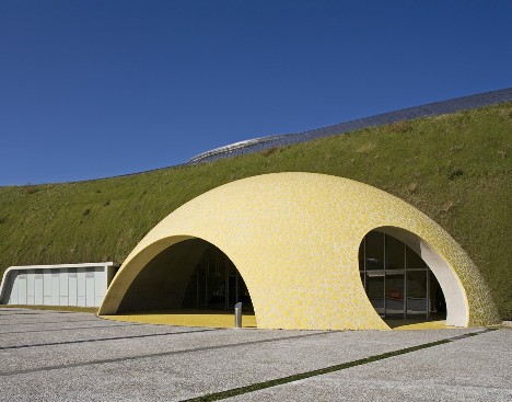
The yellow, tennis ball-like front entrance adds a touch of whimsy to the design and is actually the only part of it that really stands out – living green “cladding” on the walls help break up the obtrusive bloated form that typifies most tennis and golf domes.
Weisman Art Museum: Two Faces Have Eye
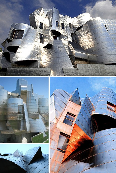 (images via: POPFi and Mosippy)
The Weisman Art Museum in Minneapolis, Minnesota, defies most ingrained concepts of what a large building should be… as do most of architect Frank Gehry‘s designs. It’s difficult to describe what, if anything, the Weisman Art Museum is in a structural sense, it’s easier to express what it is NOT: just another Brutalist expanse of reinforced concrete. Instead, Gehry’s almost freeform design is perfectly appropriate for the building’s artistic, imaginative and speculative content.
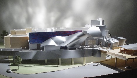 (image via: StructureHub)
Opened in 1993 on the University of Minnesota Twin Cities campus, the Weisman Art Museum overlooks the Mississippi River at the eastern end of the Washington Avenue Bridge. Gehry designed the building to blend in with its background, though said background changes radically depending on the position of the viewer.
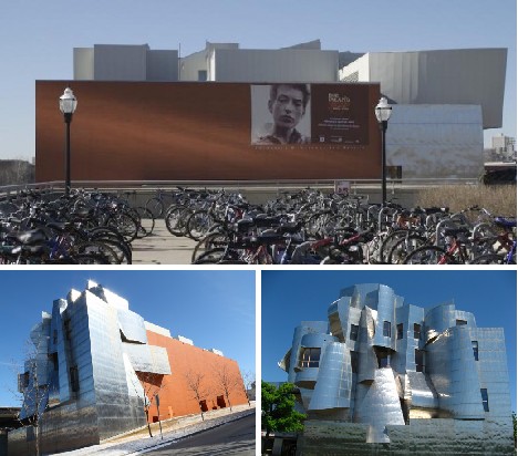 (images via: Weisman Media)
From the campus side, the Weisman Art Museum presents a brick facade that matches the existing brick and sandstone buildings at UM. Move to the opposite side, however, and a riot of stainless steel surfaces challenge the viewer to discern the abstract waterfall and fish which lurk within.
Fitzroy High School: Class Act
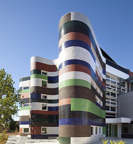 (image via: The Age)
Old School you say? Not the Fitzroy High School in Melbourne, Australia. The $3.5 million, 3-story tall science, art and technology center designed by McBride Charles Ryan shimmers like heat rising off the Outback thanks to radically curved outer walls interspersed with large, long windows. Opened in 2009, the building uses a rich palette of pastel colors including brick red, ocean blue, chocolate brown and leaf green to establish an almost organic vibe that doesn’t just look like it was built, but grew!
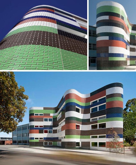 (images via: Think Brick and Job In Design)
Though the colors used for the new Fitzroy High School may seem to clash, in practice they serve to break up the walls into a conglomeration of associated surfaces. The effect is reinforced by the “deliciously wavy” walls, fostering a sense of amorphousness that allows the new structure to seamlessly connect with the older, established school buildings.
Monterey Bay Shores: Coasting To The Finish
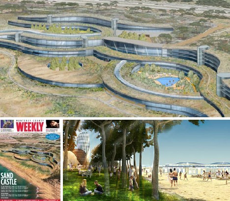 (images via: Inhabitat, Monterey County Weekly and Igreenspot)
Monterey Bay Shores is a massive oceanside development that, when complete, will encompass an eco-resort, wellness spa and luxury residences. The site of the complex is a disused sand mine that operated for over 60 years and severely disrupted the local ecosystem. The builders of Monterey Bay Shores have pledged to restore 85% of the 29 acre site to native plants and animals but the highlight of the project has to be its innovative green roof.
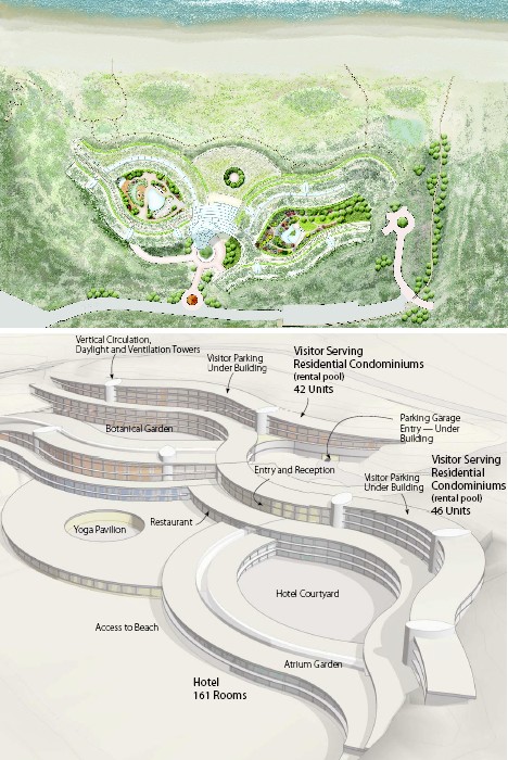 (images via: Treehugger and Archcentral)
Total space on the “living roof” covered with native grasses will be an astonishing 5 acres, allowing water to drain slowly and naturally while at the same time providing a valued stopover for migrating songbirds. The roof, along with the layered and leveled structure of the design, will do much for blending the complex as a whole into the natural geology of the Pacific coast.
Klein Bottle House: Lookin’ Sharp
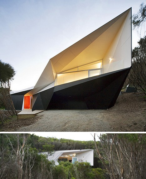 (images via: Gizmodo)
The Klein Bottle House located in Rye, Australia, was designed by McBride Charles Ryan… yes, the same firm that designed the new addition to Fitzroy High School. The Klein Bottle House is very, very different, however. Constructed from soaring sheets of lightweight concrete and midnight black metal that could have come from scrapped B-2 stealth bombers, the Klein Bottle House is the nearest thing to living in a grounded (and enlarged) F-117 Nighthawk fighter jet.
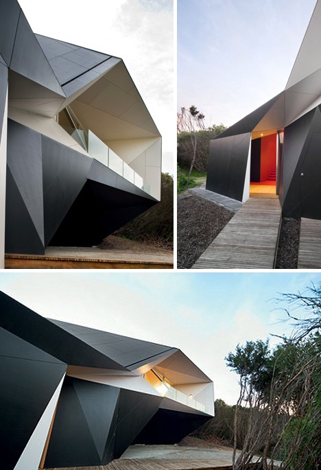 (images via: Designboom)
Jarring and even disturbing at first glance, the Klein Bottle House soon slips into a more comfortable sense of being once its severe lines and acute angles impress themselves on one’s consciousness – or so you’d hope. “I’d rather have a bottle in front of me than a frontal lobotomy”… this is what you get when you choose to have both.
The Stealth Building: A Winging Design
 (images via: Eric Owen Moss, Architeria and John Lopez)
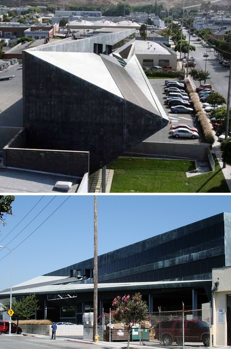
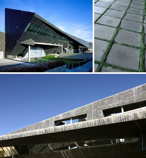
What better way to close an article featuring stealthy buildings then THE Stealth building, housing the office of Ogilvy & Mather and located in Culver City, California. Architect and urban reuse specialist Eric Owen Moss constructed the distinctive building in 1993 on the site of three old warehouses. One of the buildings had leaked toxic chemicals into the soil – the contaminated earth was removed but instead of filling the hole, Moss and associates reshaped the crater to form an outdoor garden theater that can seat 600.
 (images via: Pixelmap, AEworldmap and John Lopez)
The 300-ft long Stealth Building displays a unique cross section, morphing from rectangular at one end to nearly triangular at the other. Exterior bridges and an exposed mezzanine level allow users full access to the typically pleasant southern California weather while opening up the building’s structure visually. “Applaud the clients with the vision to support this building,” said Joseph Giovannini of Architecture Magazine, “and envy the tenants who will step each day into such an intelligent, inquisitive, and mysteriously joyous environment.”