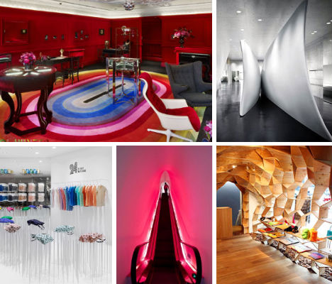
Blood-red velvet, glittering polycarbonate walls, massive sculptural centerpieces and displays that look like modern versions of medieval torture devices: all of these daring design details are carefully conceived to show off clothing, shoes, jewelry, furniture and other goods to their fullest while also engaging our senses, seducing us into spending. From the clever and creative to the absolute avant-garde, these 14 (more!) retail interiors definitely dazzle.
Neil Barrett, Tokyo, Japan
(images via: arcspace)
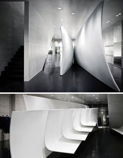
Who else but world-famous architect Zaha Hadid could have conceived and executed a retail interior so sculptural? The main event at this Neil Barrett store in Tokyo is, of course, the curving white room divider that breaks up the space not into rooms but rather a circular passage that encourages movement. Pleats, bends and folds give the sculptural/architectural element visual interest, but rather than overpowering, they complement the minimalism of the wares themselves.
Solange Azagury-Partridge, London, England
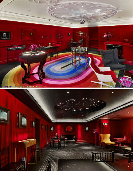
(images via: coolhunter)
Tactile, sensual, dazzling: jewelry designer Solange Azagury-Partridge is a woman who knows what she likes, and when she took on the design of her own flagship store in London, the results were absolutely one-of-a-kind. All of this glitter, red velvet, geometric pattern and turned wood could easily be totally overwhelming, but in a tightly controlled pallette of black, red and white – with a few unexpected rainbow accents here and there – it works.
Lucien Pellat-Finet, Osaka, Japan
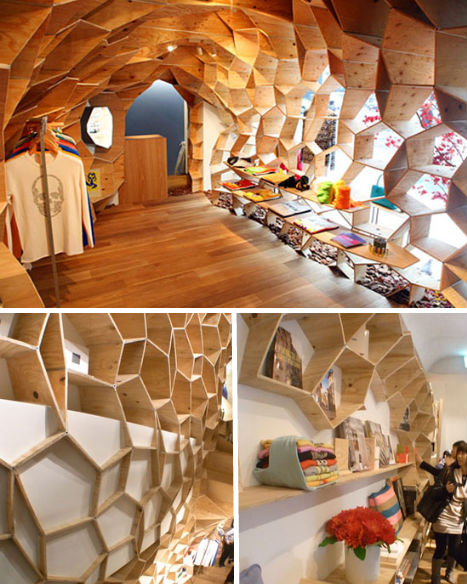
(images via: design boom)
Trippy and organic, the Lucien Pellat-Finet store in Tokyo’s Roppongi district is characterized by normally mundane plywood fashioned into a honeycomb-inspired configuration by interior designer Kengo Kuma. The lively and kinetic feel of the design provides a warm, almost womb-like atmosphere that contrasts with the edgy prints on the clothing sold within.
Ayres, Buenos Aires, Argentina
(images via: design boom)
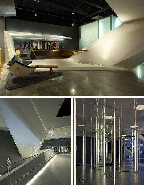
Walking into the Ayres store in Buenos Aires is almost like entering a very chic, modern funhouse: none of its surfaces are quite exactly horizontal or vertical, angles are everywhere, and reflection is so much part of the design that some areas are like halls of mirrors. Architects Tristan Dieguez and Axel Fridman have produced a monochromatic urban space that is full of surprises.
Bosco Pi, Moscow, Russia
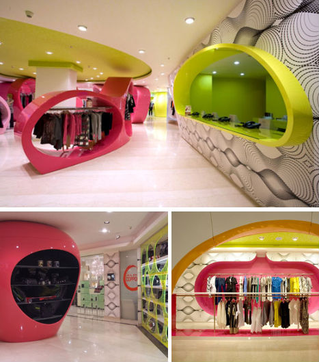
(images via: decodir)
An unprofitable, uninspiring ground floor of a mall in Russia proved to be fertile ground for designer Karim Rashid, who transformed it into a tempting and vivid urban playground that passersby just can’t resist. Rashid, who believes that today’s successful brick-and-mortar stores must absolutely dazzle to compete with internet sales, says “I designed this boutique lifestyle of young people as a labyrinth constantly changing, thanks to visual obstructions. Sensuality, the elements are designed around a vast network of columns that have certain functions that define different shopping experiences.”
Barbie Store, Shanghai, China
(images via: arch daily)
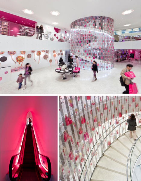
What more could you expect from a Barbie emporium than this: a gleaming, crystalline palace where pink reigns and Barbie herself is present by the thousands in all of her best party frocks? Slade Architecture granted Mattel’s wish to make the Barbie Store in Shanghai, China a place were “Barbie is hero” with lots of translucent polycarbonate and neon pink lighting. Pearlescent, mirrored and lacquered surfaces abound and everything is glamorous in that psuedo-1950s, plastic kind of way.
Jan Jansen Shoes, Amsterdam, Netherlands
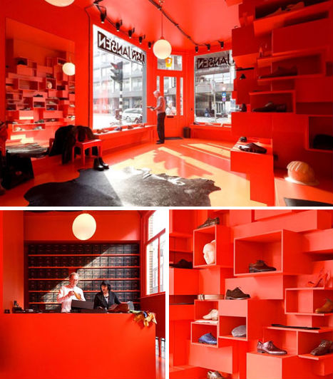
(images via: coolboom.net)
Normally, the combination of blood red and matte black might look vampiric and intimidating, but in the hands of architect Lok Jansen, it’s simply stunning. This Amsterdam retail store showcases designer Jan Jansen’s world-famous shoe designs as if they’re modern art in a gallery, which is indeed sort of what they are. Jansen’s experimental shoe designs demand an unusual setting, and they definitely get it in this case.
24 Issey Miyake, Tokyo, Japan
(images via: design boom)
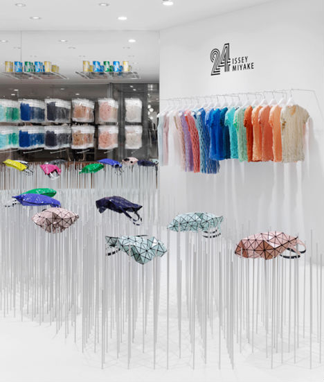
How do you highlight the changing form of a bag that looks different depending on how it falls? Design studio Nendo came up with a novel solution: steel rods at staggered heights, which not only show off the unusual bag design to its fullest, but make displayed wares appear as if they’re floating.
Ami-e-Toi, Arnhem, Netherlands
(images via: maurice mentjens)
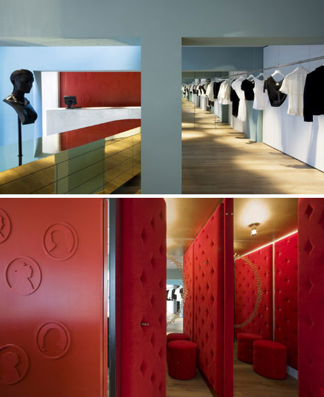
Dutch designer Maurice Mentjens gave Ami-e-Toi in Arnhem Netherlands a sleek and feminine look fitting for the fashion sold by the shop. Mentjens sought to translate the label’s blend of classic and modern styles with a fresh blue-and-red color scheme juxtaposed with busts and cameos. Most stunning are the luxurious tufted velvet fitting rooms, complete with matching stools.
Lourdes Bergada, Barcelona, Spain
(images via: coolboom.net)
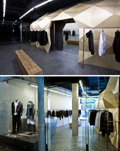
1,000 pieces of beech wood came together to form the faceted store-within-a-store at Lourdes Bergada in Barcelona, which provides just a hint of texture in an otherwise very minimalist space. The industrial feel of the store with its steel, concrete and wood beams echoes the Lourdes Bergada aesthetic for a cohesive overall feel that is still visually engaging.
Delicatessen, Tel Aviv, Israel
(images via: dezeen)
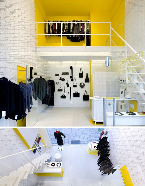
Reminiscent of the 24 Issey Miyake steel rods, Delicatessen’s array of pegs covering the entire expanse of two walls is functional, adaptable and stylish, turning a rather un-hip material into an arresting design detail. The pegboards make it easy to change up the display of clothing on the wall at a moment’s notice and give the walls a spiked look – resembling, from afar, a sort of cheerful torture chamber.
Camper, London, England
(images via: design boom)
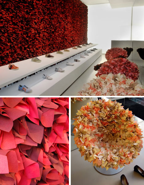
The danger of having a wall this tactile is that customers might be tempted to crawl right over all of those shoes so they can run their hands over all that soft-looking red fabric. But then again, why do that when they can sink down into soft bouquets and try on lots of fancy shoes? Designer Tokujin Yoshioka made an intriguing and feminine choice for the Camper store in London, choosing a bold accent color that actually does draw the eye right to the product display.
Derek Lam, New York, New York
(images via: dezeen)
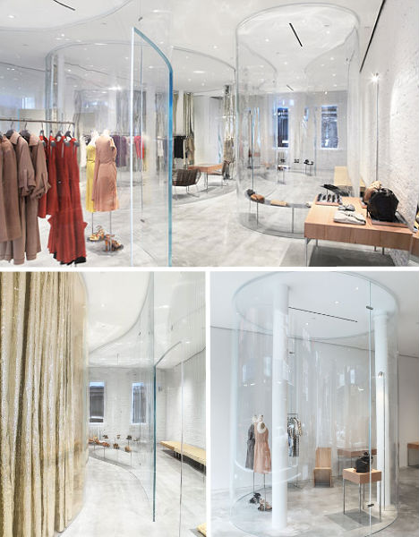
“Minimalist, functional, intimate and warm” – that’s how Derek Lam describes the space created for his retail store in New York by SANAA, where curved acrylic walls allow the designer’s clothing to shine. The acrylic divides up the space into little niches for groupings of clothing and accessories, but allows lots of natural daylight in and an uninterrupted view of the entire store. Whitewashed brick walls and shimmering metallic gold curtains add some texture and shine.
United Nude, Amsterdam, Netherlands
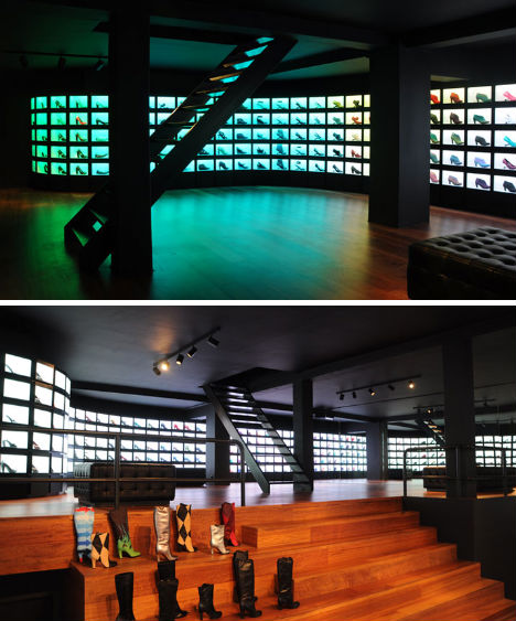
When shoe brand United Nude needed a new retail space in Amsterdam, they needed to go no further than to their own co-owner and co-designer, Rem D. Koolhaas – nephew of renowned architect Rem Koolhaas, from whom he clearly learned a few tricks of the trade. The United Nude flagship store puts all of the focus on the shoes by placing them in an illuminated wall display, with all other parts of the store left in relative darkness.
