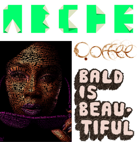
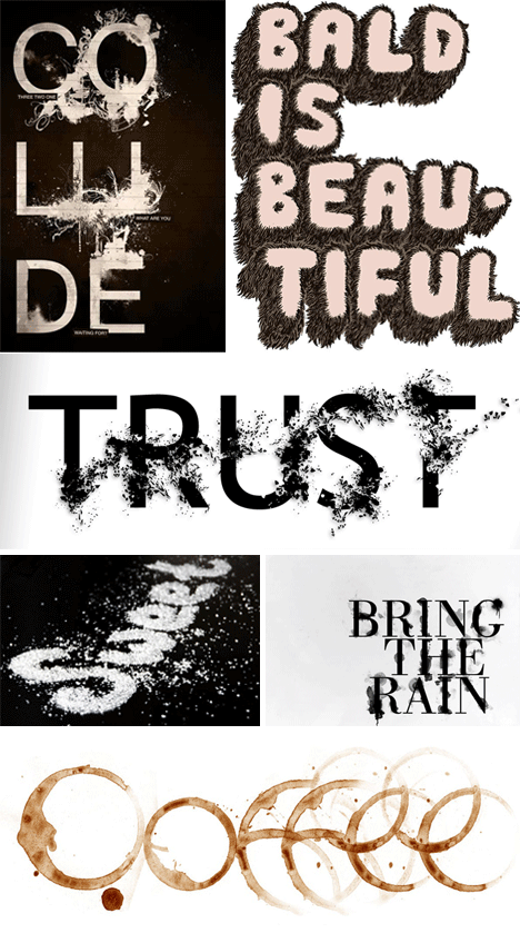
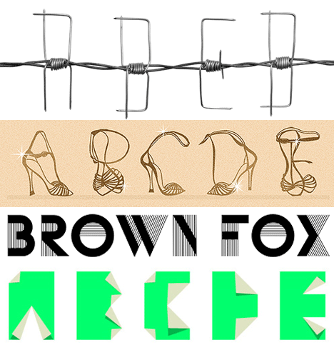
The most the layman knows about Typography tends to be that Comic Sans is inappropriate for business correspondence and that Times New Roman works just fine. Beyond the most basic fonts in your favorite word processor, there is an entire artistic movement pushing forward the quality and variety of typographic styles.
(Images via freelancewebdesigner, freelancewebdesigner, cretique, smashingapps, seattlegraphix, smashingapps)
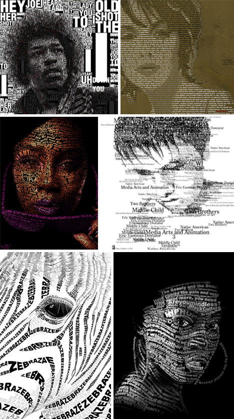
A picture is worth a thousand words, but a thousand words can also create a picture. If someone had handed Gutenberg a paintbrush, it wouldn’t be surprising if he had come up with something along the lines of these portraits.
(Images via thisiscolossal, typeandimage, antsmagazine, brandclay, monsteractive, parsons)
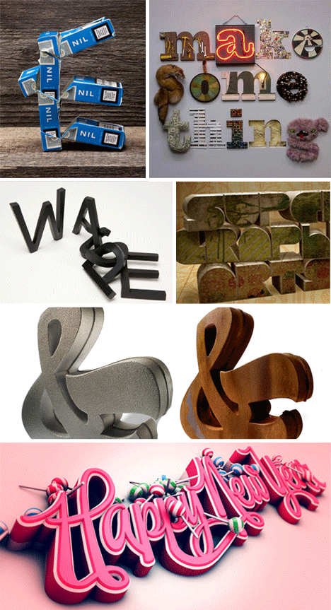
When a font emerges into three dimensions, it’s able to convey emotion in a way not typically experienced on the page or screen. Some artists celebrate the effect something as simple as a stylish font can have on us, by bringing it into three dimensions and lending it a physical dimension that makes it more real.
(Images via thisiscolossal, sixrevisions)
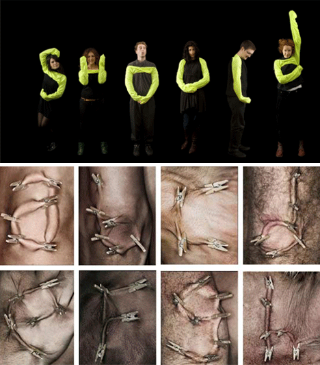
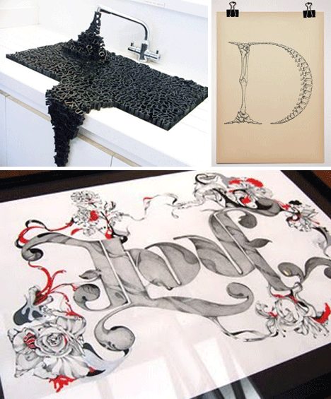
People can create fonts too, but not always in a way that’s appealing to the eye. Artists will sometimes try anything to snap people out of their reverie and pay attention; even if it requires a little pinch.
(Images via scene360, outtheway)
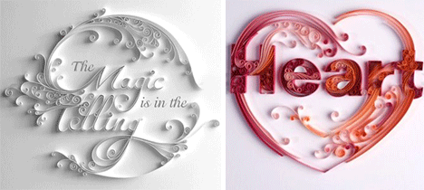
Words made out of paper are a unique twist in the art department. Whether one hangs these on their wall, or keeps them laying down on a desk, they would be an excellent reminder of the beauty of the written word.
(Images via squidoo, 1stwebdesigner, thehypeoftype)
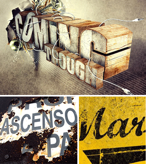
Some typography lovers embrace the real down and dirty grunge style, adding rust and vintage fading into their fonts with reckless abandon. It’s good to be reminded that words are not always clean and detached – they are a very real part of our everyday existence.
(Images via iheartguts, alias3dmedia)
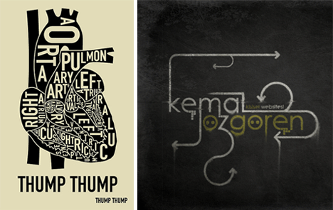
Words can be an integral part of any art project, blending the visual with the written allows a viewer to interact more deeply with the art.
(Images via typedimage, anamorphosis-kate, sirdab)
Some typography art is simply beautiful. Other artists take their work to exhibition calls and attempt to send a clearer message than can be achieved through words alone.
(Images via anoizes, idnworld, invadespace, photoshopwebsite, oneradiotabaco, smashingapps)
The perfect bridge between a word and its meaning involves a visual representation of the word’s definition. The word “coffee” spelled out in coffee stains is a great example of fusing emotion with design.
(Images via thisiscolossal, cravogolina, beautiful-views, thisiscolossal)
Looking at the font list in any modern word processing program makes it seem like there can’t be much more to create. How many variations on such simple shapes can their be? The incredible influx of new and exotic typefaces are a clear repudiation of anyone who claims the end of typography is near.
