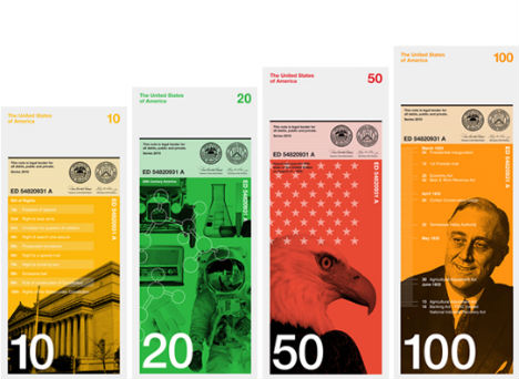
What if thoughtful design, in which aesthetic concerns shared top priority with practical ones, were able to infiltrate every aspect of our lives? Even the bank notes in our pockets would be works of art. Artist Dowling Duncan imagines just such a scenario with ‘The Dollar Redesign Project’.
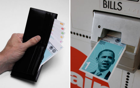
First and foremost, Duncan has changed the size of each bank note so that it’s easy to distinguish by value. The one-dollar bill is the shortest and the hundred-dollar-bill the longest, so there’s less awkward fumbling for the correct amounts.
The horizontal format of the United States bank note is switched from horizontal to vertical. Duncan told Design Boom, “When we researched how notes are used we realized people tend to handle and deal with money vertically rather than horizontally… the majority of people hand over notes vertical when making purchases. All machines accept notes vertically. Therefore a vertical note makes more sense.”
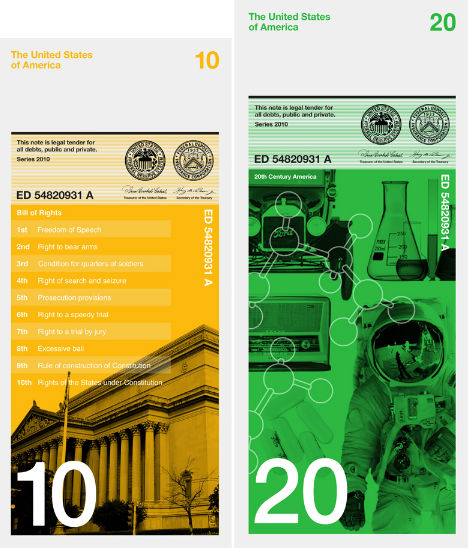
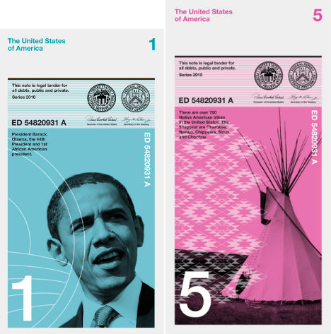
Furthermore, the notes are each given a different color, making it even easier to distinguish them from one another. Duncan has also assigned imagery to each that he feels represents their value. For the one-dollar bill, the first African-American president. The five biggest Native American tribes are shown on the five-dollar bill. The ten-dollar bill features the ten amendments in the Bill of Rights, and the twenty represents twentieth-century America.
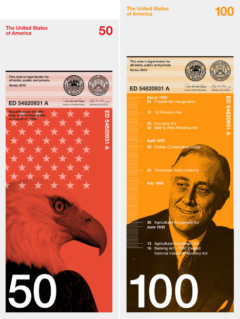
On the fifty-dollar bill are the fifty states of the nation, and on the 100 are the first one hundred days of President Franklin Roosevelt, which helped fight the economic crises during the time of the depression. See more designs from other artists and for other nations at the Dollar Redesign Project blog.
