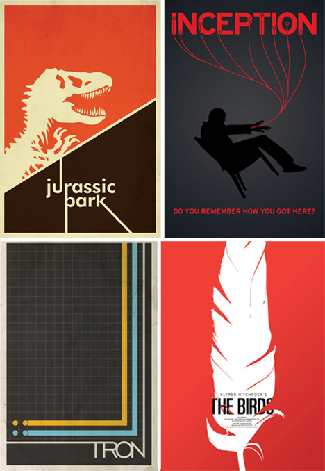
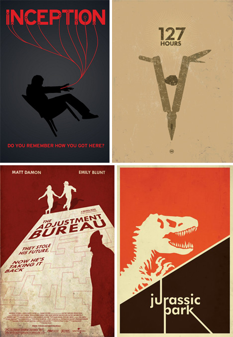
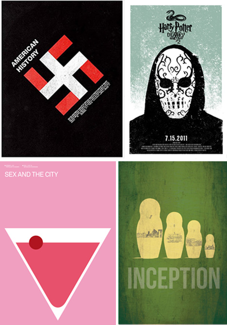
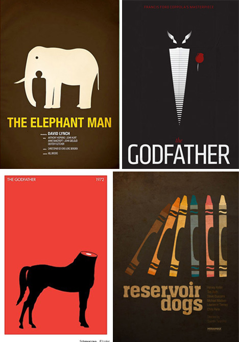
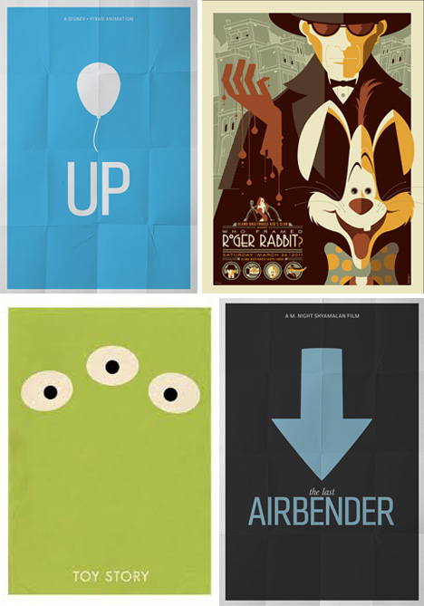
Modern society is built on a “more, more, more!” mentality that has leaked into movie marketing. Minimalist posters take a more bare bones approach. Minimalist posters are recreations of classic poster examples, that take a bare bones approach and leave some elbow room.
(Images via buzzfeed, bavatuesdays, nerdeux, liveforfilms)
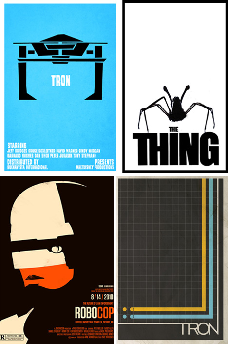
These classic science fiction movies are given a reworking in what becomes a gorgeous exhibition of the less-is-more mentality. The silhouette of a well-known object serves as a symbol for the movie as a whole.
(Images via boingboing, mymodernmet)
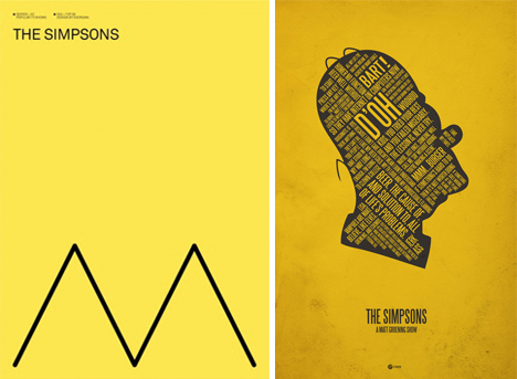
Minimalist artists often see how bare-bones they can go and still convey the message. A few lines from Bart Simpson’s hair, and you have a poster. The fact that such minor details are so readily recognizable are great testaments to the power of the Simpsons’ brand.
(Images via thanley, boingboing, ohhhshot, ryanfmc)
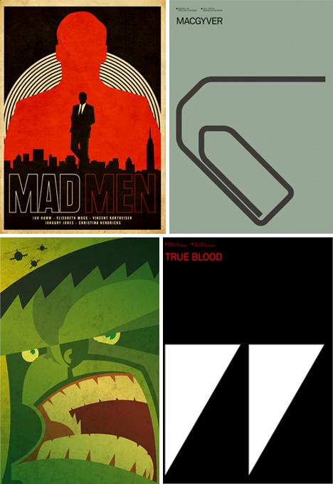
Television shows are not immune to the minimalist treatment. True Blood becomes two fangs, Macgyver is broken down to a paperclip… A more vintage look is also popular, as shown in these examples from the Incredible Hulk and the always classy Mad Men.
(Images via anadergretley, listal, horror-movies, popwatch)
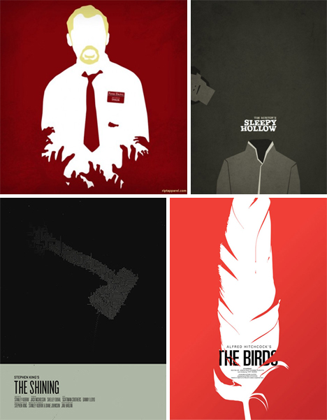
Feel that tingle down your spine? That’s the effect of seeing horrifying good horror movie art. These posters display memorable symbols from classic scenes. The wide open appearance is refreshing and captivating.
(Images via comicbookmovie, abduzeedo, latestnew, dontstandtheregawping)
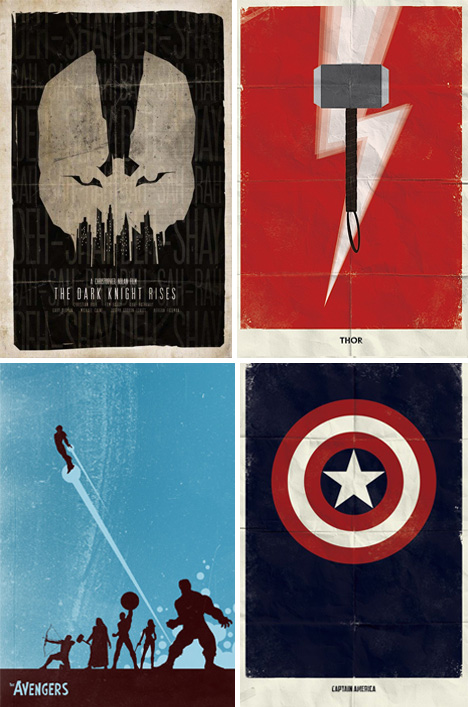
Superhero movies have surged back into popularity. To counter-balance the super slickness of these new graphic bonanzas, here are a few vintage, toned-down examples of superhero posters from an alternate universe.
(Images via jeffisageek, flavorwire)
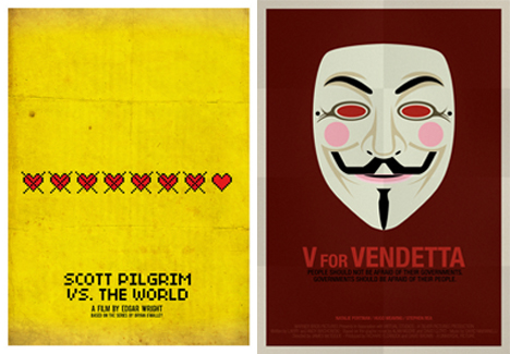
Two fantastically popular graphic novels have been re-imagined in these examples. Simple lines and colors are reminiscent of the videogames Scott Pilgrim Vs. The World celebrates, and the famous mask from V for Vendetta is used to great effect in its re-worked poster.
(Images via wgsl-hbn, joearevaloadam, wtfpixel, neatorama, bavatuesdays)
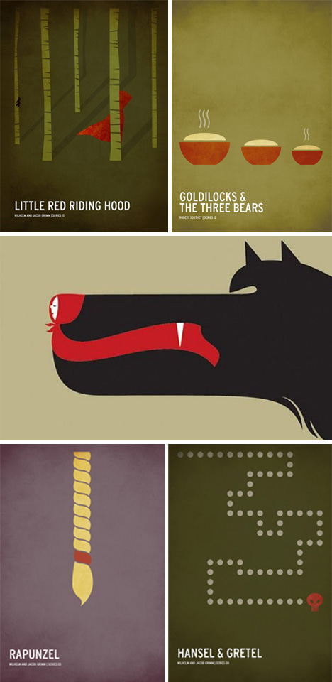
Classic fairy tales are full of symbolism, and it’s no surprise that they’d be given the a toned down look.
(Images via humorsurf, listal, astonishingadventures, listal)
These posters of more modern films would look great on any wall. It makes one wish that movie distributors would think outside the box and give some of these classy examples a real shot.
(Images via dailylinked, listal, pinterest, trendland)
Breaking down a complex film into its most basic, compelling parts is not easy, and it can be truly satisfying to see.
(Images via glimpse-it, designerbooster, listal, urlesque)
These classic film posters use in-jokes and famous scenes to call forth an emotional reaction from anyone who has seen them. It may not be the best marketing device, but it certainly works from an aesthetic perspective.
(Images via mousekeblog, designordeath, floobynooby, whatthemovie)
Appealing to children typically takes bright colors and a lot of splash. These vintage and spare posters turn that idea on its head, and become much more appealing to adults in the process.
