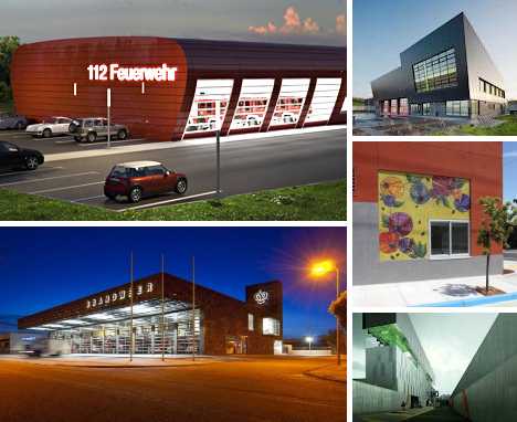
When it comes to fire stations, simplicity and usability are foremost but that doesn’t mean form has to take a back seat to function. These 12 hot designer fire stations are hook & ladder leaders in more ways than one, combining WYSIWYG practicality with livability, economy and style.
Brandweer, Weert, The Netherlands
 (images via: Revolutioner and Contemporist)
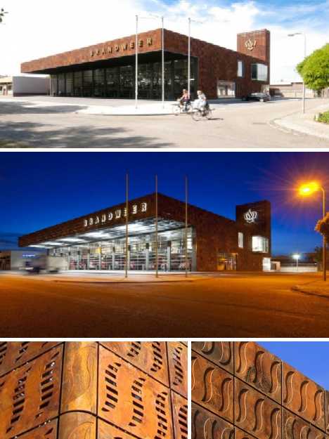
By day or by night, the Weert Fire Station designed by BDG Architects displays a cool modernist vibe tempered by the use of cast steel earthtone panels on its exterior walls. The stylized “fire” patterns embossed into the panels age naturally under the influence of the weather but their rusty hues manage to evoke the image of smoldering embers.
 (images via: Revolutioner and Contemporist)
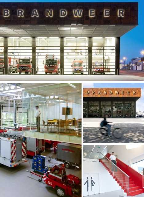
Inside, carefully considered space management and a conscious effort to introduce exterior light results in a comfortable, livable area that minimizes the need for energy-intensive artificial lighting. Translucent doors on the fire engine bays invite outside observers to view the station’s workings while contributing to the refreshingly light atmosphere within and throughout the structure.
Fire Stations Leipzig, Germany
 (images via: Tagebau)
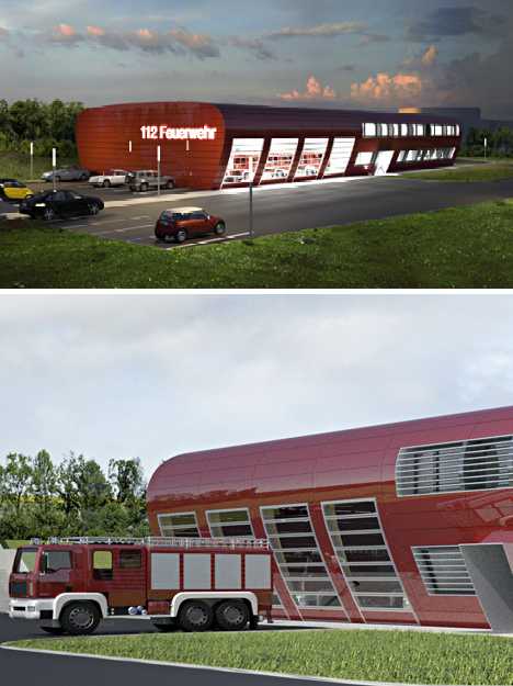
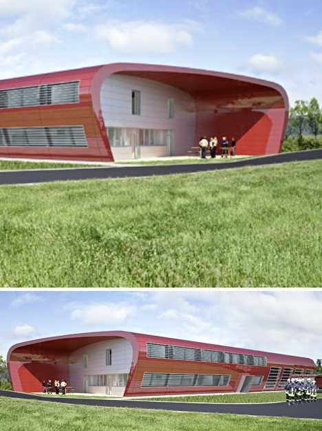
When Tagebau Architekten + Designer were invited to submit their design for a trio of identical feuerwehr (fire stations) in Leipzig, Germany, they focused on keeping costs down through economies of scale. The result was the sleek, modern structure above that resembles a cross section of an airfoil. An extension of the outer walls on one end of the building creates a sheltered outdoor space where station staff can congregate and interact.
 (images via: Tagebau)
Another important consideration was the need for the projected stations to be environmentally friendly. By integrating the 4 engine bays smoothly into the building’s structure, thermal transmission through the exterior skin is minimized without affecting the firefighters’ need to access the engines quickly and conveniently.
“Ave Fenix” Fire Station, Mexico City
 (images via: AP Architecture-Page)
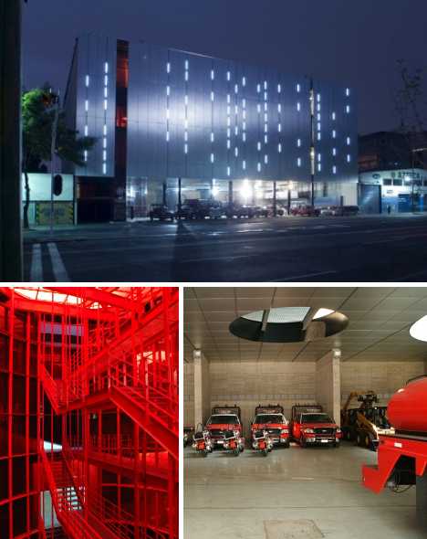
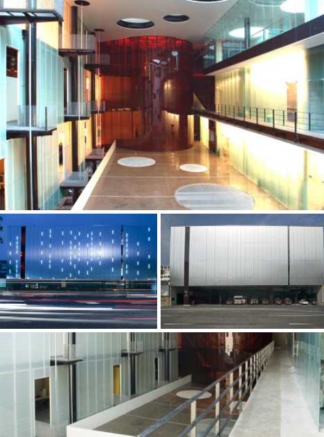
The Ave Fenix Fire Station by BGP Arquitectura was designed as a high boxlike shape that “almost disappears after the facade.” The use of complementary colors and materials combined with a plethora of slit-like windows that soften the structure’s shape at night help the station blend in with the surrounding urban scene.
 (images via: AP Architecture-Page)
Inside, the designers have taken full advantage of the “big box” plan so as to create a sense of brightness and openness, cancelling out any claustrophobic impressions that the lack of large windows may possibly engender.
Vitra Fire Station, Weil am Rhein, Germany
 (images via: Cheetah_flicks, Dom Dada, Modern Architecture Center and Wojtek Gurak)
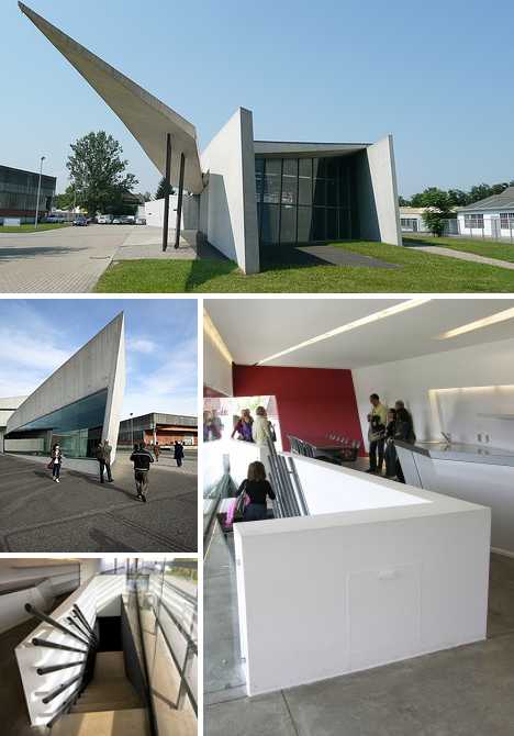
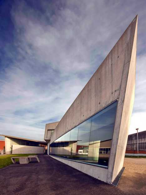
Iraqi-British architect Zaha Hadid kicked off her stellar career in a big way with the Vitra Fire Station in Weil am Rhein, Germany. Four years in the making, the station was competed 10 years before Hadid was awarded the prestigious Pritzker Architecture Prize in 2004.
 (image via: Wojtek Gurak)
The Vitra Fire Station gives the appearance of a bird in flight from afar. Closer in, one can see the structure of the building formed from a series of sharply angled flat planes that come together to create a stunning three-dimensional interior space. Ironically, the impetus for this stunning station was a 1981 fire that caused extensive damage to the Vitra design campus in Weil am Rhein. The Vitra Fire Station’s true purpose is to preclude the possibility of such a destructive fire occurring in the future.
Fire Station in Porto Santo, Madeira, Portugal
 (images via: Arch Daily)
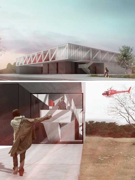
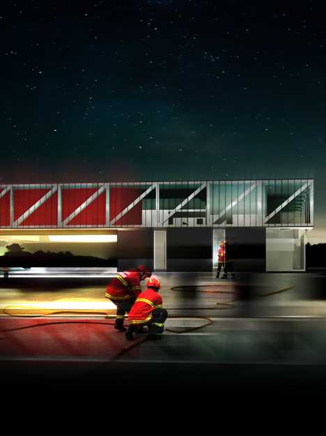
Luís Banazol’s entry in a design competition for a proposed fire station in Porto Santo, Madeira, Portugal emphasizes ease of construction taking into account a site with irregular geometry situated on a small slope. Though steel and concrete are the materials of choice, Banazol’s design appears light, airy and open while retaining ease of access and superior functionality.
 (image via: Arch Daily)
The proposed fire station is actually larger than it appears, consisting of a two-story above ground building with large open areas and an integral basement. The size of the building’s component features was dictated by specifications suggested by Portugal’s National Fire Service, challenging Banazol to create a distinctive design within very narrow parameters – a challenge which he seems to have met admirably.
Porte Pouchet Fire Station + Municipal Motor Transport, Paris, France
 (images via: FF3300 and Arch Daily)
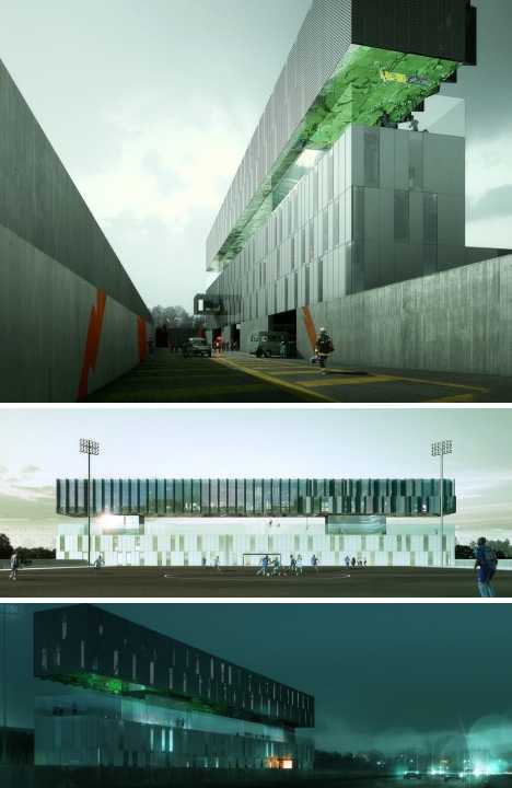
French architects Jean-Marc Ibos and Myrto Vitart have a soft spot for firefighters – how else to explain the Porte Pouchet Fire Station + Municipal Motor Transport in Paris, France? The post-modernist multi-level structure includes a restaurant and a glass-fenced terrace with a running track while just outside, a regulation-sized soccer field offers a grassy expanse for practicing The Beautiful Game.
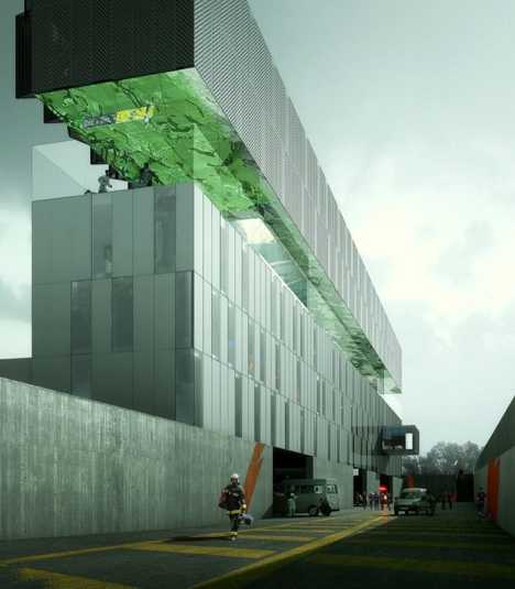 (image via: Arch Daily)
It’s not ALL fun & games for the firefighters at Porte Pouchet, however. Interior space includes bedrooms for up to 50 firemen, workshops and administrative offices. One singular design feature stands out: the terrace ceiling is made up of a mirror-polished sheet of stainless steel perforated by acoustic insulation. The design acts to trap noise from the road outside and prevent it from reflecting into the building below.
Fire Station 18, Oakland, California
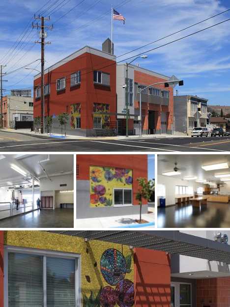 (images via: Architecture-View and Inhabitat)
The Oakland Fire Department’s Fire Station 18 may look red thanks to its brick walls but it’s actually green, inside and out. Designed by Shah Kawasaki Architects to be an environmentally sound and toxin-free replacement for a demolished traditional fire station, Fire Station 18 was built with sustainable materials and features x natural ventilation system and a radiant-heated floor. These efforts paid off when the completed station was awarded LEED Gold status. Community involvement was arranged by contracting out the building’s outside wall decor to a public art project, created by artist Laurel True.
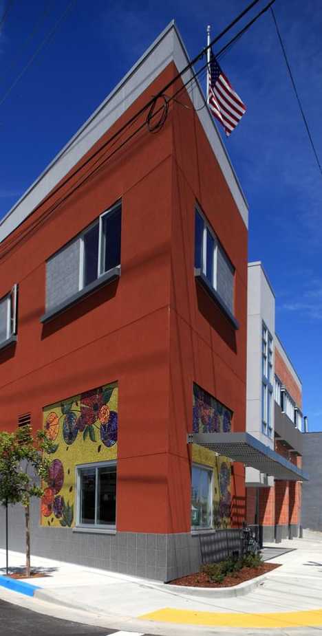 (image via: Inhabitat)
Fire Station was not only designed to be green, it’s environmentally friendly in its daily functions as well. features include a solar hot water heater, a highly efficient HVAC system, denim insulation and cool roofing materials. Community involvement was arranged by contracting out the building’s outside wall decor to a public art project.
Fire Station, Radebeul, Germany
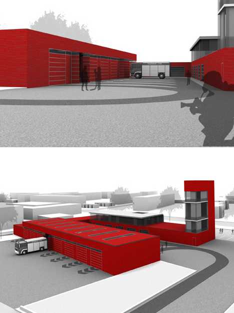 (images via: Tagebau)
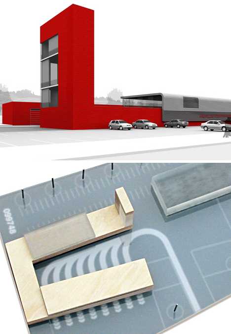
Tagebau Architekten + Designer’s proposal for a fire station in Radebeul, a suburb of Dresden, Germany, was designed on a clean slate. It looks like it’s made from clean slate as well: slab sides and an ultra-clean profile speaks of no-frills, bare bones modern aesthetics.
 (images via: Tagebau)
It may be unadorned but Tagenau’s fire station is anything but inefficient. The structure assumes the form of an open-ended courtyard to facilitate community use, while the engine exits are positioned so that the bulk of the building blocks sound from reaching a nearby housing development.
Monaghan Fire Station, Monaghan, Ireland
 (images via: Architecture News Plus)
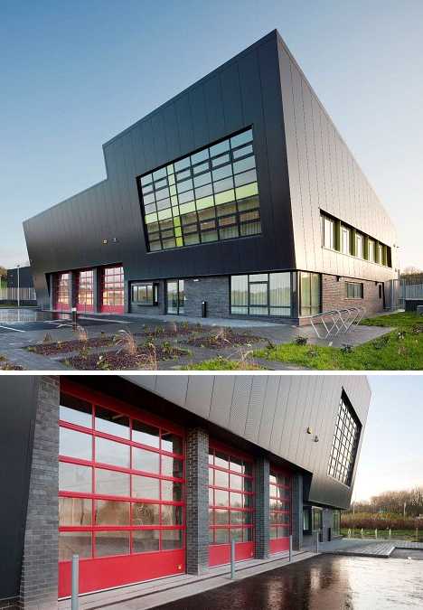
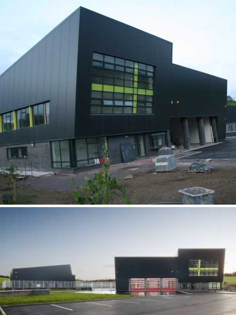
Designed by Van Dijk International, the Monaghan Fire Station features a noticeably tilted front façade “expressing the readiness of the fire brigade to respond quickly and efficiently to an emergency.” Yellow accents on the main windows and red framed engine bay doors contrast with the building’s deep gray brick and cladding while evoking the colors traditionally associated with firefighting.
 (images via: Geograph and Furniture Fair)
The station’s design incorporates 6 dedicated vehicle bays, a drill tower for training, a CCTV system, workshop areas and a canopy area for smokers. Yes, smokers… well, it’s not as if they’re going to start a fire or anything.
Clovis Fire Station No.5, Clovis, California
 (images via: Masonry Systems and Jazzportraits)
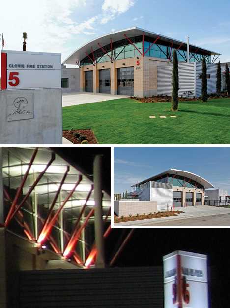
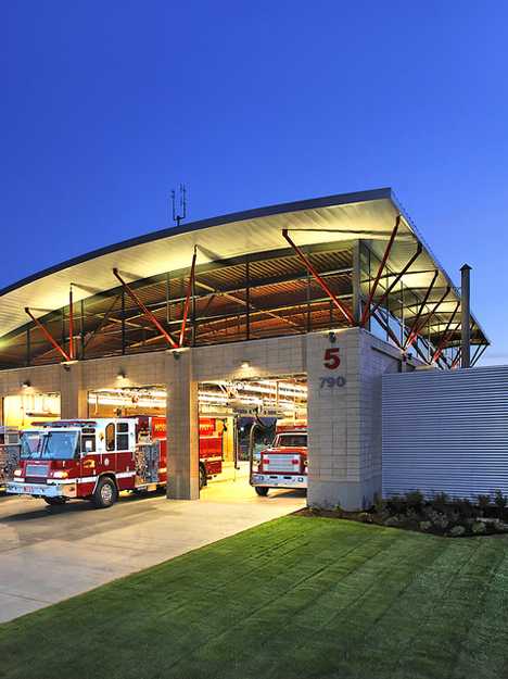
Completed in 2007, Clovis Fire Station No.5 was designed by Don Dommer Associates and is a triumph of sustainable design. Its construction involved the extensive use of recycled and low-pollutant materials while natural lighting was maximized through the use of clerestory lighting, shaded windows and a skylight over the front entry.
 (images via: Arc Hop)
The 10,500 square foot station houses a crew of 6 and features a conference room, kitchen & dining area, a day room, fitness facilities and an 80-ft. apparatus bay. An open truss roof system supports a gently arching steel roof sheltering the three-bay engine and service garage.
Fire and Rescue Services Building, Libourne, France
 (images via: ArcelorMittal)
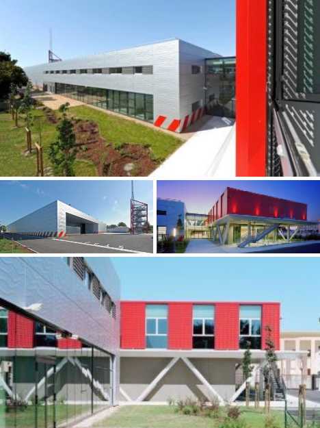
Designed by Atelier des Architectes Mazières and Agence Ragueneau et Roux and completed in 2009, the Fire and Rescue Services Building in Libourne, France, is made up of two complementary structures: a silver-colored technical structure housing the firefighters’ living quarters and equipment and a mainly red administration block containing offices and training facilities. A simple, monolithic fire tower gives the station its identity as well as serving for training purposes.
 (image via: ArcelorMittal)
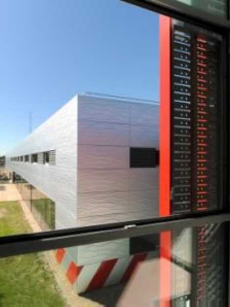
As the facility was conceived as being environmentally friendly both during and after construction, heavy use was made of 100% recyclable Aluzinc which is steel clad with a weather-resistant aluminum-zinc alloy. The Aluzinc panels making up the exterior walls are stamped with a wave pattern, meant to symbolize the importance of water to firefighters and firefighting.
Bergen Brannstasjon, Bergen, Norway
 (images via: ArchitectureLover and Urbika)
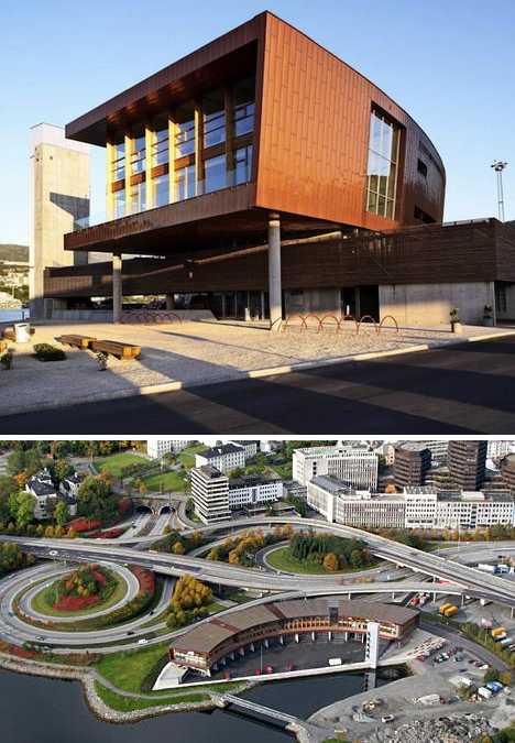
The sweeping layout of the Bergen Brannstasjon (fire station) curves inwardly against a small lake highlighted by a flying bridge and an asymmetrically placed drill tower. The design, by Oslo-based architects Stein Halvorsen Sivilarkitekter, strives for sustainability while adding one more appealing public component to Bergen’s vibrant lakefront area.
 (image via: Top Box Design)
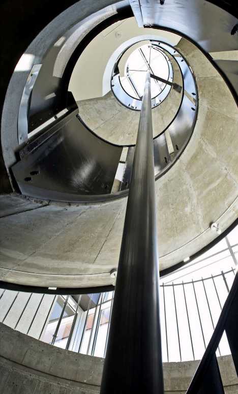
What’s a fire station without a fire pole? The Bergen Brannstasjon’s fire pole has also undergone the designer treatment. Retaining its uncompromising functionality, the pole is surrounded by varying textured materials and open views to the outside that act to bring light into the building during the day.
![]()
 (image via: StrangeCosmos.com)
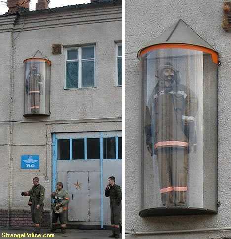
“In case of emergency, break glass”… this unorthodox fire station located somewhere in Eastern Europe goes one further by putting a fireman (a dummy, we presume) in a glass bubble protruding out from the station’s upper level. It seems a bit too far away for someone at street level to break the glass – perhaps that’s the intention.