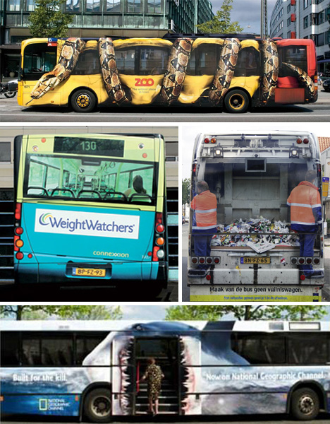
Cash-strapped municipalities are doing anything and everything they can to lighten the load on their budgets. This means monetizing everything possible, including public transportation. Bus ads are nothing new, but like most marketing it’s a field that’s becoming increasingly sophisticated.
(Images via frederiksamuel, funniest-commercials, tumtumtree, toxel)
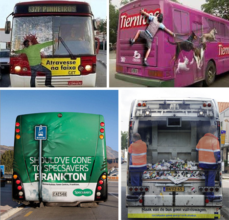
Buses don’t typically make nature come to mind, but adding a little bit of action can make these ads engrossing. The detail is incredible.
(Images via topdesignmag, bigsislilsis)
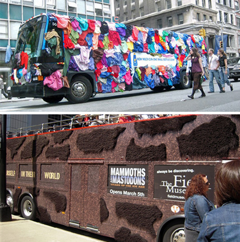
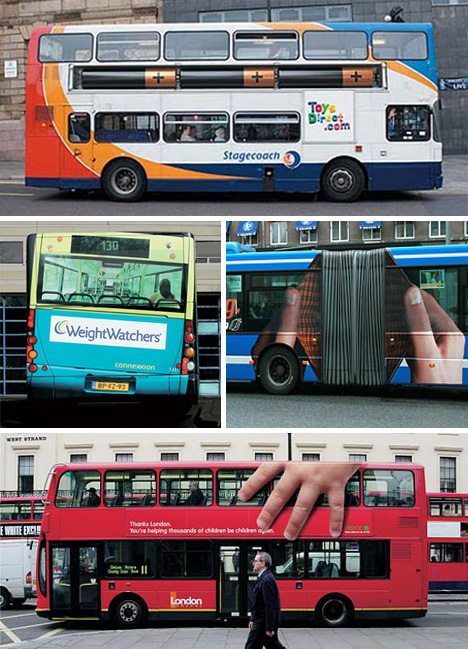
Some advertisers opt to pay quite a bit extra and break through the wall of a static, flat advertisement by adding a bit of texture. When city-dwellers see something this out of the ordinary, it’s sure to draw some attention.
(Images via walking-billboards, dynamicbusads, xcitefun, freshpics)
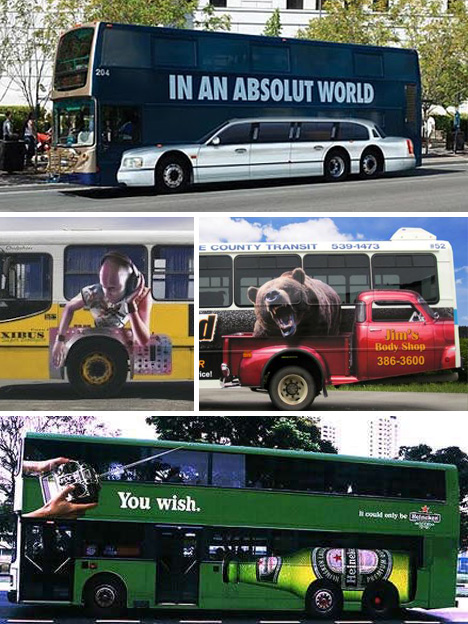
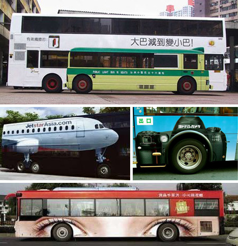
Use the wheels of the bus to the ad’s advantage! Bus wraps can be used in a million different ways to create visually compelling content. Don’t be boring.
(Images via adsoftheworld, smosh)
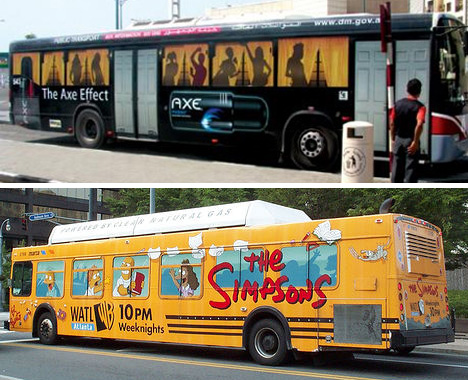
These buses are a party! Just look through the windows and you’ll see some wild happenings. Thankfully the bus riders are still able to see out these windows, or it would be a pretty dismal development.
(Images via funtoxin, demilked, demilked, demilked)
Advertisers take note: use the features of the bus to your advantage! By integrating the ad design into the overall structure of the bus, ads can be much more visually appealing.
(Images via nsmb, pagog, adland, frederiksamuel)
Very careful artistry can make a bus ad look incredibly realistic. All of these bus wraps force a double-take.
(Images via illusionking, villageofjoy, dynamicbusads, zuzafun)
The use of tires within an ad turn one of the most mundane and forgotten aspects of the bus into the ad’s defining feature. These bus wraps look a lot more realistic than they would if the tires were just wasted space.
