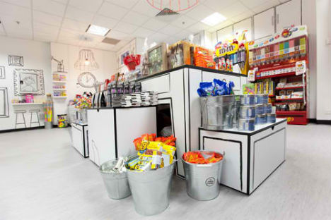
Some candy shops are so colorful and chaotic, you’re not sure where to look. That kind of wild Willy Wonka-esque environment can certainly be fun, but sometimes, simplicity is what it takes to make the truly important element stand out: the candy itself. RED Design Group gets sketchy with a black-and-white store for Candy Room in Melbourne, Australia.
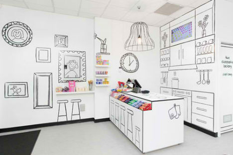
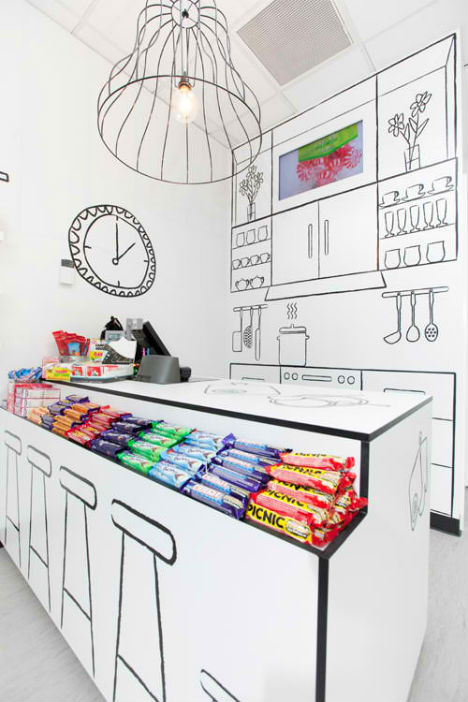
Sweet Enough, a wholesale importer of sugar-free candy products, wanted to break into the retail market with a store that would be “a destination and an experience.” RED Design Group captured a childlike spirit with hand-drawn details like a kitchen, stools and books on stark white surfaces.
“Being strongly influenced by the idea of designing a playful, simple and somewhat illusional space for the Candy Room, the exaggeration of a ‘room’ idea was formulated,” say the designers. “The application was to use line artwork on white space to represent a room.”
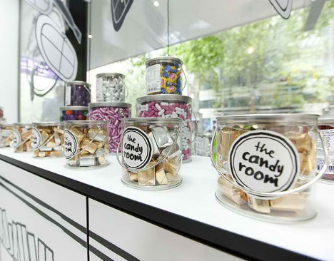
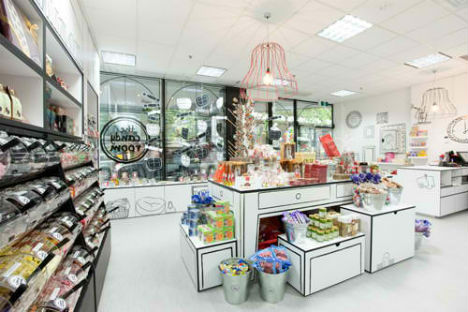
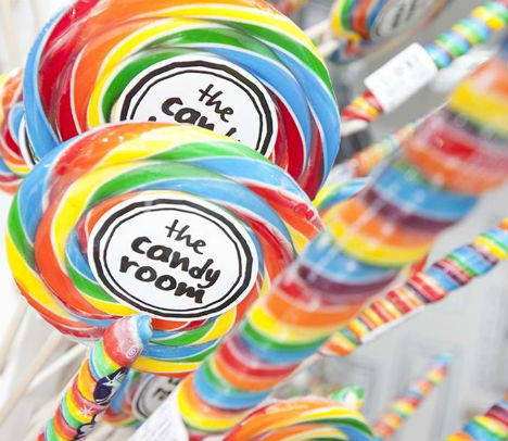
They extended the same theme to the store’s branding and packaging, with labels and signage casually hand-written. Walking into the store, visitors are immediately greeted by the bright coloring of the canned packaging, eyes drawn to lollipops, chocolate bars, caramels and much more.

