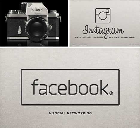
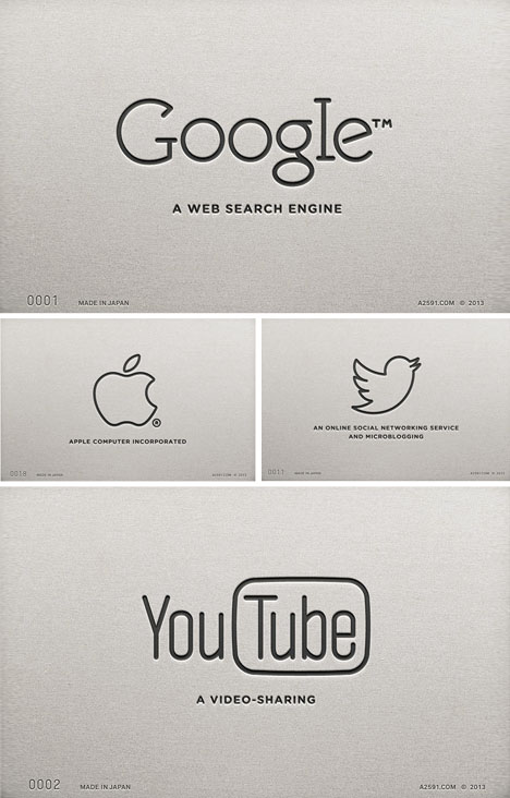
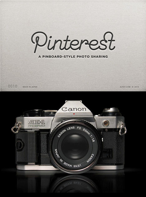
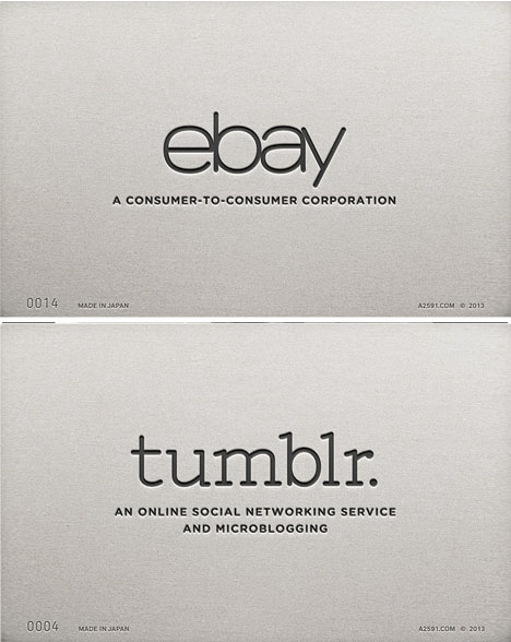
There is something simply elegant about type-embossed metal – in part the association with classic high-end manual cameras. This logo series takes that typology and applies it to a series of contemporary companies.
Antrepo was inspired by brands like Canon, Nikon, Pentax and Minolta, greatly impressed by how simple (effectively logo-free) lettering made a bold and compelling statement in each case.
From the firm: “Canon AE-1, Nikon FTn, Ashai Pentax ESII, Minolta XG-1 – these cameras are some of the Japanese 35mm SLR cameras from the vintage ’70s and ’80s, the “Made in Japan” era, when Japan set the global standard of producing quality.”
In these remakes (featuring Facebook, Twitter, Instagram, Pinterest, Google, YouTube and more) some of the typographic styles and logo figures are still present, but in every case there is something breath-taking about the simplification to a monochrome, black-on-steel look. Not to mention: this also follows the existing apparent trend toward re-simplifying logos throughout online industries.


