The world lost a star architect this week, trailblazing Iraqi-born Zaha Hadid, who was the first woman to receive the Royal Institute of British Architects (RIBA) Gold Medal. Her striking modern structures are experimental, visionary and bold, never afraid to make a strong statement. These are not buildings designed to blend into their environments, but rather sculptural focal points, every one of them a landmark in its respective city. Attempting to narrow down her best works is as futile as it is subjective, but here are five that stand out as prime examples of her distinctive style.
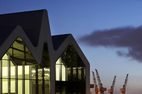
Glasgow Riverside Museum of Transport
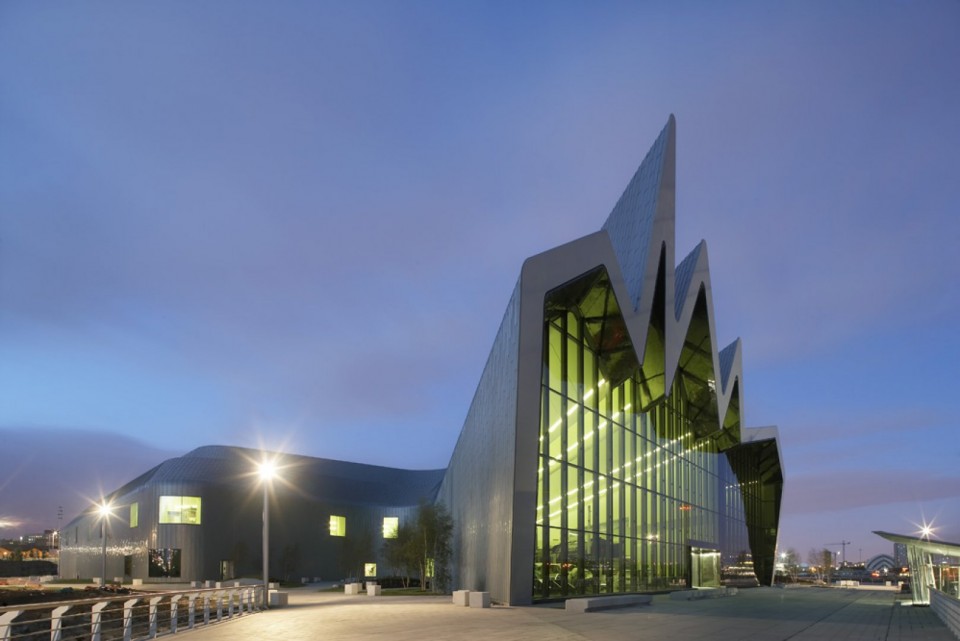
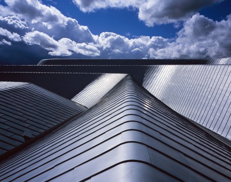
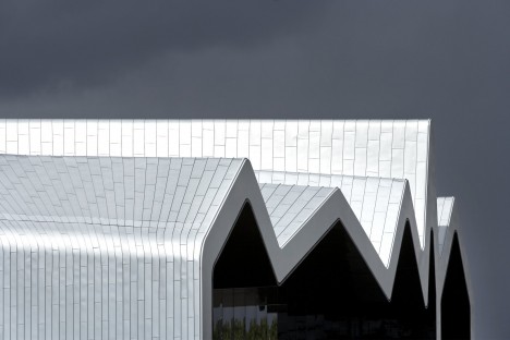
The spiky, jagged front facade of this museum flows into ribbons of reflective zinc, symbolizing the landscape of its setting as the junction of the rivers Clyde and Kelvin. Designed like a linear tunnel bent to one side, its roof mimicking waves in the water, with a column-free, open center for hosting exhibits. Said Hadid of the project, “Through architecture, we can investigate future possibilities yet also explore the cultural foundations that have defined the city. The Riverside Museum is a fantastic and truly unique project where the exhibits and building come together at this prominent and historic location on the Clyde to enthuse and inspire all visitors.”
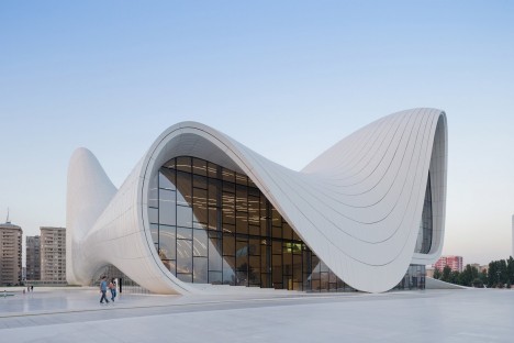
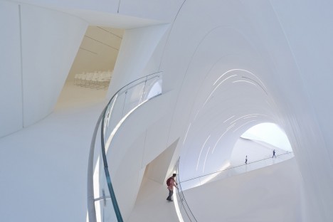
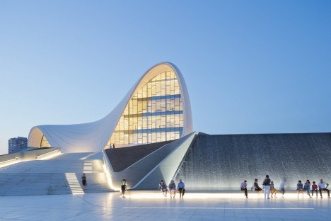
Heydar Aliyev Center, Baku
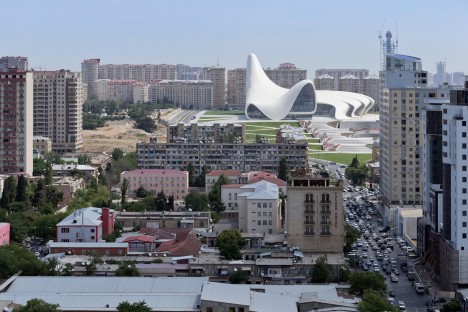
The organic form of this cultural center in Azerbaijan gives it the look of a gigantic sea shell nestled among rectilinear Soviet architecture, establishing fluid connections between itself and the surrounding plaza. It’s all vaulted curves and sinuous lines extending over the roof and back to the ground again. Said Hadid, “Elaborate formations such as undulations, bifurcations, folds, and inflection modify this plaza surface into an architectural landscape that performs a multitude of functions: welcoming, embracing, and directing visitors through different levels of the interior. With this gesture, the building blurs the conventional differentiation between architectural object and urban landscape, building envelope and urban plaza, figure and ground, interior and exterior.”
Messner Mountain Museum, Corones
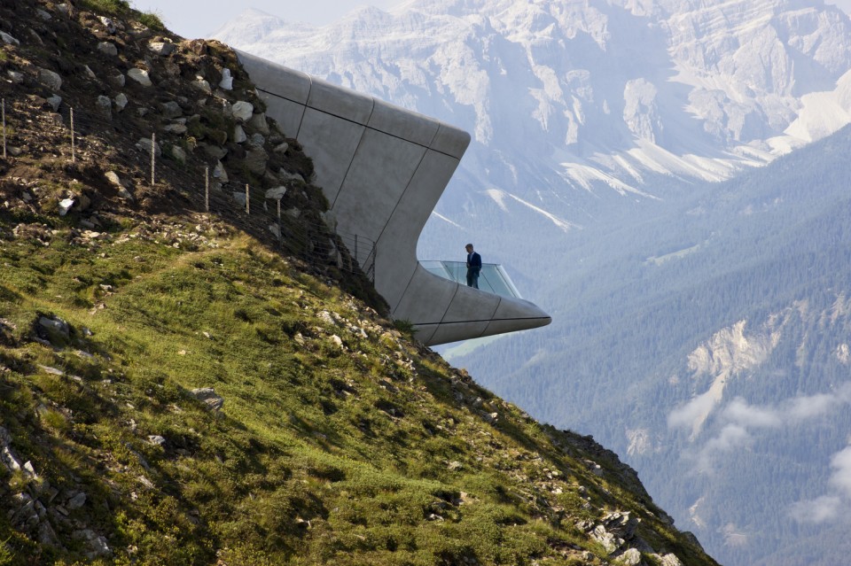
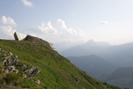
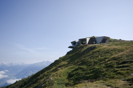
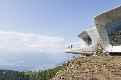
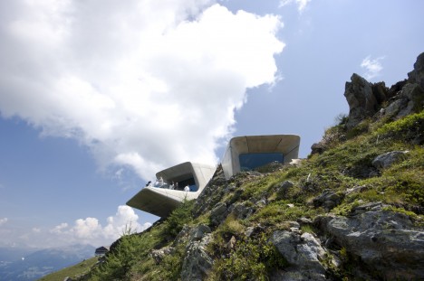
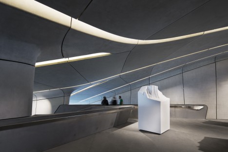
Poking out of a peak within the Italian Alps, the Messner Mountain Museum Corones almost seems to have unearthed itself from the depths of Mount Kronplatz to look out onto South Tyrol. In fact, the overlook visible from outside is only the tip of a structure enabling visitors to explore the mountain’s caverns and grottos. Views from the shard-like lookouts are directed to specific peaks, and the pale exterior panels are informed by the tones of the adjacent limestone.
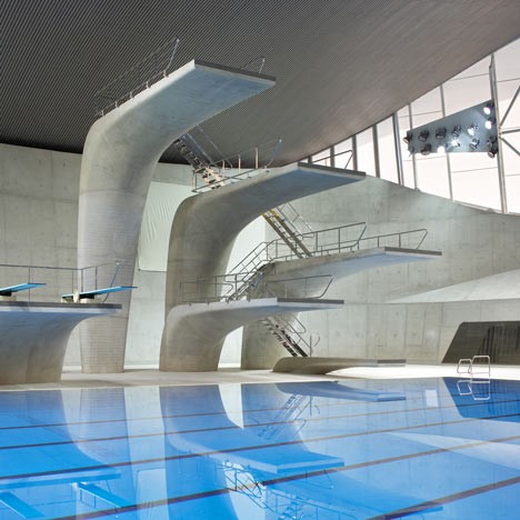
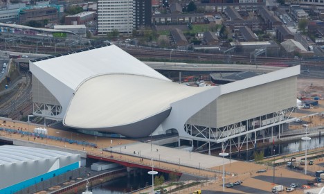
London Aquatics Center
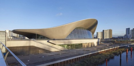
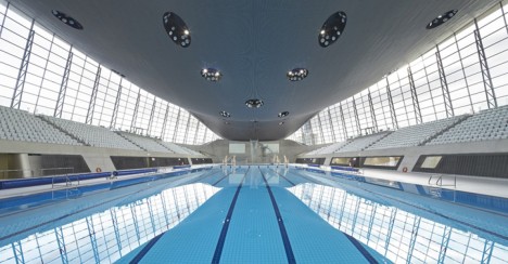
The undulating swimming venue for the 2012 Olympics in London is inspired by “the fluid geometries of water in motion,” nearly every line within the interior taking its shape from waves. As dynamic and beautiful as it truly is, the design reflects a certain deliberate restraint on Hadid’s part. In contrast to the visually dazzling spaces she’s known for, this interior takes care not to outshine its intended purpose, keeping focus on the pool and its inhabitants. As seen in the aerial photography, controversial ‘wings’ were added to Hadid’s design to accommodate extra seating during the Games, but have since been removed to honor the integrity of her original vision.
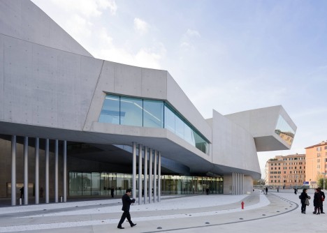
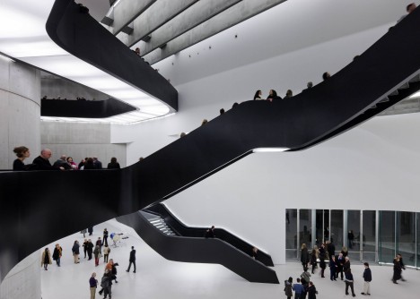
MAXXI Museum, Rome
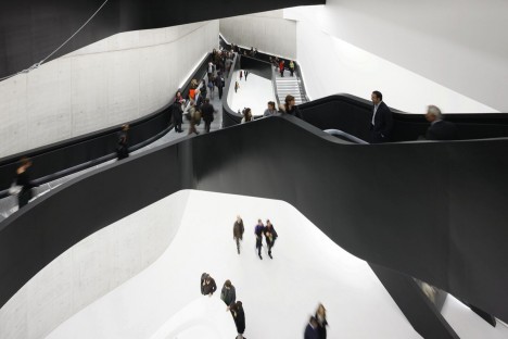
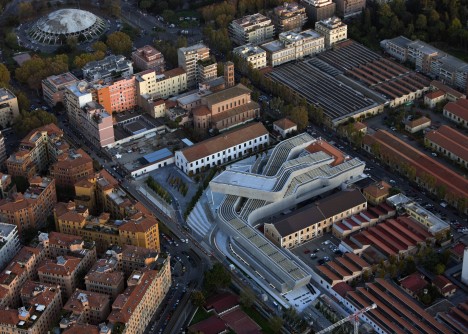
Often referred to as Hadid’s most iconic project, the MAXXI Museum of the Arts of the XXI Century in Rome complements the city’s antiquities while also bringing in a much-needed freshness and fluidity. An historic city full of ruins, without a lot of notable modern architecture, can start to feel static. Hadid injects a sense of vitality without dwarfing the centuries-old architecture in its immediate vicinity. Said Hadid, “Here we are weaving a dense texture of interior and exterior spaces. It’s an intriguing mixture of permanent, temporary and commercial galleries, irrigating large urban field with linear display surfaces. It could be a library; there are so many buildings that are not standing next to, but are intertwined and superimposed over one another. This means that, through the organizational diagram, you could weave other programs into the whole idea of gallery spaces. You can make connections between architecture and art – the bridges can connect them and make them into one exhibition.”
