Apartment buildings are typically so hideous, it’s kind of exhausting. A structure with some measure of character gets knocked down in a prominent spot and before locals dare to dream that something cool might go up in its place, there’s another boring old block of apartments (or worse yet, condos) adding to the dull architectural noise of the city. Of course, it’s all subjective. You could argue, fairly enough, that pretty much all new apartment buildings are ugly, and that trying to make them ‘cool’ results in an even more irritating visual offense. What do you think – are these 13 designs switching up the same-old same-old in a positive way?
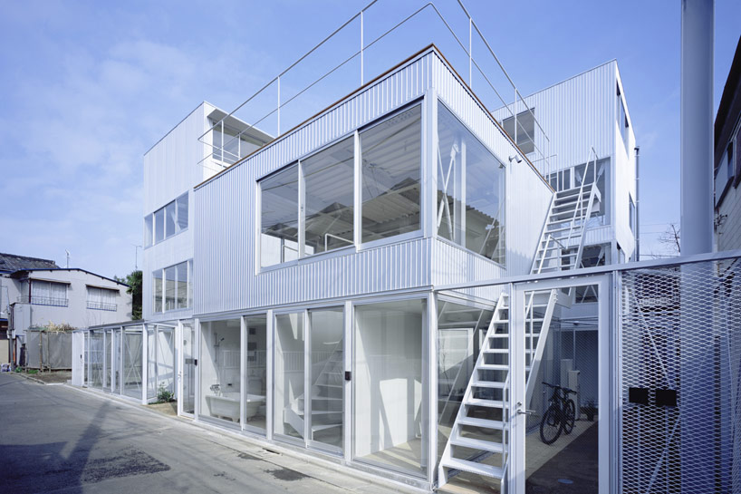
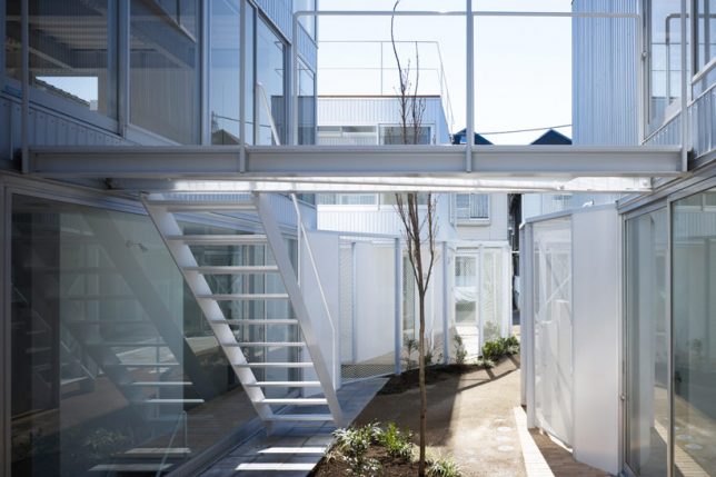
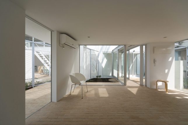
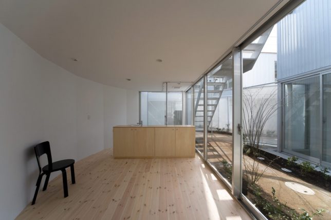
Lots of Light: 9 Units at the Apartment in Kamitakada
Developers looking to squeeze big bucks out of a project by creating high-end luxury housing are a lot more motivated to build structures that are more interesting than usual, but every now and then, there’s the rare project that gives some aesthetic consideration to a building that’s actually affordable to the average city resident. Takeshi Yamagata Architects designed this 9-unit building in Tokyo as a cluster of four buildings connected by open-air pathways, integrating gardens, curving walls and lots of windows for the feel of an urban refuge minus the multi-million-dollar price tag.
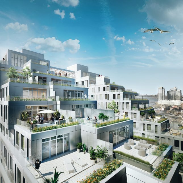
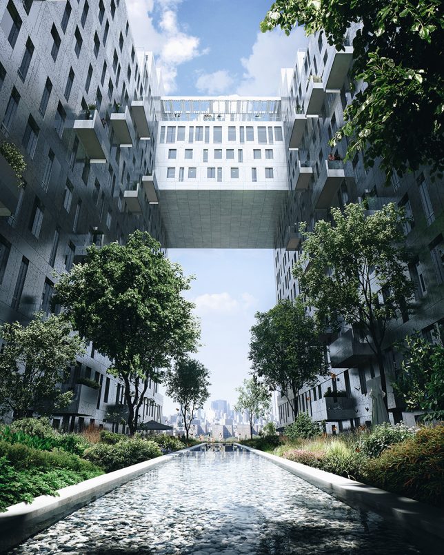
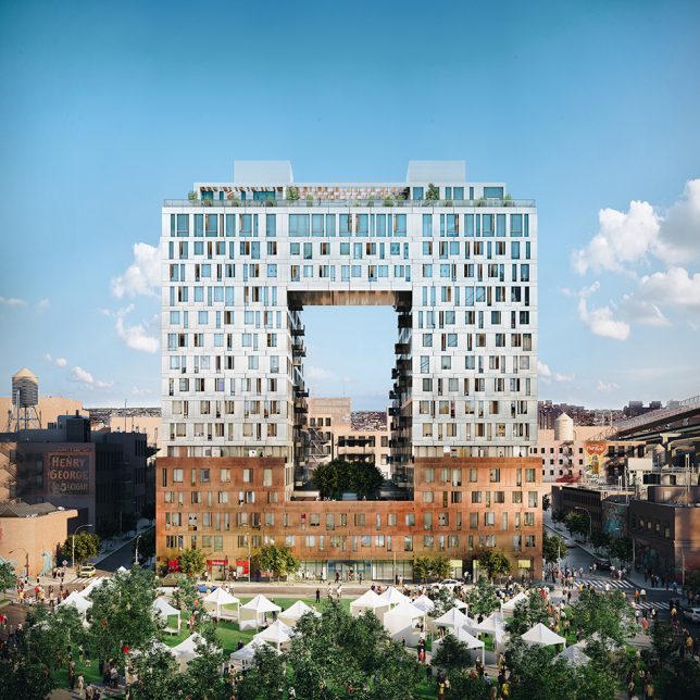
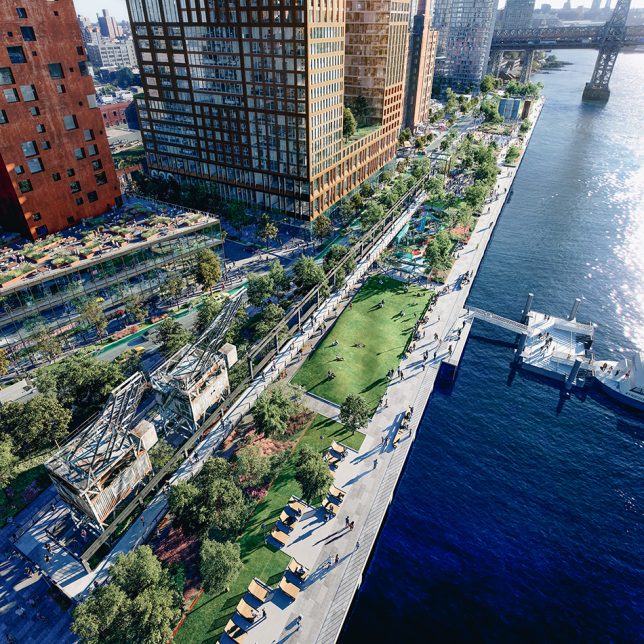
325 Kent by SHoP Architects
Currently under construction on the site of an old Domino sugar factory in Williamsburg, Brooklyn, the 325 Kent project by SHoP Architects is part of a redevelopment masterplan transforming the refinery into a 380,000-square-foot complex with a waterfront park and four residential buildings containing 2,800 rental units. SHoP’s building will house 522 of those apartments in a 16-story structure, arranged around a dramatic elevated courtyard. The units at the top will be stepped to create a series of spacious outdoor terraces. Nope – this one isn’t going to be cheap.
Pixelated Concrete: 222 Jackson by ODA
Over in Queens, the 11-story 2222 Jackson building by ODA features a pixelated concrete facade creating voids and projections for shade, privacy and outdoor spaces. Located just steps away from MoMA PS1, the building is conceived as a modular grid, giving it about 30% more outdoor space than the same-sized building with the same number of units arranged in a more typical shape.
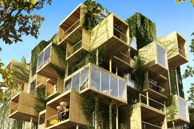
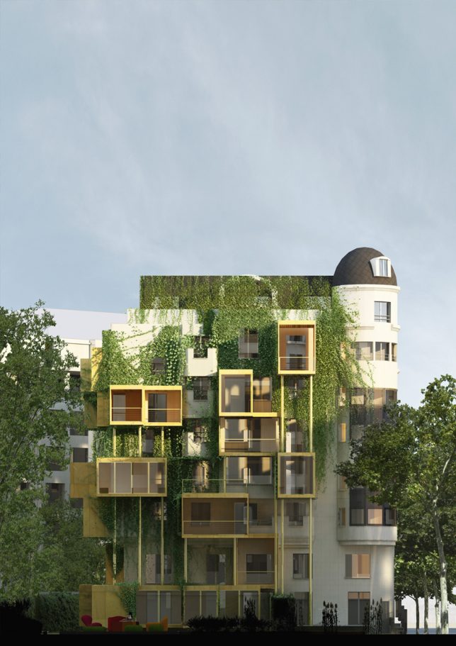
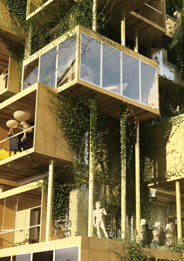
Parasitic Growth: Plug-In City 75 by Stephane Malka
Commissioned to update and expand a 1970s-era building in Paris, architect Stéphane Malka proposes a system of parasitic wooden cubes that would attach to the facade, extending the living space and reducing the structure’s energy consumption by 75 percent. The unusual design would help mitigate problems with poor insulation and permeable windows while adhering to the city’s restrictive building laws, which don’t allow architects to build vertically.
Contemporary and Complimentary: p17 Housing in Milan
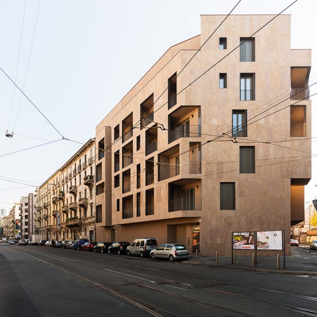
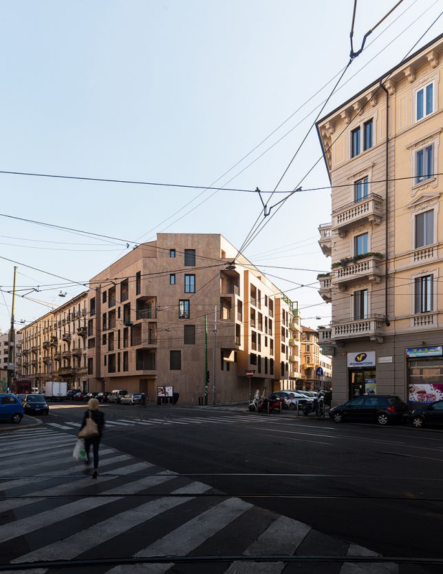
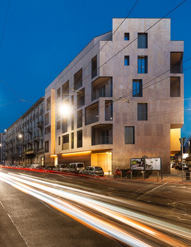
How do you sensitively design a new apartment complex that will blend in with a historic neighborhood while reflecting the era in which it’s being built? For P17, a residential housing complex in Milan, Italian architectural firm Modourbano harmonizes with surrounding buildings while retaining a contemporary feel, thanks to the beautiful natural hues in its sandstone facade.
