There’s design that’s just plain crappy, and then there’s design that’s maliciously terrible because the creator just wanted you to suffer. They’re related, yet distinct, which explains the existence of two separate subreddits collecting all the worst design the internet has to offer, r/crappydesign and its highly specific offshoot, r/assholedesign.
Whether we’re talking about user experience, packaging or entire buildings, poor design is a whole lot more frustrating when we realize someone’s trying to trick us, shame us, cheat us or just delight in being a giant a-hole for reason.
For example: why would anyone create an ‘alone cam’ for hockey games just to point out people who came solo, especially when they look this dejected? Bonus points for the trollolol Comic Sans, of course. A website selling shoes put a fake hair in their images to make you think you need to wipe your screen off, so you end up hitting ‘shop now’ whether you wanted to or not.
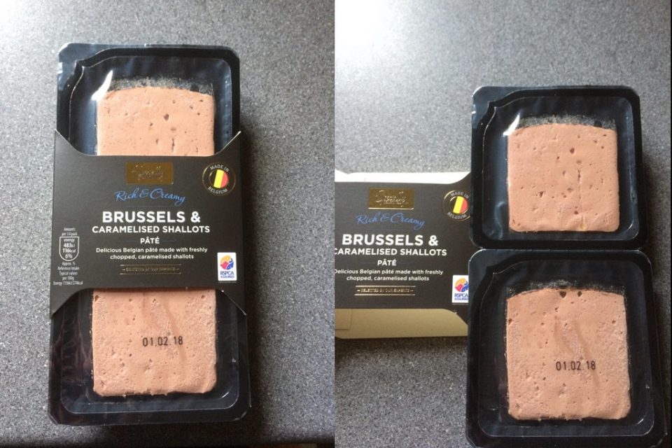
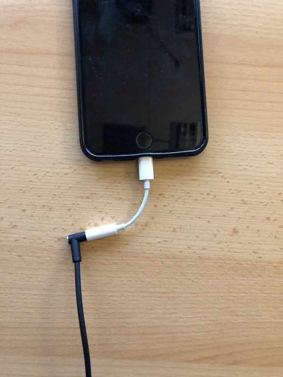
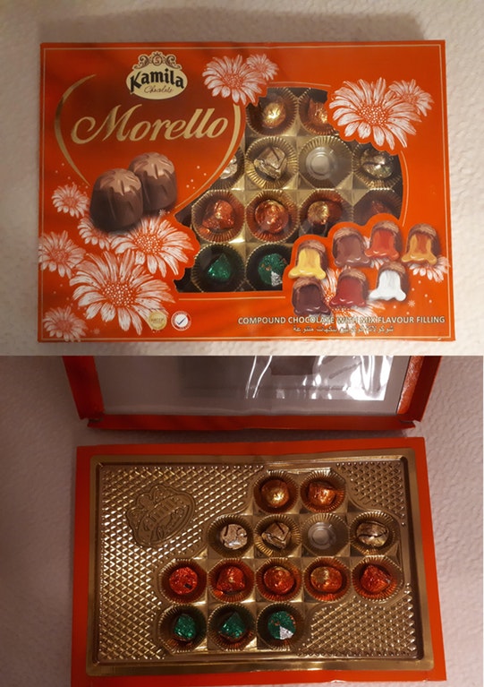
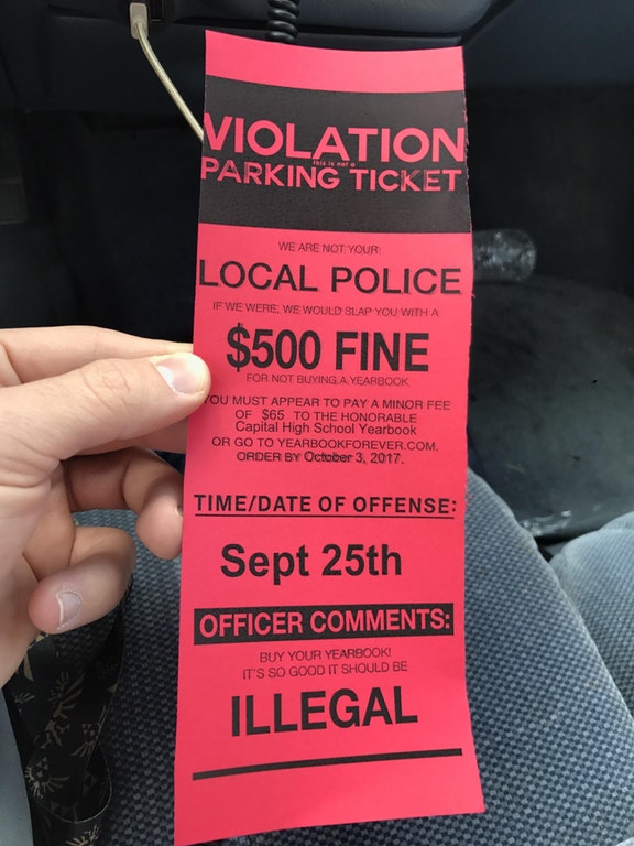
Apple’s clunky converter dongle, necessitated by the ‘space-saving’ lack of an audio port, is clearly absurd. A seemingly 600W power supply is actually just 230W with the model number ‘600W.’ And then there’s the packaging that makes you think you’re getting more food than you really are. It just goes on and on. (There’s a special place in hell for the creators of fake parking tickets.)
Whether you’re designing software or boxes of chocolate, this whole subreddit should be a lesson of what not to do – but hey, if you’re the kind of person who would create this stuff in the first place, you probably won’t care anyway. The rest of us will just keep compiling the receipts and cursing your name.
h/t FastCoDesign


