How is it that a simple, abstract composition of black and white grids and primary colors has touched our collective psyche so deeply? Dutch-born artist Piet Mondrian created some of the most reproduced designs in modern history with works like Composition II (1920), Tableau II (1922) and Composition II in Red, Blue and Yellow (1929). A century later, you can hardly walk a lap around a city block without seeing something influenced by Mondrian’s signature style, and our fascination shows no signs of slowing down.
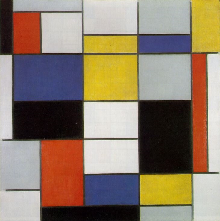

Mondrian co-founded the Dutch art movement De Stijl (“The Style”) in 1917, which consisted of both artists and architects and is characterized by its rejection of mimesis. Instead of trying to represent or imitate the real world, De Stijl valorizes pure abstraction, reducing a visual composition down to its absolute essentials. Known as neoplasticism, this philosophy “finds its expression in the abstraction of form and color, that is to say, in the straight line and the clearly defined primary color,” as Mondrian wrote at the time.
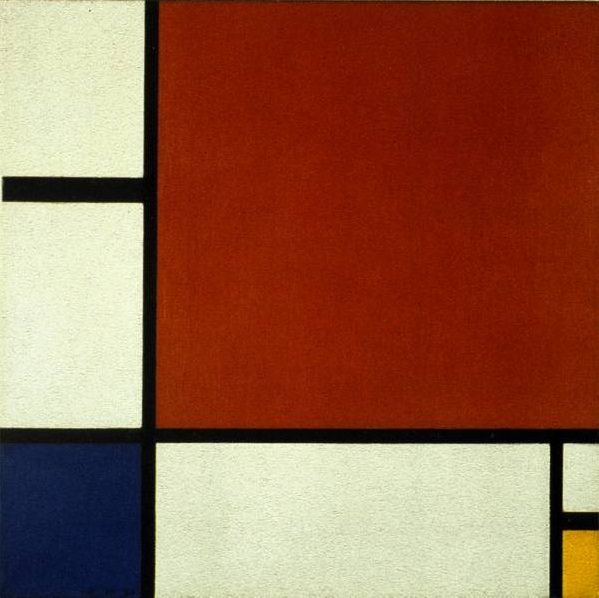
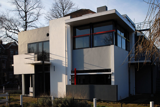
Though the first case of Mondrian-inspired architecture might appear to be Gerrit Rietveld’s 1924 Schröder House, the architect was actually a member of De Stijl and adhering to its principles. Rietveld collaborated with fellow De Stijl member Theo van Doesburg on a number of striking interiors in Amsterdam, too. But while the influence of De Stijl as a movement is certainly far-reaching, the tributes specifically referencing Mondrian’s paintings are the most readily recognizable to this day.
“It is possible that, through horizontal and vertical lines constructed with awareness, but not with calculation, led by high intuition, and brought to harmony and rhythm, these basic forms of beauty, supplemented if necessary by other direct lines or curves, can become a work of art, as strong as it is true,” Mondrian said.
This single quote may tell us all we need to know about why Piet Mondrian’s work strikes such an enduring chord. While it’s certainly true that efforts to preserve the artist’s legacy by his heirs, among others, helped lead to commodification of his work – you can find everything from Mondrian-themed underwear to cakes on the internet – there’s more to the story. People make and purchase those products because the work speaks to them. As simple as it may be, there’s something about it that still feels fresh and dynamic. There’s a tension between the lines, a sense of expansion when a block of color is bound only by the edge of the canvas, a sense of order despite the seeming randomness of the composition.
Case Study House No.8 by Charles and Ray Eames
Asymmetric and sparing, the artist’s grids, planes and careful use of color easily scale up, practically producing a blueprint for minimalist yet visually engaging designs. In 1945, designers Charles and Ray Eames demonstrated how well Mondrian’s style translated to emerging prefabrication technologies developed during World War II with “Case Study House No.8” in Los Angeles, and it worked so well, the brothers claimed the home for their own usage.
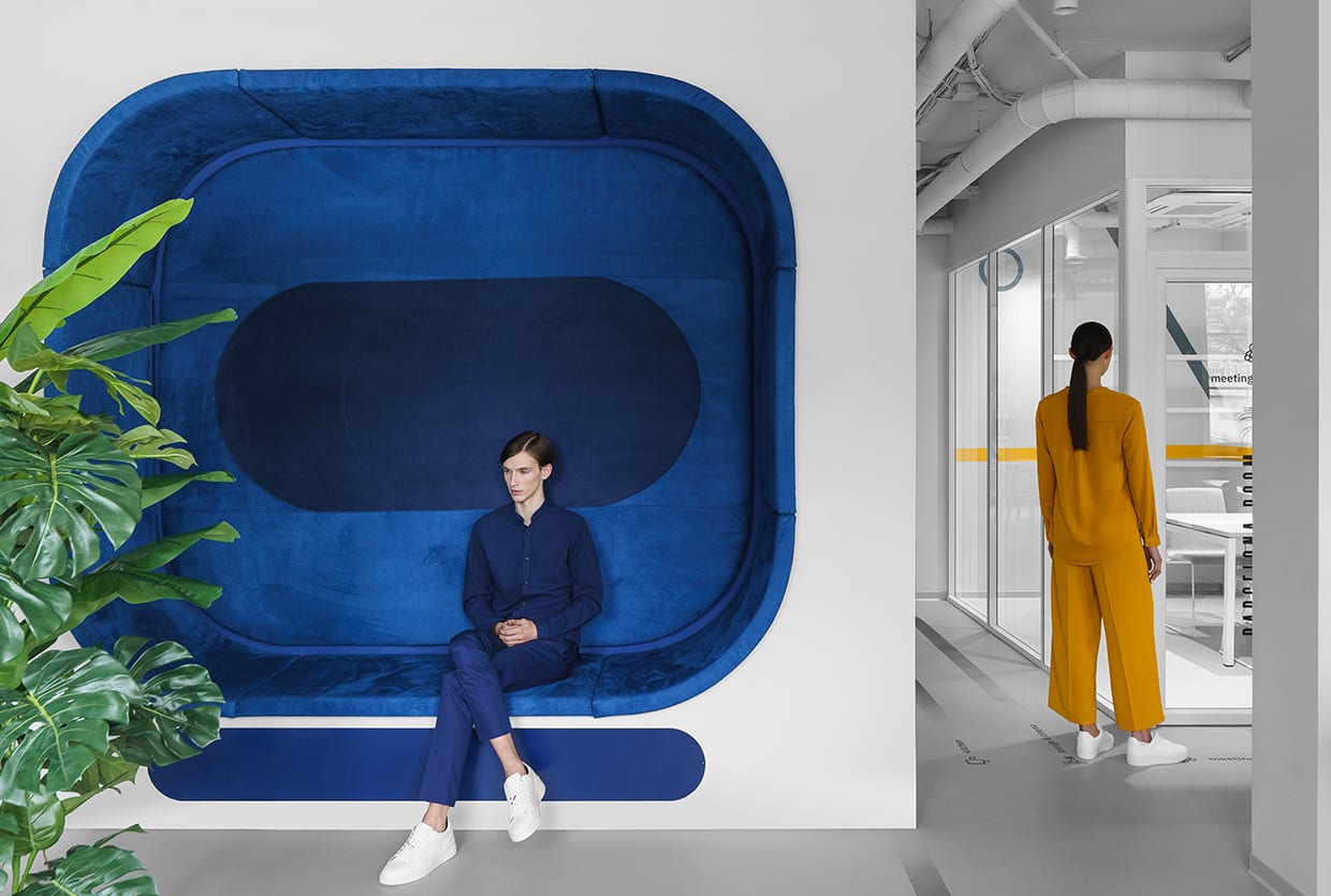
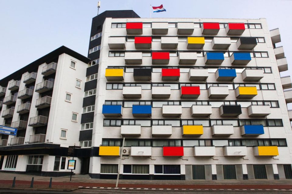
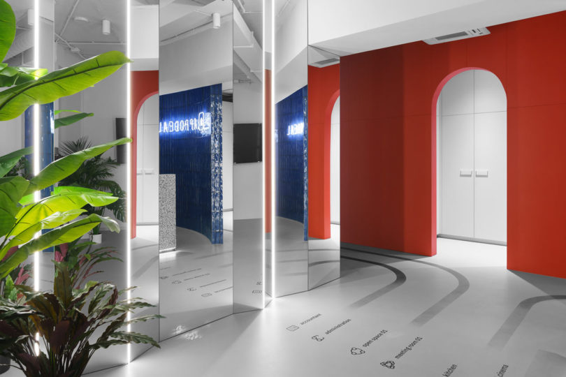
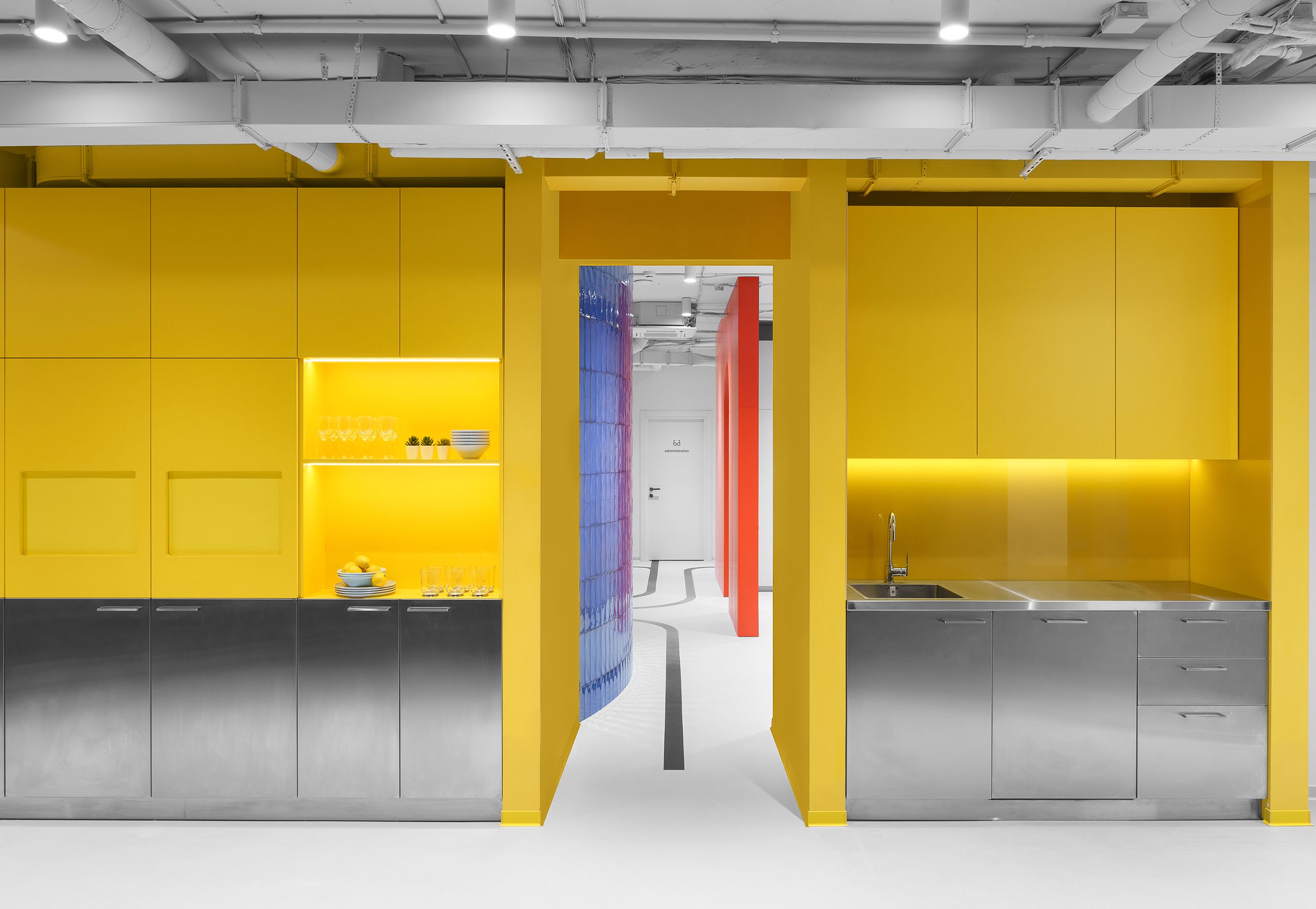
It’s also easy to see how applying the subtle balance of Composition II to the facade of a building, as Studio VZ did in The Hague, can brighten up what might otherwise be an architecturally dull structure. Similarly, creating blocks of primary colors within a largely black and white interior, like Appodeal’s new offices in Minsk by Studio11, can lend to a space an air that’s simultaneously whimsical and sophisticated.
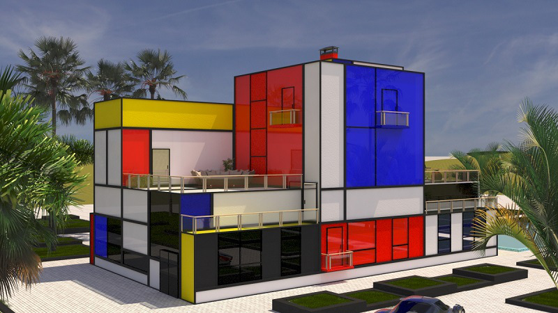

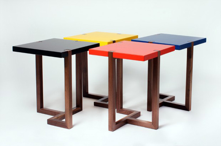
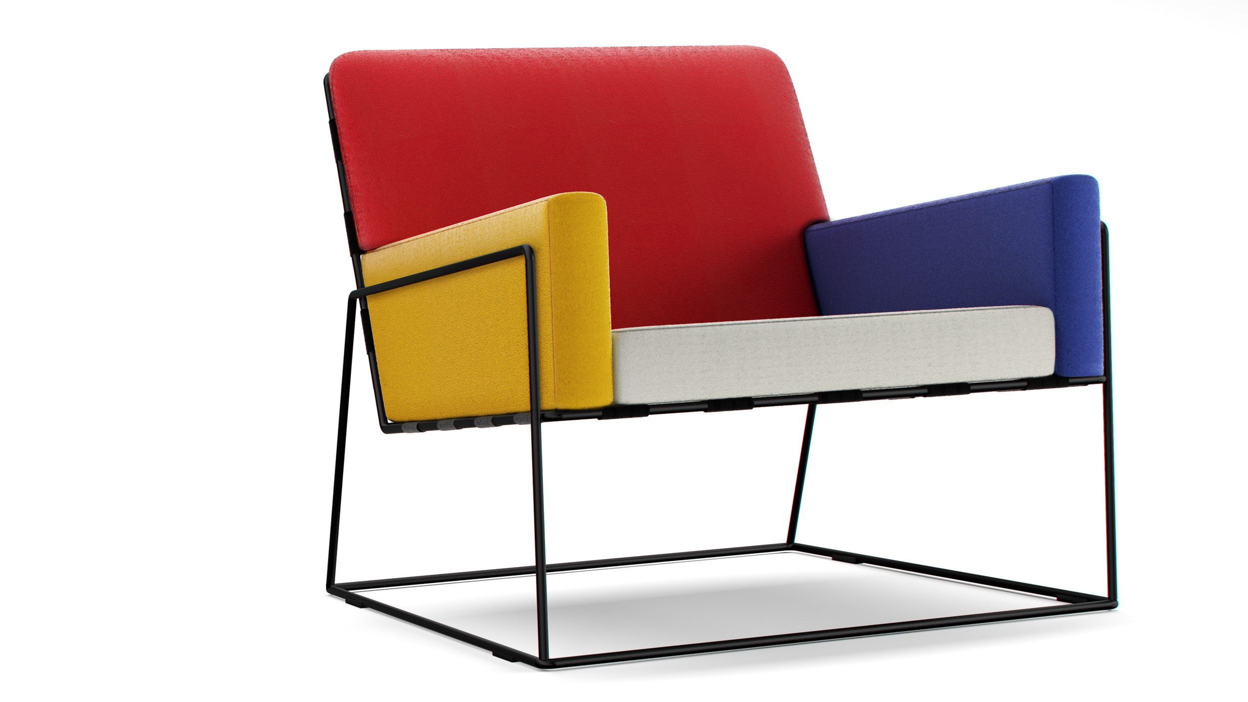
Some designers are so captivated by Mondrian’s use of lines, grids and color that they’ve envisioned houses, yachts and cars using his paintings as a framework or a skin. Vasily Klyukin’s “Villa Mondrian” translates the works to architecture in the most literal way possible and aims to turn vehicles into works of art. Other works, like Marcel Wanders’ Charles Chair and Hugo Passos’ Piet Side Table, find new ways to transmute the essence of Mondrian into functional objects.
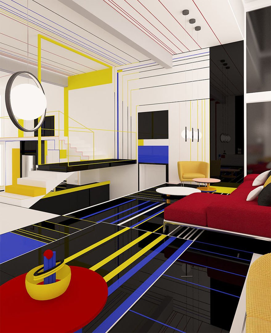
If you’ve ever loved a work of art so much you wished you could crawl inside it and live within it forever, here’s one way to do just that. In “Breakfast with Mondrian,” an apartment interior by Bulgarian design studio Brani & Desi, you almost feel as if the designers have magically stretched Mondrian’s paintings into an inhabitable three dimensional space.
Most artists can only dream of making such an impact on the world of architecture and design. Perhaps, at some point, the world will tire of seemingly endless iterations of Mondrian’s most iconic works, but that day probably won’t arrive anytime in the immediate future. Is there an underlooked artist you wish could get the Mondrian treatment?
