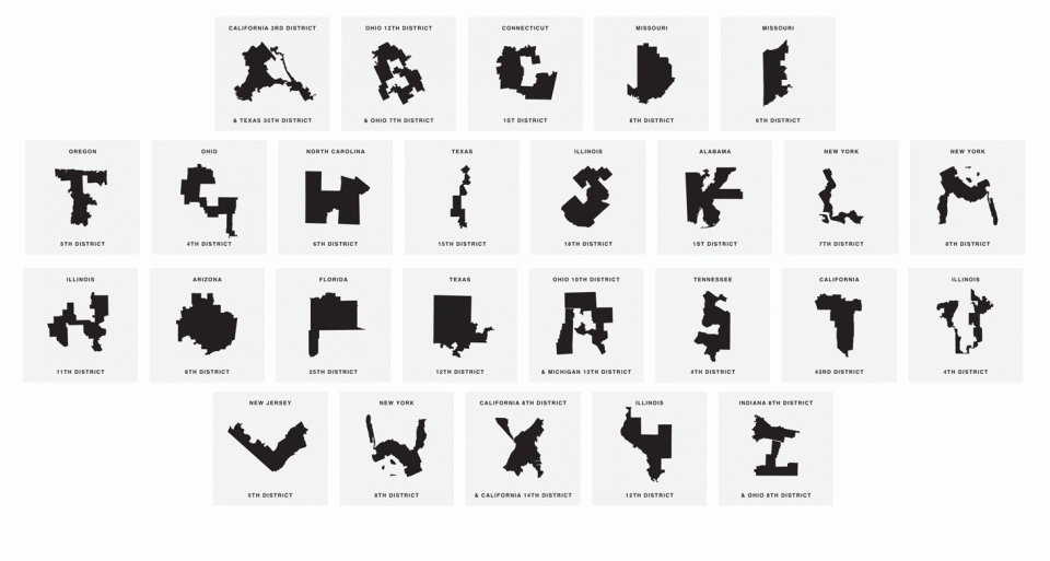
Gerrymandered districts are perhaps the most visible forms of political corruption, dramatically redrawn into implausible shapes to benefit one political part or another. The idea for this font dubbed “Gerry” by Ben Doessel and James Lee explores just how many forms these places are bent into — as it turns out, one can make an entire alphabet out of them.
“To ensure the eroding of democracy isn’t an issue that is lost in the news cycle, our design team from Chicago concocted a creative way to keep our warped voting districts top-of-mind,” says the font’s makers. “What looks like a ‘G’ is really the 4th Congressional district of Ohio, the ‘E’ is actually Missouri’s 6th district, and so on.”
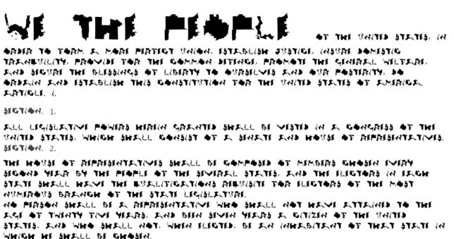
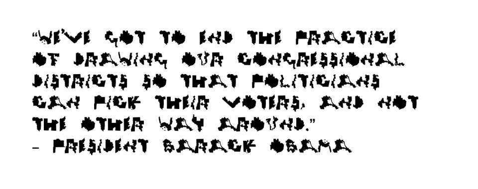
The font, downloadable for free, started with Chicago’s 4th District, which the designers noticed had a distinctive “U” shape. Searching around, they found more and more letters, and realized they could create a full typeface from their discoveries. Since then, gerrymandering has stayed in the spotlight, and Gerry has been used on things like the US constitution. Its hard-to-read letters make it less than ideal for legibility, but that isn’t the point — the message is in the shapes themselves.