For much of history, urban planning as we know it didn’t exist. Sure, there were cities with zoning ordinances and building codes, but ones thoroughly planned from scratch with heavily controlled development are largely a recent phenomenon. So a few years ago, the San Francisco Planning and Urban Research Association (known as SPUR) assembled ten key illustrations to summarize the twists and turns planners took to get where we are today.
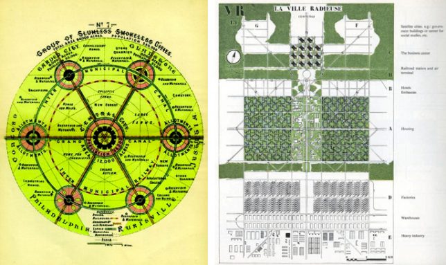
Illustrations like this one of the Garden City from the early 1900s are powerful things, able to distill complex ideas down into compelling graphics. The idea in this case was to create greenbelts for urban dwellers and keep urban centers limited to populations of just over 30,000 people. Along similar lines, Le Corbusier’s “Towers in the Park” vision incorporated vast open spaces, but instead of spreading out, it pushed up, proposing people live in towers. This idea heavily shaped urban design in America, and public housing projects in particular.
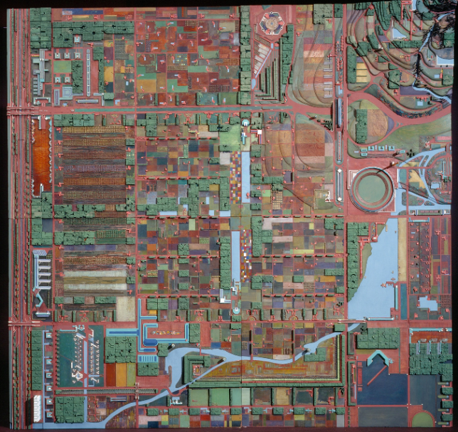
More known for his architecture than his urban planning ideas, Frank Lloyd Wright had a lot of thoughts on how people should live and work outside of the actual houses and offices he built. His ideas for things like Broadacre City were more rural than urban, taking large plots of land and turning them into family housing in which each person would live on an acre of land. If implemented, this idea would have turned the entire country effectively into a giant mega-suburb.
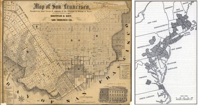
The street grid was not a modern invention as such, but it was deployed much more rigorously and often starting from scratch in American cities like Philadelphia that were essentially working from a blank slate. In many cities, grids were laid out regardless of complex topography, creating problems down the road. Linked together, some of America’s gridded cities have started to become something bigger — megaregions, alluded to by science fiction authors like William Gibson decades ago and increasingly a reality today.
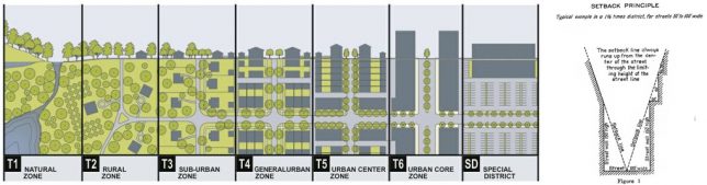
On a more closeup scale, transects have been used to show spectrums of possibility for urban planners ranging, for example, from highly paved urban spaces to lush green areas, rendering visible different hybrid typologies in between. As cities grew up, they also employed setback principles to guide growth and maintain light access, which fundamentally shaped the skylines and on-the-ground experiences of major metropolitan areas.
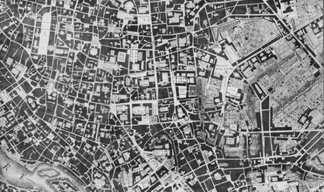
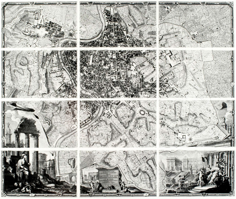
A classic in any list of historical city maps, the Nolli Map drawn in the 18th century was incredibly ambitious for its time, detailing every last little aspect of Rome and providing a basis for comparing old and new forms of this famous city. Notably, it is a straight-on view — maps of its time often tilted things at angles, which distorted the geography, but this one became a precursor for what we think of as typical plan-type maps today.
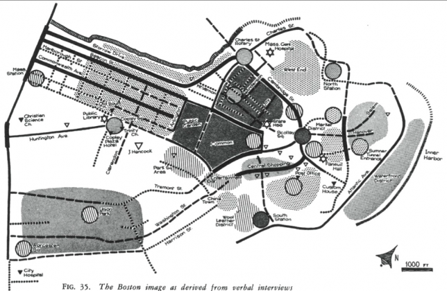
At the other end of the spectrum are the psychogeographical maps developed by Situationists in the mid-1900s, which aimed not to depict the shapes of buildings and spaces in between but to instead document the subject experience of the city. It was in many ways a reaction against a Nolli-type approach as well as the rigorously rectilinear plans of people like Le Corbusier. Maps were drawn from memory and then used to understand the “psychogeography” of cities.
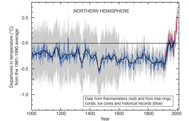
Finally, the most unusual selection of all: the so-called “hockey stick” chart. This captures an aspect of the history of cities, specifically: the effects of the industrial revolution on global temperatures. It’s a diagram not so much about how to physically build a city but the big-picture impacts to think about while designing one.