Most urban designs are at best useful for skaters as an afterthought, or more typically: specifically created to foil skaters, but not this set of signs.
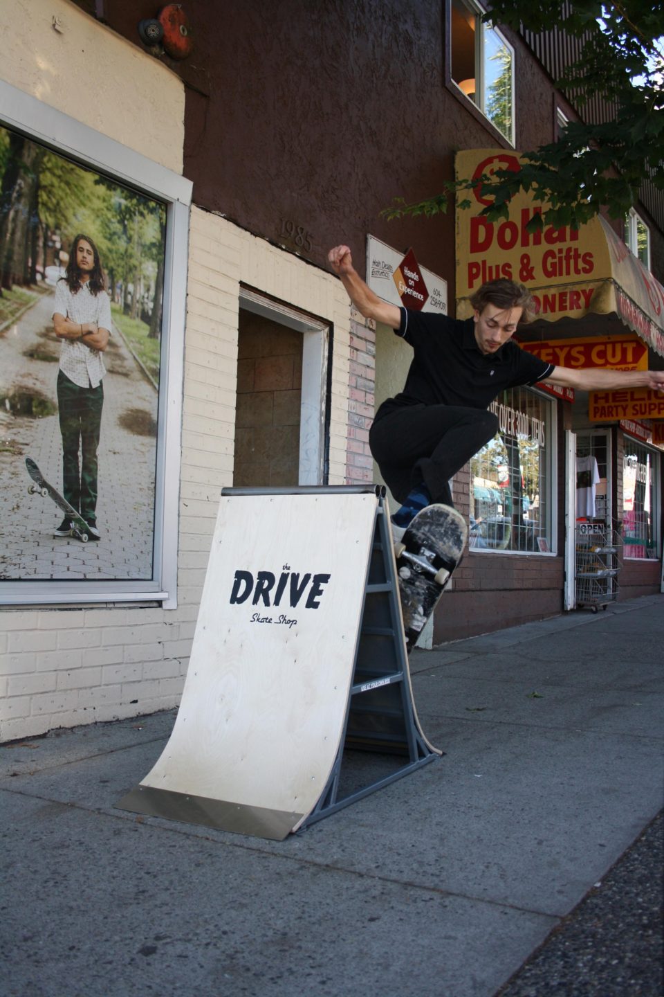
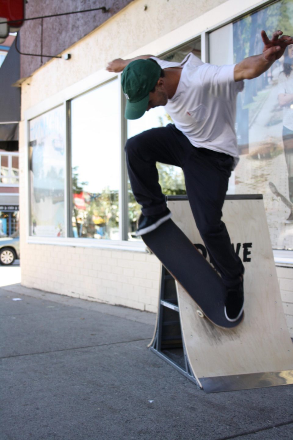
The Drive Skate Shop in Vancouver created two of these, the first of which mimics a typical and ubiquitous “sandwich board” style sign, which normally consists of two planes angling out toward the bottom for stability.
By extending those surfaces onto the ground and adding a slight curve, a skateable sign is created — ride it at your own risk, however (it’s steep!). Metal supports provide stability, too.
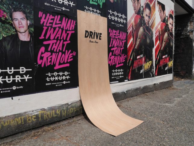
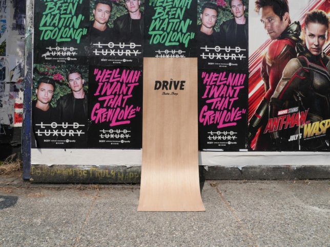
The second variant is crafted from curved plywood and slopes up a wall, imitating a typical pasted posters toward the top, but turning into an angled ramp near the ground, effectively turning the whole wall into a more skate-friendly surface.
As marketing strategies go, this one has it all: simple and clever, cheap but functional and to-the-point, letting passing skaters take a stab at riding the signage then maybe stopping for some supplies when they tank their landing.


