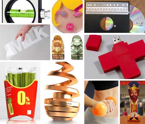
They say you shouldn’t judge a book by its cover, but there are times when the packaging matters just as much as what’s inside. When you’re shopping for anything from a bottle of juice to a new pair of shoes, the package is what catches your eye long before you consider the merits of the actual product. That’s why designers spend so much time and energy designing the perfect container for every product imaginable. Some are perfectly sensible and some are so far out that you can’t help but wonder what they were thinking. These packaging designs are some of the most eye-catching and wonderfully inventive from recent years.
Fast Food Fun
(images via: TheDieline)
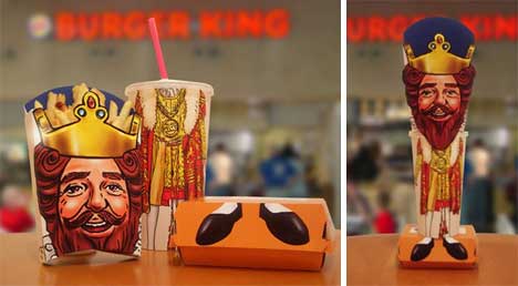
Eating at a fast food restaurant is always fun for kids, but what about grown-ups? This Burger King concept from designer Bernadette Coughlin would let adults have fun creating their own Burger King from their various food packages, and switching his appearance by changing out the pieces.
(images via: TheDieline)
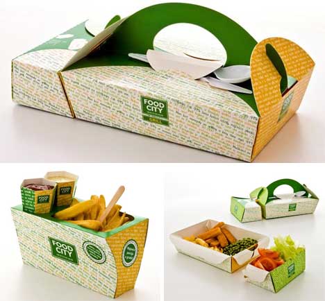
Just as fun is this suite of interactive, modular takeout packages for the Food City chain. The boxes are totally waterproof and free of glue, and the customer transforms them from box to eating tray. Add-on containers hold sides and sauces, making for a customizable experience without any excess waste.
Healthy Foods Can Be Fun, Too
(images via: TheDieline)
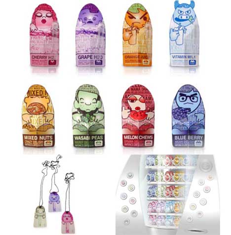
On the other end of the spectrum is this brilliant brand of healthy snacks called VitaMeal. They’re aimed at reducing childhood obesity by putting appropriate serving sizes of healthy foods into places where kids congregate, like schools and recreation centers. Each product has a “personality,” making them easy for kids to get excited about. The vending machines themselves are modular in nature so they fit into the available space, and they’re designed to work with special “credit” cards that bear the likeness of one of the snack characters. Parents put credits onto the card and decide which snacks their little ones can and can’t buy.
(images via: Toxel & Gajitz)
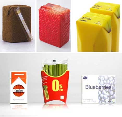
Making healthy foods more appealing is often just a matter of the way they’re presented. Above, fruit juice is packaged in boxes that look and feel like real fruit skin, making them interesting to the touch as well as delicious to the taste buds. Just below that, a new concept for packaging healthy foods puts carrots, celery and blueberries into packages usually reserved for very unhealthy products. Carrots are packed like cigarettes, celery comes in a French fry container, and blueberries are in a blister pack like chocolates…all in the hopes that consumers will want more fresh, healthy foods if they come in unusual packages.
The Packaging Is the Product
(images via: Treehugger 1, 2)
As beautiful as some packaging is, sometimes it’s simply excessive. With some products coming wrapped in two or three layers of plastic, paper and cardboard, it’s enough to drive any environmentally-minded person crazy. So when a company integrates their packaging into their product design, it’s a win on every level. At the top, Hangerpak is a box to ship tee shirts that transforms into a hanger once in the customer’s hands. Below that, Lite 2 Go is a modular hanging light kit that’s packaged inside its own shade, greatly cutting down on the amount of waste generated by each individual product.
(images via: Treehugger)
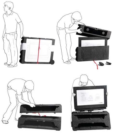
One of the worst parts of bringing any new product home from the store is having to deal with all of the wasted packaging – this is especially true of carefully-packed items like televisions. They usually come with layers upon layers of styrofoam, cardboard, plastic and plenty of little paper leaflets. But this packaging design from Tom Ballhatchet is different: it’s actually functional. The box formerly used to hold a television transforms into a stand for that television; the cavity that once cradled the TV and kept it safe turns into shelves for your DVD player and other accessories.
Smells Like Creativity
(images via: The Dieline 1, 2)
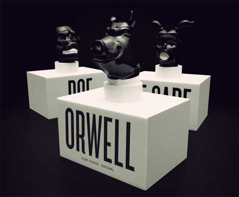
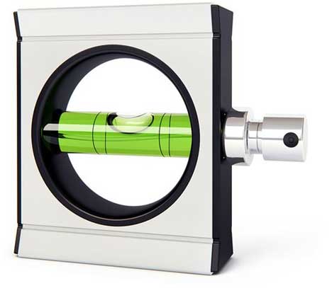
Women’s perfume is often packaged in lovely curved bottles, but men’s cologne is usually stuck in plain square or rectangle containers. These two concepts take men’s fragrance to a whole new level of packaging design. At top is Scent Stories, a concept from Polish design studio Ah&Oh. The bottles are all based on classic literature, featuring quotes from Poe, Orwell, de Sade and Laclos stories, along with tops that resemble characters from memorable pieces by each author. Below that is Levelus, a tongue-in-cheek package for a manly fragrance; the level is functional and can actually be used to straighten picture frames in the bathroom while you get ready for a big date.
It’s All About the Shoes
(Images via: LovelyPackage, Gizmodo, Treehugger)
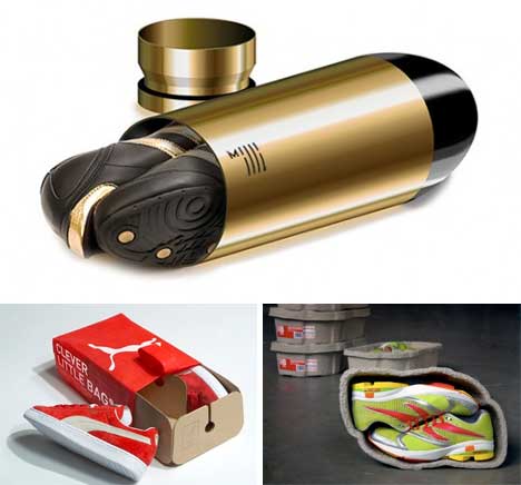
It’s often said that you can’t improve on the design of the mousetrap – and the same goes for the humble shoebox. But that doesn’t stop some designers from trying to cut down on shoe packaging waste or simply make the box more interesting. At top is Milli, a concept from student designer Jenny Kim. Milli stands for both millimeters – the unit of measurement used for bullets – and milliseconds – the unit of measurement that often decides the winner of a race. Her bullet shoebox represents the speed and power needed by runners. Bottom left is a brand new packaging design from Puma that incorporates a less-wasteful box with an exterior bag, eliminating both the laminated cardboard box (which is often hard to recycle) and the single-use exterior plastic bag. Bottom right: Newton shoes are packaged in 100% recycled cardboard (rather like cardboard egg carton material) and instead of being stuffed with paper, the shoes are stuffed with a pair of socks and a reusable shoe bag.
Drink it Up
(images via: TheDieline, LikeCool, TheDieline and DesignYearbook)
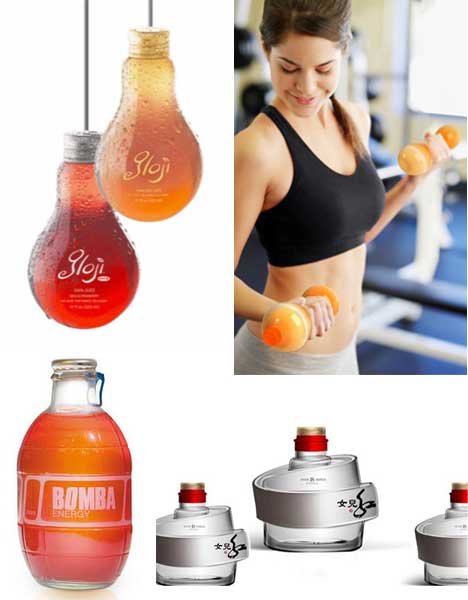
Beverages – from sodas to sports drinks to alcoholic beverages – already come in a wide variety of packages. But often, when we go into a store not sure of what we want, a unique package can be the deciding factor for our purchase. Above, beverages packaged in these incredible bottles would be sure to catch any shopper’s eye.
(images via: Reuben Miller and TheDieline)
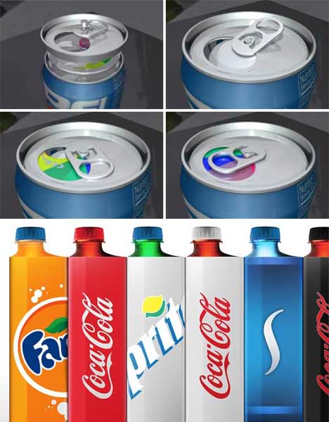
Not all packaging innovations are for the sake of aesthetics only. These unique packages were designed with a desire to make lives easier. Above, a resealable soda can would prevent bugs and dirt from contaminating an open soda while allowing advertisers a brand new spot to reach their audience. The rectangular soda bottles would be the first major change to the shape of plastic beverage bottles, but it could save untold amounts of money. Packaging beverages this way would allow them to stack more closely and save room, thus drastically reducing transport costs.
(images via: LovelyPackage, TheDieline, VisualAdvice, PackagingoftheWorld)
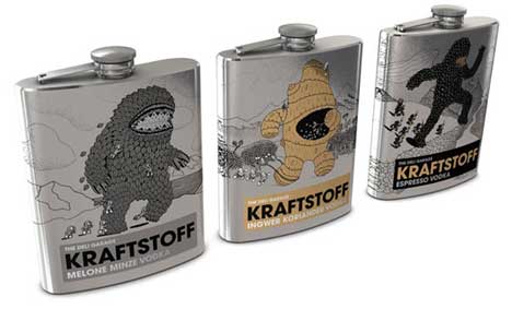
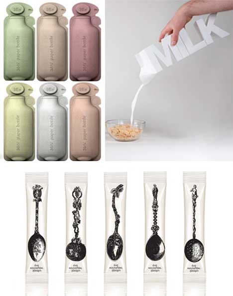
Although most of us don’t want to admit it, a product’s packaging has a huge impact on what we purchase. Would you rather have a package on your shelf with a boring plain label or one that has clearly been designed to please the eyes and be useful? Above: flavored vodka comes in astonishingly cool flasks, the design of which won a bronze award at the 2009 German Art Director’s Club Competition. Lower, the 360 Paper Bottle could dramatically cut down on plastic bottle waste and still give the consumer a fun drinking experience. The “Milk” package is a two-liter carton which was designed as an experiment in unique packaging and communication. Bottom, a visual representation of what’s inside: a spoonful of sugar.
Playful Packages
(images via: TheDieline 1, 2)
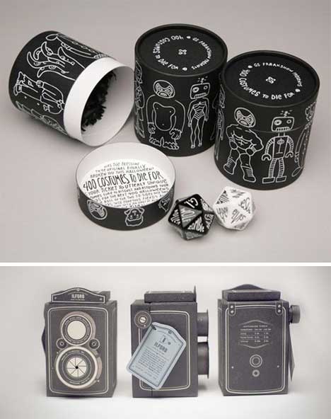
It can be almost painful to throw away the coolest packaging – when you select a product based on how it’s packaged and bring it into your home because you like the way it looks, tossing the package into the trash is a little heart-wrenching. These products allow you to keep the wrapping around. Top, a set of dice help you decide what to be for Halloween while the canister they come in is an endlessly entertaining toy. Below that, a package containing rolls of film also works as a pinhole camera. It comes complete with instructions to help you construct your own photographic masterpiece.
You’ve Got the Music in You
(images via: PackagingoftheWorld 1, 2)
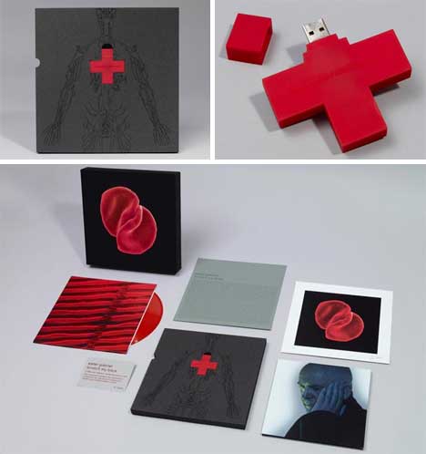
Music, being creative and highly subjective, lends itself well to creative and innovative packaging. Here, Peter Gabriel and the band Marrow both went with unusual packaging ideas for their music.
(images via: Azltron)
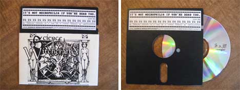
Science vs. Witchcraft did something a little different with their CDs and packaged them in old floppy diskettes, complete with retro labels and paper sleeves. As an added bonus, users can play a text-based game when they insert the diskette into a computer.
(images via: PackagingoftheWorld)
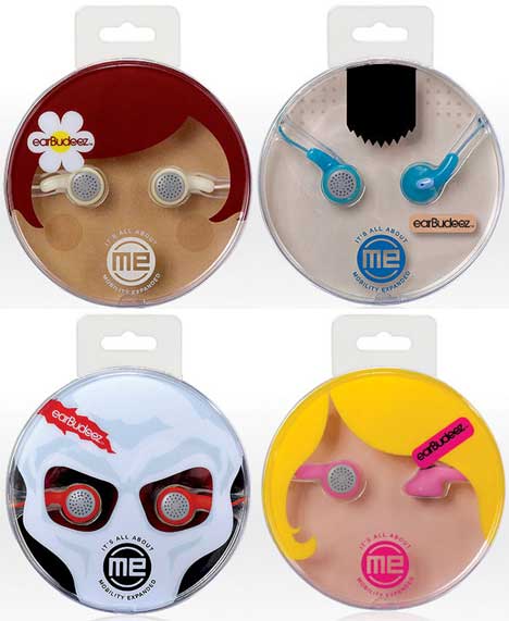
You wouldn’t use just any earbuds to listen to all of that creatively-packaged music, right? Audiovox designed these packages knowing that many people choose their earbuds as a fashion accessory rather than an electronics accessory. They put them in these personality-rich packages to help consumers decide which personality fits their lifestyle and their needs the best.
Power Up: Health Products
(images via: PackagingoftheWorld and Gajitz)
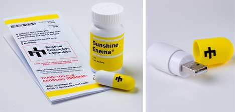
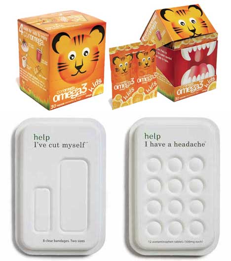
Any parent knows that getting kids to take vitamins can be a rather difficult task. These Omega-3 supplements come in kid-friendly packaging that might once and for all end the battle over taking or not taking vitamins. Below, creative first aid packaging whispers, rather than shouts, what’s inside – leaving the product to speak for itself.
Beautifully Creative Packaging
(images via: PackagingoftheWorld and Freedom of Creation)
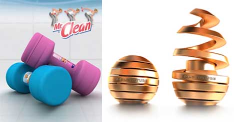
There’s really no question that we’re simply drawn toward creative, attractive packaging. Even if the product is exactly the same as the one next to it, we simply want the one that looks more interesting. Whether it’s Mr. Clean packaged in dumbbell-shaped bottles or L’Oreal skin cream nestled in a golden sphere, many of us will buy a brand other than our usual when a different product offers a more attractive outer wrapping. Even though the packaging often just ends up in the trash, that first impression in the store makes all of the difference. Most of us decide in a split second, right when we see a product for the first time, whether we’re going to buy it. Since we can’t test out every product in the store, we rely on the packaging to tell us part of the story and draw us in.
