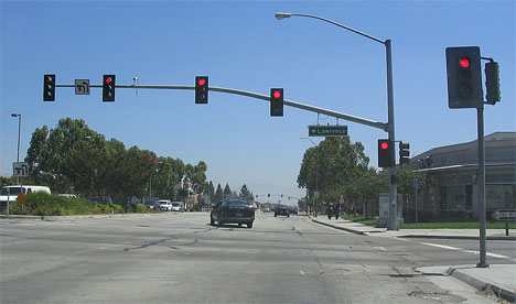
We all gaze upon the humble traffic light nearly every time we climb into a car and take a journey, whether it’s down the street for a jug of milk or across the country for a great adventure. Around the world, the design is remarkably standardized, deviating only a little from one continent to the next. But is the familiar design really the best design? Or is the traffic light due for an overhaul? According to the designers behind these concepts, there is a way to improve on that most recognizable of urban landmarks.
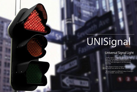
The Colorblind-Friendly UNISignal
(image via: Dornob)
For people who have trouble discerning the difference between red and green, stoplights can be daily challenges. Particularly in places where the stoplights are situated horizontally, telling the difference between “stop” and “go” can be far from intuitive. This concept from four innovative designers would use shapes along with colors to give traffic directions, thereby eliminating any confusion about whose turn it is to go.
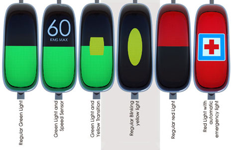
Control Safety Traffic Light
(image via: Yanko Design)
When traffic lights were invented, there were serious limitations on their functions based on the materials that were available. Today, LEDs can do so much more than the light bulbs of previous generations, giving traffic lights almost unlimited potential. This traffic light concept would give speed limit and road condition information to waiting motorists while displaying a special “emergency” signal for approaching emergency vehicles, telling all other traffic to halt and let the emergency vehicles go by.
The Eko Stoplight
(image via: Yanko Design)
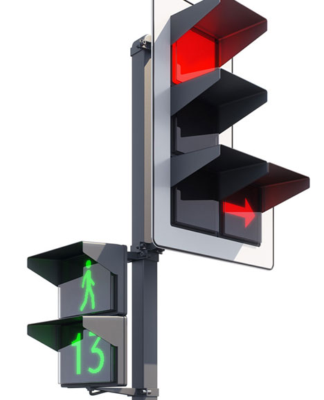
Designer Damjan Stankovic believes that we can go a little way toward saving the world if we stop idling our cars for so long at stop lights. And how would we accomplish this feat? By knowing exactly how long we have to wait at red lights, of course. His timed stop light concept would tell drivers exactly how long remains until the light turns green, giving them time to shut off their engines and wait patiently or prepare to race ahead.
IBM’s Controlling Concept
(image via: Wikipedia)
IBM wants to employ the same concept as the Eko Stoplight, but without relying on drivers to make any decisions. Their recently patented idea would actually control the engines of participating cars, shutting them off at long lights and allowing them to start again once the light changed. In addition to saving on gas at long lights, the system could potentially prevent accidents in people who choose to run red lights or simply get impatient and creep too far out into the intersection while waiting. Of course, not everyone would be excited about the prospect of handing over control of their car engines to stoplights, but for now this patent refers only to a theoretical application.
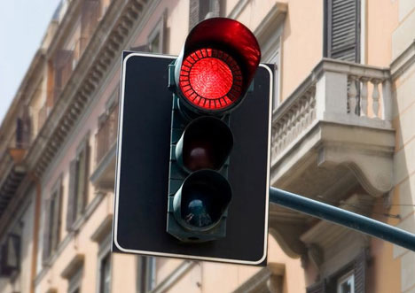
The Luxofor Traffic Light
(image via: Wired)
Russian design studio Art Lebedev has come up with an elegantly simple redesign of the traffic light, one that doesn’t rely on gimmicks or technology. Their Luxofor Traffic Light would feature square lenses rather than round ones since the round lenses are no longer necessary (they were designed to be used with bulbs, not the LEDs we use today). The shape would allow more visible area for the signal, thereby making the traffic lights easier for motorists to read.
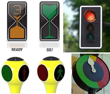
Hourglass Traffic Lights
(images via: Yanko Design)
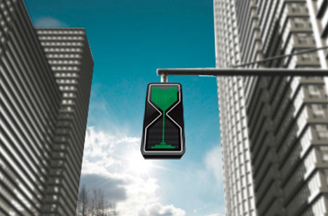
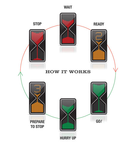
In the belief that knowledge is power, this traffic light concept tells motorists exactly how long is left before the light changes to its next phase. Cycling through the regular green, amber and red phases, the lights are arranged in an hourglass shape that “empties” from top to bottom to display just how much time remains until the next color in the cycle. This concept would be an absolute disaster for colorblind drivers, but it’s a fun rethinking of this classic design.
Solar-Powered Four-Way Traffic Lights
(image via: The Design Blog)
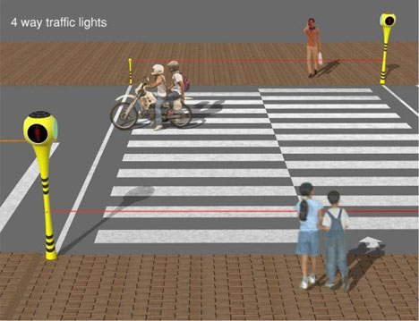
Pedestrians are often faced with danger when trying to cross the street in busy urban areas, so designer Hojoon Lim devised a new type of solar-powered traffic symbol that would keep pedestrians and cars out of each other’s way. The system consists of four signals at each intersection in the shape of a square. Whichever side has to wait for the moment is greeted with a thin laser signal blocking the way, giving a harmless visual cue that is perhaps a little harder to ignore than the standard red light.
The Marshalite
(image via: Wikipedia)
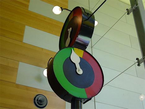
Of course, many of these fancy electronic designs have a classic design to thank for their inspiration. The Marshalite was invented by Charles Marshall in 1936 and employed a mechanical pointer to indicate what the cars should be doing at any given time. Thanks to the sweeping hand that moved at a predictable speed across the colored segments, motorists knew exactly how long remained until the signal changed. The Marshalite was used in Australia until the 1970s, but its design influence can still be felt today.
