Why should health care buildings be cold and impersonal? These 15 designs for both built and unbuilt healthcare-related facilities buck tradition with lots of natural light, gardens and sculptural details. While some reflect what they truly are – state-of-the-art medical facilities with all of the modern bells and whistles – others disguise their technical functions in warm, welcoming designs that feel more like a modern art museum or an aesthetically pleasing home than a hospital or clinic.
Placebo Pharmacy by KLAB
(images via: dezeen)
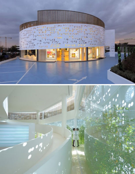
Would you ever guess that this building is a pharmacy? Greek design house KLAB wrapped a round facade punctured with braille lettering around an existing placebo pharmacy in Athens and renovated the interior. Inside, curving white walls, ramps and illuminated glass display cases suggest an art museum rather than a medical building. A radial pattern brings natural light deep within the internal octagonal structure.
Taiwan Center for Disease Control Complex
(images via: studio shift)
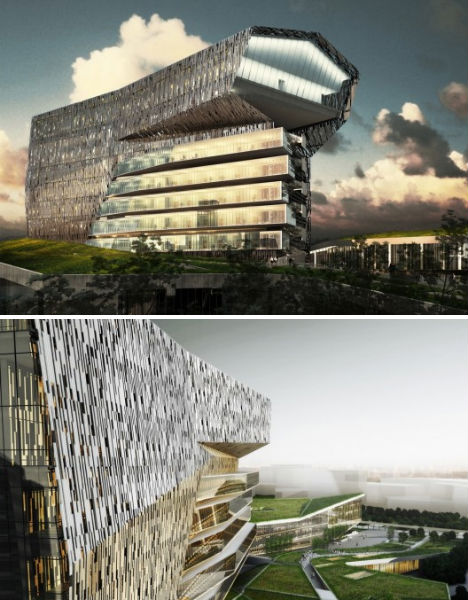
A layered design full of green roofs and light-filtering facades makes up Studio Shift’s vision for the Taiwan Center for Disease Control Complex. While this multi-level proposal was not chosen as the final design, it received Honorable Mention and provides an interesting perspective on the function of such a complex and how it interacts with the public. Vast stretches of grass provide a natural, welcoming atmosphere and recreation space. Laboratories are stacked within a central tower, utilizing a ‘central circulation spine’ for service and waste removal.
National Heart Center in Singapore
(images via: broadwaymalyan.com)
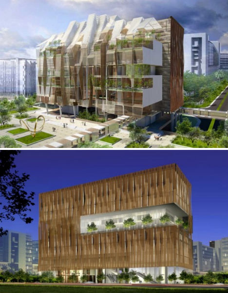
With all of its glass walls and greenery, this design for the National Heart Center in Singapore looks more like an apartment complex than a hospital. Architects Broadway Malyan, wishing to emphasize interaction among patients, staff and workers, provided plenty of large, open common areas brimming with plants and flooded with natural light. The building would be modular to allow quick and easy construction and future renovation.
Center for Brain Health by Frank Gehry
(images via: archdaily)
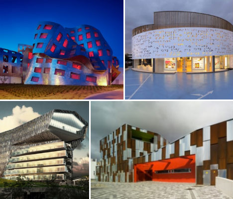
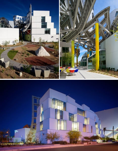
Among Frank Gehry’s more recent built projects is the Cleveland Clinic Lou Ruvo Center for Brain Health in Las Vegas, which will be a major center for the study and treatment of brain disorders like Alzheimer’s, Parkinson’s and Huntington’s diseases. The blocky white medical building, which houses patients, features a stainless steel-covered breezeway that connects it to a second building on the campus, the Life Activity Center.
Life Activity Center by Frank Gehry
(images via: archdaily)
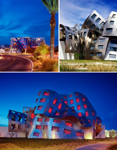
Far more characteristic of Gehry’s style than the medical building is the Life Activity Center, a showy structure clad in reflective stainless steel. Rather than housing patients or research, the Life Activity Center is a space for events. The profits from these events will benefit research in the adjacent medical building.
Champalimaud Center for the Unknown
(images via: archdaily)
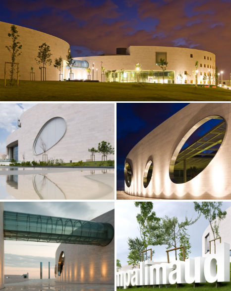
The Champalimaud Center for the Unknown is a research and diagnostic center in Lisbon, Portugal, designed by Charles Correa. This state-of-the-art facility, located on the ocean, consists of three units – one for the doctors and scientists, and another which houses offices, a theater and an exhibition hall. The third unit is a public ampthitheater.
Says Correa, “What makes me most proud about this project is that it is NOT a Museum of Modern Art. On the contrary, it uses the highest levels of contemporary science and medicine to help people grappling with real problems; cancer, brain damage and going blind. And to house these cutting-edge activities, we tried to create a piece of architecture. Architecture as Sculpture. Architecture as Beauty. Beauty as therapy.”
Velez-Rubio Health Center, Almeria, Spain
(images via: archdaily)
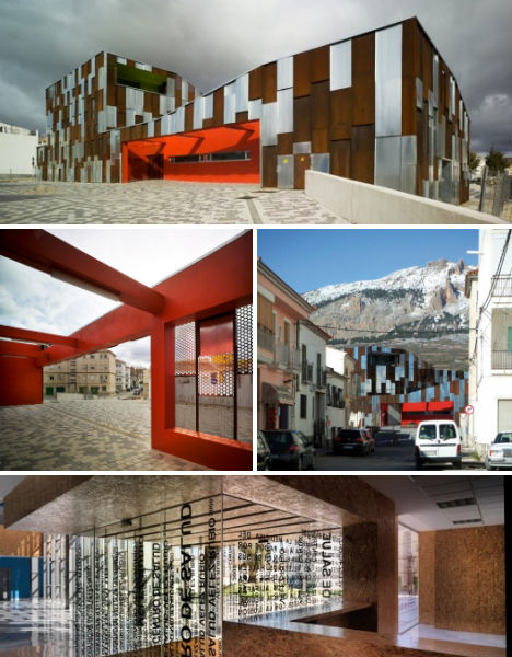
Dramatic and dynamic, the Velez-Rubio Health Center in Almeria, Spain mimics the natural colors of the rusty, snowy mountain landscape behind it and the blue sky up above. Its somewhat amorphous shape mimics that of a mountain range; various entries to different parts of the building are announced to visitors with bright colors. Say the architects, “The solution of the facade offers confusion to the real dimension of the building, that is, it makes it look big despite the fact that it only has two floors. The real scale appears at the moment in which the building interacts with a person, a vehicle or any other object of a different dimension.”
Helios Rehab Sanctuary Concept
(images via: evolo.us)
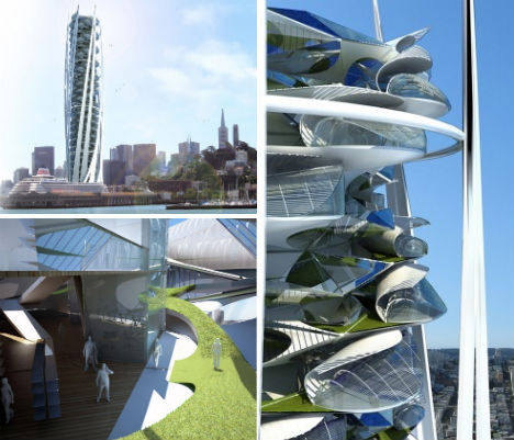
A spiky, swirling skyscraper rises out of the landscape in this Team CLS design for the ‘Helios Rehab Sanctuary’. The tower is divided into three sections, from bottom to top: body, mind, and spirit. Each section focuses on different functions of treatment. Inside the core is a hospital, while light-filled housing and green pathways line the outer skin.
Mornington Center Nursing Home by Lyons
(images via: archdaily)
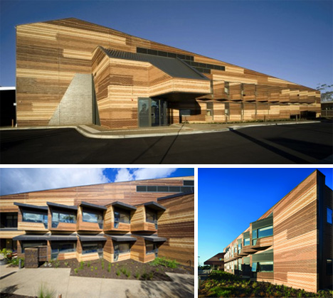
Resembling wood from afar, the Mornington Center in Victoria, Australia is actually made of printed and carved bricks in various warm and sandy shades. Architecture firm Lyons wanted this nursing home and hospital to resemble a house or coastal hotel, warm and welcoming, without the impersonal feel often associated with such facilities. Patient’s rooms feature enormous bay windows that can be opened to allow fresh air and sunlight to infiltrate the space. Clinical spaces are hidden within the interior to make the common areas feel more relaxing for patients and their families.
Suzhou Children’s Hospital
(images via: archdaily)
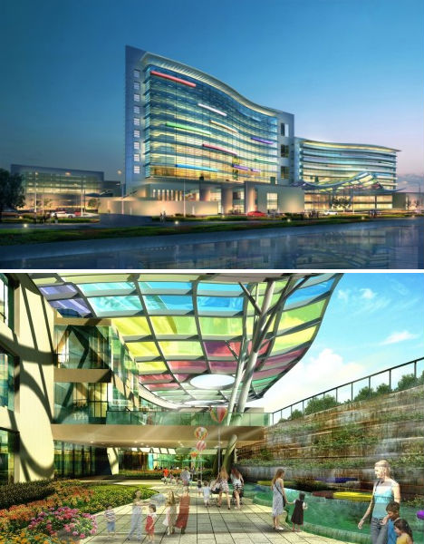
This wave-shaped proposal for the Suzhou Children’s Hospital in China incorporates a large colorful panel reminiscent of a kite which ‘floats’ over the garden and play areas. Architecture practice HKS envision a peaceful place that will ease the stress of young patients and their families. The hospital will include 600 beds, outpatient clinics, 14 operating rooms and a full-service emergency department as well as research space and staff housing, and will be highly accessible via mass transit. All patient rooms face south for maximum exposure to the sun and can be opened to the breeze off the sea, as the Chinese consider access to nature essential in healing.
Mobile Hospital Made of Semi-Trailers
(images via: hord coplan macht)
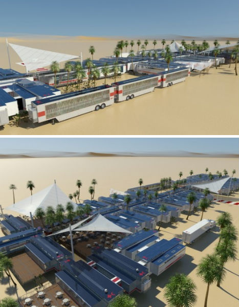
Bringing Western medicine to third-world countries in need, particularly in the aftermath of a disaster, could be a lot easier if this mobile hospital concept by Hord Coplan Macht + Spevco catches on. The design is made up of 58 semi-trailers that contain 48 patient beds in addition to operating rooms, imaging, surgical suites, pharmacies, labs and even a gift shop. The whole 55,380-square-foot complex could be disassembled, moved and re-assembled within two weeks.
New Santa Lucia University General Hospital
(images via: casasolo.es)
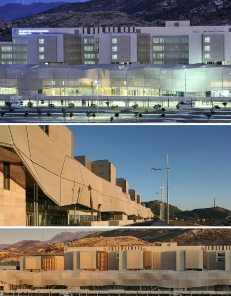
CASA sólo arquitectos have designed the new Santa Lucia University General Hospital in Murcia, Spain, a complex that includes not only a teaching hospital but also spaces for sports, leisure and shopping. A geometric shade covering characterizes the exterior, reaching from the main volume of the hospital over the shops and sports facilities to an external sidewalk. Patient rooms, which are located along the ‘spine’ of the design, look out onto a two-level rooftop garden which is located above diagnostic and outpatient units.
Ubuntu Center by Field Architecture
(images via: fieldarchitecture.com)
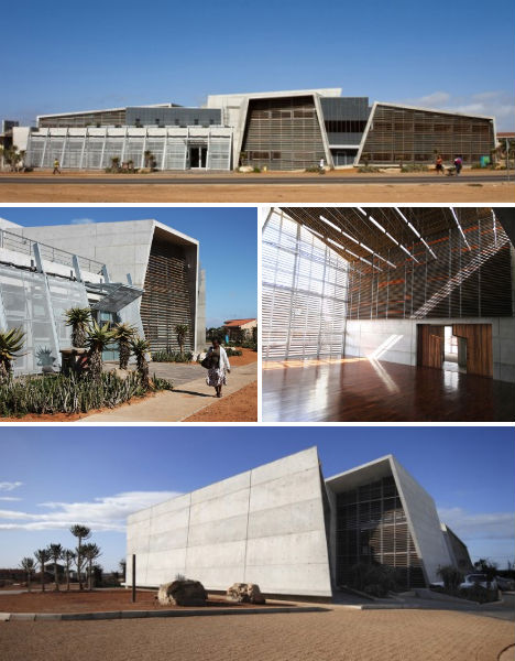
The $6 million Ubuntu Center, which feeds 2,000 children per day and provides holistic care to 3,500 patients, has helped uplift the South African community of Zwide Township. California-based Field Architecture made the Ubuntu Center an even more positive addition to the town by using locally-sourced materials and incorporating green features like renewable energy and passive cooling and heating. The thick concrete walls keep the internal temperature stable, and carefully placed vented windows circulate air. The building also includes a rooftop garden irrigated with graywater.
Rehabilitation Center Groot Klimmendaal
(images via: dezeen)
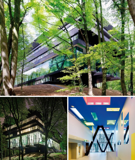
Located in a serene Dutch forest, the Rehabilitation Center Groot Klimmendaal by Architectenbureau Koen van Velson was among six projects shortlisted for the 2011 Mies Van Der Rohe Award, the European Prize for Contemporary Architecture. Inside are clinics, offices, sports facilities, a swimming pool, a restaurant and a theater. With reflective glass windows and neutral anodized aluminum cladding, the building is meant to blend into its natural surroundings. The design stresses natural light and the healing power of connection to the outdoors. “The design ambition was not to create a centre with the appearance of a health building but a building as a part of its surroundings and the community.”
Pictou Landing Health Center
(images via: e-architect.co.uk)
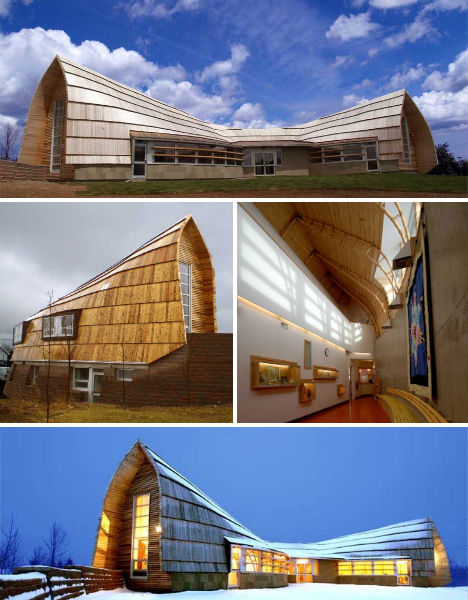
With its flowing contours and warm wood construction, the Pictou Landing Health Center looks more like a farm building than a medical complex. Located in a Mi’kmaq First Nation fishing community in coastal Nova Scotia, the health center design has a structural system made of small-diameter spruce trees that are shaped while green by members of the community. This building technique connects the center to the historic indigenous traditions of house and lodge construction.
