You know you’ve got a winning architectural design when strikingly similar structures begin popping up around the world. Sometimes, these similarities are just coincidences. Sometimes, they’re due to the same architect repeating a theme. And at other times – well – imitation really is the best form of flattery. These 12 pairs of buildings and interiors are almost identical in many cases, from an intentional copy of Mies van der Rohe’s iconic Farnsworth House to the evidently Zaha Hadid-inspired Liverpool Museum.
Banq Restaurant & Xm3
(images via: yatzer + archdaily)
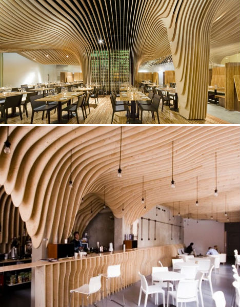
Fluid, curving sheets of wood form what seems to be a highly unusual ceiling design in Boston’s Banq Restaurant by Office dA, Inc, built in 2008. But this wasn’t the first and would not be the last time such a design was integrated into a building interior. The earliest example is the Farkasret Mortuary Chapel, built in Hungary in 1975, which actually resembles a huge wooden ribcage and spine. The W Hotel & Residences in New York City was built in 2008-2009, and the Xm3 restaurant of Poland (pictured) was completed in 2011. See even more examples at PostPost.
Metropol Parasol & Swoosh Pavilion
(images via: yatzer + dezeen)
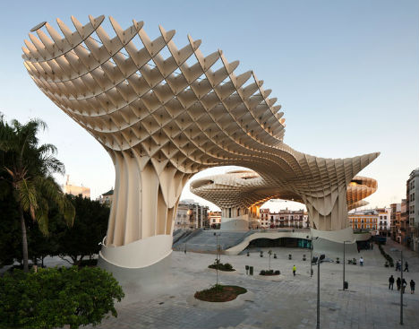
The world’s largest wooden structure is an absolute stunner, a huge multi-story pavilion and walkway made of bonded timber with a polyurethane coating that provides shade, architectural interest and above all an important landmark for the city of Seville, Spain. The Metropol Parasol’s high profile since its design was first revealed in 2004 is likely the reason many people found the Swoosh Pavilion by students at the Architectural Association school so familiar. The Swoosh Pavilion uses a similar concept, on a much smaller scale; it was erected temporarily in 2008 for the London Festival of Architecture.
Hanoi Museum & China Pavilion
(images via: my modern met 1 + 2)
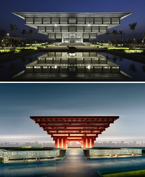
Inverted pyramids are a popular motif in modern architecture, perhaps because they literally turn an ancient and very familiar man-made shape on its head. Two notable examples that may lead to a few double-takes are the Hanoi Museum, designed by German architectural firm GMP, and the national pavilion for China’s 2010 World Expo, which has since been turned into a national history museum. The Hanoi Museum sits on a beautiful reflecting pool; the 56 wooden brackets used to construct the China Pavilion’s roof are highly symbolic, representing the 56 minority ethnic groups in China.
Hemeroscopium House & Rishikesh House
(images via: archdaily + dezeen)
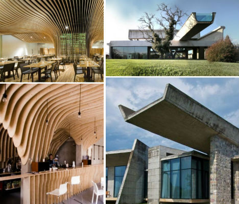
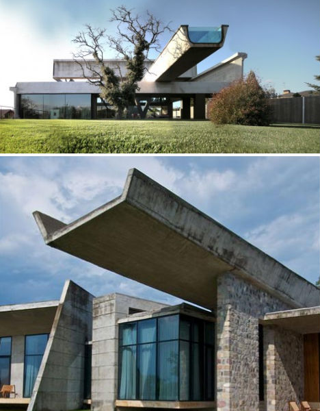
Both are residences with large, U-shaped cantilevered concrete shapes jutting out from their roofs, looking almost like unfinished freeway ramps. The Hemeroscropium house in Madrid by Ensamble Studio was entirely pre-fabricated and took only seven days to assemble. The structure on the roof of this house is actually an infinity pool, while the similar structure atop the Rishikeshi House by Mumbai architects Rajiv Saini + Associates seems to be simply decorative.
Toree Agbar & Swiss Re Headquarters
(images via: arcspace, foster + partners)
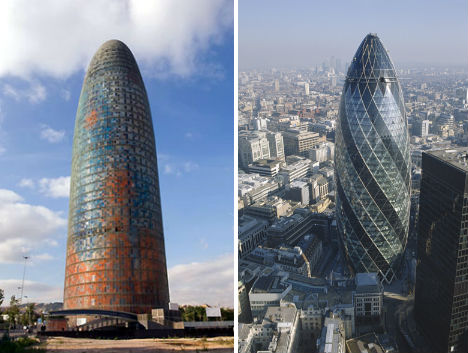
Known locally as the Gherkin for its decidedly pickle-like shape, 30 St. Mary Axe – the Swiss Re Headquarters – instantly became an iconic part of London’s skyline when it was completed in 2004. The Torre Agbar by Jean Nouvel, located in Barcelona, is a glittering spire that serves as the headquarters of the local municipal water company; it features aluminum panels in 25 colors as well as 4,400 windows and 55,619 transparent and translucent glass plates. It was completed in 2005.
Riverside Museum & PEGS Junior Boys School
(images via: archdaily 1 + 2)
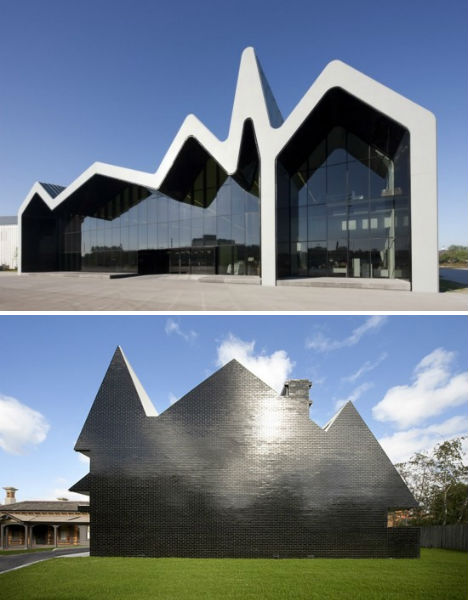
A stark graphic silhouette of a house forms the basis of both Zaha Hadid’s Riverside Museum in Glasgow, Scotland and the PEGS Junior Boy’s School in Melbourne, Australia. The former is a bit more stylized, with a white-edged roofline on one side and black on the other, topping giant walls of windows. The latter is sharper, more defined, even including the shape of a chimney, and features glossy black brick in its construction.
The San Remo & The Eldorado
(images via: postpost)
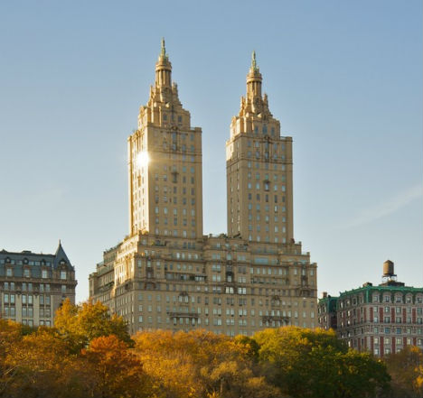
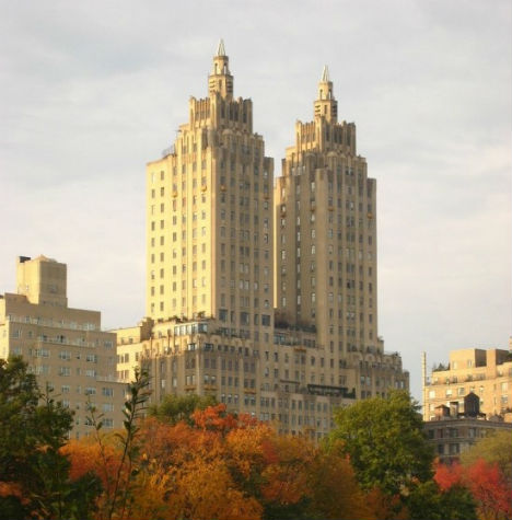
If as a traveler in New York City it seems you’re passing the same building numerous times, rest assured that you’re not lost, and you’re not going crazy. The El Dorado at 300 Central Park West looks almost like an exact replica of The San Remo, which is located in the same area. Both were built in 1931, and both were at least partially designed by architect Emery Roth. The twin towers of each residential building are remarkably similar. When they were built, the San Remo apartments were much pricier, while the lower-rent El Dorado apartments were smaller and more modern. Both buildings now house plenty of celebrities and apartments within sell for up to ten million dollars each.
Farnsworth House & Glass House
(images via: archdaily 1 + 2)
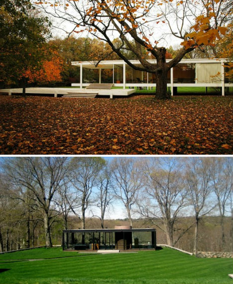
Philip Johnson’s Glass House, built for himself on a 47-acre estate in Connecticut, was openly inspired by the iconic Farnsworth House by Mies van der Rohe. Both houses are relatively small single-story structures, one black and one white; the Farnsworth House is elevated off the ground. Evidently, van der Rohe was less than impressed with Johnson’s creation. According to ArchDaily, “It is said that the brilliant mentor to Philip Johnson stormed out in fury because of what he interpreted as a lack of thought in the details of the house.”
Maxxi Museum & Liverpool Museum
(images via: minimalismi, wikimedia commons)
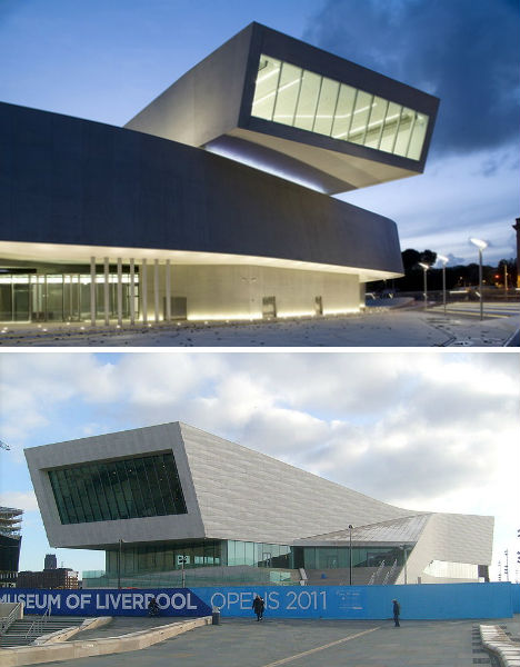
When the Museum of Liverpool debuted this year, it’s safe to say that fans of the architect Zaha Hadid were not amused. The Liverpool museum resembles, more than a little bit, the award-winning design of the Maxxi Museum in Rome, which spent over a decade in development and construction. Designed by Dutch architects 3XN, the Liverpool Museum is the largest National Museum to be built in the UK in over 100 years and sits on a UNESCO World Heritage Site along the Mersey River. The Maxxi is the National Museum of 21st Century Art and features an interior that is decidedly more complex.
Serpentine Pavilion & Nestle Museum
(images via: london design guide, archiarcha)
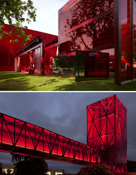
Both of these buildings are blood-red, a highly unusual choice for architecture. That alone is what brought the 2010 incarnation of the temporary Serpentine Pavilion at the Serpentine Gallery in London to mind when the Nestle Museum by Metro Arquitectos debuted in 2011. Jean Nouvel designed the Serpentine Pavilion in geometric forms made of glass, polycarbonate and fabric, and absolutely everything in it was red. The public viewing structure of the Nestle Chocolate Museum, located on the side of a highway between Sao Paulo and Rio de Janeiro in Brazil, certainly attracts attention.
Museo Soumaya & Selfridges
(images via: contemporist + dezeen)
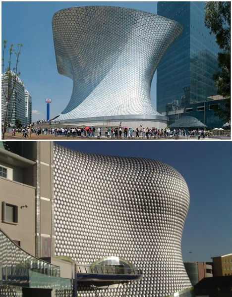
When multiple nearly-windowless scaled metallic buildings pop up, they’re bound to get noticed. First there was the 2007 Selfridges building in Birmingham, England, by Future Systems Architects. Smooth and shiny, the four-story building resembles a giant water-rounded boulder with its 15,000 spun aluminum discs painted blue. Then, in 2011, FREE Fernando Romero EnterprisE completed its anvil-shaped Museo Soumaya in Mexico City, which is covered in hexagonal aluminum tiles.
St. Mary’s Cathedral & San Josemaria Escriva Church
(images via: postpost)
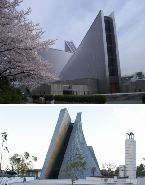
One was built in 1963, the other was only just completed in 2011. But St. Mary’s Cathedral in Tokyo and San Josemaria Escriva Church in Mexico City certainly resemble each other, all the more so because their shared characteristics are so unique. St. Mary’s is the seat of the Roman Catholic Archdiocese of Tokyo and was designed by Kenzo Tange. As opposed to St. Mary’s cross shape, San Josemaria is a single volume, rising from the ground at an angle. The former resembles another St. Mary’s in San Francisco, while the latter is visually similar to the Luce Memorial Chapel in Taiwan.
