As humans, we are programmed to anthropomorphize our surroundings. So what would happen if the letters on pages conveyed meanings others than the words they represented … say, actual (versus just typographic) faces?
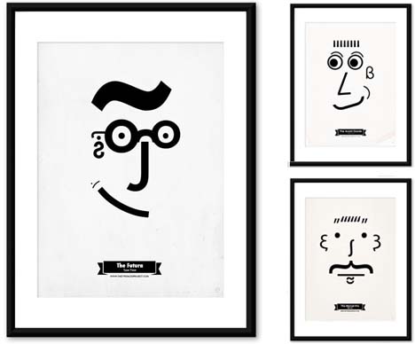
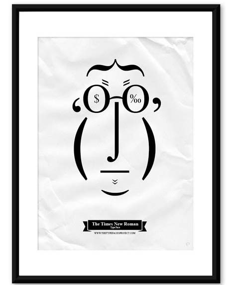
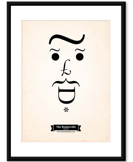
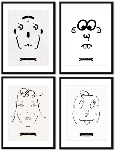
In this Type Faces Project, Tiago Pinto takes familiar fonts, breaks them down into serif, sans-serif and miscellaneous, then assembles them to form caricatures based on inferred character traits.
Futura becomes a kind of excited science geek – forward-thinking optimist, perhaps. Times New Roman is, predictably, that stodgy old bottom-liner. And Baskerville is, well, quite the hound dog.
It should come as no surprise that WingDings (upper left above) is one weird-looking dude, or that Comic Sans (upper right above) is a hopelessly confused-looking loser.


