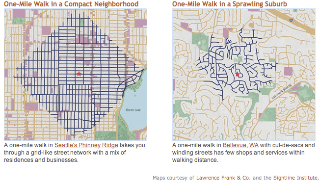
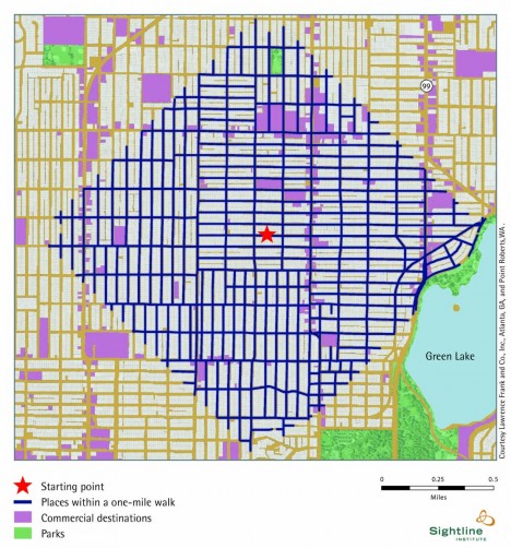
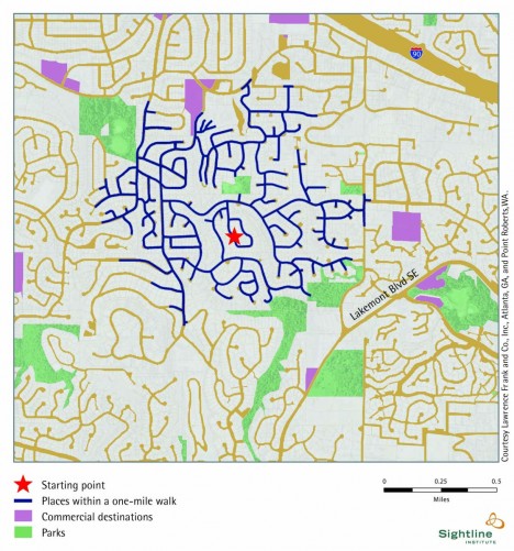
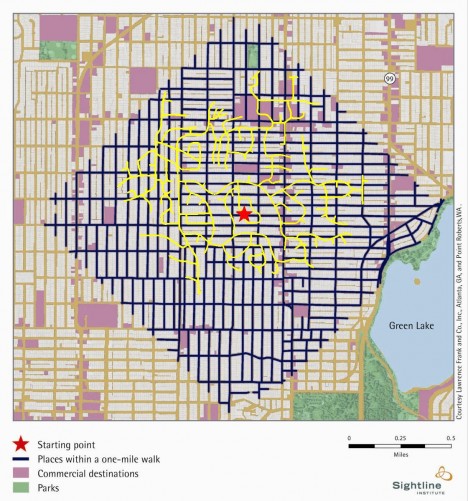
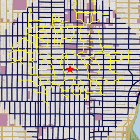
A tale of two neighborhoods, these graphics (and their hybrid) stunningly illustrate how much further you can get on foot when you take a walk through an urban grid versus the suburban sprawl just a few miles away.
Depicted here are Phinny Ridge in Seattle, Washington (mapped above) and a section of its sibling-city across the water: Bellevue (shown below). As these images from the Sightline Institute show, the grid of streets on the Seattle side puts parks, services and shops of various sizes all within a walker’s reach. On the Bellevue side, there are a few more micro-parks but very few shops, services or large green spaces to be found in a winding one-mile range.
Of course, other examples, including many European cities, show that there is more too the equation than grid layouts. Some urban centers work well with non-rectilinear layouts (circular, for instance), and in other cases sufficient density, public transit or arterial connections make up for twisting shapes of local streets.
Still, these side-by-side (and overlaid) graphics tell a story of surprising contrast in terms efficiency and accessibility in relatively modern contexts. Larger structural differences are shaped and reinforced by building codes, zoning laws and other details that shift from one municipality to the next. These in turn dictate everything from large-scale pedestrian accommodations to road widths, building setbacks and other details that conspire to form tight-knit cities or allow for sprawling suburbs at both macro- and micro-scales.
From SightLine: “The walkability maps and information presented in Cascadia Scorecard 2006 were developed by University of British Columbia’s Dr. Lawrence Frank, and colleagues Dr. James Sallis of San Diego State University and Dr. Brian Saelens of Cincinnati Children’s Hospital, and were funded by King County, Washington, and the National Institutes for Health.”
