A long-standing design proposal from Foster + Partners has been scrapped by developers in favor of a new scheme from BIG (Bjarke Ingels Group) that presents a different face to viewers depending on their approach or view within the city, rejecting conventional skyscraper typology and cultivating visual transitions between neighborhoods on all sides.
As the last project slated to be built on the World Trade Center site, the would-be 2 WTC skyscraper is a critical piece of the Lower Manhattan landscape, but its future tenants wanted something that stood apart from the more straightforward tall buildings associated with finance and Wall Street.
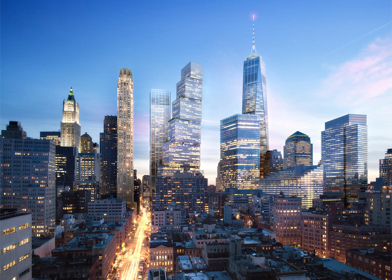
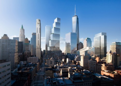
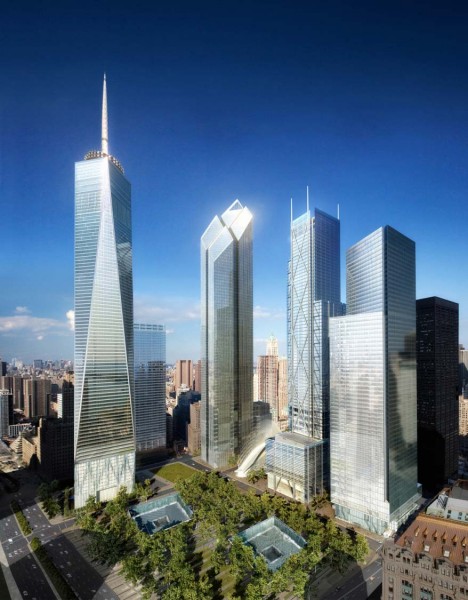
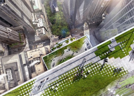
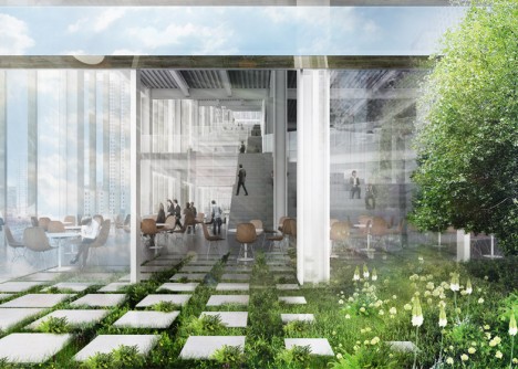
The prior scheme, shown above, featured four connected verticals, each terminating in an angled plane at the top, essentially a tower with slots centrally located along each face. The new scheme, endorsed by occupants including 21st Century Fox and News Corp and shown below, intentionally shies away from the skyscraper aesthetic and creates space for greenery on a series of platforms created by recessed sections of structure.
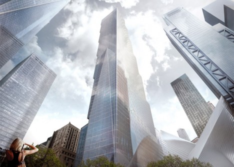
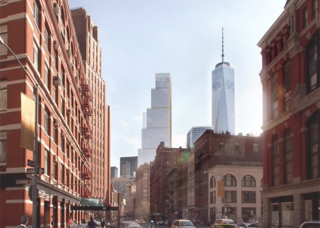
Its facade shows off a slim and modest structure when viewed from the memorial site on one side below but creates a stacked-box effect when seen from adjacent lower-rise parts of the city above like Tribeca: “From Tribeca, it will appear like a vertical village of singular buildings each tailored to their individual activities stacked on top of each other, forming parks and plazas in the sky.”
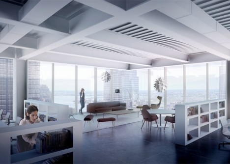
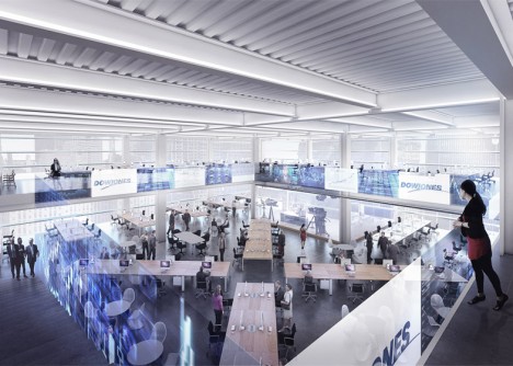
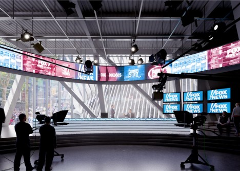
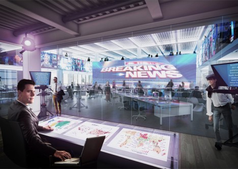
By keeping larger boxes at the base and similar overall square footage (nearly 3,000,000 square feet), the building also is designed to accommodate sizable studio spaces for the aforementioned media companies. Lower levels will be occupied by these giants while upper floors will be rented out to smaller commercial clients. Set alongside One, Three and Four World Trade Center, this structure will stand apart, its broken-down scale visually bridging the gap between the southern tip of the island and the rest of the city to the north.
