(source: fornal)
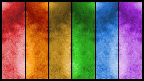
When most people think about monochrome photography (or monotone photography for that matter), they immediately jump to black & white or grayscale. That’s not to say that they’re wrong, since monochrome photography most often does refer to capturing three-dimensional spaces in two-dimensional black-and-white, but by doing so they are limiting their options. Monochrome simply means ‘of one color’, and what that color ends up being, is entirely up to you. Here are some eyeopening monochromatic shots in red, blue, green, purple, orange, and yellow.
Monochrome Photography in Red
(sources: jenriks, manganite, sahrizvi)
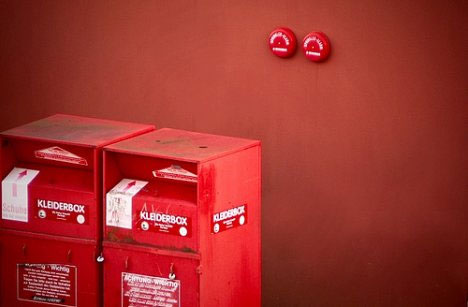
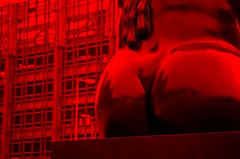
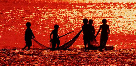
In many cases, opting to shoot in one color rather than utilizing the entire spectrum can provide you with much more powerful results. The color red, for example, is associated with lust, lust, sex, blood, and sin on the one hand, and courage, sacrifice, passion, love, and beauty on the other. Shooting in red can make the most innocent scenes appear sinister and foreboding.
Monochrome Photography in Blue

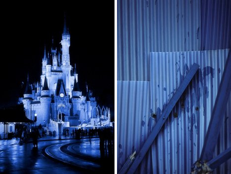
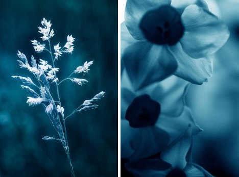
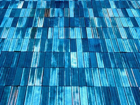
(sources: expressmonorail, nabenori, manganite, emilyquinton, evaekeblad, mavis_hk)
The color blue has come to be synonymous with feelings of sadness. This is because Greek mythology associated blue with rain and storms, which were believed to be direct results of Zeus being sad or angry. Adding some blue to your photos can immediately make even the most jovial of settings appear a little melancholy.
Monochrome Photography in Green
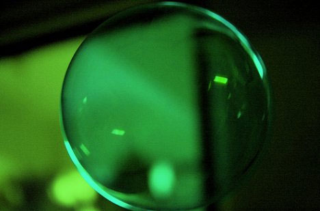
(sources: emadivine, ringydingydo, manganite)
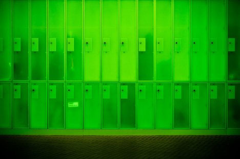
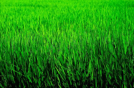
The color green is complex and interesting in its connotations. Derived from the old english verb growan (meaning to grow), it is often used to refer to plants and vegetation (even when not denoting their color), and environmentalism (the green movement). The color also refers to lack of experience (he’s green), jealousy (green with envy), and money (greenbacks). While in some cultures the color denotes growth and prosperity, in others it can mean sickness and death. Even though three out of the four images above are manufactured, their coloring gives them a distinctly organic feeling.
Monochrome Photography in Purple
(sources: flumpster, damgaard, fern_carver, kristianbirchall)
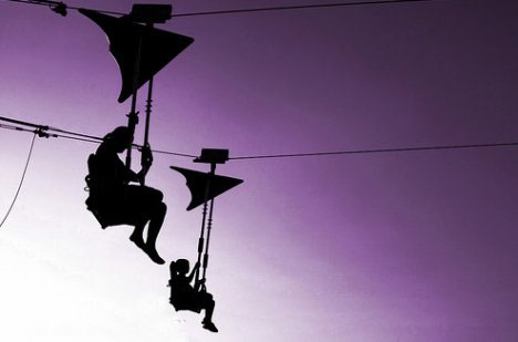
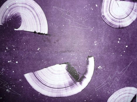
Purple is a very exclusive color, or…elitist if you will. When the use of the color first became fashionably, the dye was so expensive to acquire that only the wealthy could afford it, and therefore it came to denote royalty (in fact Tyrian purple is also called imperial purple). Throw in a dash of purple and your shots, too, can look undeniably regal.
Monochrome Photography in Orange
(sources: harraz, wards, babylon9, vanbrad, gkayacan)
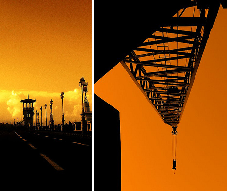
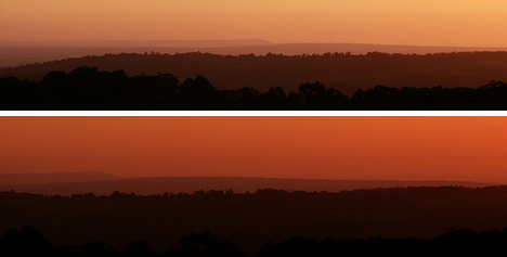
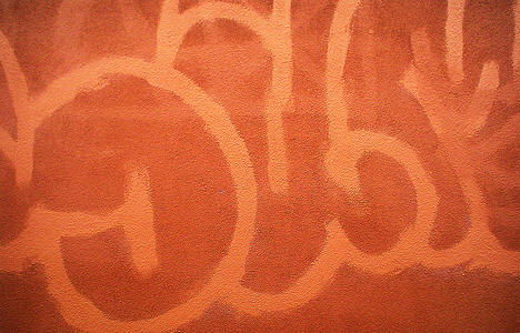
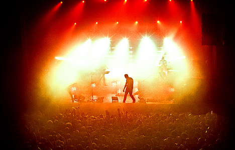
Just as purple is regal, orange is equally common. So common, in fact, that the name of the color is derived from the fruit (and not the other way around as many believe). Orange also much softer and more sedated than red, and symbolizes energy and warmth rather than anger and sin. The color is cheerful and friendly without being overbearing and at the same time demands attention (traffic cones) without screaming (red stop signs). The first two images represent the transitional nature of orange (autumn/fall – the changing seasons) while the latter two represent the energy and attention.
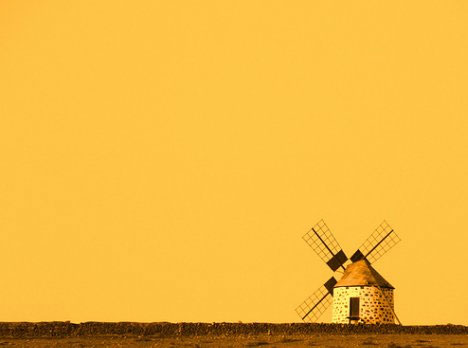
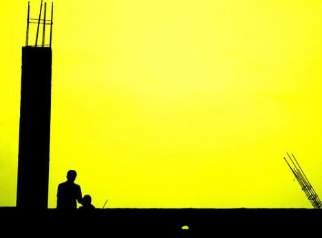
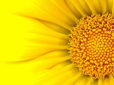
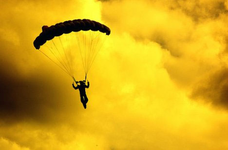
Monochrome Photography in Yellow
(source: leticiamr, dum, chun, ketzal)
Yellow is sunshine, sunflowers, and smiley faces, but yellow isn’t always happy. Much like the duality of red, yellow also has two faces, two sets of possible responses, two completely different uses. On the one hand yellow is everthing joyous and hopeful, and on the other, it denotes cowardice, deciet, and aging. Be careful when using colors with dual interpretations as they can have a distorting effect on your statement.
