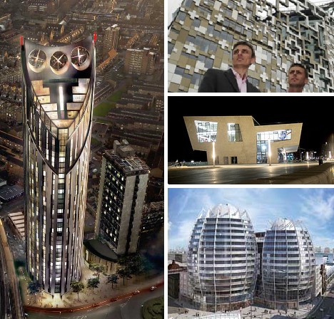
The Carbuncle Cup is an annual award bestowed by Building Design magazine upon the ugliest building in the UK over the past 12 months. Since 2006 the dubious distinction of winning the Carbuncle Cup (named after Prince Charles’ infamous “carbuncle speech” given in 1984) has gone to five architectural abominations, each selected from publicized shortlists of 5 to 10 nominees. Here are the five “winners” plus five runners-up from the 2010 shortlist.
2006: Drake Circus Shopping Centre, Plymouth
 (images via: BBC and Building UK)
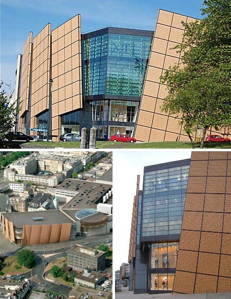
One would think that the emergence of a building displaying overwhelming awfulness would be required to jump-start an annual competition that highlights the lowlights of British architecture – and the Drake Circus Shopping Centre in Plymouth was seemingly made to order. “Is this the worst monstrosity ever to blight a town centre?”, asks Building Design. “Possibly not. But as an example of how bad architecture and bad planning can combine to produce something truly awful, it deserves to win our cup.”
 (image via: Wikimedia)
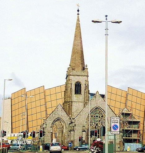
The Drake Circus Shopping Centre was nominated for the initial competition by Daniel Atkins of PDP Green Consulting, who sought to state his case in this manner… oh, and feel free to read this (and all other quotes to follow) to yourself in an early Monty Python-era John Cleese voice: “The building is comprised of a massive shopping precinct and car park. Apparently the planners were so concerned about its vast size, they insisted on visually fragmenting the facade. This results in a collision of styles and materials with no unifying characteristics whatsoever. The car park entrance of the building is a tour de force, being as it is the ‘bum’ of the monster.” And now for something completely different, it’s…
2007: Opal Court, Leicester
 (images via: U of Leicester, Price Tags and Anakbrunei)
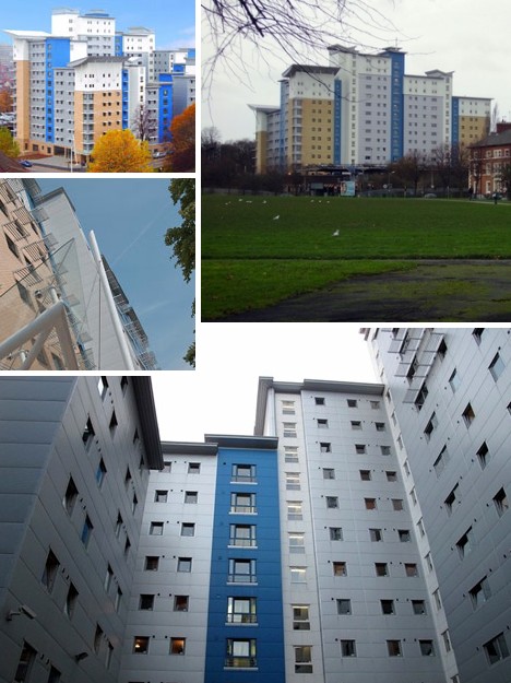
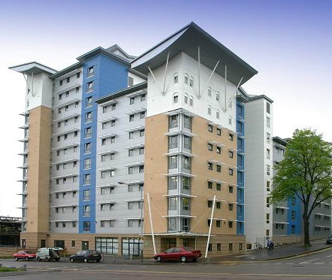
Opal Court in the city of Leicester, designed by Stephen George & Partners, is a housing block for students and key workers located near the city center. The anonymous nomination of Opal Court for the 2007 Carbuncle Cup was kinder than what might be expected, stating that Opal Court’s design is “symptomatic of the kind of rubbish being built in Leicester at the moment.” Misery loves company, one supposes.
 (image via: Opal Group)
Critics on the jury who voted Opal Court this year’s winner more more specific (and more withering) in their criticism, stating “the tiny, token butterfly roof on the top of each core is pathetic, the colours are a grim, post-modern throwback, and in scale, language, materials, form and design, it’s a lesson in how to ignore context.” So, um, I guess they were less than impressed.
2008: Radisson SAS Waterfront Hotel, St. Helier, Isle of Jersey
 (images via: TripFit, Business Traveler and Cameron’s)
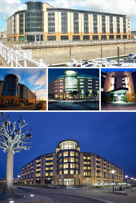
Often the man (or woman) in the street is unable to convey their impressions – good or bad – of new architecture in their city or town. Not so the readers of the Jersey Evening Post, who peppered the editor with their near-universally negative opinions of the Radisson SAS Waterfront Hotel. Some of these include “like a communist-era east European sewage works” and “like the Chernobyl nuclear power station.” That’s hot.
 (image via: BD Online)
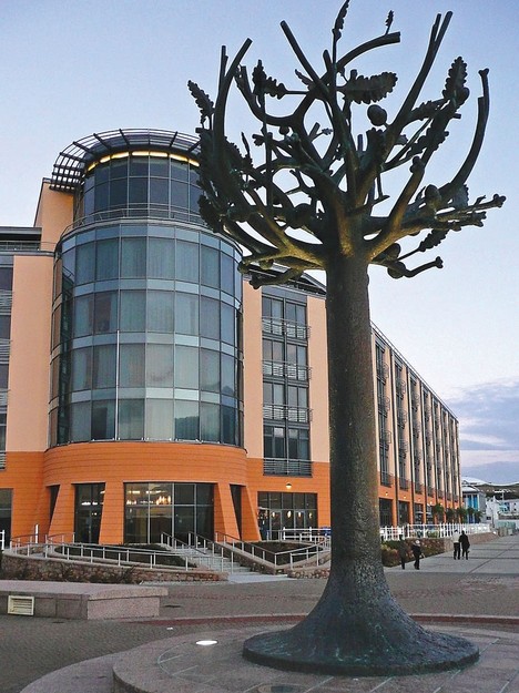
Describing EPR Architects’ somewhat controversial Radisson SAS Waterfront Hotel in his submission to the 2008 Carbuncle Cup jury, Alan Holmes was at a loss for words… just kidding, he described it as being “reminiscent of a cross between a blockhouse and a wheat silo.” Holmes WAS at a loss for images, however, stating “I fear my camera may not take the strain.” Luckily we have a few choice ones just above.
2009: Pier Head Ferry Terminal, Liverpool
 (images via: Telegraph UK and Arbroath)
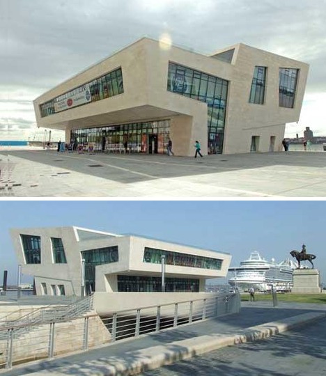
Talk about damning with faint praise… “Despite strong competition from a record number of entries, this year’s winning building by Belfast-based Hamilton Architects is a shining example of bad architecture and bad planning.”
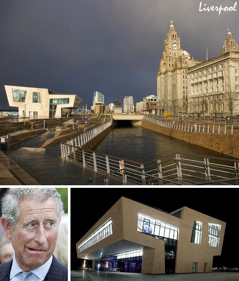 (images via: Fotolog, NG Matthew and Architecture.org.nz)
Competition or not, the new Pier Head Ferry Terminal in Liverpool instantly achieved notoriety, both for its jarring looks and its inappropriate location. “It was given the Carbuncle Cup as much for where it is, as for its lack of architectural merit,” explained Amanda Baillieu, editor of Building Design. “The result is abominable, complete pap and should never have been allowed to be built. It will look dated in only a year or two.”
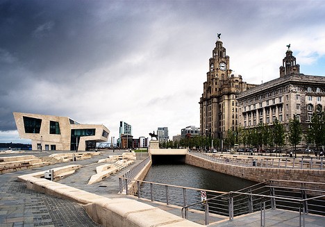 (image via: Andy Barton)
You have to admit, the terminal building looks VERY out of place, especially when viewed in context of the frilly, Victorian gingerbread buildings that share this stretch of the Liverpool seaside. Building Design’s 2009 Carbuncle Cup jury said the new ferry terminal “is essentially a horrible sectional idea that has been extruded like a stick of rock. When you go there you think: ‘Oh no, I can’t believe they’ve done that’.”
2010 Finalist: Bézier Apartments, Old Street, London
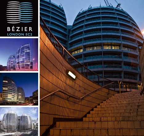 (images via: Skyscraper News and Skyscraper City)
According to detractors (of which there are many), the Bézier Apartments designed by TP Bennett and situated near London’s near Old Street aren’t just ugly, they’re “most offensively ugly.” Obviously being plain old capital-U Ugly isn’t enough to get one’s carefully thought-out project onto the short list for the 2010 Carbuncle Cup.
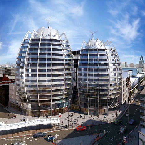 (image via: Skyscraper City)
The Bézier Apartments consist of twin 14 and 16 story buildings containing a total of 200 apartment units. If their bulging facades aren’t enough to catch the eye, then how about the almost comically tiny windmills perched on their rooftops in the fashion of a quintessential beanie-wearing nerd. But back to the facades, which Building Design compared to a “gigantic pair of buttocks”… actually, with that there’s not much else to say.
2010 Finalist: Saint Anne’s Square, Belfast, Northern Ireland
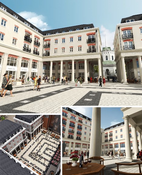 (images via: Belfast City Council and Franklin Rees)
Saint Anne’s Square is a £100m leisure, commercial and residential development in Belfast’s Cathedral Quarter, said to be a major site of regeneration in the long-troubled Northern Ireland city. With that in mid, it’s nomination for the 2010 Carbuncle Cup has to be more than a little dismaying for proponents of Belfast city pride. The design of Saint Anne’s Square (by WDR & RT Taggart) is described as “neo-classical pastiche mess” that is at the same time “overscaled and underimagined.” The area of Belfast in which Saint Anne’s Square is located was heavily bombed by the Luftwaffe in World War II – doubtless many critics wouldn’t mind inviting them back for another go.
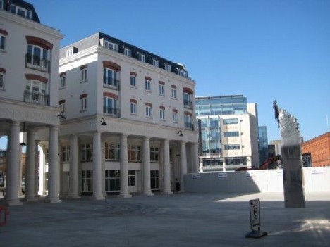 (image via: PropertyNews)
Saint Anne’s Square was one of a number of Belfast projects nominated for the 2010 Carbuncle Cup – a fact that should lead the city planning department to review their approval process. According to NR Greer of The Newsletter, “What I cannot forgive is the fact that it blocks the view of the cathedral as you approach Belfast from the north. What were the planners thinking?”
2010 Finalist: Haymarket Hub, Newcastle
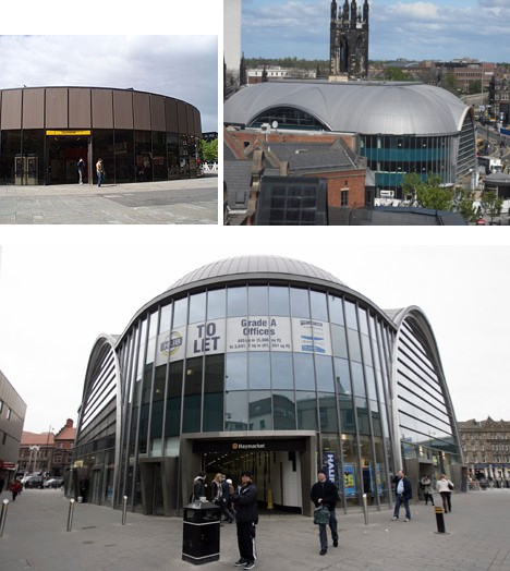 (images via: Wikipedia and Chronicle Live)
Haymarket Hub is the above-ground portion of the rebuilt Haymarket Metro station, which first opened in August of 1980 and displayed a rather plain, circular “roundhouse” look (above, top left). The station, on the Tyne and Wear Metro line located in the northern part of Newcastle’s historic city center, is used by about 6 million passengers annually. The upgraded Haymarket Hub building was officially opened March 29th, 2010 by Princess Anne. In early July the station was added to the shortlist for the 2010 Carbuncle Cup.
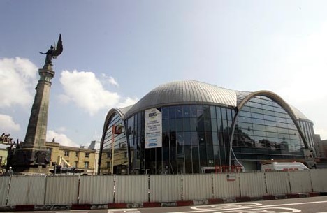 (image via: NE Business)
The revised Haymarket Metro station completely rejects the modernist 1980 design aesthetic, instead opting for a 4-sided structure with glassed-in arches. The Haymarket Hub was designed by architects Reid Jubb Brown (now Sadler Brown) and bears closer aesthetic kinship with romanesque Byzantine churches than anything existing today in Newcastle. Being nominated for the Carbuncle Cup hasn’t fazed its architects, however, “because no architect wants his work to be so dull it goes unnoticed” according to Sadler Brown director Kevin Brown. “Iconic buildings like the Eiffel Tower were considered eyesores when built but have become icons of our age,” added Brown in defending the structure. “The Haymarket Hub makes a statement, in my opinion, and will become an icon in Newcastle.” From eyesore to icon? Only time will tell.
2010 Finalist: The Cube, Birmingham
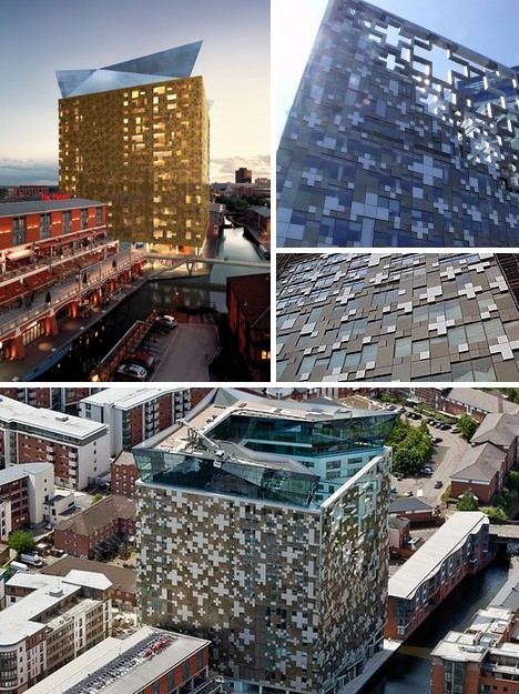 (images via: Estates Gazette, The Stirrer, Need Office Space and BBC)
The 23-story tall The Cube office development in Birmingham has taken a lot of flak for its unconventional 8-bit style facade that led one critic to call it a “pixellated leviathan”. Designed by Make Architects with an eye towards Birmingham’s surrounding Jewelry Quarter, The Cube was was nominated for the 2010 Carbuncle Cup along with a jaundiced opinion stating it best resembled “a lumpy beige ornament your father buys your mother for her birthday because he thinks it’s classy, whereas she can see it for the tat it is”. Ouch.
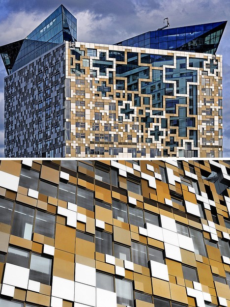 (images via: Flickriver and Darrell Godliman)
Nominators offended by The Cube’s design took pains to point out its “clunky windows” and “horrifically inelegant vents” while turning up their noses at its “overall colour”, meant to evoke gold jewelry. The Cube also bears the unwelcome distinction as being one of the only buildings nominated for the Carbuncle Cup before it was even finished! “Perhaps it is best to say that if this building works at all then it is from far away, because you can’t quite see what makes it so monstrous.”
2010 Finalist: Burns Monument Centre, Kilmarnock, Scotland
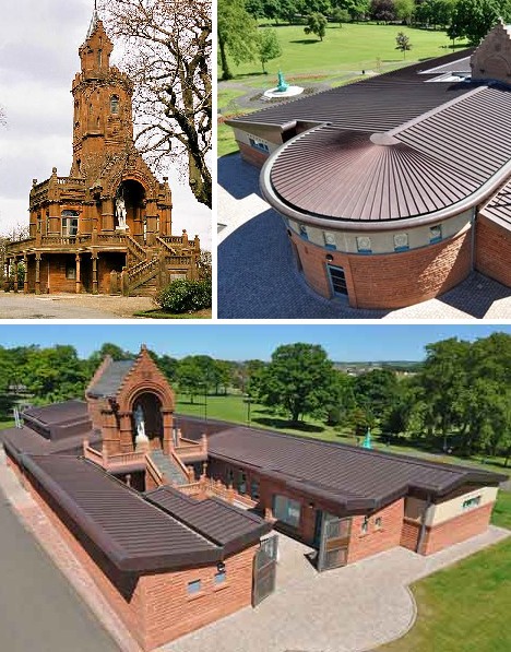 (images via: Scotsman.com, Landscape PING! and Bad British Architecture)
Constructing a memorial center for Scottish poet and national icon Robert Burns (1759-1796) was bound to be an exercise in futility: how to do proper justice to a figure adored by many as Scotland’s secular saint? Indeed, the howls of gaelic-accented protest over the Burns Monument Centre have taken on a poetic lilt of their own. Commenters at the Bad British Architecture Blog have had a field day with it, one saying “Good God, it looks like its the Auschwitz zone at Disneyland.” Another let loose with “Just so wrong. Wrongness taken to whole new levels of wrongitude. Wrong concept, wrong language, wrong materials, wrong detailing. Many many layers of wrong. So wrong that the word ‘wrong’ is now starting to look a bit funny when I type it.”
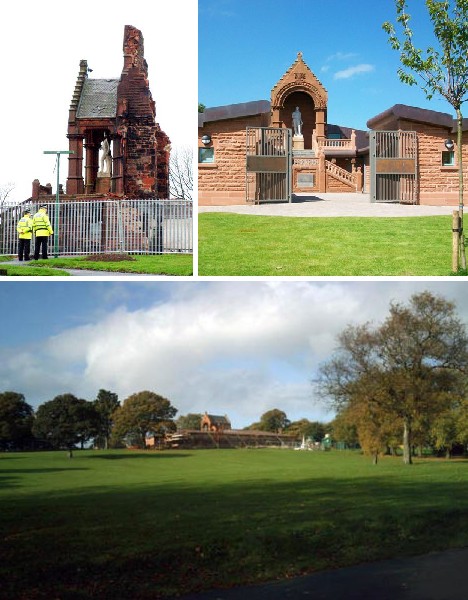 (images via: Burns Monument Centre, Barred Bard and Kilmarnock)
The original Burns Monument Centre was constructed in 1879 and was an endearingly glorious exercise in Victorian excess. The charming structure was badly damaged by fire in 2004, unfortunately. In rebuilding the Centre it was decided to add a substantial extension that gives the compound as a whole the feel of a courtyard. It’s this modern expansion that has inflamed critics who fervently wish things were restored to their previous state. Indeed, critics are decrying what they term a “clumpy monstrosity with pointlessly random roofs” or “a series of terracotta bicycle sheds.”
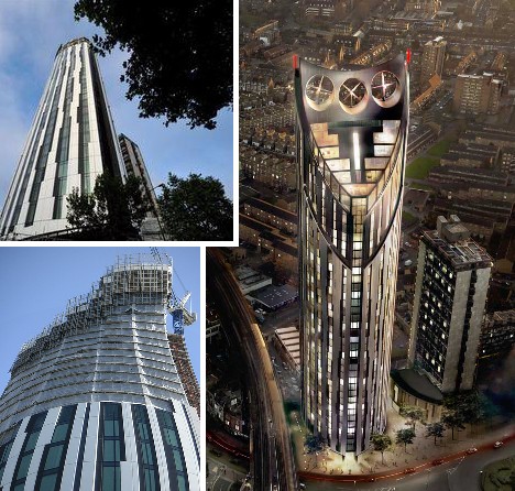
2010 Winner: Strata Building, Elephant & Castle, London
 (images via: IO9, E-Architect, NOROA and Joe CWS)
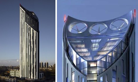
The Strata Building in central London’s Elephant & castle district was nominated by The Georgian Group for its “plain visual grotesqueness” and “breakfast-extracting” ugliness. From its barcode- like cladding to the concave front facade to the electric shaver cut of its upper levels, the 43-story Strata Building (designed by BFLS) certainly stands out – then again, the 480 feet tall block is Britain’s tallest residential building and it dwarfs anything in the neighborhood.
 (images via: South London Post and USCL News and Gossip)
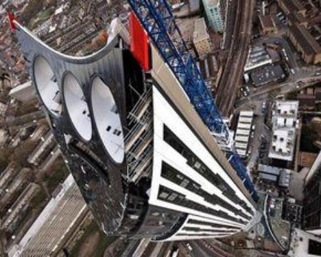
On the bright side, BFLS claims the three large rooftop wind turbines can supply 8 percent of the building’s energy requirements… one assumes, when the wind is blowing in just the right direction.
 (image via: Zoopla)
Negative reviews of the Strata Building far outweigh the positives, however. “Quite simply the worst tall building ever constructed in London,” said Ellis Woodman, deputy editor of Building Design and a man who doesn’t mince words. Continued Woodman, scathingly, “A skyscraper is an energy-greedy building form, both in terms of construction and the power needed to take people to their front doors in a lift. To top one off with some wind turbines is the worst sort of greenwashing.”
![]()
 (image via: Yang Square)
The winner of the 2010 Carbuncle Cup was selected in August by a jury comprising of Jonathan Glancey, Owen Hatherley, Amanda Baillieu and Ellis Woodman. Besides being well-versed in architectural knowledge and history, the jury members are also well-versed in, well, verse: they’ve displayed admirable proficiency in the traditional English art of snooty, disdainful dismissal. We’d very much like to see where THEY live and work.