You might think web designers would strive for the most cutting-edge, up-to-the-moment look possible considering the 21st-century nature of the medium. But websites don’t all have to be sleek and modern – sometimes, a theme featuring old-fashioned signs, retro typography and photographs, vintage products and illustrations straight off World War II propaganda posters can be surprisingly fresh. These 15 websites take us back to another age in a manner that’s appropriate for each site’s subject matter.
Hipstery
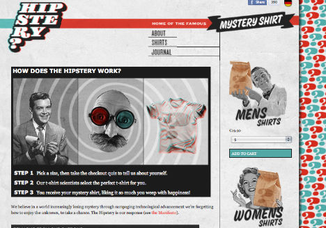
A concept that’s a bit zany needs a zany website, and Hipstery certainly has that with its psychedelic Leave it to Beaver vibe. The site allows users to take a quiz about their likes and dislikes and then receive a mystery t-shirt in the mail.
Dollar Dreadful
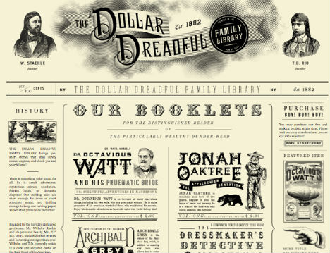
With an engraved-style header image including two portraits of the site’s founders, Dollar Dreadful could easily be a newspaper from 1882 – down to the row of old-fashioned ads for things like “Muccatypo, fine letter forms & moustache twirling.” Hawking short stories “for the distinguished reader or the particularly wealthy dunder-head”, Dollar Dreadful gets a lot less antique-looking once you click on the storefront.
MediaBOOM
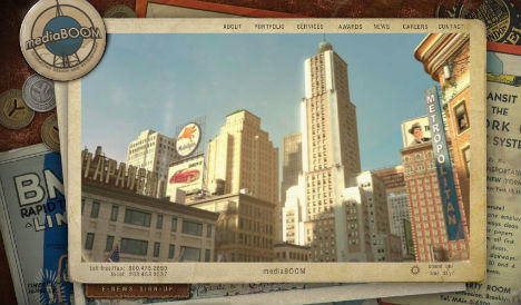
MediaBOOM isn’t trying to convince anyone that they provide “modern design for a modern word”, or any such nonsense. But they do use cutting-edge technology to provide interactive websites for clients like Jim Beam and Yale University. The layered, scrapbook-style design of their own site even comes with a vintage radio soundtrack.
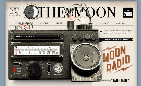
The New York Moon
The way that The New York Moon’s “radio feed” is delivered to its website is anything but vintage: it’s a direct stream from Twitter. But that doesn’t mean they can’t cleave to the same aesthetics that they have loved since they first began transmission a century ago. And, somehow, it works. As they say themselves: “the internet is the dream of ham radio fulfilled. It’s a place for individuals to connect and broadcast with little obstruction.”
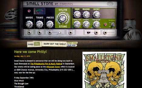
Small Stone Recordings
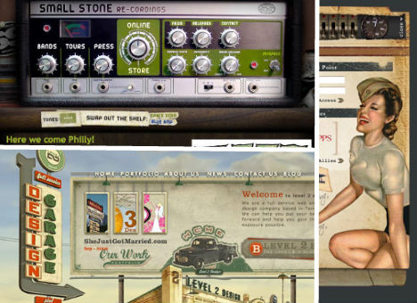
Like those who yearn for the days when families gathered around radios, many musicians aren’t thrilled about the transition from analog to digital and how it has affected sound. Perhaps that sentiment is behind the rock n’ roll throwback look of the Small Stones Recordings website.
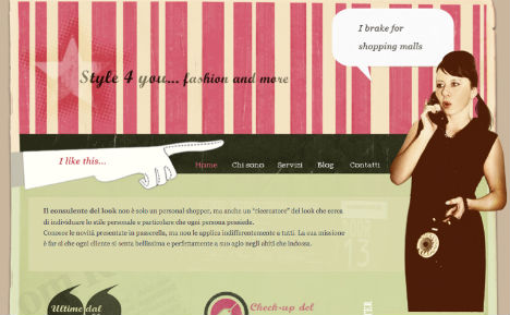
Style 4U
Pairing vintage-looking photos and details like gloves, old television sets and film strip image borders with a fresh color scheme, Italian site Style 4U marries an aged aesthetic with the latest in fashion.
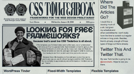
CSS Tinderbox
With a look that’s more Soviet propaganda than 21st century web template source, CSS Tinderbox certainly stands out from all the other websites offering similar products, though their “frameworks for the web design proletariat” are more run-of-the-mill.
Island Photobooth
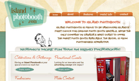
Photo booths were all the rage back in the ’60s, but they’ve gotten big updates for modern times – like digital touch screens and personalized custom graphics. Island Photobooth, a Vancouver company that rents out photo booths for events, illustrates their tagline “vintage style meets digital technology”.
Target Scope
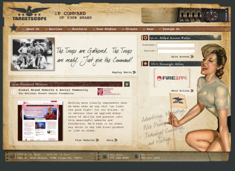
How do you get command of your brand? Hire some WWII-era troops, apparently. Dallas advertising agency Target Scope has an engaging military-themed interactive website that features plane shadows flying by on occasion, bullet holes and, yes, a scope that you use to browse the top navigation bar.
Custom Design
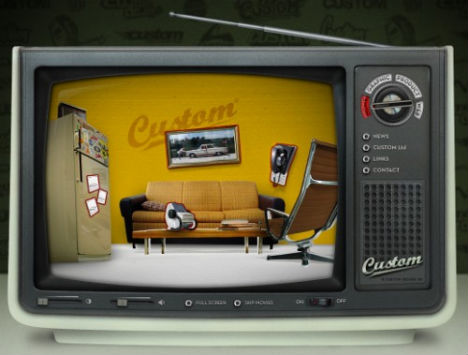
The buzzing, pixelated static of an analog television isn’t the only thing on the Custom Design website that will take you back in time. Check out the script font, the vintage furniture, and even the rolodex on the table which stands in for a “contact” button.
Font Diner
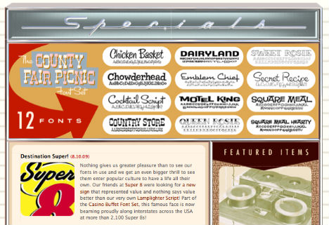
What are you craving – a chicken basket? A milkshake? Perhaps something from the country store, or the diner’s secret recipe? Font Diner has it all, packed with all-you-can-eat retro fonts on a very dineriffic website.
Charlies Loan
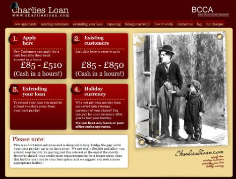
Most loan websites are all business, seeking to look as professional as possible. The British Check Cashers Association decided to do something a little different with the ‘Charlies Loan’ website, which oddly – or not – prominently features a photo of Charlie Chaplin on the home page.
Ernest Hemingway Collection
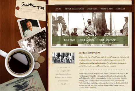
If Ernest Hemingway were around today, would he have anything to do with websites? Fans and scholars could debate that question, but in any case, the late author’s website pays fitting tribute to a man from another time. The site is designed to look like a desktop scattered with change, photos, a passport and a cup of coffee.
Level 2D
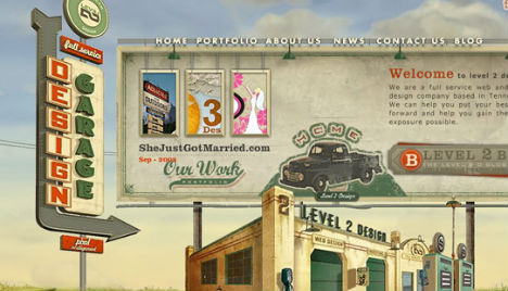
Interactive and scenic, the Level 2D website has the look of a vintage full-service garage complete with a flickering sign and garage bays for web design and hosting.
Visit Cascadia
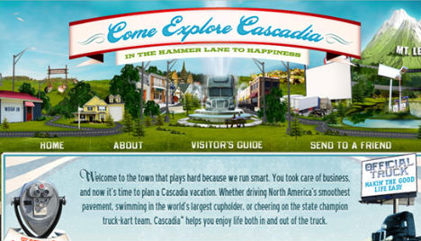
Truck drivers get to see a lot of American landscapes, including those that have remained relatively unchanged over the decades. But imagine if they had an idyllic all-American town of their very own, with attractions like a truck-only drive-thru, the World’s Largest Cupholder and a beef jerky tasting room. The ‘Visit Cascadia’ website brings this imaginary town to life with nostalgic imagery.
