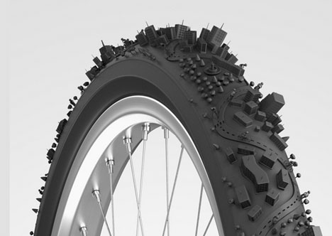
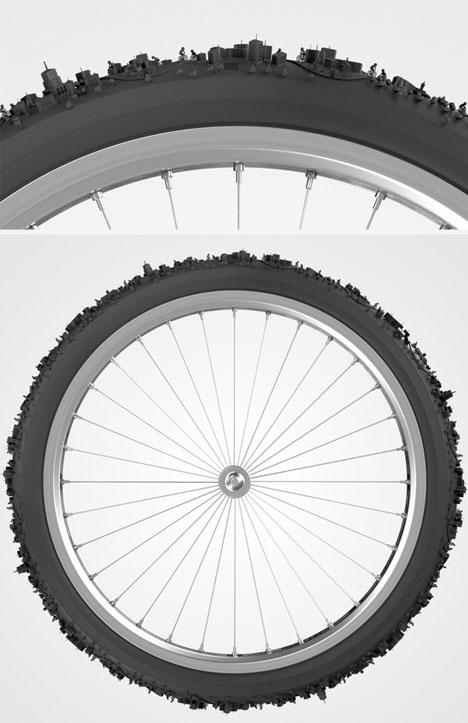
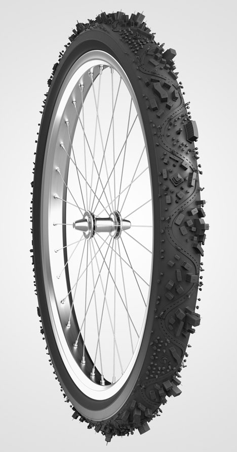
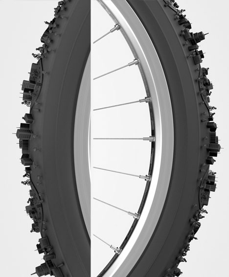
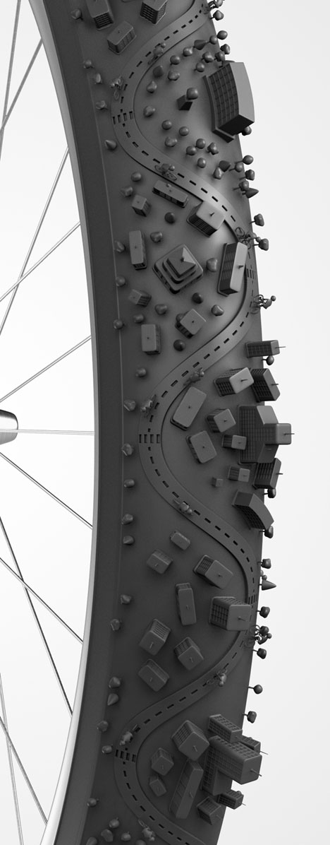
Rough around the edges, we rarely notice the unique landscape that evolves from regular wear and tear on our bicycle tires – this illustration draws on that familiar-yet-foreign topography.
Bruno Ferrari & Rodrigo Paranhos used Luxology and a little bit of Photoshop to craft this series of images for a creative agency – yes, sadly this is not a prototype for a real rubber bicycle tire tread pattern.
Yet you have to wonder: why not? If issues of unevenness were resolved, it would sure make a neat additional designer touch for riding around in cities. Either way, it is a neat inversion of the Halo-style ringed landscape concept.
