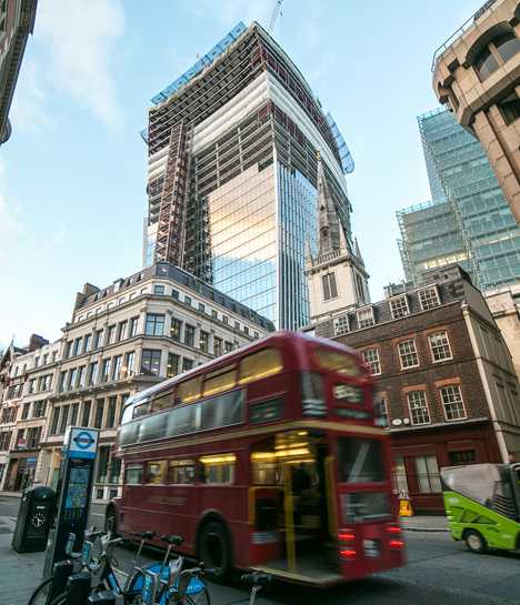
The Walkie-Talkie – 20 Fenchurch St., London, UK
 (image via: Designboom)
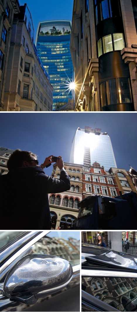
The recently completed, 37-story high-rise building at 20 Fenchurch Street in London, UK has been attracting attention for all the wrong reasons. Dubbed the “Walkie Talkie” after its resemblance to those two-way radio handsets, the building designed by Rafael Viñoly Architects displays vast expanses of curved glass which, under certain daytime conditions, focus sunlight in a manner that could be dangerous to people and possessions.
 (images via: UrbanGlass, Vancouver Sun and Designboom)
If you’ve ever considered the POV of an ant looking up at a kid with a magnifying glass, then walking (or parking) anywhere near 20 Fenchurch is a questionable proposition to say the least. After someone reported plastic parts on their Jaguar had partially melted after being exposed to the building’s reflected heat, a reporter sent to investigate beat a quick retreat when his hair began to catch on fire. That’s one way to dissuade the homeless, Mormons and pigeons.
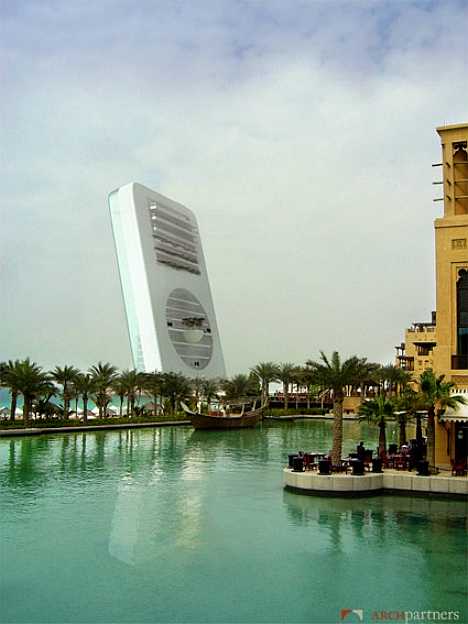
Archpartners Concept Tower
 (image via: Eikongraphia)
There’s not much info around concerning the above building concept from Archpartners other than it was intended to stoke interest in investors hoping to ride the growing wave of telecom-related infrastructure spending. If the coastal setting with abundant palms is any clue, the Leaning Tower of Telecommunications was yet one more entry in the much-cooled Dubai building frenzy.
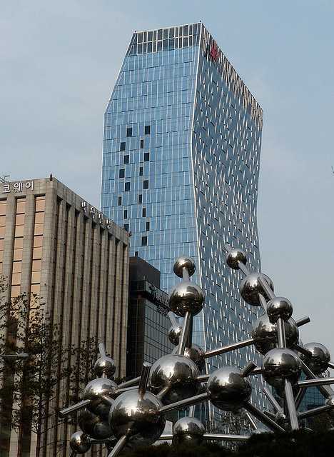
SK Telecom Headquarters – Seoul, South Korea
 (image via: Dan)
The SK Telecom Headquarters building in Seoul, South Korea was designed for a telecom company and designed to look like a mobile phone, which makes perfect sense as long as SK Telecom maintains offices in the building and isn’t replaced some day by some anonymous insurance company. Kudos to Flicker user Dan for capturing the above inspiring image of SK Telecom’s T-Tower.
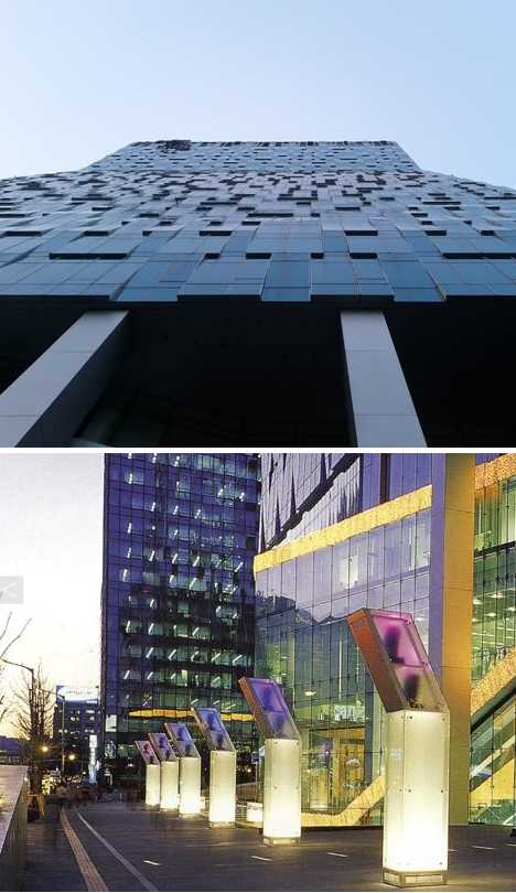 (images via: Kevin Sung and RAD)
The 33-story T-Tower stands 148 meters (486 feet) tall, which puts it at only 68th place among other Seoul skyscrapers. If only they had straightened out the topmost bend in the planning stage. The T-Tower carries the clamshell flip-phone theme down to the ambient lighting constructed around the building’s base. The overall design should age well, as long as people keep buying bent mobile phones.